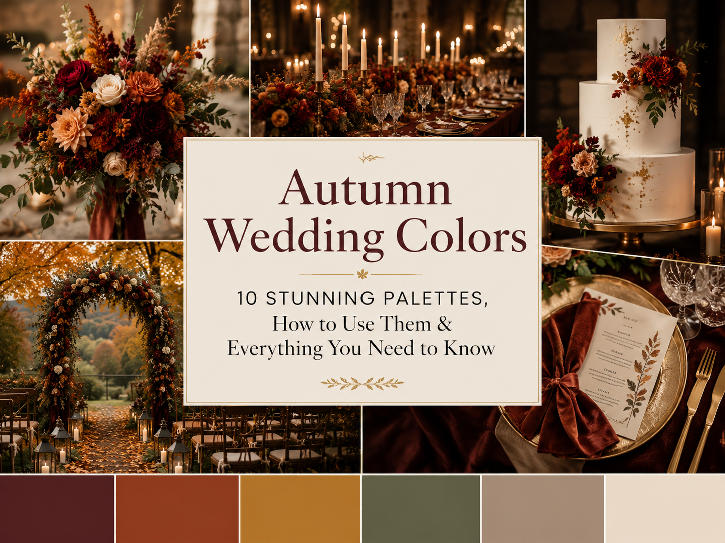
Autumn Wedding Colors – 10 Stunning Palettes, How to Use Them & Everything You Need to Know
The Autumn Colour Edit · 2026
Autumn Wedding Colors
10 Stunning Palettes, How to Use Them & Everything You Need to Know
From deep oxblood and burnished copper to dusty sage and smoked plum — your complete guide to choosing, building, and styling the perfect autumn wedding color palette in 2026.
Autumn wedding colors are not chosen from a swatch book. They are borrowed from the landscape itself — from the hedgerows and the woodland floor, from the harvest fields at dusk, from the light that falls at an angle no other season can produce.
Introduction
Why Autumn Wedding Colors Are in a Category of Their Own
Every season offers a couple a palette to work with. Summer gives pale blues, soft greens, and the blush tones of the garden in full bloom. Spring offers pastels, fresh whites, and the first tentative yellows of the season. Winter draws on the deep blues of early dark, the ivory of frost, and the drama of candlelit interiors. And then there is autumn — which hands the wedding planner not a palette but an entire world of colour. A world of extraordinary richness, depth, and visual complexity that no other time of year can match, and that operates at a level of natural drama that requires very little embellishment to become genuinely breathtaking.
The challenge of autumn wedding colors in 2026 is not finding beautiful options — it is choosing between them with enough intention and coherence that the result feels like a considered aesthetic decision rather than a seasonal shopping list. The couple who simply reaches for every rich, warm, dark tone the season offers will produce a wedding that looks busy and undirected, however individually beautiful each element might be. The couple who chooses two or three colours with precision — an anchor, a complement, and a carefully considered contrast — and applies them with consistency across every element of their day will produce something of genuine, memorable beauty.
In this guide we present ten of the most beautiful and distinctive autumn wedding color palettes for 2026 — each a fully considered, seasonally specific combination with guidance on where and how to apply it across your wedding day. We also cover the principles behind building a coherent autumn palette, how to adapt colors to different venues and aesthetics, and everything you need to know to brief your suppliers with confidence.

The Edit
10 Autumn Wedding Color Palettes That Define the Season
Each of these ten palettes represents a fully formed aesthetic direction for an autumn wedding — not simply a list of colors but a considered combination with a specific mood, venue affinity, and visual character. Read each one as a creative brief for a complete wedding day, and notice which feels instinctively, undeniably right for you.
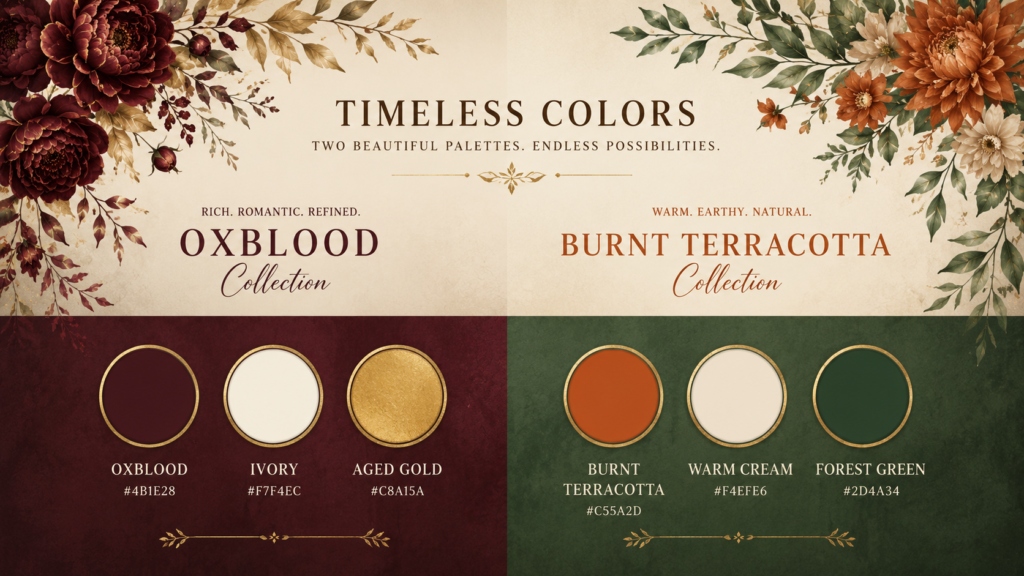
01
Oxblood, Ivory & Aged Gold
Oxblood
Aged Ivory
Aged Gold
The most dramatic and formally beautiful of all autumn wedding color combinations. Oxblood anchors the palette with a depth and richness that commands every photograph, ivory provides the breathing space that prevents it from overwhelming, and aged gold catches candlelight with a warmth that no cooler metallic can replicate. This palette belongs in a stone manor, a candlelit chapel, or a Victorian townhouse — and it suits the bride in a warm ivory velvet gown with deep burgundy florals and gold-leaf stationery. The couple who chooses this palette is choosing confidence, richness, and an autumn wedding that feels genuinely, memorably extraordinary.
02
Burnt Terracotta, Warm Cream & Forest Green
Terracotta
Warm Cream
Forest Green
One of the most naturally beautiful autumn wedding color combinations available — earthy, warm, and deeply grounded in the visual language of the season without ever feeling predictable. Burnt terracotta is the colour of clay pots, turning bracken, and harvest earth; warm cream prevents it from becoming heavy; and the addition of forest green introduces a freshness and a natural credibility that anchors the whole palette firmly in the real autumn landscape rather than a stylised version of it. This palette belongs in a barn, a walled garden, or a rural estate setting, and suits bridesmaids in terracotta silk with greenery-heavy florals and cream stationery on kraft paper.
03
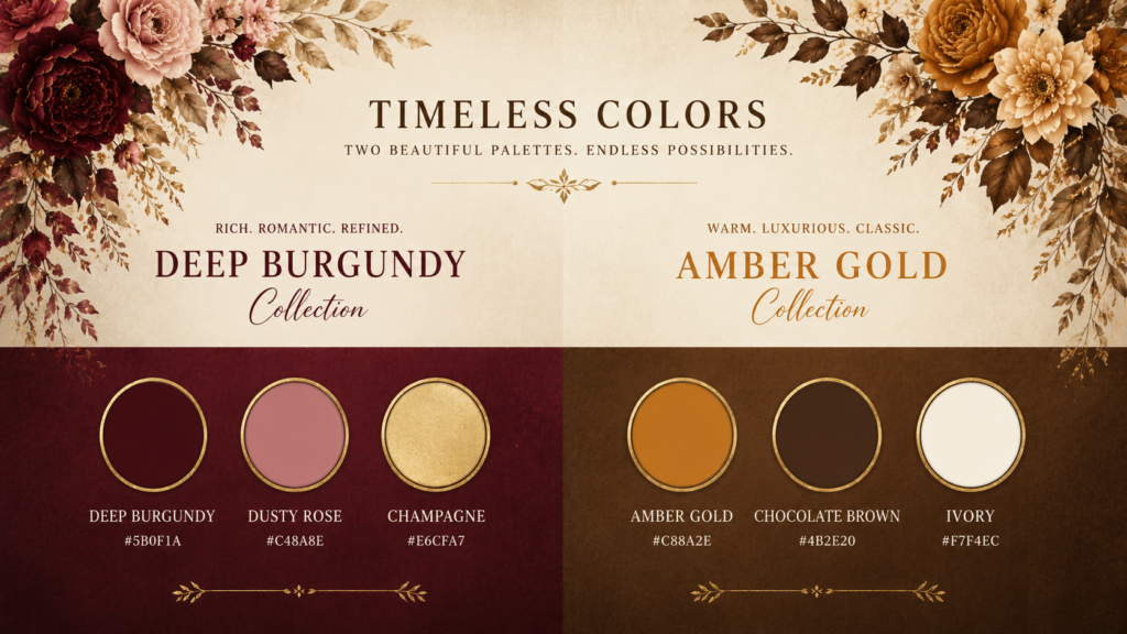
Deep Burgundy, Dusty Rose & Champagne
Burgundy
Dusty Rose
Champagne
The most romantic of all the autumn wedding color palettes — deeply feminine without being saccharine, richly seasonal without being obvious. Burgundy provides the anchor and the depth; dusty rose softens and romanticises; champagne illuminates and ties both to the natural warmth of autumn’s golden light. This palette suits the couple whose autumn wedding aesthetic leans toward garden-gathered florals, candlelight, and understated luxury. Bridesmaids in dusty rose, groom in a charcoal three-piece, florals in deep burgundy dahlias and blush garden roses. Stationery in champagne with deep red hand-lettering. Entirely, effortlessly beautiful.
04
Amber Gold, Chocolate Brown & Ivory
Amber Gold
Chocolate
Ivory
Warm, rich, and unmistakably autumnal — this palette evokes the harvest more directly than almost any other combination. Amber gold is the colour of the afternoon light itself in October; chocolate brown grounds the scheme in the earth and the bark and the leaf mould of the woodland floor; ivory lifts and illuminates both. This combination works magnificently in any autumn venue but is particularly extraordinary in an oak-panelled room or a barn with exposed timbers, where the chocolate brown tones of the architecture create a natural fourth element in the palette. Chrysanthemums, dried grasses, and amber-toned Café au Lait dahlias are the natural floral companions.
05
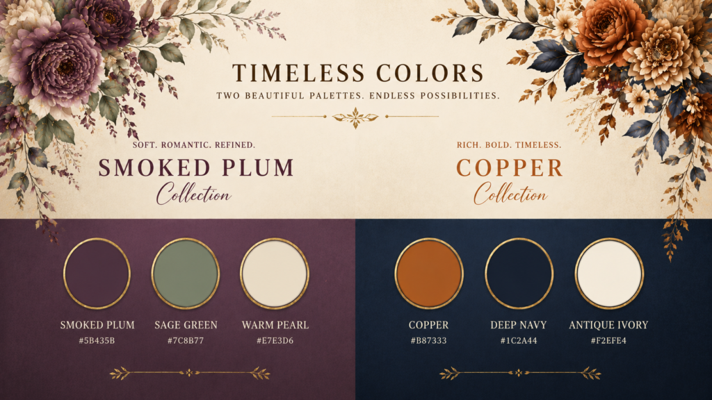
Smoked Plum, Sage Green & Warm Pearl
Smoked Plum
Sage Green
Warm Pearl
The most unexpectedly sophisticated of all the autumn wedding color palettes — one that reads as thoroughly seasonal while resisting every obvious autumn cliché. Smoked plum has the depth and richness of the season without leaning into the conventional burgundy territory; sage green introduces a botanical freshness that prevents the plum from becoming heavy; and warm pearl provides the luminosity that ties both to the quality of autumn’s actual light. This palette photographs with extraordinary refinement and suits the couple whose aesthetic is considered, personal, and slightly outside the mainstream of seasonal wedding design.
06
Copper, Deep Navy & Antique Ivory
Copper
Deep Navy
Antique Ivory
A striking and genuinely unexpected autumn wedding color combination that draws on the season’s metallic character — the copper of turning beech leaves, the deep navy of the shortening sky — and balances both against the timeless elegance of antique ivory. This palette has a slightly more formal, slightly more urban character than the earthier combinations and suits city weddings, townhouse receptions, and any venue where the architecture provides the drama and the wedding palette provides the warmth. Copper candleholders, navy velvet napkins, ivory florals with copper-leafed foliage. Photographs with extraordinary sophistication.
07
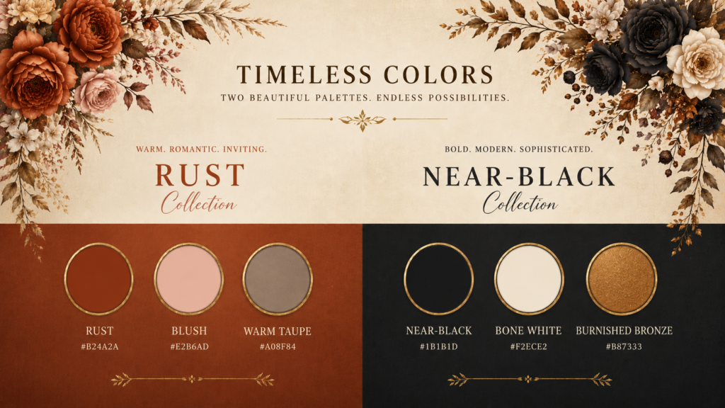
Rust, Blush & Warm Taupe
Rust
Blush
Warm Taupe
A gentler, more approachable version of the autumn wedding color palette — warm and seasonal without the drama of the deeper combinations. Rust is the colour of bracken, of turning oak leaves, of the late harvest field; blush softens and feminises it; warm taupe grounds the whole palette in a natural neutral that holds the other two together with quiet elegance. This combination suits the couple who wants an autumn wedding that feels warm and personal rather than dramatically styled — and it works beautifully across every scale of celebration from an intimate gathering to a large country house wedding.
08
Near-Black, Bone White & Burnished Bronze
Near-Black
Bone White
Burnished Bronze
For the couple whose autumn wedding aesthetic draws on the gothic, the dramatic, and the darkly romantic. Near-black creates an atmosphere of extraordinary depth and candlelit intensity; bone white provides the ghostly contrast that prevents the palette from consuming itself in darkness; and burnished bronze introduces the warmth that makes the scheme feel of the season rather than of a horror film. This is the palette of the autumn wedding that guests will remember for decades — visually daring, technically demanding, and breathtakingly beautiful when executed with confidence and complete commitment.
09
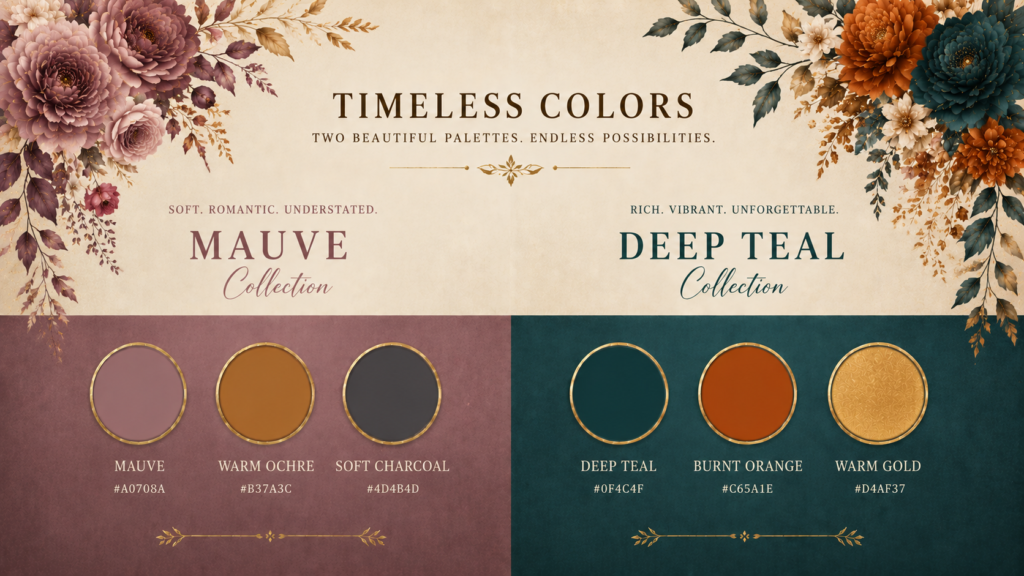
Mauve, Warm Ochre & Soft Charcoal
Mauve
Warm Ochre
Soft Charcoal
An autumn wedding color palette of quiet, unusual beauty — one that takes the season in a slightly more muted, more sophisticated direction without losing any of its warmth. Mauve brings a faded, dusty violet note that evokes the late-season hedgerow; warm ochre introduces harvest gold without the brightness of a true yellow; and soft charcoal provides the neutral gravity that gives both colours room to breathe. This palette suits the couple who wants something distinctly personal and unlikely to appear in anyone else’s October wedding album — and it photographs with a film-like, editorial quality that more conventional autumn palettes simply cannot match.
10
Deep Teal, Burnt Orange & Warm Gold
Deep Teal
Burnt Orange
Warm Gold
The most visually daring of all the autumn wedding color palettes — and in the right venue and with the right creative team, the most spectacular. Deep teal is the colour of the autumn sky just after sunset, of the cold river running through October woodland; burnt orange is its exact complementary opposite, producing a contrast of extraordinary vibrancy and warmth; and warm gold resolves the tension between them with a richness that feels entirely of the season. This palette demands a confident creative brief and a florist, stylist, and stationer who can execute bold colour work with precision. In skilled hands, it produces wedding photography that stops the scroll every single time.
“The right autumn wedding color palette is not the one that looks most beautiful on a mood board. It is the one that looks most completely itself in the specific light of your specific venue on your specific October day. Start with the light — the colors will follow.”
— The Autumn Colour Edit
How to Apply Your Palette
How to Apply Autumn Wedding Colors Across Every Element of Your Day
Choosing your autumn wedding color palette is the beginning of the creative process, not the end of it. The palette must then be applied — consistently, thoughtfully, and with an understanding of how different materials and surfaces carry color differently — across every visual element of the day. The florals carry the palette in organic, living form. The stationery introduces it formally before the day itself begins. The bridal party’s attire applies it to the human scale. The table linen and decor bring it into the reception room. The cake incorporates it as an edible centrepiece. And the lighting — particularly the warm amber candlelight that is autumn’s greatest gift to any wedding aesthetic — both reveals and transforms every color it touches.
🌸
Florals
The anchor and the dominant carrier of the palette. Brief your florist with specific color references and hex codes, not just descriptive words. “Burgundy” means different things to different florists — be precise.
👗
Bridal Party Attire
Bridesmaids carry one palette color; the groom’s party a second. The bride stands apart in warm ivory or an on-palette gown. The human scale is where the palette becomes most personally expressive.
🕯️
Lighting & Candles
Candlelight shifts every autumn wedding color toward warmth. Test your palette choices under actual candlelight conditions before finalising — some colors transform dramatically and beautifully, others less so.
✉️
Stationery
The invitation sets the tone before the day begins. Deep-toned card stock, kraft paper, letterpress printing, and wax seals in your palette colors introduce the aesthetic months in advance and photograph beautifully as flat lay content.
The Three-Color Rule for Autumn Wedding Palettes
Every autumn wedding color palette works best when built around three distinct roles: an anchor color (the dominant, most saturated tone that carries the visual weight of the scheme), a complement color (a related but lighter or more muted tone that softens and supports the anchor), and a contrast color (a tone from a different part of the spectrum that prevents the palette from becoming monotonous and creates the visual energy that makes it memorable). Apply the anchor at roughly 60% of the palette’s presence, the complement at 30%, and the contrast at 10% — and you will produce a scheme that feels coherent, balanced, and completely of the season.
Practical Planning
Ten Things Every Couple Should Know When Choosing Autumn Wedding Colors
- Visit your venue in October before choosing your palette. The single most important step in building an autumn wedding color scheme is understanding the specific light quality, architectural tones, and surrounding landscape of your venue in the actual season. A palette that looks extraordinary against pale limestone will look entirely different against dark oak panelling. See the space in autumn light before you commit to anything.
- Choose colors by their warmth, not just their depth. The quality of autumn light is warm — amber, golden, low-angled. Cool colors — stark white, icy blue, cool grey — fight this light rather than working with it. Even if you are drawn to a cooler tone, choose the warmest version of it: warm ivory over stark white, dusty sage over cool mint, smoked charcoal over blue-grey.
- Brief every supplier with the same color references. The word “burgundy” means something different to a florist, a stationer, a cake designer, and a bridesmaids dress retailer. Use physical swatches, Pantone references, or specific hex codes when briefing all suppliers — and collect physical samples from each to compare them together before finalising.
- Test your palette under candlelight before the wedding day. Candlelight is the defining light source of an autumn wedding reception, and it changes every color it touches — warming some dramatically, dulling others, shifting the apparent relationship between hues. Lay your palette swatches on a table, light real candles, and photograph the result. You may be surprised by what you see.
- Understand the difference between the palette’s presence in daylight and evening light. Your ceremony will likely be photographed in daylight or late afternoon golden hour; your reception in candlelit evening darkness. Some color combinations that are beautiful in the day become even more spectacular by candlelight — dark jewel tones and burnished metallics are the most obvious example. Others lose their distinctiveness. Plan for both conditions.
- Limit your palette to three colors maximum, applied consistently. The most common mistake in autumn wedding color planning is choosing too many beautiful seasonal tones and applying all of them simultaneously across every element of the day. The result is visual busyness rather than visual beauty. Three colors, clearly defined as anchor, complement, and contrast, applied with discipline and consistency, will always produce a more beautiful and more memorable result.
- Consider how your palette reads in photographs, not just in person. Wedding photography compresses three-dimensional space and color into a two-dimensional image. Some color combinations that are beautiful in person become muddy or indistinct in photographs; others that seem quiet in person become vivid and striking when captured. If possible, photograph your palette swatches with your photographer’s camera before finalising.
- Use the venue’s existing colors as a fourth element in the palette. The stone, timber, brick, or plaster of your venue is always present in the photographs — it is unavoidable and should be treated as a design element rather than a neutral background. Choose a palette that works with the venue’s existing tones rather than competing with them, and the space itself becomes a natural extension of your color scheme.
- Do not try to replicate what you see on Pinterest. The autumn wedding color palettes that photograph most beautifully in other people’s weddings were created in specific venues, with specific lighting, with specific florals and specific fabrics. Attempting to replicate them in your own different context will produce a version that looks like a less successful copy rather than a genuinely considered original. Use inspiration as a starting point for understanding what moves you — then build something that belongs to your day specifically.
- The best autumn wedding color palette is one that makes the season feel inevitable. Not imposed upon the day from outside but grown from the specific world of your celebration — from the light in your venue, the flowers in your region, the architecture of your setting, and the particular quality of beauty that October or November brings to everything it touches. When you find that palette, you will know it immediately: it will feel less like a decision and more like a recognition.
“The couples whose autumn wedding photographs stop the scroll are never the ones who chose the most colors. They are the ones who chose the right three — and applied them with a consistency, a confidence, and a love of the season that shows in every frame.”
— Autumn Colour Planning Notes
Closing Thoughts
The Autumn Wedding Color Palette Is the Heart of Your Day’s Visual Story
Of all the creative decisions in wedding planning, the color palette is the one from which every other visual decision flows. It is the first thing a guest perceives — in the invitation that arrives months before the day, in the florals that line the ceremony aisle, in the bridesmaids’ dresses, the table linen, the cake, the candleholders. It is the thread that runs through every element of the celebration and ties it into a coherent, beautiful whole. And in autumn, that thread is woven from the richest, most deeply beautiful material the calendar has to offer.
Choose with intention. Choose with the light of your specific venue in mind. Choose colors that belong to the actual world of October or November rather than a stylised, abstracted version of it. Brief your suppliers with precision, apply your palette with consistency, and then — when the candles are lit and the room is full and the light is exactly as you imagined it — stand within the world your colors have built and know that this particular decision was made as well as it could possibly have been made.