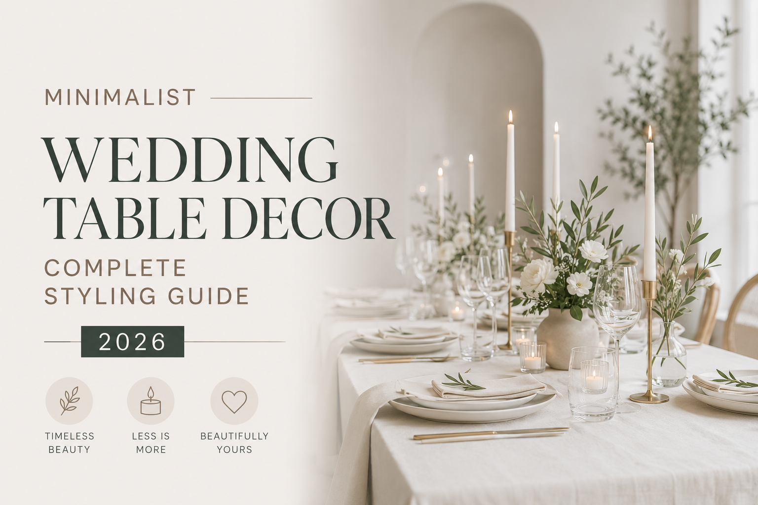
Minimalist Wedding Table Decor — Complete Styling Guide 2026
Wedding Decor · 2026
Minimalist Wedding Table Decor — Complete Styling Guide 2026
Five complete minimalist table aesthetics, the centrepiece guide, linen and setting details, and how stationery becomes part of the table design.
The minimalist wedding table is one of the most consistently misunderstood concepts in reception planning. It is not an empty table. It is not a table that forgot to be decorated. It is a table where every element was chosen with such precision that nothing superfluous survived the editing process — and the result is a visual experience that reads as more considered, more elegant, and more beautiful than a fully decorated table could achieve. This guide covers how to build that table, in five distinct aesthetic directions.
“A minimalist wedding table is not one that is sparsely decorated. It is one that is edited — every element chosen with intention, every superfluous element removed until what remains is exactly enough and nothing more.”
Section 01 The Minimalist Table Philosophy
The most useful reframe for understanding minimalist wedding table decor is to replace the word ‘minimalist’ with the phrase ‘maximally edited.’ A minimalist table is not one that lacks decoration — it is one where the editing process was applied so rigorously that only the elements that genuinely earn their place survived. The negative space between a single-stem vase and a beautifully typeset menu card is not absence; it is the deliberate preservation of visual breathing room, which is itself the most powerful design element available at the table level.
The distinction matters practically because it determines how the planning process works. A maximally decorated table starts with nothing and adds until it looks full. A minimalist table starts with the complete vision and removes until what remains is both sufficient and perfect. The removing is harder than the adding, which is why minimalist tables consistently require more decision-making than decorated ones — and why they photograph so well. Every element in the frame earned its position by surviving an editing process that eliminated everything else.
In 2026, the minimalist table aesthetic has expanded significantly beyond its early iterations as a purely white-and-architectural direction. Five distinct minimalist aesthetics now exist alongside each other — from the pure architectural white-and-ivory direction to the warm neutral quiet luxury table to the editorial monochrome table — each sharing the editing philosophy while working in completely different visual registers. All five are covered in Section 02. The rule that applies to all of them: one idea per table, executed perfectly. Not three ideas at reduced intensity. One.
✨ Styling Note
The minimalist table test: stand at the end of the room and look at the tables before guests are seated. If your eye moves from element to element searching for a resting place, there are too many elements. If your eye settles immediately on one specific point — the centrepiece, the linen, a beautifully placed menu card — and then rests there comfortably, the table is edited correctly. The minimalist table gives the eye one thing to appreciate rather than many things to process.
Section 02 Five Minimalist Wedding Table Aesthetics
Five complete table directions, each sharing the editing philosophy of Section 01 and each producing a genuinely distinct visual experience. None of them is a variation on the others.
Most Architectural
2.1 — The White & Ivory Table
Pure White · Warm Ivory · Antique Gold Accent
Linen: A 400gsm matte white or warm ivory linen tablecloth — the specific warm ivory rather than cool bright white when the venue has warm lighting; cool bright white when the venue is deliberately architectural and bright. The linen is the table’s primary surface element and the quality of its texture — linen weave, cotton sateen, or raw linen — communicates the quality of the table before any centrepiece is placed.
Centrepiece: A single stem in a clear or white bud vase placed at each place setting, or one tall single-variety arrangement (white ranunculus, white anemone, or white amaryllis) in a simple cylindrical vase at the table centre. One centrepiece form only — the single stem at each place or the central arrangement — not both simultaneously.
Stationery: A clean white or warm ivory menu card in a typeset serif font, placed precisely at the centre of the plate or propped against the stem vase. The typography of the menu card is the table’s most visible printed element — it should be as deliberately considered as the centrepiece.
What breaks the look: Any colour on the table surface — even a subtle warm tone in the linen ribbon or napkin fold breaks the monochrome integrity of this direction. Mixed centrepiece forms at different table positions — some with single stems, some without — read as inconsistent rather than considered. A coloured candle that introduces a second palette element.
The White and Ivory Table is the most architectural and the most enduring of the five directions — it works in any venue from a modern concrete space to a centuries-old chapel because its visual language is so restrained that it never conflicts with an existing environment. Its primary challenge is in the quality of execution: with no colour, no pattern, and no abundance of decoration to redirect the eye, the quality of the linen texture, the flower form, and the typography of the stationery all bear the full weight of the table’s beauty. There is nowhere for a small imprecision to hide.
✨ Styling Note
A single white stem in a clear bud vase is one of the most deceptively demanding minimalist centrepiece choices — because the stem, the bud vase form, and the quality of the water in the vase are all visible and all significant. Choose a bud vase with a simple, elegant profile rather than a novelty form; fill it with fresh water changed the morning of the wedding; and select a stem with an interesting natural form rather than a perfectly straight standard. The beauty is in the specificity of the single element, not in its generic correctness.
Most Luxurious
2.2 — The Beige & Warm Neutral Table
Warm Ivory · Warm Beige · Deep Sage · Antique Gold
Linen: Warm ivory or oatmeal linen in a raw or slightly textured weave — the specific organic texture of natural linen that reads as quiet luxury rather than as simply neutral. The linen should have visible texture: a linen weave visible to the touch, or a raw edge at the runner border, or the specific slightly irregular quality of a high-grade natural fabric.
Centrepiece: Dried pampas tails in honey-cream at a central low arrangement, or a cluster of cream and warm ivory dried florals in a ceramic or raw clay vessel. The vessel is as important as the botanical material in this direction: a warm cream ceramic or a raw clay pot reads as specifically quiet luxury; a generic glass cylinder reads as generic.
Stationery: A warm ivory or oatmeal menu card with a fine-line botanical illustration border and warm brown or antique gold lettering. The stationery palette should belong to the same warm neutral world as the linen and the centrepiece: warm ivory stock, warm brown lettering, a fine botanical line as the accent.
What breaks the look: Cool-toned elements in the linen or the centrepiece — a cool grey linen beside warm ivory reads as two separate whites that do not quite match. Fresh flowers in bright saturated colour that introduce a hue outside the warm neutral family. Silver metallic detail when antique gold is the correct metallic for this direction.
The Beige and Warm Neutral Table is the direction that most consistently earns the description ‘quiet luxury’ — because its palette communicates warmth, restraint, and material quality simultaneously. The specific combination of a textured natural linen, a raw clay or warm ceramic vessel, dried botanical material in honey-cream tones, and a beautifully typeset menu card on warm ivory stock reads as specifically considered and specifically expensive in the way that only warm neutrals in the correct materials can achieve.
Most Natural
2.3 — The Botanical Minimalist Table
Warm Ivory · Deep Sage · Warm Green · Antique Gold
Linen: A warm ivory linen as the base, with a simple greenery runner — eucalyptus branches, olive leaves, or soft ruscus placed in a loose, organic line along the table centre — as the primary surface element. The greenery runner in this direction replaces the centrepiece rather than supplementing it: a greenery runner alongside a centrepiece produces a botanical abundance direction rather than a botanical minimalist one.
Centrepiece: One of three options, chosen before anything else is purchased: a single variety arrangement (all white ranunculus, all eucalyptus, or all anemone in one clear vessel per table); a bud vase cluster of three to five vessels in varying heights with single stems in each; or the greenery runner alone with no additional centrepiece. One approach per table, applied consistently across all tables.
Stationery: A warm ivory or sage-tinted menu card with minimal botanical illustration in the line style — a single leaf or eucalyptus sprig as the sole illustrated element beside the typography. The stationery should feel as though it grew from the same botanical world as the table.
What breaks the look: Mixing botanical approaches across tables — some tables with single-variety arrangements and others with bud vase clusters — which reads as inconsistent planning rather than as designed variety. Adding florals in colours that compete with the deep sage and warm green — bright yellow, bright orange, or cool-toned blue.
The Botanical Minimalist Table is the direction that most naturally suits outdoor, garden, and courtyard venues — because the botanical vocabulary at the table echoes rather than conflicts with the natural environment beyond the room. A greenery runner on warm ivory linen beside an olive tree or a garden wall reads as part of the same world; the same greenery runner in a modern urban venue reads as specifically designed botanical contrast. Both work; the botanical minimalist table adapts to context more naturally than any of the other four directions.
Most Editorial
2.4 — The Monochrome Elegant Table
Crisp White · Deep Black · Antique Gold Accent
Linen: A crisp white linen — specifically the brightest, most precisely laundered white available, because the black accent elements in this direction depend on the white base being as clean and as precise as possible. A black napkin in a simple fold beside the white plate; or a white linen with a single black napkin ribbon detail. The black element should appear at the table level — in the napkin, the menu card border, or the cutlery — not in the centrepiece.
Centrepiece: A single white flower variety in a clear or black vessel; or white taper candles in black candle holders as the primary centrepiece element. The centrepiece in this direction should stay in the white-and-clear register rather than introducing black into the botanical element — the black appears in the table setting details, not in the flowers.
Stationery: A white menu card with black typography and a minimal black border detail — the stationery in this direction is the table’s most deliberately editorial element. Clean modern typography rather than a script font; precise typesetting with generous margins; the black text on white card communicating the same precision as the table’s linen and setting decisions.
What breaks the look: Any colour element introduced beside the black and white — even a warm gold that would be appropriate in another direction breaks the high-contrast monochrome integrity of this table. Brown or ivory tones in the linen that cool the white element when a crisp clean white is specifically needed.
The Monochrome Elegant Table is the most editorial and the most photographically powerful of the five directions — black and white at the table level photographs in high contrast in a way that reads as specifically designed rather than as generically decorated. It is also the direction most likely to be remembered by guests, because it is the most decisively different from the expected ivory-and-gold default.
Most Contemporary
2.5 — The Modern Script Table
Warm Ivory · Warm Neutral · Bold Black Script
Linen: A warm ivory or warm oatmeal linen — the most neutral, most recessive surface possible, because the design intention in this direction is for the typography of the stationery to be the primary visual element of the table rather than the linen or the centrepiece.
Centrepiece: A single taper candle in a simple brass or antique gold holder, or a single bud vase with one stem at each place setting. The centrepiece in the Modern Script direction should be deliberately minimal — it exists to bring warmth and life to the table surface rather than to compete with the typographic quality of the stationery.
Stationery: Large-format menu cards or place cards where the script typography is the primary design element — placed prominently at each setting, propped against the bud vase, or laid flat at the precise centre of the plate with generous white space around the text. The typography is the table decoration.
What breaks the look: Small-format stationery that loses the impact of the script typography at the distance guests first see the table. Mixed font styles that reduce the impact of the chosen script. A centrepiece that is more visually prominent than the stationery, which reverses the hierarchy this direction is built on.
The Modern Script Table is the direction for couples whose design instinct is typographic — who see the words of a beautifully typeset menu as an object of beauty in themselves rather than as a functional list. It is also the most adaptable direction: the script typography translates to any scale and any venue, and the minimal centrepiece requirement means the overall table cost is typically the lowest of the five directions.
Section 03 Minimalist Wedding Centrepieces
The centrepiece is the element most couples find hardest to minimise — because the default wedding centrepiece logic is ‘abundant and tall’ and the minimalist centrepiece logic is ‘one idea, executed perfectly.’ The most common minimalist centrepiece mistake is trying to do a smaller version of an abundant arrangement rather than a genuinely different kind of arrangement. A small abundant arrangement reads as an abundant arrangement that ran out of budget; a single-stem bud vase reads as a considered design decision. These are not the same thing.
Five centrepiece approaches work for minimalist tables, and the decision between them should be made before any florist conversations begin — because the choice determines the brief, and the brief determines the budget, and the budget determines the rest of the table planning.
Single Stem in Bud Vase
What it is: One stem of a single variety in a simple clear, white, or ceramic bud vase. The stem should have an interesting natural form rather than a perfectly straight standard stem — a slightly curved rose stem, an anemone with its dark centre visible, a white amaryllis at its peak opening.
The number rule: One bud vase per place setting, or one bud vase at the table centre and nothing else. Not one at each setting and one at the centre simultaneously.
This is the most rigorously minimalist centrepiece choice and the most demanding in terms of the quality of the individual stem. When there is only one stem, that stem is the entire visual experience — its form, its colour, its opening stage, and its placement in the vase are all fully visible and fully significant. Choose the variety and the stem form as carefully as a florist would choose the hero flower in a full arrangement.
Bud Vase Cluster
What it is: Three to seven bud vases in varying heights, arranged as a loose cluster at the table centre. Each vase holds one stem. The vessels should belong to the same material family — all clear glass, all white ceramic, or all raw clay — rather than being deliberately mixed.
The number rule: Three to seven vases per table, all from the same material family. More than seven reads as abundant rather than as minimalist; fewer than three reads as incomplete rather than as restrained.
The bud vase cluster is the most forgiving of the minimalist centrepiece approaches because the variation in height and vessel position creates visual interest without any single element needing to carry the full weight of the table’s beauty. It is also the approach most naturally suited to the long table — where a cluster can be extended along the table length rather than positioned at a single central point.
Single Variety Arrangement
What it is: One variety of flower in one clear or simple vessel — an arrangement of all white ranunculus, or all green eucalyptus, or all white peony — where the restraint of the single-variety choice is the design decision rather than the abundance of the arrangement.
The number rule: One vessel per table, placed at the centre. No supplementary bud vases alongside it; no scatter elements at the table level.
Single-variety arrangements read as more specifically considered than mixed-variety arrangements because the decision to use only one flower communicates aesthetic confidence — a preference for depth over variety — that guests register even when they cannot name it. The arrangement of thirty white ranunculus in a simple low vessel reads as more designed than an arrangement of ten mixed white and cream varieties in the same vessel.
Greenery or Botanical Runner
What it is: A loose organic line of one botanical variety — eucalyptus branches, olive leaves, soft ruscus, or dried pampas — placed along the table centre without a vessel, appearing to rest naturally on the linen surface.
The number rule: One botanical variety per table. No additional centrepiece beside the runner; no flowers mixed into the runner unless the runner is the botanical base for one central stem arrangement.
The greenery runner is the approach that most naturally suits long tables and outdoor venues — because the organic, unconstructed quality of a loose botanical line belongs to the natural world in a way that a formal arrangement does not. It also allows for the most variation in table length: the runner simply extends or contracts to match the specific table, which makes it the most practically flexible of the five approaches.
Pampas as Minimalist Statement Piece
What it is: A single large dried pampas arrangement — one to three plumes in a simple tall cylindrical vase or a wide low vessel — at the table centre. The pampas is the statement; nothing else competes with it.
The number rule: One vessel, one arrangement, three plumes maximum. Pampas in a cluster of five or more plumes reads as abundant rather than as minimalist; one or three plumes in a simple vessel reads as a considered statement.
Dried pampas sits at the intersection of natural beauty and architectural form in a way that almost no other botanical element does — its warm honey-cream colour belongs to the quiet luxury palette, its feathery texture catches light in the specific way that expensive materials do, and its height gives the table a vertical element without the requirement for a floral arrangement. It is also the most sustainable minimalist centrepiece choice: dried botanical material requires no water, no refrigeration, and no same-day sourcing.
✨ Styling Note
The minimalist centrepiece rule — one idea per table, executed perfectly — applies to the number of centrepiece approaches across the entire reception as much as to any individual table. A reception where long tables have greenery runners, round tables have bud vase clusters, and the head table has a single-variety arrangement reads as three ideas tried at reduced intensity rather than one idea committed to. Choose one approach; apply it to every table; let the consistency of the decision be part of the design.
Section 04 Minimalist Table Setting Details
The table setting — linen, cutlery, glassware, and the amount of empty table surface left visible — is where minimalist tables most consistently lose their integrity. Individual decisions that seem correct in isolation combine at the table level to produce a surface that reads as cluttered. The four decisions below need to be made together, at the same time, before any individual element is sourced.
Linen — warm or cool, textured or smooth, the decision that precedes everything else
Choose the linen tone and texture before the centrepiece, before the cutlery, and before the stationery — because every other element is chosen to belong to the linen’s palette family. A warm ivory linen in raw linen texture belongs to the warm neutral quiet luxury direction; a crisp bright white in cotton sateen belongs to the White and Ivory or Monochrome direction; an oatmeal or warm beige in a raw weave belongs to the Beige direction. The temperature of the white matters: warm ivory beside antique gold reads as intentional; cool white beside antique gold reads as a slight mismatch. Choose the linen’s precise tone with gold and cutlery samples beside it before placing the order.
Cutlery — quality over quantity, one style throughout
A minimalist table setting uses the minimum number of cutlery pieces required for the menu — never the full formal setting of eight pieces when four are sufficient. The material and finish of the cutlery is the quality decision: brushed gold or antique gold cutlery belongs to the warm neutral and white directions; matte black cutlery belongs to the Monochrome direction; polished silver belongs to no minimalist direction (its high reflectivity is too visually busy for the restrained aesthetic). One cutlery style throughout every table setting — no mixing of finishes at the same table.
Glassware — simple, elegant, invisible as possible
The minimalist table uses the simplest glassware available — a clear, thin-walled, undecorated water glass and a clear, simple wine glass. No coloured stem, no etched pattern, no novelty form. The glassware should be as visually recessive as possible: its job is to hold the liquid and refract the light, not to be noticed. The one exception: a simple coupé glass in the correct proportion for the champagne toast, chosen for its elegant profile rather than for any decorative quality.
Negative space — how much empty table surface to preserve
The minimalist table preserves more visible table surface than any other reception aesthetic — and that preserved surface is not a failure of decoration but a design decision. A rough guide: the combined footprint of the centrepiece, the stationery, the cutlery, and the glassware should occupy no more than sixty percent of the table surface visible between place settings. The remaining forty percent is the negative space that gives the eye room to rest and the design room to breathe. When the table feels too full but every individual element is correct, the problem is almost always that the negative space has been compressed by one element too many.
✨ Styling Note
Photograph the table setting from a standing position and from a seated position before guests arrive — the two views produce very different impressions. A setting that reads as correct from standing often reads as too full from seated, because the seated guest sees the table surface at close proximity and experiences the negative space differently. The seated view is the one that determines the guest’s experience throughout the meal; it is the photograph worth taking before the room opens.
Section 05 Stationery as Minimalist Table Decor
The most significant shift in minimalist table design in the past three years is the recognition that stationery — menu cards, place cards, table numbers — is not a functional category that sits separately from the decoration. On a minimalist table, stationery is decoration. A beautifully typeset menu card on warm ivory stock with a fine botanical illustration border is doing the same visual work as the centrepiece — it communicates taste, intention, and the quality of the celebration — in a format that every guest reads at close proximity throughout the meal.
The stationery principle for minimalist tables: the menu card and place card should be designed to be seen, not only to be read. This means generous margins around the typography; a card stock that has visible texture and weight; and a typographic choice — whether a restrained serif, a calligraphic script, or a bold modern font — that communicates the same aesthetic position as the centrepiece and the linen. A menu card in 10-point Arial on bright white glossy card stock beside a beautifully considered centrepiece reads as two separate design decisions placed at the same table.
The flat lay principle: a photograph of the place setting from above — the plate, the stationery, the centrepiece, and a portion of the linen — should read as a composition where every element belongs to the same visual world. This is the most practical test of stationery coherence available: if the menu card reads as belonging to the table in the flat lay photograph, it belongs to the table. If it reads as a different material world from the linen and the centrepiece, it needs to be reconsidered. Below are five collections that consistently pass this test across all five minimalist table directions.
White & Ivory Direction
Minimalist Wedding
Clean white and warm ivory — the most architecturally precise stationery suite for the White and Ivory table direction.
Quiet Luxury Direction
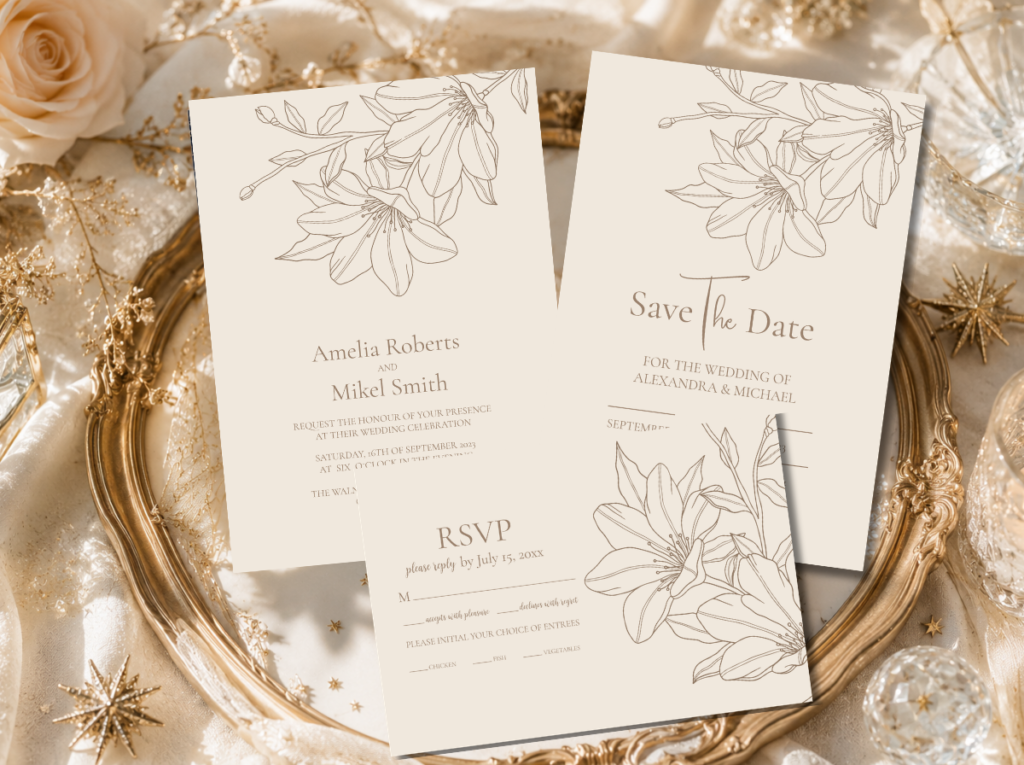
Elegant Modern Beige Lineart Floral
Warm beige and fine botanical line — the stationery suite that most naturally belongs to the quiet luxury table direction.
Monochrome Direction
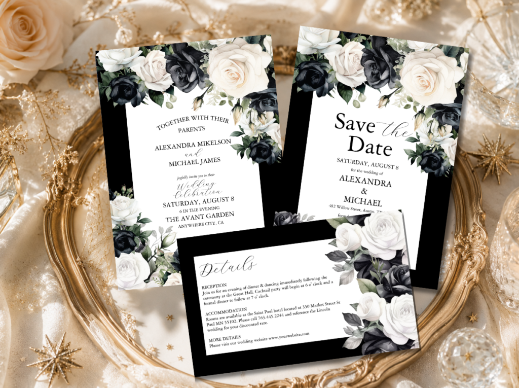
Black & White Modern Floral
High-contrast monochrome botanical — the stationery suite for the Monochrome Elegant table direction.
Script Direction
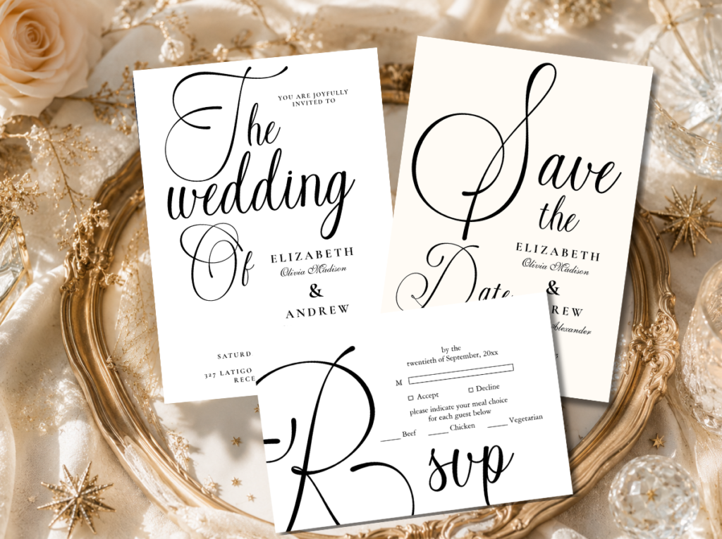
Modern Black Script
Bold typographic script — the stationery suite where the typography is the table decoration in the Modern Script direction.
Botanical Direction
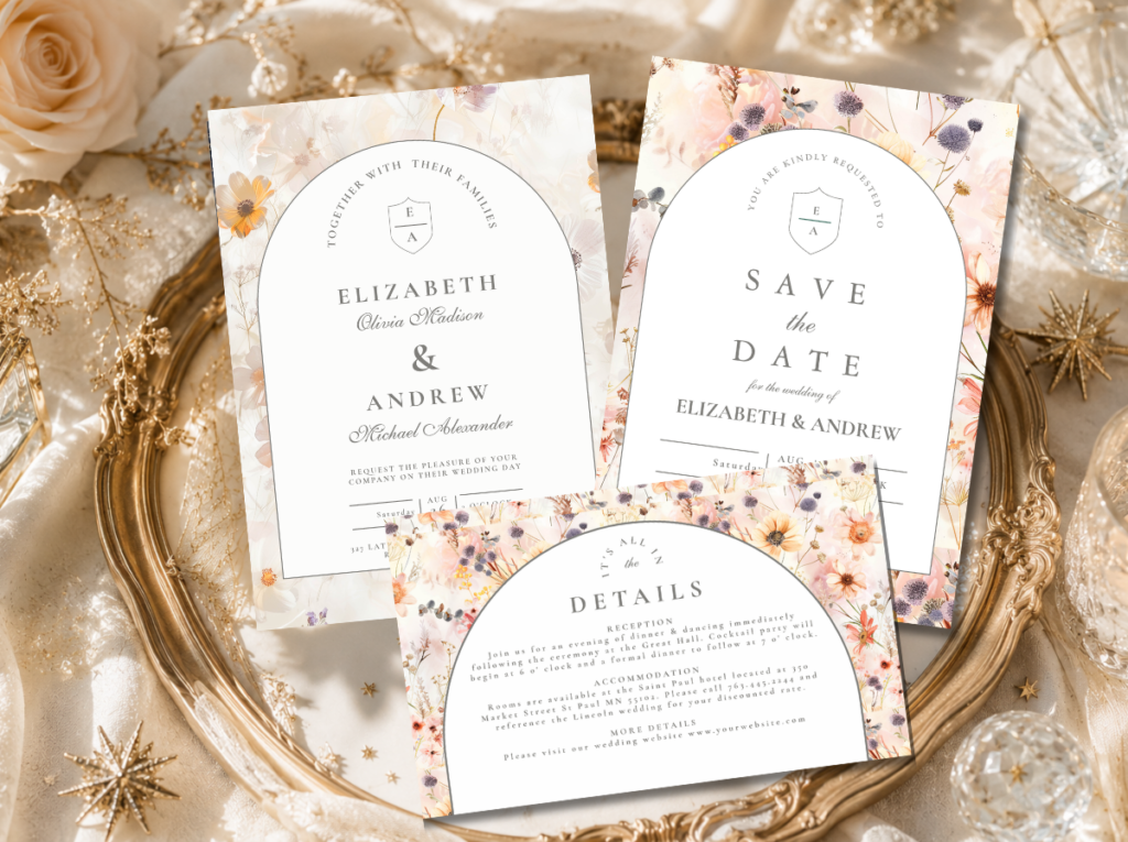
Floral Wedding
Warm botanical illustration — the stationery suite that belongs beside greenery runners and botanical minimalist table settings.
✨ Styling Note
Order the full stationery suite — menu card, place card, and table number — from the same collection as the invitation so every printed element a guest encounters belongs to the same visual world. A minimalist table achieves its quality through consistency: the consistency of the linen choice, the centrepiece approach, and the stationery style. Inconsistency in any one of these three — even a subtly different card stock tone on the menu card versus the invitation — is visible in photographs and breaks the specific coherence that makes a minimalist table read as designed rather than simply sparse.
Frequently Asked Questions
Is a minimalist wedding table more or less expensive than a fully decorated table?
It depends entirely on where the cost is concentrated. A minimalist table that chooses a single-stem centrepiece and redirects the floral budget toward a significantly higher quality linen and a heavier card stock menu card can cost exactly the same as a fully decorated table. A minimalist table that simply reduces the quantity of everything without upgrading the quality of any individual element reads as sparse rather than as edited — and sparse is not the same as minimalist. The minimalist table does not spend less; it spends differently. The budget moves from quantity of decoration to quality of individual elements.
How do I keep a minimalist table from looking empty or unfinished?
The negative space on a minimalist table is a design decision, not an oversight — but it reads as a decision rather than as an oversight only when every element that is present is clearly chosen with intention. A single stem in a perfectly chosen bud vase, a beautifully typeset menu card on a heavy card stock, and a precisely folded linen napkin in an exact placement together produce a table that reads as edited and considered. The same table with a generic bud vase, a generic menu card, and a loosely placed napkin reads as unfinished. The quality of each individual element is what communicates intention; quality is what prevents empty space from reading as oversight.
Can a minimalist table work for a large wedding with many guests?
Yes — the minimalist approach scales very naturally to large guest counts because its design logic is per-table rather than room-wide. Applying one centrepiece approach — one bud vase cluster per table, or one greenery runner per table — consistently across forty tables reads as powerfully designed at the room level precisely because of the consistency. The challenge at large scale is supply: sourcing the same bud vase vessel form in a consistent material quality across forty table placements requires forward planning and a reliable supplier. Order more than required and quality-check each vessel before placing.
What flowers work best for minimalist wedding centrepieces?
Single-variety arrangements from varieties with strong individual forms: white ranunculus (the specific layered petal form reads beautifully in a single-variety arrangement); white or blush anemone (the dark centre creates the strongest visual contrast in a minimalist setting); eucalyptus in all its varieties (the most versatile greenery for runners, bud vase clusters, and mixed botanical arrangements); dried pampas in honey-cream (the most sustainable and the most architecturally interesting of the dried botanical options); and white amaryllis (the most dramatic single-stem choice, with a form that carries a full table from a single vessel). All of these share the quality of being beautiful individually rather than needing the context of a mixed arrangement to look designed.
Every Element Chosen with Intention
Minimalist Wedding Table Stationery
Menu cards, place cards, and table numbers in the same visual world as the centrepiece and the linen — five collections for five complete minimalist table directions.