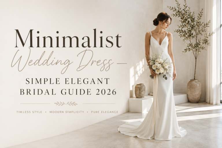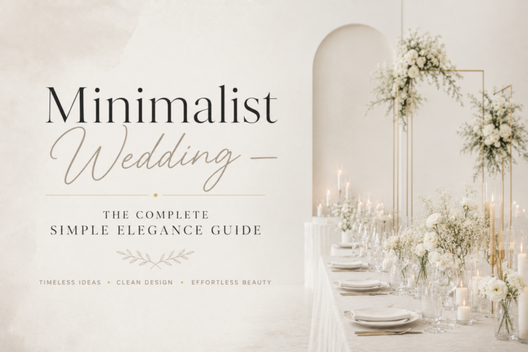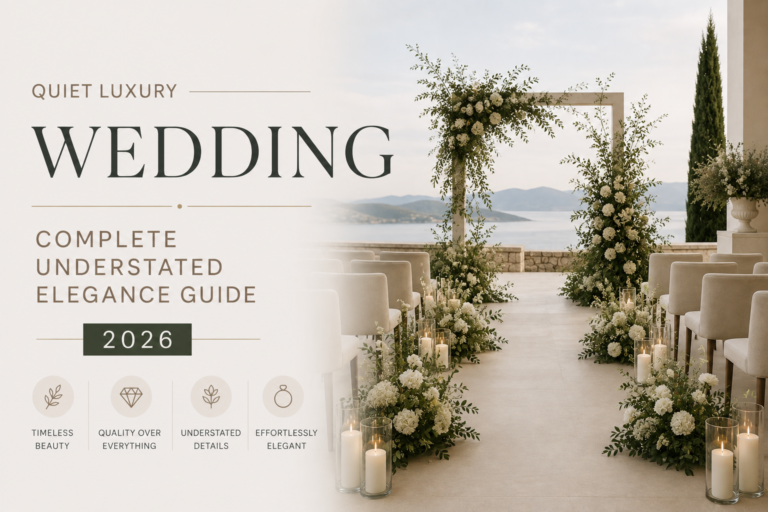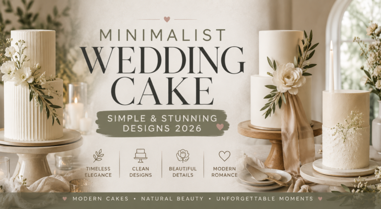
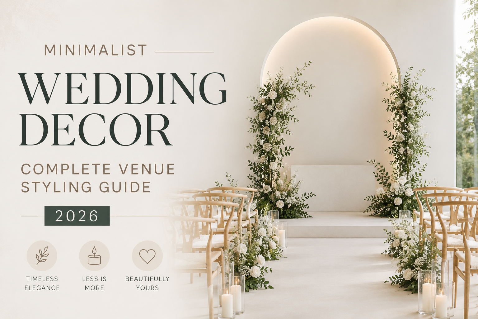
Minimalist Wedding Decor — Complete Venue Styling Guide 2026
Wedding Decor · 2026
Minimalist Wedding Decor — Complete Venue Styling Guide 2026
Ceremony to reception — the complete minimalist decoration guide covering flowers, lighting, signage, and the four palette directions that make restraint the most powerful design decision available.
The minimalist wedding is not a wedding that forgot to be decorated. It is a wedding where the decoration was edited until every element that remained was genuinely necessary — where the quality of each chosen detail became visible precisely because nothing competed with it. The single stem in a clear vase. The perfectly typeset welcome sign on heavy card stock. The warm candlelight that does the work of a hundred unnecessary additions. This guide covers every venue zone from ceremony to reception, in the four palette directions that give minimalist decoration its specific visual character.
The shift that makes minimalist wedding decor work in practice rather than only in theory is this: stop adding elements and start evaluating them. The question is not ‘what else can I add to this table?’ but ‘what would this table lose if I removed one element?’ If the answer is ‘nothing’, the element goes. If the answer is ‘it becomes weaker’, the element earns its place. Apply this test consistently across every decoration decision in the venue and the result will be a celebration that reads as designed with intention rather than assembled with effort.
“Restraint is not the absence of decoration. It is the most demanding form of it — the room that looks effortless because someone made every difficult decision correctly.”
Section 01 The Minimalist Decoration Philosophy
The most useful reframe for planning minimalist wedding decor is to replace ‘minimalist’ with ‘maximally edited.’ A minimalist wedding is not one with a reduced decoration budget or a sparse aesthetic from necessity; it is one where the editing process was applied so rigorously that only elements which genuinely earn their visual weight survived. The negative space between a single-stem centrepiece and a beautifully placed menu card is not emptiness — it is the deliberate preservation of breathing room, which is itself the most powerful design element available in any decorated environment.
The connection to the quiet luxury aesthetic is direct: both are built on the principle that quality communicates itself without assistance from quantity. A single exceptional element — one large pampas installation rather than ten medium-sized arrangements; one exquisite botanical welcome sign rather than five generic table signs; one perfectly chosen candle grouping per table rather than a scatter of mismatched elements — always reads as more considered and more beautiful than the same budget distributed across many average elements. The minimalist decoration principle is not about spending less; it is about spending differently, concentrating investment where it is most visible and removing it entirely where it is not.
In practice, the minimalist approach to venue decoration follows three rules that apply at every scale. First: one idea per zone, executed perfectly. The ceremony arch or the aisle markers, not both simultaneously. The centrepiece or the runner, not both at the same table. Second: quality in the individual element rather than quantity of elements. The heaviest available card stock for the welcome sign. The most beautifully formed flower variety for the centrepiece. The warmest and most consistent candle light across every table. Third: the edit is ongoing. After assembling any decorated zone, remove one element. If the space is stronger or equal without it, the element goes.
✨ Styling Note
The minimalist decoration test: stand at the entrance of any decorated zone and count the number of elements your eye visits before coming to rest. More than three is almost always too many. The minimalist room gives the eye one thing to appreciate — one centrepiece, one installation, one lighting statement — and then rests. The decorated room keeps the eye moving and frequently loses it in the process.
Section 02 Minimalist Ceremony Decorations
The ceremony zone is where the minimalist decoration principle produces its most powerful results — because the natural focal point of the ceremony (the couple, the officiant, the moment) is already the most visually compelling element in the space, and any decoration that competes with it diminishes rather than enhances the experience. The minimalist ceremony decorates only to support and frame the central focal point rather than to create additional visual destinations.
The ceremony arch — one exquisite thing or nothing
The ceremony arch in a minimalist aesthetic is either one exquisite botanical installation — a single floral variety arranged with real compositional intelligence in a simple metal or natural wood frame — or nothing at all, with the venue architecture serving as the ceremony backdrop. The error most often made is choosing a full florally abundant arch for a minimalist celebration because ‘something needs to be there.’ Nothing needs to be there; the couple is there. If an arch is chosen, the rule is single variety only: all white ranunculus, or all eucalyptus, or all white garden rose, arranged to show the natural form of the variety rather than to create a maximally filled frame. A single-variety arch reads as specifically beautiful. A mixed-variety arch reads as a general abundance arrangement that happens to be arch-shaped.
Aisle markers — single stems or candles, not both
Aisle markers in a minimalist ceremony follow the same single-element rule as every other decoration zone. A single stem of one flower variety in a bud vase at the end of alternate rows reads as precisely considered. A single pillar candle in a hurricane glass at the end of alternate rows reads as warmly atmospheric. A single stem and a candle together at each row reads as two decoration decisions placed at the same point rather than one. Choose one approach; apply it consistently to every row; allow the repetition to create its own visual rhythm. The rhythm of identical single-stem bud vases along a ceremony aisle reads as more designed than the absence of any pattern — but only when the repetition is exact and the single element in each position is genuinely beautiful.
The ceremony backdrop — architecture first, decoration second
The best minimalist ceremony backdrop is the best available architectural feature of the venue — an original stone wall, a high window with natural light behind it, a beautifully proportioned doorway. Where the venue architecture does not provide a sufficient backdrop naturally, a single large-scale botanical installation at one side of the ceremony space — a tall pampas arrangement, a large single-branch installation, a simple fabric drape in the linen palette of the wedding — reads as more specifically minimalist than a designed backdrop structure covered in additional decoration. The backdrop should frame the ceremony without competing with it.
✨ Styling Note
The aisle in a minimalist ceremony can be the most powerful decoration decision available if it is treated as a single line rather than as a series of points to decorate. A continuous line of one botanical element along the aisle floor — a simple greenery line, a scatter of one petal variety, a line of candles — reads as an architectural decision rather than a decoration decision, and it communicates the same aesthetic confidence as the best minimalist interiors.
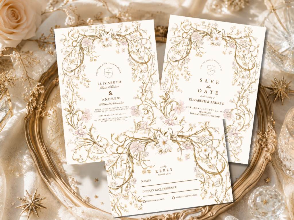
The Minimalist Wedding stationery collection provides the ceremony programs, welcome signs, and order-of-service cards that belong to the same edited aesthetic as the ceremony decoration.
Section 03 Minimalist Reception Decorations
The reception zone contains the highest concentration of decoration decisions in any wedding — table centrepieces, welcome sign, seating chart, bar signage, gift table, order of events, menu cards — and it is where the minimalist edit is both hardest to maintain and most visually rewarding when sustained. The table styling for a minimalist reception is covered in depth in the Minimalist Wedding Table Decor guide. This section covers the signage and statement elements that frame the reception space outside the individual tables.
The welcome sign — typography-led, one botanical detail
The welcome sign is the first large-format printed element guests encounter at the reception and the one most frequently photographed by the wedding photographer. In a minimalist aesthetic, the welcome sign is typography-led: the couple’s names, the date, and a warm welcome message in beautifully set type on a quality card or board, with one botanical illustration detail as the sole graphic element. No frame decoration, no floral surround, no additional signs beside it competing for attention. The welcome sign stands alone, in its own space, and its quality is visible precisely because nothing competes with it. The typography should be as carefully chosen as the centrepiece: a beautifully typeset welcome sign with generous margins and precise letter spacing reads as designed; a generically fonted one in the same format reads as a template.
The seating chart — clean, readable, beautiful
The seating chart in a minimalist reception serves the same functional purpose as in any other wedding but does so with the same editorial discipline as every other element: clean typography, generous white space, one botanical or illustrative detail as the sole graphic element. The format options that suit the minimalist aesthetic best are an alphabetical list of guests with table numbers (the most typographically clean) or a table-by-table display with guest names in the same elegant typeface as the invitation. Avoid complex decorative frames, elaborate embellishment of the seating chart display, or surrounding the chart with additional decoration that makes the guests work harder to read it. A seating chart is read under mild social pressure; it should be immediately legible and visually calm.
Signage across the reception — quality paper, restrained design, one system
All signage at the reception — bar menu, gift table sign, favour table, photo area instruction, order of events — should belong to the same visual system as the invitation and the welcome sign. The same card stock, the same typeface, the same palette. A reception where every sign was printed from the same suite reads as a complete designed world; a reception where each sign was sourced separately reads as a collection of individually beautiful things that do not quite belong to each other. The minimalist principle applied to signage: one system, applied consistently, at the highest quality level the budget allows.
✨ Styling Note
The most effective minimalist reception decoration decision costs nothing: commission nothing that is not genuinely necessary. Most receptions function better with fewer signs than couples plan for — a bar menu is helpful but rarely essential; a gift table sign is pleasant but rarely needed; an order of events sign at an outdoor venue is more useful than at a reception room where the MC handles it verbally. Every sign that is not ordered is one fewer visual element competing with the elements that remain.
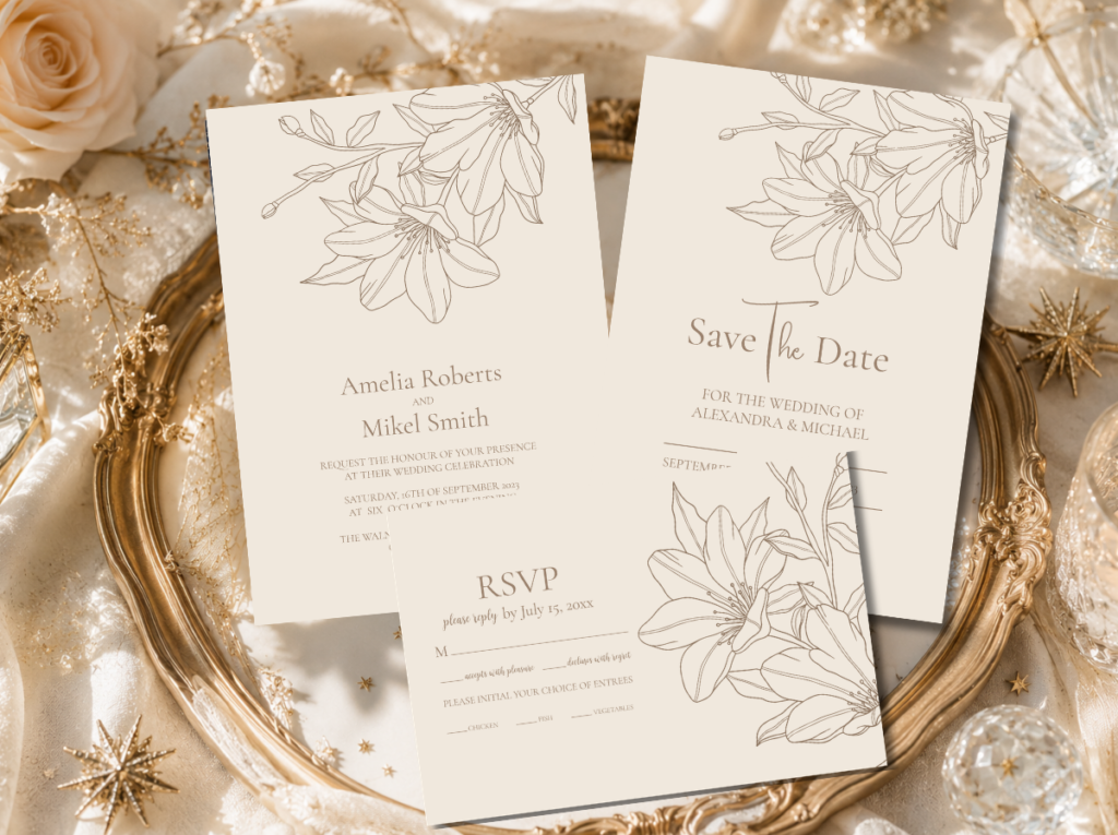
The Elegant Modern Beige Lineart Floral collection provides welcome signs, seating charts, menu cards, and table signage in the warm botanical aesthetic that reads as specifically designed beside a minimalist reception decoration.
Section 04 Minimalist Wedding Lighting
Lighting is the single most powerful decoration element available to a minimalist wedding — more powerful than any floral arrangement, any textile choice, or any signage decision — because it determines the quality of every other element in the room simultaneously. Warm candlelight makes warm ivory linen read as warmer and more textured. It makes the gold lettering on a welcome sign glow rather than merely reflect. It makes a single white ranunculus centrepiece read as the most beautiful object in the room rather than as an isolated stem in a vase. Lighting does not decorate the space; it determines how every decoration reads.
The minimalist approach to wedding lighting follows the same principle as every other minimalist decision: one source used with precision rather than many sources used at varying intensities. Warm candlelight as the primary source — beeswax or high-quality paraffin in the correct warm tone, not the cool bright white of cheap candle light — produces the specific warmth that the minimalist aesthetic requires. The quality of the candle light is visible in every photograph taken under it: warm amber candlelight produces the specific depth and warmth that no artificial lighting source can fully replicate.
Candlelight — the primary minimalist decorator
A table lit by three quality taper candles in simple brass or antique gold holders, without any other light source competing, is the most beautiful and the most specifically minimalist table setting available. The taper candle provides both light and decoration simultaneously, which means it earns its place twice over — something that almost no other decoration element can claim. The holder should be as simple as the candle: a slim brass candlestick, a simple glass hurricane, or a single votive holder in clear glass. No candle arrangements that spread across the full table surface; no mixed candle heights and diameters that create visual complexity rather than warmth. One candle type, one holder type, placed with the same consistency across every table.
Statement lighting — one pendant or installation
Where a venue allows for a statement lighting installation — a single large pendant over the head table, a cluster of pendants at different heights over the dance floor, a canopy of warm-toned festoon lights over an outdoor reception — this installation should be the room’s primary decoration rather than a supplement to other decoration. A venue where the lighting is the decoration requires significantly less surface decoration to achieve the same visual quality. One exceptional lighting installation is worth more than all the table decorations a similar budget could buy, because it changes the quality of everything in the room simultaneously.
Avoiding the over-lit room — the minimalist lighting mistake
The most common minimalist lighting mistake is a room that is too bright. Overhead fluorescent lighting in its full intensity, bright white spotlights at high saturation, or venue lighting that has not been dimmed for the reception all produce a quality of light that reads as cold, commercial, and completely at odds with the warm atmospheric aesthetic of a minimalist celebration. The first conversation to have with any venue coordinator or lighting technician is about the dimming capability of the room’s primary light source. A room that can be dimmed significantly and then warmed with candles is more decoratable with less than any room that cannot control its primary light source.
✨ Styling Note
Ask the venue to set the room lighting at its intended reception level at least one hour before guests arrive, so that any adjustments needed — additional candles at darker table positions, dimmer pendant settings, candles added to a reception entrance that reads as too bright — can be made before the first guest sees the space. Lighting decisions made under occupation pressure are always worse than decisions made in the empty room.
Section 05 Minimalist Wedding Flowers
The minimalist approach to wedding flowers is built on one principle that applies at every scale and in every zone of the venue: one flower variety, perfectly arranged, is worth more than many flower varieties adequately arranged. This is a principle that most floral briefings reverse — because the reflex of abundance is hard to resist when confronted with an empty table or an undecorated arch — but it is the principle that produces the most beautiful minimalist floral results every time it is applied correctly.
The reason is simple: a single-variety arrangement communicates a specific aesthetic preference — ‘I chose this flower’ — that a mixed arrangement cannot. Thirty white ranunculus in a simple low vessel says something specific about the couple’s aesthetic world. The same vessel filled with a mix of ten white varieties and five green varieties says something general about their appreciation of flowers. Specificity communicates more than abundance, and in a minimalist celebration, specificity is the entire aesthetic.
Single-stem bud vases — the most minimal centrepiece choice
One stem of one variety in a simple bud vase is the most precisely minimalist centrepiece available — and the most demanding, because the quality of the single stem is fully visible with nothing to divert attention from it. The stem must be at an interesting stage of opening; the bud vase must have a profile that suits the flower; the water in the vase must be fresh and clear. For a single-stem centrepiece, the flower variety is the design decision: white anemone with its dark centre, or white ranunculus at its peak of layered opening, or a single white amaryllis just past its tightest bud, or a single eucalyptus branch selected for its specific stem form. One stem; one vessel; complete.
Bud vase clusters — the most versatile minimalist arrangement
Three to seven bud vases in varying heights, each holding one stem, grouped as a loose cluster at the table centre or along a long table at irregular intervals — this is the minimalist arrangement that achieves the most visual interest while maintaining the single-variety discipline. The vessels must share one material family: all clear glass, or all white ceramic, or all raw clay. Mixing vessel materials reads as intentional variety in the vessels rather than intentional restraint in the flowers, which is the wrong hierarchy for this approach. The cluster of three clear glass bud vases each holding one white ranunculus reads as a single considered arrangement; the same cluster with three different vessel materials reads as three separate arrangements placed near each other.
Greenery only — the most minimal and most versatile option
A greenery-only arrangement — a cluster of eucalyptus branches in a simple vessel, or a loose olive leaf arrangement in a raw clay pot, or a single large branch of flowering eucalyptus as a table statement — is the most minimal and the most versatile floral direction available. It works in every season, belongs to every palette (warm ivory, warm beige, monochrome, sage), and reads as specifically contemporary rather than as a budget compromise. For outdoor venues in particular, a greenery arrangement that uses the same botanical species present in the surrounding environment creates a visual coherence between the table and the landscape that no floral arrangement can achieve.
Pampas as a minimalist statement — one installation
A large pampas arrangement — three to five plumes in a wide low vessel or a tall cylindrical vase — placed as a single statement at one location (the ceremony backdrop, the welcome sign area, the head table) is the most architecturally interesting minimalist floral decision available. Pampas has a specific quality that almost no other botanical material shares: its texture catches warm light in a way that reads as specifically luxurious, and its form is architectural rather than decorative, giving the installation a presence that reads as a design decision rather than a floral addition. The single pampas installation as a room statement costs less than many smaller arrangements and produces more visual impact than any of them would individually.
✨ Styling Note
The single floral installation principle: one exceptional arrangement in one location produces more visual impact than many average arrangements distributed across the room, because guests remember the one exceptional thing. A couple who spend their entire floral budget on one genuinely extraordinary ceremony arch — and use simple greenery bud vases on every table — produces a more memorable wedding than the couple who distributes the same budget evenly across many adequate arrangements everywhere. Concentrate investment; trust the edit.
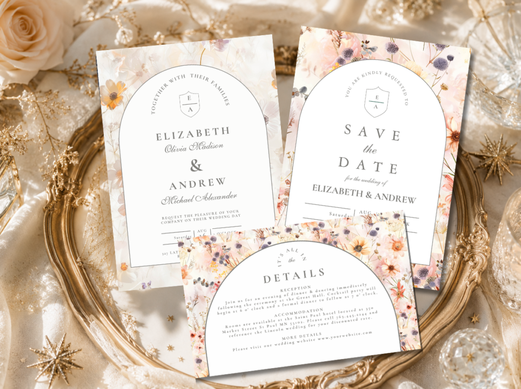
The Floral Wedding collection carries the botanical illustration vocabulary that coordinates with every floral direction above — from single-stem bud vase to botanical garden abundance.
Section 06 Minimalist Decor by Colour Palette
Four complete minimalist decoration palettes — each with specific decor guidance and the stationery collection that belongs to the same visual world.
Most Timeless
White & Ivory
Pure White · Warm Ivory · Antique Gold · Warm Cream
Decor: Quality linen in warm ivory or bright white; single-stem bud vases in clear glass with white ranunculus or white anemone; slim brass taper candles; white ceramic or glass vessels throughout. No colour accent; the palette operates entirely within the white-to-warm-ivory range. Every element must be the correct temperature of white — warm ivory beside antique gold reads as intentional; cool white beside antique gold reads as a mismatch.
Stationery: Minimalist Wedding collection: clean white and warm ivory typography in the most timeless minimalist register, with restrained serif or calligraphic type as the sole design element.
Quiet Luxury
Warm Beige & Gold
Warm Beige · Warm Ivory · Deep Sage · Antique Gold
Decor: Raw or slightly textured linen in oatmeal or warm beige; dried pampas in honey-cream as the centrepiece; raw clay or warm ceramic vessels; antique gold candle holders. The warmth of the palette communicates quality through material texture rather than through colour contrast. Every element should read as warm when held beside a warm amber candle.
Stationery: Elegant Modern Beige Lineart Floral: fine botanical illustration on warm beige stock — the stationery that earns the description ‘quiet luxury’ more reliably than any other direction.
Most Editorial
Monochrome Black & White
Pure White · Deep Black · Antique Gold Accent
Decor: Crisp white linen; black linen napkin as the sole colour contrast element; white single-variety centrepiece in clear glass; matte black candle holders or slim brass with black taper candles; white ceramic dinnerware. Black appears only at the table level — never in the centrepiece or in any botanical element. The high contrast of black and white reads as editorial and powerful.
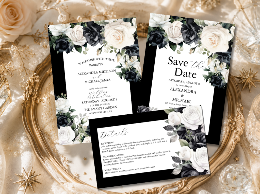
Stationery: Black and White Modern Floral: monochrome botanical illustration at the table — the stationery that communicates the same editorial confidence as the palette.
Most Natural
Sage & Natural
Deep Sage · Warm Ivory · Natural Linen · Warm Cream
Decor: Raw natural linen tablecloth; greenery-only arrangements in warm cream ceramic or raw clay; olive branch runners; warm cream ceramic or terracotta dinnerware. No additional floral colour — the greenery and the natural linen provide all the palette variation needed. The sage and natural palette is the most outdoor-appropriate of the four and belongs naturally at garden, courtyard, and vineyard venues.
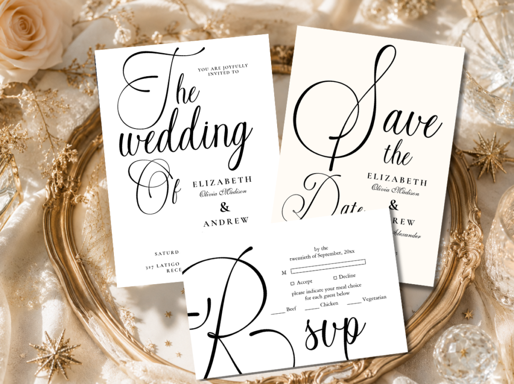
Stationery: Modern Black Script: clean typographic stationery on warm ivory — the most contemporary and the most typographically confident pairing for the sage and natural palette.
Section 07 Stationery as Minimalist Decoration
The most underused minimalist decoration element at any wedding is the stationery suite — because stationery is almost universally treated as a functional category separate from the decoration, when it is in fact the decoration element that guests interact with most closely and most personally throughout the entire day. The invitation is held in the hand, studied at close proximity, and often kept. The ceremony program is read slowly during the most emotionally significant moments of the day. The place card is found and read at the moment of being seated. The menu card is held throughout dinner. No other decoration element receives this quality of guest attention, and yet it is almost never considered alongside the centrepiece and the arch when decoration decisions are made.
In a minimalist decoration scheme, the stationery suite does the work of several decoration elements simultaneously — because a beautifully typeset menu card on heavy warm ivory stock, placed at the centre of a precisely set place setting on quality linen, IS the table decoration. It does not supplement the centrepiece; it is the centrepiece’s printed companion. A couple who invests in a complete stationery suite from a single collection and then chooses simple bud vase centrepieces and quality linen consistently achieves a more composed and more beautiful reception table than one who invests heavily in floral centrepieces and uses generic printed stationery.
The stationery-as-decoration principle applies at two scales simultaneously. At the individual table level: the menu card and place card compose the table setting alongside the linen, the cutlery, and the centrepiece, and all four should belong to the same visual world. At the room level: the welcome sign is the room’s primary typographic statement, the seating chart is its primary informational moment, and both should carry the same design identity as the invitation the guests received before arriving. A room where every printed element belongs to the same suite reads as a completely designed world. A room where each printed element was sourced separately reads as a beautiful collection of things that do not quite speak to each other.
Browse the five collections below to find the stationery suite that belongs to the same visual world as your chosen decor palette and direction. Every collection includes the full range of reception stationery — welcome sign, seating chart, menu card, place card, table numbers — alongside the invitation suite, so that every printed element the guest touches throughout the day comes from the same considered aesthetic world.
Most Timeless
Minimalist Wedding
Clean white and warm ivory — typography as the design, the most architecturally precise stationery for the White and Ivory palette.
Quiet Luxury
Elegant Modern Beige Lineart Floral
Fine botanical illustration on warm beige — the stationery that earns the quiet luxury description most reliably.
Most Editorial
Modern Black Script
Bold typographic script on warm ivory — the most confident and most contemporary stationery for the Sage and Natural palette.
Monochrome
Black & White Modern Floral
Botanical illustration in high-contrast monochrome — the editorial stationery for the Black and White palette direction.
Most Botanical
Floral Wedding
Warm botanical illustration across the full suite — for the minimalist decoration direction that uses one perfect floral installation.
Frequently Asked Questions
Is minimalist wedding decor more or less expensive than decorated?
Neither more nor less — different. A minimalist decoration approach concentrates the available budget on fewer, higher-quality elements rather than distributing it across many adequate ones. A single large pampas ceremony installation may cost the same as many smaller mixed floral arrangements; it produces more visual impact and requires no other decoration in the ceremony zone. Quality linen on a minimalist table costs more per metre than a standard rental cover, but requires no additional decoration to look beautiful on the table. The minimalist approach does not reduce costs; it redirects them toward quality in the elements that remain after the edit.
How do I keep a minimalist wedding venue from looking empty?
The same answer applies at every scale: every element that is present must be clearly and specifically chosen. A single stem in a perfectly chosen bud vase, a beautifully typeset welcome sign on heavy card stock, and a precisely folded quality linen napkin together produce a table that reads as considered and complete. The same table with a generic bud vase, a generic printed card on thin stock, and a loosely placed polyester napkin reads as unfinished. The quality and specificity of each individual element is what communicates intention — and intention is what prevents negative space from reading as oversight.
How many floral elements does a minimalist wedding need?
The answer is always ‘fewer than initially planned.’ The most effective starting point is to identify the one zone where a floral element will have the most visual impact — the ceremony arch, the head table, the welcome sign area — and concentrate the floral budget there with the highest quality variety available. Then apply simple bud vases or greenery-only arrangements everywhere else. The result is a wedding where one floral moment is genuinely memorable and every other floral element is quietly beautiful rather than competing for attention. Most minimalist weddings are better served by one extraordinary floral installation and simple greenery throughout than by many adequate arrangements distributed evenly.
What venues suit a minimalist wedding aesthetic best?
Venues with strong inherent architectural character suit the minimalist aesthetic most naturally — because the architecture does decoration work that does not require supplementing. A stone barn, a high-ceiling industrial space, a glass-walled garden room, a historic library, a simple white-walled chapel: all of these have visual character that the minimalist decoration approach reveals rather than covers. The venues that are hardest to decorate minimally are those that lack inherent architectural character and rely on decoration to provide all the visual interest — generic hotel ballrooms, low-ceiling function rooms, spaces with dated or busy existing decoration. The minimalist approach is most effective when there is something worth revealing beneath the decoration.
Every Element Chosen with Intention
Minimalist Wedding Stationery Collections
The stationery suite that belongs to the same edited, intentional world as the decoration — from the ceremony program to the reception menu card.