Retro Wedding Aesthetic — Colors, Vibes & Inspiration 2026
Retro Wedding · 2026
Retro Wedding Aesthetic — Colors, Vibes & Inspiration 2026
Eight retro aesthetics. Eight colour worlds. One guide to finding yours.
The retro wedding aesthetic is not one thing — it is eight distinct visual worlds, each with its own colour temperature, its own graphic energy, and its own emotional register. This guide maps all eight: their defining palettes, the feeling each produces, the venues that suit them, and the stationery that communicates the right decade from the moment the invitation lands in a guest’s hand.
Whether you are drawn to the earthy warmth of 70s groovy, the graphic precision of 60s Mod, the glittering excess of disco glamour, or the joyful boldness of bubblegum pink — the retro aesthetic offers a decade of visual confidence to match every personality. The only rule is commitment: choose your decade, and go all the way.
“Bold colour is not excess. It is confidence. The retro wedding couple knows exactly which decade feels most like themselves — and builds an entire celebration from that certainty outward.”
Section 01 How Retro Aesthetics Create Their Own Visual Language
Every decade of the twentieth century produced its own visual language — a specific combination of colour temperature, typographic convention, pattern grammar, and material culture that is instantly recognisable as belonging to that moment and no other. The 1970s had warm earthy palettes, rounded sans-serif typefaces, macramé textures, and the specific graphic confidence of a decade that believed design should feel as natural and handcrafted as the world around it. The 1960s had high-contrast monochrome, geometric precision, and the bold graphic energy of a decade that believed design could change the world. The disco era had glitter, metallic surfaces, and the specific excess of a culture that treated glamour as a democratic right.
Retro wedding palettes feel more joyful than contemporary ones for a structural reason: they were designed to communicate emotion rather than to achieve neutrality. Contemporary wedding palettes — blush and sage, warm cream and linen, soft terracotta and white — are calibrated to be universally pleasing, which means they are calibrated to take no risks. Retro palettes take risks. Burnt orange and avocado green is a commitment. Mirror gold and deep plum is a statement. Bubblegum pink on everything is a declaration. Each one communicates something specific about the couple who chose it, which is what the retro wedding aesthetic is fundamentally built on: the confidence to have a point of view.
The commitment principle: The retro aesthetic only works when it is fully committed. A wedding with a single retro element — a groovy font on the invitation, one macramé arch — surrounded by conventional modern styling reads as confused rather than curated. The retro aesthetic earns its confidence from consistency: the same palette, the same typographic register, and the same material language applied from the invitation to the cake to the exit signage. Choose your decade. Commit completely. The result is a wedding that could not have happened in any other aesthetic register — which is exactly the point.
Section 02 Eight Retro Wedding Aesthetics
Each card below describes one retro aesthetic: its four defining colours, the feeling it produces, the venue type it suits, and the stationery collections that execute it correctly.
Aesthetic 2.1
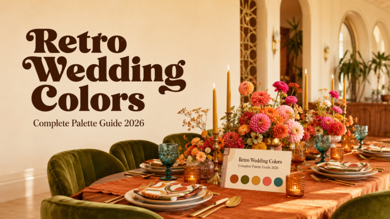
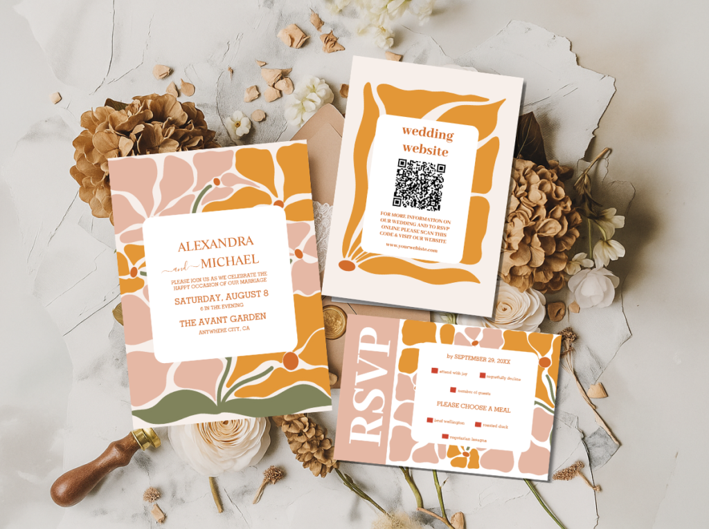
70s Groovy Earth
Burnt OrangeAvocado GreenMustard YellowWarm Brown
“Warm, earthy, and abundant — the retro aesthetic that feels most like an outdoor harvest table lit by late afternoon sun, with macramé overhead and wildflowers in rattan vessels.”
Venue: Open outdoor spaces, farm venues, meadows, and vineyards. Natural light is essential; the 70s Groovy palette reads most authentically when it is lit by warmth rather than by artificial overhead lighting.
Aesthetic 2.2
60s Mod Graphic
Crisp WhiteBold BlackPrimary RedElectric Blue
“Sharp, graphic, and completely self-assured — the retro aesthetic that reads as a magazine editorial from the decade that made graphic design a form of cultural power.”
Venue: Mid-century modernist architecture, rectilinear event spaces with strong geometric structure, and venues with clean horizontal and vertical lines. Gothic Revival and Victorian settings work against this aesthetic.
Aesthetic 2.3
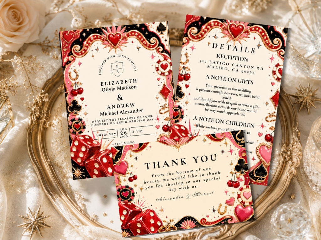
Vegas Neon Kitsch
Electric PinkHot GoldNeon OrangeBright White
“Theatrical, spectacular, and unapologetically fun — the retro aesthetic that treats the wedding reception as the greatest show in the room and every guest as a performer in it.”
Venue: Vintage supper clubs, retro diners with original neon signage, Las Vegas-style chapels and event spaces. The venue should feel like it was always meant for this.
Aesthetic 2.4
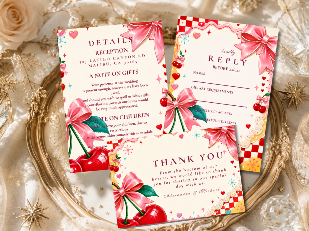
Kitschy Maximalist
Clashing CoralLime GreenHot PinkSunshine Yellow
“Deliberately playful and maximally joyful — the retro aesthetic that celebrates excess as a design principle and treats every surface as an opportunity for more colour, more pattern, and more delight.”
Venue: Any venue that can accommodate maximalist decoration: the kitschy aesthetic builds its world through decoration rather than finding it in the architecture. Generic event spaces work as well as specialist ones when the styling is fully committed.
Aesthetic 2.5
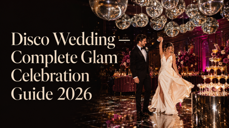
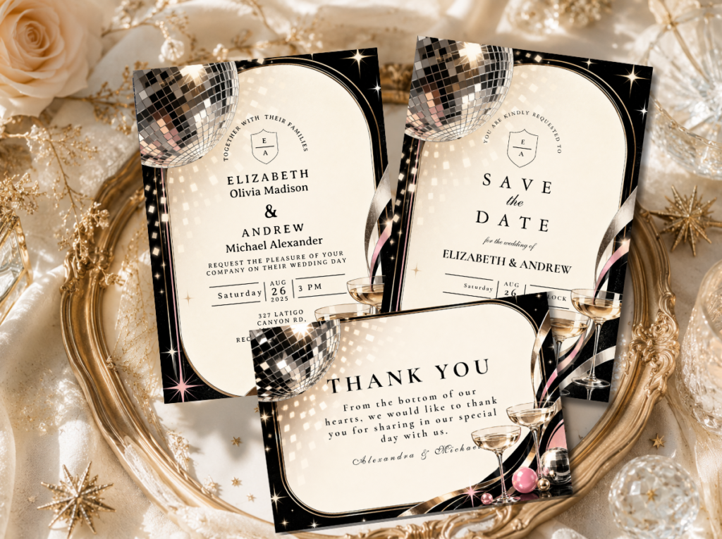
Disco Glam
Mirror GoldDeep PlumMidnight BlackSilver Glitter
“Spectacular, glamorous, and completely committed to the idea that a wedding reception should feel like the best night anyone in the room has ever had.”
Venue: Venues with functioning or convertible dance floors. The Disco aesthetic requires movement, music, and reflective surfaces; a room without a dance floor is the wrong room.
Aesthetic 2.6
Mid-Century Sophisticated
Warm TealMustardCoralCream
“Clean, considered, and quietly confident — the retro aesthetic that reads as sophisticated from across the room and increasingly specific the closer you look.”
Venue: Mid-century modernist buildings, flat-roof venues, and spaces with strong architectural geometry and period-appropriate furniture. The MCM aesthetic is the most venue-dependent of all eight directions.
Aesthetic 2.7
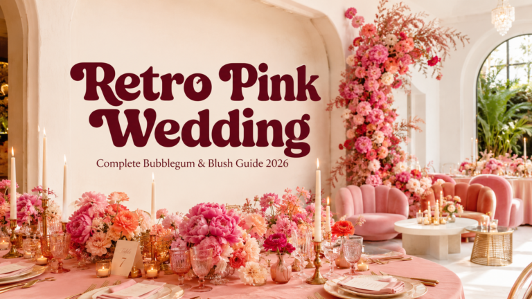
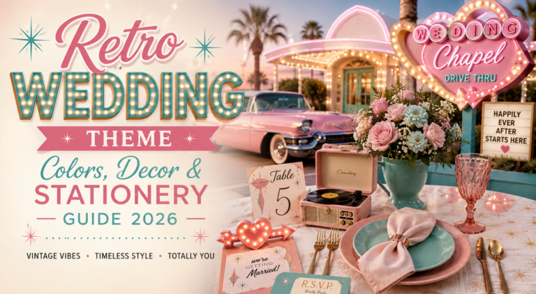
Retro Pink Bubblegum
Bubblegum PinkHot PinkCreamWarm Gold
“Joyfully feminine and completely unashamed of it — the retro aesthetic that takes pink seriously as a design language and builds an entire celebration from its warmth and sweetness outward.”
Venue: Any venue that can hold pink lighting without reading as monochromatic: the Retro Pink aesthetic benefits from warm pink uplighting that transforms the room’s atmosphere at the reception stage.
Aesthetic 2.8
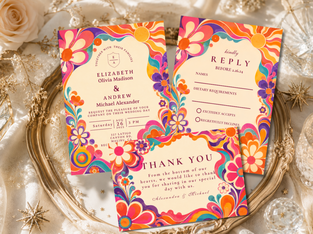
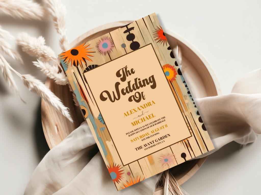
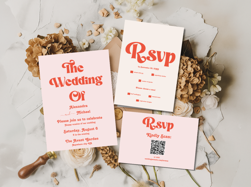
Groovy Typography
Warm OrangeHot PinkCreamDeep Brown
“Stationery-forward and typographically specific — the retro aesthetic where bold retro fonts are the primary design element and every surface is an opportunity for the typeface to do the decorative work.”
Venue: Any venue: the Groovy Typography aesthetic builds its world through printed surfaces rather than through architectural context. The invitation, the signage, and the menus carry the aesthetic identity; the venue provides the space.
Section 03 Retro Colour Combinations That Work
The eight retro palettes divide naturally into three colour groups, each with its own internal logic. Understanding the group your preferred aesthetic belongs to helps with every subsequent styling decision.
Warm earth tones — the 70s group: Burnt orange, avocado green, mustard yellow, and warm brown all belong to the same colour temperature: warm-toned, slightly muted, and drawn from the natural world rather than from manufactured pigment. They work together because they share this temperature; introducing a cool or bright element — a royal blue, a bright red, a clean white — breaks the warmth immediately. The 70s Groovy, Mid-Century Sophisticated, and Groovy Typography aesthetics all draw from this group, though with different saturations and proportions. Mid-Century Sophisticated adds warm teal as a cooler counterpoint; Groovy Typography adds hot pink as a deliberate tension element. Both additions work because they are introduced with intention and in controlled quantity.
High-contrast graphic — the 60s Mod group: Black and white as the primary palette, with a single bold colour accent introduced as deliberate punctuation, is the defining combination of the 60s Mod aesthetic. The logic is architectural rather than decorative: the contrast does the work, and the accent colour communicates which side of the graphic argument the design is on. Mixing this palette with warm earth tones or bubblegum pink produces immediate conflict — the temperatures are incompatible and the graphic logic dissolves. The 60s Mod palette works best in isolation.
Bold saturated — the glam and pink group: Electric pink, hot gold, mirror silver, deep plum, bubblegum, and hot orange are all highly saturated and all communicate theatrical confidence rather than decorative restraint. They work together within their sub-groups — the Vegas Neon, Disco, Kitschy, and Retro Pink aesthetics all draw from this temperature — but mixing across sub-groups requires care. Disco’s deep plum and mirror gold do not naturally sit beside bubblegum’s sweetness; the two palettes have compatible energy but different emotional registers.
The one-decade rule: The most common mistake in retro wedding styling is mixing decades — combining the earthy warmth of the 70s with the graphic precision of the 60s, or adding disco mirror balls to a Mid-Century Modern reception. Each retro aesthetic is a complete visual language with its own internal logic; two different languages in the same room produce visual noise rather than visual confidence. Choose one decade. Let it speak.
The colour cards above introduce each aesthetic; the guides below go further — covering venues, florals, cake styling, dress code, and the complete stationery direction for each retro direction. The complete guide is available now; individual aesthetic guides are arriving throughout 2026.
Frequently Asked Questions
What is a retro wedding aesthetic?
A retro wedding aesthetic is a wedding designed around the specific visual language of a past decade — its colours, typography, pattern grammar, and material culture — applied to a modern celebration with editorial intention. It is not a costume party or a themed event in the novelty sense; it is a couple using a decade they love as a genuine design framework. The retro aesthetic differs from a vintage aesthetic in emotional register: vintage is soft, nostalgic, and gently nostalgic; retro is bold, graphic, and joyfully confident.
What are the best retro wedding vibes for 2026?
In 2026, the 70s Groovy and Retro Pink directions are the most searched on Pinterest, but ‘best’ is always the aesthetic that most accurately matches the couple’s own visual personality. The 70s Groovy direction is the most widely accessible because its earthy warmth translates well across a wide range of venues and florals. The 60s Mod direction is the most visually striking because its graphic precision is immediately recognisable. The Disco direction is the most socially energetic because it requires and rewards guest participation. The Retro Pink direction is the most emotionally clear because it makes no pretence about what it is celebrating.
What retro wedding colour palette should I choose?
Choose the palette that belongs to the decade whose visual world feels most naturally like yours — not the one that seems most popular or most accessible, but the one whose specific colour temperature resonates. Warm earth tones (burnt orange, avocado, mustard) belong to the 70s and produce a warm, natural, abundant atmosphere. High-contrast black and white with a bold accent belong to the 60s and produce a graphic, architectural atmosphere. Bold saturated tones (hot pink, gold, deep plum) belong to the disco and glam directions and produce a theatrical, spectacular atmosphere. The palette is the first decision; everything else follows from it.
What stationery suits a retro wedding aesthetic?
Retro wedding stationery should use the typographic conventions of the chosen decade: rounded slab-serif or bold rounded sans-serif for the 70s; geometric architectural typeface for the 60s Mod direction; bold display fonts for Disco and Vegas; playful brush-script for Retro Pink. The colour palette of the stationery should be the palette of the wedding — not a neutral-toned version of it. Uncoated or slightly textured card stock reads as more period-appropriate than glossy finishes. The envelope should be part of the design: a coloured envelope in the palette’s accent tone extends the stationery aesthetic before the invitation is opened.
Eight Aesthetics · Bold Colour · Complete Commitment
Shop Retro Wedding Stationery
Invitations, place cards, and stationery suites in every retro aesthetic — from earthy 70s groovy to disco glam to bubblegum pink.