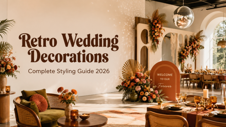
Retro Wedding — The Complete Aesthetic Guide 2026
Retro Wedding · 2026
Retro Wedding — The Complete Aesthetic Guide 2026
Eight distinct retro aesthetics, the palettes that define them, venues that suit them, and the stationery decisions that communicate the right decade before a single guest arrives.
The retro wedding is the most joyfully confident aesthetic available to a couple in 2026 — and the most misunderstood. It is not a costume party, not a nostalgic exercise in playing dress-up, and not a compromise between modern minimalism and themed excess. It is a genuine design direction with its own visual language, its own rules, and its own specific emotional register: bold, alive, colourful, and completely uninterested in being generic. The retro wedding bride knows exactly what she wants, and what she wants is a celebration that looks like nobody else’s and feels like entirely herself.
The aesthetic draws from the most visually confident decades of the twentieth century — the 60s Mod moment, the earthy grooviness of the 70s, the disco glamour of the late 70s, the Mid-Century Modern clarity of the 50s — and applies that visual language to a modern wedding with editorial intention rather than costume accuracy. The result is a wedding that reads as designed rather than dressed, confident rather than quirky, and unforgettable in a way that generic elegance rarely achieves.
This is the complete retro wedding guide for 2026: eight distinct aesthetics, the colour palettes that define each one, the venue types that suit them, and the stationery decisions that communicate the right decade before a single guest arrives.
“A celebration is not a background event. It is a declaration — of who you are, what you love, and what you want your guests to feel the moment they walk in. The retro wedding makes that declaration in the most joyful, colourful, and alive way possible.”
Section 01 What Is a Retro Wedding?
A retro wedding is a wedding designed around the specific visual language of a past decade — its colour palettes, its graphic forms, its typographic conventions, its material culture — applied to a modern celebration with editorial confidence and aesthetic intention. The key word is ‘applied.’ A retro wedding is not a reconstruction of a historical event, and it is not a fancy-dress party for adults. It is a couple using the design vocabulary of a decade they love — the earthy warmth of 1970s graphic design, the bold black-and-white geometry of the Mod 1960s, the glittering excess of the disco era — as the basis for a coherent, designed, genuinely contemporary event.
What unites all retro wedding aesthetics, across all eight directions covered in this guide, is a set of shared values: personality, colour, joy, and a deliberate refusal to be generic. The retro wedding couple has looked at the landscape of modern wedding aesthetics — the blush and sage, the minimalist serif, the neutral-toned venue — and decided to do something different. Not reactively, not for the sake of being unusual, but because a different and more vivid aesthetic is simply truer to who they are.
Retro versus vintage — two adjacent aesthetics with entirely different registers: Vintage is soft, nostalgic, and gentle — it looks to the past with a kind of tender affection, preferring muted tones, lace, dried botanicals, and the worn edges of things that have been loved over time. Retro is bold, graphic, and playful — it looks to the past with energy and editorial confidence, preferring bright or earthy palettes, graphic typography, geometric pattern, and the specific cultural confidence of decades that believed in the power of design to communicate joy. Both are valid and beautiful. They are not interchangeable.
Retro weddings are surging on Pinterest in 2026 for the same reason they have always drawn creative couples: they are immune to the cycles of minimalism that periodically flatten wedding aesthetics into a single muted palette and a single overused typeface. The retro aesthetic is not minimalism’s opposite — it is its refusal. A retro wedding says, without apology, that more is more when the more is beautiful, that colour is not excess when it is purposeful, and that a celebration should look exactly as joyful as it feels.
Browse the full Retro Wedding collection — all eight retro aesthetics in one place.
Section 02 Eight Retro Wedding Aesthetics
The eight retro wedding directions below each represent a distinct decade, a distinct design vocabulary, and a distinct emotional register. They share the values of the retro aesthetic — personality, colour, and deliberate non-conformity — but they produce very different weddings. Choose the one whose visual world feels most like yours.
Aesthetic 2.1
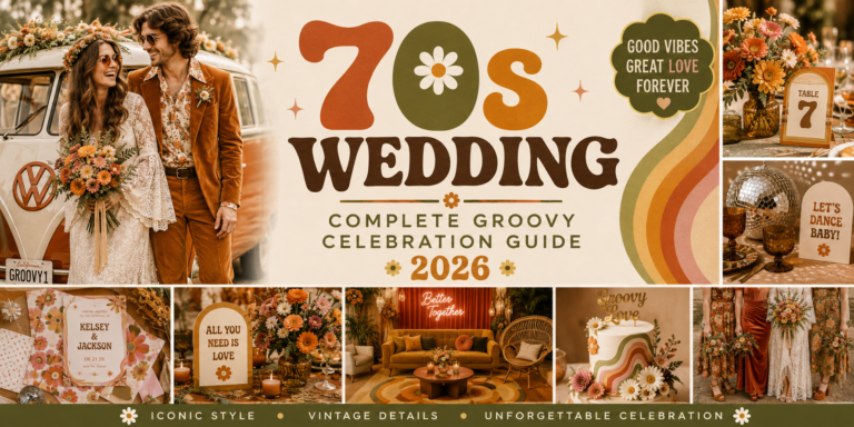
The 70s Groovy Wedding
The 70s Groovy wedding is the most warmly earthy and the most boho-adjacent of all the retro aesthetics. Its palette is drawn from the natural world as filtered through 1970s graphic sensibility: burnt orange, avocado green, mustard yellow, warm brown, and the specific terracotta that the decade made its own. Where the boho wedding uses these tones in a romantic, organic way, the 70s Groovy wedding applies them with graphic intentionality — in bold typography, in geometric illustration, in the specific confidence of a decade that treated design as a form of cultural expression rather than a neutral background.
Macramé wall hangings, pampas grass, wildflower arrangements in earthy vessels, rattan furniture and wicker lanterns: these are the material details that produce the 70s Groovy atmosphere. The food and drink register should match — drinks served in amber glassware, cheese boards on natural wood, a tiered cake in earthy buttercream with dried floral and macramé ribbon detail. The invitation sets the palette before anything else: a burnt orange and avocado green design in the bold slab-serif or rounded sans-serif typefaces of the 1970s communicates the entire aesthetic in one piece of paper.
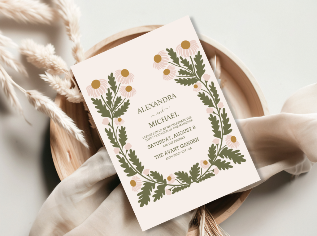
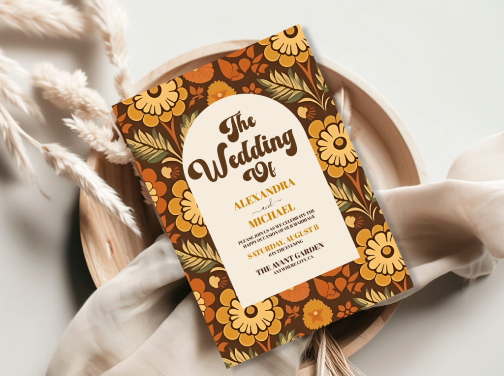
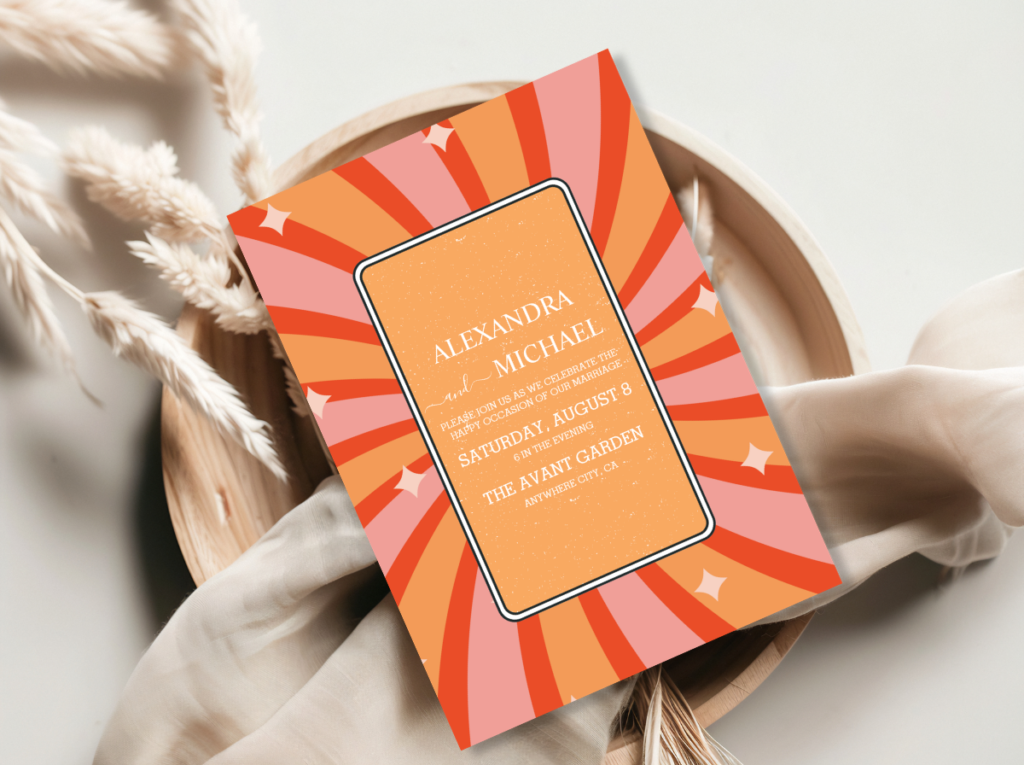
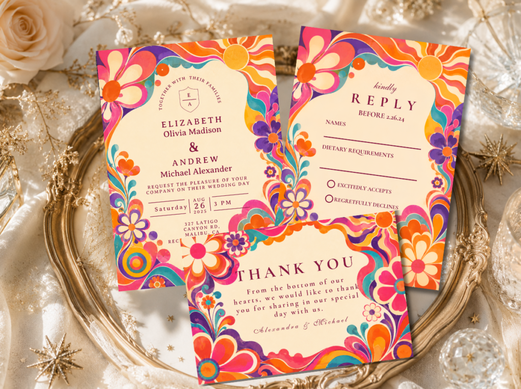
Shop the 70s Groovy and Arch Modern Retro Floral collections — earthy tones and groovy graphic energy for the 70s wedding.
Aesthetic 2.2
The 60s Mod Wedding
The 60s Mod wedding is the most graphically bold and architecturally rigorous of all the retro aesthetics. Defined by the Modernist design movement’s collision with Pop Art in mid-1960s London, the Mod aesthetic is built on high contrast, geometric precision, and the specific confidence of a decade that believed graphic design could change the world. Black and white as the dominant palette, with bold primary colour accents — electric red, sunny yellow, royal blue — introduced as deliberate punctuation rather than as a full palette element.
The Twiggy aesthetic — geometric haircuts, shift dresses, bold eye makeup, minimal jewellery — is the dress code counterpart to the Mod graphic world. Architecture and venue matter more in the 60s Mod aesthetic than in any other retro direction: a venue with clean geometric lines, strong horizontal and vertical structure, or mid-century modernist architecture provides the physical space that the aesthetic requires. A Gothic Revival or Victorian building works against the Mod direction; a rectilinear modernist space works perfectly within it.
Shop the 60s Mod and Minimal Retro Arch Black and White collections — graphic precision and Mod energy for the 60s wedding.
Aesthetic 2.3
The Retro Vegas Wedding
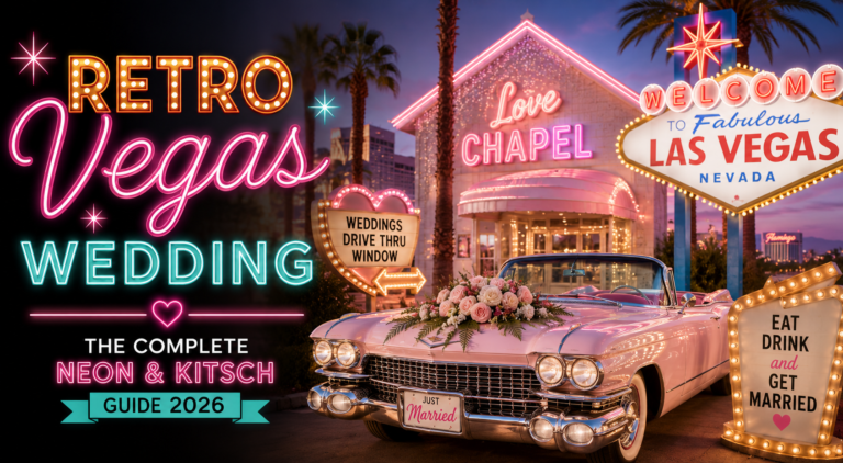
The Retro Vegas wedding is the most dramatically fun of all the retro aesthetics — and the one that most fully commits to the idea that a wedding should feel like the best night of your life rather than a tasteful backdrop for photographs. Las Vegas showgirl glamour, neon typography, the specific excess of a city that has always treated entertainment as an art form: the Retro Vegas wedding borrows from this tradition and turns it into a coherent design direction that is theatrical, joyful, and completely unapologetic.
The palette is neon and bold: electric pink, hot orange, gold, and white against a dark background that makes every colour pop as if lit from behind. Typography is the design hero — Las Vegas signage lettering, stacked bold display fonts, neon-glow effects in the invitation design. The ceremony can be short and spectacular; the reception should feel like a show. A photo booth in neon signage, a cocktail menu written in showgirl cursive, a DJ set that moves from Elvis to disco without apology: these are the details that produce the Retro Vegas atmosphere.
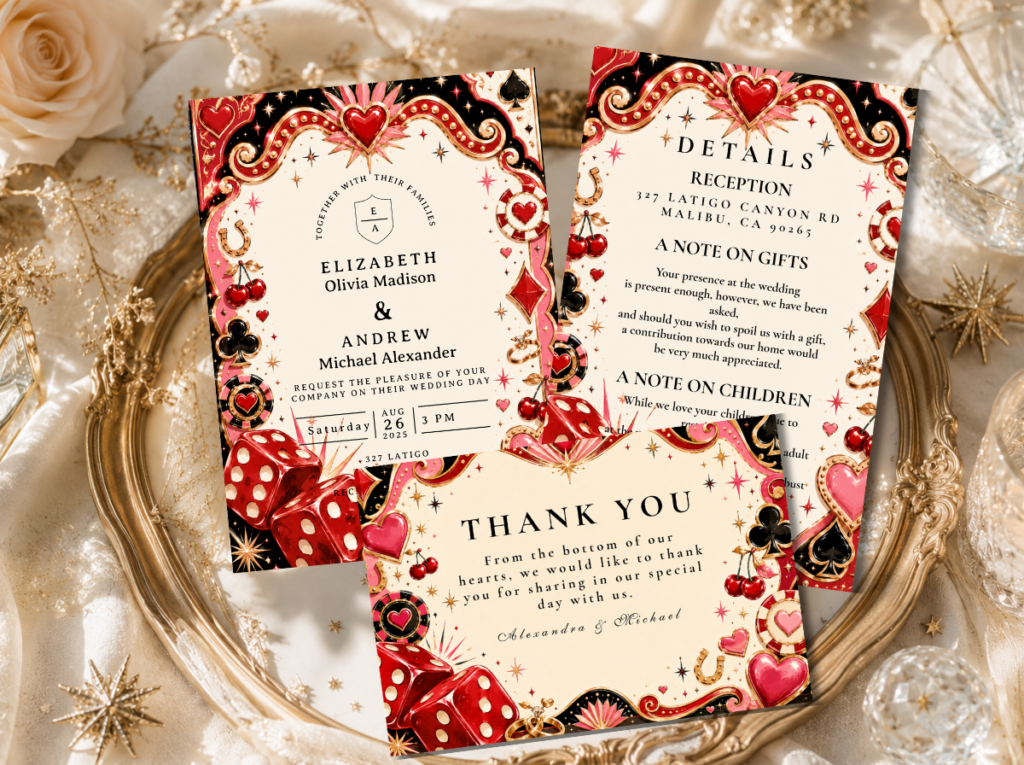
Shop the Retro Vegas Wedding collection — neon, bold, and dramatically fun stationery for the Vegas retro direction.
Aesthetic 2.4
The Kitschy Wedding
The Kitschy wedding is the aesthetic that celebrates excess with joy — and that requires, more than any other retro direction, an understanding that kitsch in the positive sense is not bad taste accidentally achieved but rather a knowing, confident, and deliberate embrace of the maximalist and the playful. Clashing prints, bold colours, unexpected details, a sense that every surface has been considered and every consideration has been delightfully wrong in exactly the right way: this is the kitschy wedding at its best.
The kitschy aesthetic works because it is committed. A half-hearted kitschy wedding — a few quirky details surrounded by conventional wedding styling — reads as confused rather than playful. A fully committed kitschy wedding, where the maximalism is consistent from the invitation to the tablecloth to the wedding cake to the favours, reads as genuinely designed and genuinely joyful. The couple who chooses the kitschy aesthetic is not failing to achieve elegance — they are choosing a different and more alive definition of it.
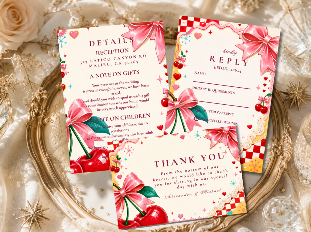
Shop the Kitschy Wedding collection — maximalist, playful, and completely committed to joyful excess.
Aesthetic 2.5
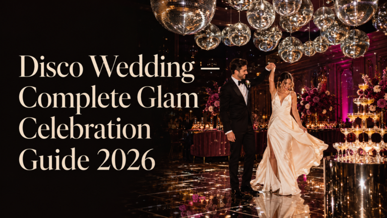
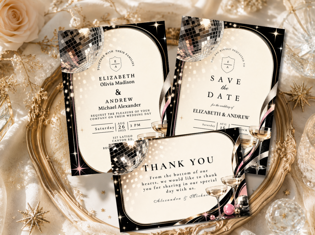
The Disco Wedding
The Disco wedding is the most dramatically glamorous of the retro aesthetics — the one that turns the reception room into a stage and every guest into a performer. Glitter, mirror balls, gold and silver sequins, deep plum and black as the background against which all that shimmer reads at its most spectacular: the disco aesthetic is not about restraint. It is about the specific magic of a room full of people in their most glamorous clothes, under light that makes everyone look like they are dancing even when they are standing still.
The Disco wedding has a clear dress code: glamorous, shimmering, and dark-toned. The invitation communicates this before anyone arrives — a foil-stamped or metallic-finish design in gold and black, with the event details in the bold display typeface of the 1970s nightclub poster. The venue needs either a functioning dance floor or the ability to become one; the DJ or band is as important as the caterer. The Disco wedding is the retro aesthetic with the highest required commitment from guests — and the highest return in collective energy and collective memory.
Shop the Disco Wedding collection — glitter, glamour, and mirror-ball energy for the disco retro direction.
Aesthetic 2.6
The Mid-Century Modern Wedding
The Mid-Century Modern wedding is the most sophisticated and the most design-conscious of the retro aesthetics — the choice of the couple who loves the precision of good design and the specific confidence of the 1950s and early 1960s in the power of architecture, furniture, and graphic design to produce a better life. Clean lines, geometric pattern, the specific palette of warm teal, mustard, coral, and cream that the period made its own: the MCM wedding is the retro aesthetic that could be described as ‘Mad Men elegance’ without that description feeling reductive.
Mid-Century Modern venues are the most important material decision in this direction: a building with flat roofs, cantilevered forms, floor-to-ceiling glazing, and angular interior geometry provides the physical world that the MCM aesthetic inhabits naturally. Furniture selection matters — tulip chairs, Eames-style seating, atomic-age side tables as the cocktail-hour furniture — and the flower arrangements should be low, architectural, and in the palette’s specific tones rather than abundant and romantic. The MCM wedding is for the couple who wants a retro wedding that reads as understated from a distance and increasingly specific and considered the closer you look.
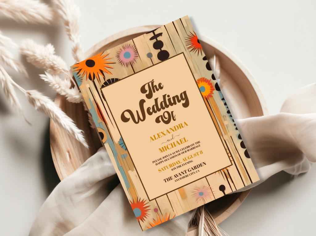
Shop the Mid-Century Modern Wedding collection — clean lines, geometric pattern, and MCM elegance.
Aesthetic 2.7
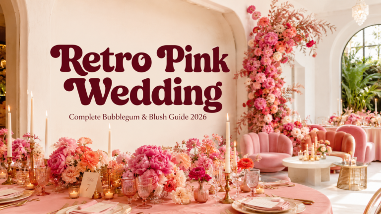
The Retro Pink Wedding
The Retro Pink wedding is the most joyfully feminine retro aesthetic — the one that takes bubblegum and blush and bold hot pink and makes them into a fully realised design direction rather than a colour choice. It is Barbie-adjacent without being Barbie-derivative, unapologetically sweet without being saccharine, and confident in its femininity in a way that the ‘neutral and elegant’ default of mainstream wedding aesthetics rarely allows. Pink on pink, with cream as the balance tone and occasional retro orange or red as the graphic accent: the Retro Pink wedding knows exactly who it is.
The Retro Pink aesthetic works at every scale: a small intimate celebration with pink floral wallpaper and bubblegum buttercream reads as entirely coherent; a large reception with pink lighting, hot pink floral installations, and pink-sequined tablecloths reads as spectacular. The invitation is the declaration: a bold pink-and-cream design in the playful retro typography of the period communicates the aesthetic’s emotional register — joy, sweetness, and complete confidence — before any other design decision is made.
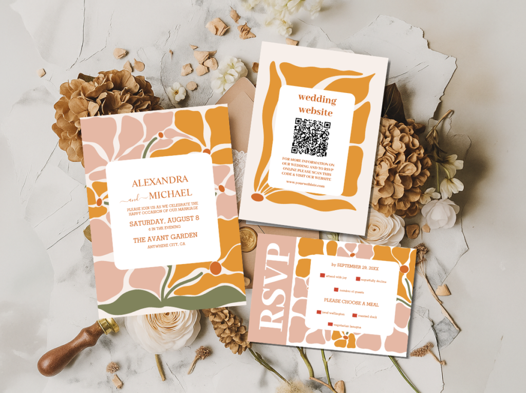
Shop the Retro Pink and Groovy Retro Pink collections — bold, sweet, and completely confident pink retro stationery.
Aesthetic 2.8
The Groovy Typography Wedding
The Groovy Typography wedding is the most stationery-forward of all the retro aesthetics — the one where bold retro fonts are not just a design choice but the primary design element of the entire celebration. Orange and pink in the specific warm-toned combination of 1970s graphic design, with bold display typefaces as the visual hero of every printed piece: the Groovy Typography aesthetic is for the couple who believes that words can be as beautiful as illustration when the typography is considered enough.
The Groovy Typography direction extends the typographic logic of the invitation into every surface at the wedding: welcome signs in the same bold retro font, menus set in the same distinctive typeface, place cards that use the font as the decoration rather than as the vehicle for decoration. The physical materials should support the graphic energy: thick uncoated card stock, hand-stamped or letterpress-printed details, warm cream or pale orange paper grounds rather than bright white. The typographic retro wedding reads as the most editorial of the eight directions — the choice of the couple who thinks in words and communicates in design.
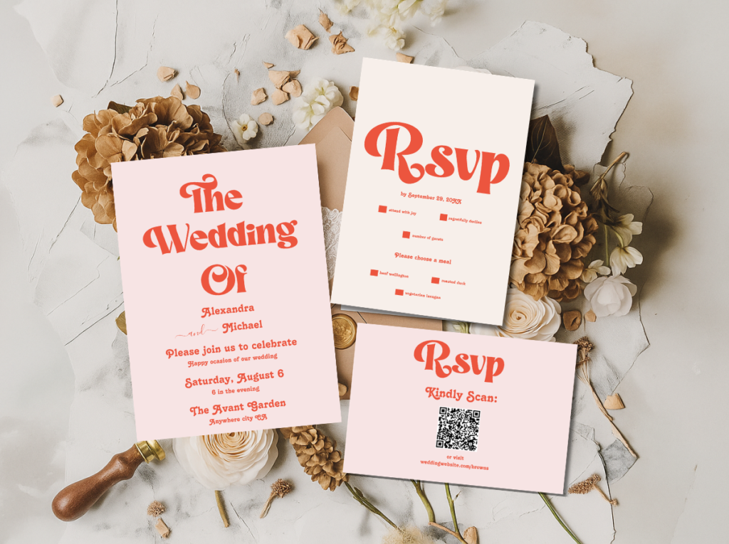
Shop the Modern Retro Pink and Orange Typography collection — bold retro fonts as the primary design element.
Section 03 Retro Wedding Colour Palettes
Each retro aesthetic has a specific palette that communicates its decade and its emotional register. The palettes below are the defining combinations for each direction — use them as starting points for stationery, florals, and styling decisions.
70s Earth — Burnt Orange, Avocado Green, Mustard, Warm Brown
60s Mod — Black, White, Bold Red, Sunny Yellow
Vegas Neon — Electric Pink, Hot Orange, Gold, White
Kitschy — Clashing Brights, Maximalist Mix
Disco — Gold, Silver, Deep Plum, Black
Mid-Century Modern — Warm Teal, Mustard, Coral, Cream
Retro Pink — Bubblegum, Hot Pink, Blush, Cream
Groovy Typography — Orange, Pink, Warm Cream, Gold
The principle across all eight palettes: choose two or three tones as the primary palette and use them consistently across every element of the wedding. The retro aesthetic earns its visual confidence from commitment — a 70s Groovy palette used across the invitation, the florals, the cake, and the signage reads as designed; the same tones applied inconsistently read as decorated.
Section 04 Retro Wedding Venues
The venue is the physical world that the retro aesthetic inhabits — and the right venue amplifies everything, while the wrong one requires significantly more work to overcome. The principles below apply across all eight retro directions; the specific requirements vary by aesthetic.
Mid-Century Modern architecture: The most naturally compatible venue type for multiple retro aesthetics — particularly the MCM Wedding and the 60s Mod direction. Flat or low-pitched rooflines, open-plan interiors with strong structural geometry, floor-to-ceiling glazing, and the specific materiality of post-war modernist architecture — concrete, glass, steel — provide the physical context that makes the MCM and Mod aesthetics read as completely at home. These buildings are found as converted civic spaces, mid-century country clubs, modernist arts centres, and private residential properties in areas developed heavily in the 1950s and 1960s.
Vintage diners and mid-century restaurants: The most naturally evocative venue type for the Retro Vegas and Kitschy directions — a diner with original neon signage, a supper club with red banquettes, or a retro bowling alley with its lanes intact all provide the specific material world that these aesthetics inhabit. The venue does a significant amount of the atmospheric work that a generic space would require styling to achieve; the retro couple who books a genuinely retro venue gets the decade for free.
Open outdoor spaces for the 70s Groovy direction: The 70s Groovy aesthetic works particularly well outdoors — a meadow, a farm, a vineyard, or any open natural space with room for macramé installations, pampas grass in large rattan vessels, and the specific warmth of natural light on earthy tones. Outdoor spaces require more weather planning and more material investment in creating the atmosphere that an indoor venue provides structurally, but the 70s Groovy aesthetic is at its most beautiful in natural light, and no indoor space fully replicates that quality.
Transforming a generic venue: The most commonly available venue type is a generic event space with high ceilings, neutral walls, and minimal architectural character. In this case, the retro aesthetic is built through decoration rather than found in the architecture: large-scale backdrop installations in the period’s graphic language, furniture selection that references the decade, and consistent typographic signage in the retro typeface throughout the space. The investment is higher, but the result can be equally powerful when the commitment is complete. The key: go all the way. A partially retro-styled generic venue reads as unfinished; a fully committed one reads as designed.
Section 05 Retro Wedding Stationery
Stationery is where the retro wedding aesthetic is most immediately and most powerfully communicated — before the venue is visited, before the florals are arranged, and before a single decoration is in place, the invitation tells every guest exactly what world they are entering. The font, the colour palette, the illustration style, and the material finish of the stationery suite do the complete work of establishing the decade, the register, and the emotional quality of the celebration in a single piece of paper held in the hand.
For the 70s Groovy direction, the stationery should use the bold, rounded, slightly imperfect typography of the 1970s — slab-serif or rounded sans-serif in earthy tones on warm cream or oatmeal card stock. For the 60s Mod direction, geometric precision and high contrast are the defining qualities: black and white with a single bold colour accent, in a clean architectural typeface. For the Retro Vegas and Disco directions, metallics and bold display fonts communicate the theatrical glamour of those aesthetics before anything else is read.
The material finish of retro wedding stationery matters as much as the design. Uncoated or slightly textured card stock reads as warmer and more period-appropriate than coated gloss; letterpress or foil-stamp finishes add the material depth that the retro aesthetic benefits from. The envelope is part of the design — a coloured envelope in the palette’s accent tone, or a white envelope with a coloured liner in the retro palette, extends the stationery suite before the invitation is even opened.
The collections and category pages below cover all eight retro aesthetic directions — each with stationery designed in the specific typographic and palette language of its decade:
Full Retro Suite
Retro Wedding Collections
All eight retro aesthetic directions in one browsable category — the complete starting point for any retro wedding stationery decision.
70s Groovy
Arch Modern Retro 70s Floral
Bold earthy tones and groovy 70s floral illustration — the stationery direction for the burnt orange and avocado green palette.
Groovy Earth Tones
Groovy 70s Muted Tones
The muted, earthy version of the 70s groovy palette — warm brown, terracotta, and oatmeal in a softer graphic register.
60s Mod
Minimal Retro Arch Black & White
High-contrast geometric stationery in the Mod tradition — black and white with the specific graphic precision of the 1960s.
Groovy Typography
Modern Retro Pink & Orange Typography
Bold retro fonts in warm pink and orange — the stationery direction where typography is the primary design element.
Pink Retro
Groovy Retro Pink & Orange Arch
Retro pink and orange in a groovy arch format — the joyfully feminine retro stationery direction.
70s Groovy Category
70s Groovy Wedding
The full 70s Groovy aesthetic stationery category — earthy tones, bold typography, and groovy illustration.
60s Mod Category
60s Wedding
The full 60s Mod aesthetic stationery category — graphic precision and Mod energy.
Browse all retro wedding stationery collections — every decade, every aesthetic, every palette direction.
Frequently Asked Questions
What is a retro wedding aesthetic?
A retro wedding aesthetic is a wedding designed around the specific visual language of a past decade — its colour palette, its typography, its graphic forms, and its material culture — applied to a modern celebration with editorial confidence and deliberate intention. It is not a costume party or a themed event in the conventional sense: it is a couple using a decade they love as a genuine design framework rather than as a decorative surface. The result is a wedding that reads as designed rather than dressed, confident rather than quirky, and specific rather than generic. The retro wedding differs from a vintage wedding in emotional register: vintage is soft, nostalgic, and gentle; retro is bold, graphic, and joyfully unrestrained.
What decade should I choose for a retro wedding?
Choose the decade whose design vocabulary feels most naturally like yours — not the decade you think is ‘most popular’ or the one you associate with your parents’ era, but the one whose colours, shapes, and graphic energy most closely match how you want your wedding to feel. The 70s Groovy direction suits couples who love warmth, natural materials, and earthy abundance. The 60s Mod direction suits couples who love graphic precision, bold contrast, and architectural clarity. The Disco direction suits couples who want the most dramatically glamorous evening possible. The Mid-Century Modern direction suits the design-conscious couple who prefers sophistication to spectacle. The Retro Pink direction suits the couple who wants to celebrate joy and femininity without apology. There is no wrong answer — the right decade is the one you could live in design-first.
What colours work for a retro wedding?
Each retro aesthetic has its own palette, and the palettes are specific enough that choosing the wrong colours for your decade breaks the aesthetic immediately. For the 70s Groovy direction: burnt orange, avocado green, mustard yellow, and warm brown. For 60s Mod: black and white with bold primary accents — red, yellow, or royal blue. For Retro Vegas and Disco: electric pink, gold, silver, deep plum, and black — always with metallic elements. For Mid-Century Modern: warm teal, mustard, coral, and cream. For Retro Pink: bubblegum, hot pink, blush, and cream. For the Groovy Typography direction: orange and pink in the warm-toned combination of 1970s graphic design. Across all directions, the key principle is commitment: use two or three palette tones consistently across every element rather than introducing neutrals or supplementary colours that dilute the retro identity.
What stationery suits a retro wedding?
Retro wedding stationery should use the specific typographic conventions of the chosen decade — bold rounded slab-serifs for the 70s, geometric architectural typefaces for the 60s Mod direction, bold display fonts for Disco and Vegas — alongside the palette of that aesthetic. Material finish matters: uncoated or textured card stock reads as more period-appropriate than gloss; foil stamp or letterpress finishes add material depth. The envelope is part of the design: a coloured envelope in the palette’s accent tone, or a white envelope with a coloured liner, extends the stationery suite before it is opened. Most importantly, the stationery should commit to the decade’s specific graphic language rather than gesturing toward it — a half-retro invitation alongside a conventional wedding website confuses the aesthetic register before any other design decision is made.
Eight Aesthetics · Every Decade · Complete Stationery
Shop Retro Wedding Stationery Collections
From earthy 70s groovy to 60s Mod graphic precision to disco glamour — retro wedding invitations, place cards, and stationery suites for every decade and every aesthetic direction.