Retro Wedding Flowers
Wedding Avenue Studio · Retro Wedding · Floral Guide 2026
Retro Wedding Flowers
Groovy Floral Guide 2026
Six bouquet styles, the flowers that belong to each decade, ceremony and reception florals, and the stationery that carries your floral palette from invitation to thank-you card.
The retro wedding bouquet is the most immediately decade-specific detail of the whole celebration — a sunflower and cosmos arrangement reads 1970s before a single other element has been noticed; a graphic single-variety daisy bunch reads 1960s with equal immediacy. Flowers are decade signals, and in a retro wedding they do as much tonal work as the stationery, the palette, or the venue. This guide covers the floral decisions that make the retro reading land precisely.
“The retro bouquet is not a prop — it is the most direct reference to a specific era available to a bride. A carnation says 1970. A daisy says 1965. A sunflower says the whole flower-power decade at once.”
Section 01 The Retro Floral Philosophy
The fundamental difference between a retro wedding bouquet and a conventional bridal bouquet is this: the retro bouquet is deliberately not trying to be bridal. The conventional bridal bouquet — white flowers, soft garden roses, dusty sage greenery, perhaps a dried element for texture — is beautiful precisely because it is universally appropriate and universally readable as wedding. The retro bouquet is not interested in universality. It is interested in a specific decade’s specific colour language, a specific era’s specific flower preferences, and a specific aesthetic confidence that says ‘this is exactly the celebration we wanted.’
In the retro floral philosophy, bold takes precedence over delicate, colour takes precedence over shape, and personality takes precedence over convention. A carnation is not an inferior flower in a retro wedding — it is the exact right flower, because the carnation — hot pink, full, and unapologetically unfashionable in the contemporary wedding market — reads as 1970 more directly than any other single bloom. The same logic applies to the sunflower, the daisy, the gerbera, and the chrysanthemum: flowers that the contemporary bridal market has largely set aside in favour of more ‘refined’ varieties are precisely the flowers that carry the strongest decade signal.
The retro florist — or the couple working with a florist to build a retro floral palette — works from a decade reference first and a flower preference second. The question is not ‘which flowers do I like?’ but ‘which flowers belong to the decade I am referencing?’ The answer is almost always more joyful, more abundant, and more colourful than the conventional bridal answer would be.
🌻 Floral Tip
Brief your florist with a palette image and a decade, not a flower list. A florist who understands ‘70s earth tones, wildflower quality, abundant rather than arranged’ will produce a more cohesive result than one given a list of twelve individual stems with no decade context. The decade is the design direction; the flowers follow.
Section 02 Six Retro Bouquet Styles
Six bouquet directions, each with a specific decade reference, a specific flower vocabulary, and a specific aesthetic personality.
2.1 — The 70s Wildflower Bouquet
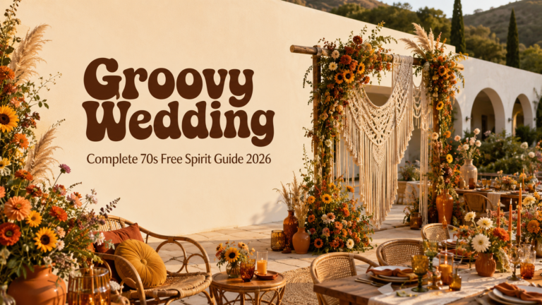
The 70s wildflower bouquet is the retro floral direction that photographs most beautifully and most consistently on film — the one that reads as specifically and joyfully 1970s without requiring any other decade reference in the surrounding decoration. The palette is the 70s earth palette: burnt orange sunflowers, warm yellow cosmos, rust and terracotta dahlias, soft mustard marigolds, and warm brown-toned dried grasses and wheat stems woven through the arrangement as texture and movement. The overall quality is ‘gathered from the garden’ rather than ‘arranged by a florist’ — abundant, organic, slightly informal, and specifically warm.
The key to the 70s wildflower bouquet’s success is the dried element. Pampas grass, dried wheat, bleached grasses, and dried seedheads woven through the arrangement give it the textural quality that separates a beautiful retro bouquet from a conventional garden arrangement with warm-coloured flowers. The dried elements are not filler — they are decade signals as specific as the sunflower itself, referencing the 1970s’ specific embrace of natural, unprocessed materials in every design context.
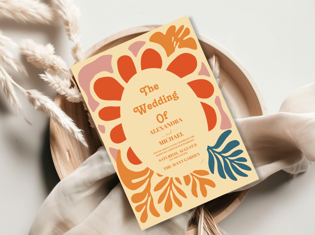
70s Groovy Wedding stationery and the Arch Modern Retro 70s Floral collection — botanical illustration in the wildflower palette’s warm earth tones.
2.2 — The Groovy Muted Botanical Bouquet
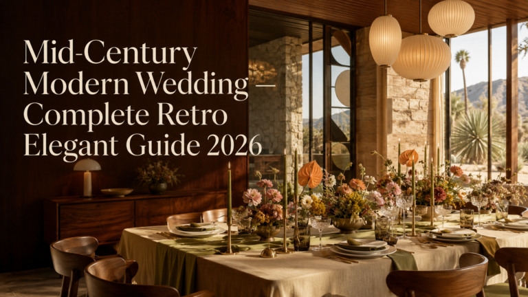
Where the 70s wildflower bouquet leads with maximum warmth and maximum colour, the groovy muted botanical bouquet leads with restraint within the same decade’s palette. Terracotta and burnt sienna tones, soft sage and eucalyptus greens, dried pampas tufts, bleached honesty pods, and preserved botanical elements in warm amber and cream: this is the 70s earth palette at its most considered and most editorial. The bouquet reads as intentionally designed rather than garden-gathered — still warm, still specifically 70s, but with the quality of a photographer’s palette rather than a flower market’s abundance.
The muted botanical direction is the most versatile retro bouquet for couples who want a decade reference without the full saturation of the 70s wildflower palette. It pairs naturally with the muted stationery direction — warm cream ground, terracotta typography, and botanical illustration elements — and produces the most consistently photogenic result in warm indoor lighting or at a late-afternoon outdoor ceremony.
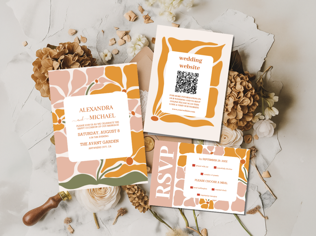
The Groovy 70s Muted Tones collection — terracotta, sage, and warm cream stationery in the muted botanical palette.
2.3 — The Pink Carnation Bouquet
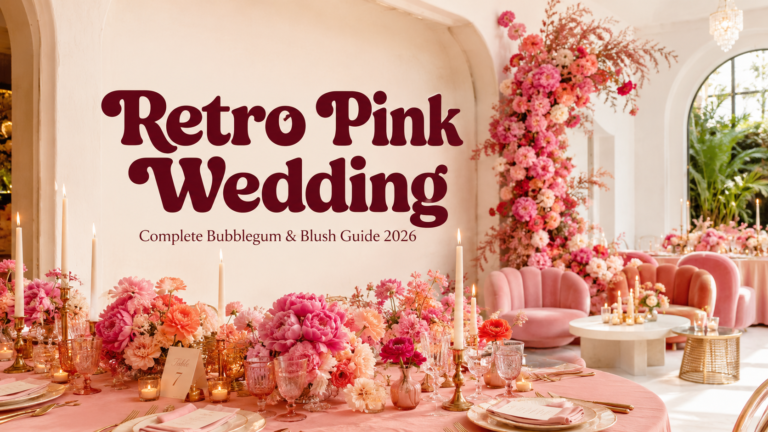
The carnation is the most retro flower available — and for most of the last thirty years, that has been the reason the bridal industry avoided it. In a retro wedding, that avoidance inverts entirely: the carnation is the exact right flower because its specific cultural association with the 1960s and 1970s is so strong and so immediate that no other bloom can deliver the same decade signal. A hot pink carnation bouquet — dense, round, full-headed, in the specific saturated pink of a 1970s Polaroid — is the most decade-specific bridal flower arrangement possible.
The carnation bouquet works best as a single-variety arrangement — all carnations, all in the same saturated hot pink or warm coral, with minimal greenery and no softening filler flowers. The directness is the point: the carnation at its most unapologetic reads as the boldest and most confident retro floral statement available. Pair it with the retro pink stationery collection and the result is a completely cohesive celebration where every element belongs to the same joyful, pink-saturated world.
Retro Pink Wedding and Groovy Retro Pink and Orange Arch stationery — the two pink-forward retro collections that pair most naturally with the carnation bouquet.
2.4 — The 60s Daisy Bouquet
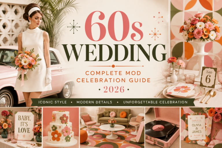
The 1960s single-variety daisy bouquet is the most graphic and most immediately readable retro floral direction: a dense bunch of ox-eye daisies or Shasta daisies, white petals and yellow centres, held in a clean round form without any additional greenery or filler. The daisy bouquet reads as 1965 before any other decade reference has been registered — it is the Mod movement’s flower, the Op Art era’s bloom, the decade’s most beloved and most consistently photographed floral motif.
The 60s daisy bouquet works because of its graphic quality. Where most bridal bouquets seek a soft, mixed, organic arrangement, the daisy bouquet seeks the opposite: clean, repetitive, graphic, and bold. A single variety in a single form, held tightly and carried with the same graphic confidence as the Mod movement’s textile patterns. The stationery that belongs with this direction is equally graphic: black and white, clean typography, the minimal retro arch in the 60s palette.
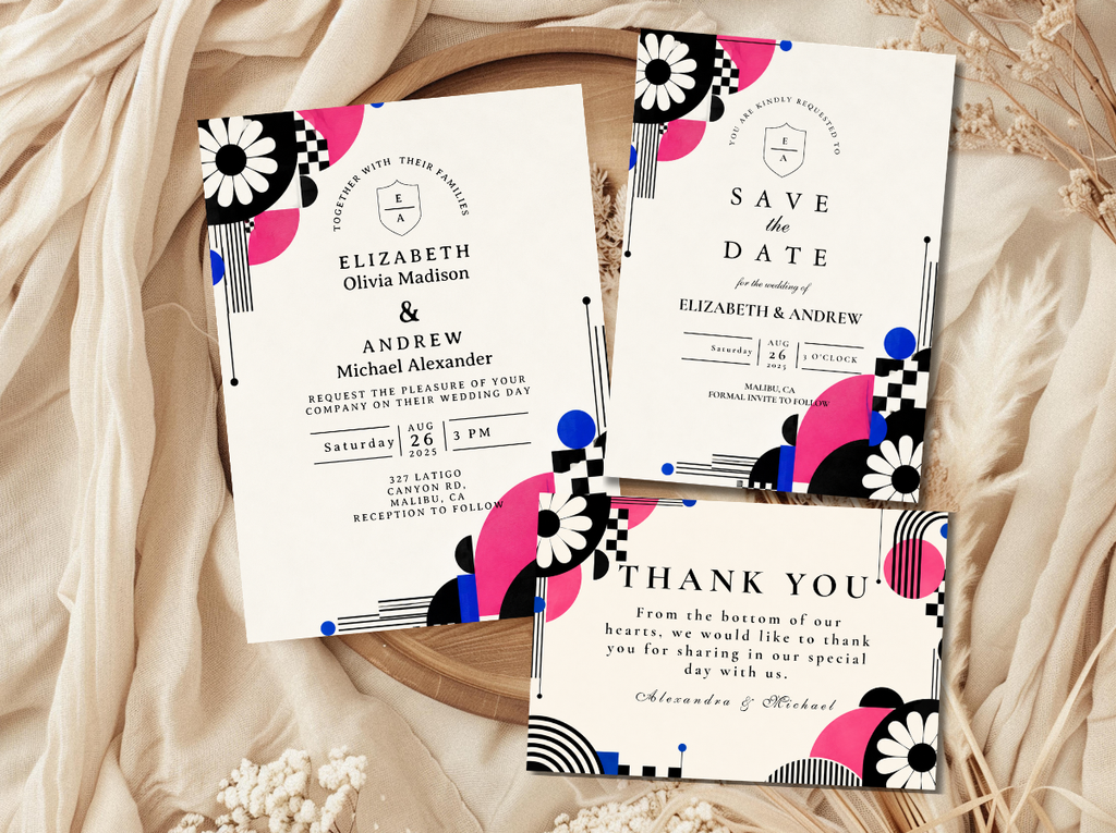
60s Wedding stationery — graphic, clean, and specifically 60s Mod in every printed element.
2.5 — The Groovy Sunflower Statement
The sunflower is the 1970s’ most iconic bloom — the flower that appears in more decade photographs, more decade posters, and more decade memory than any other. A sunflower statement bouquet — oversized heads, warm yellow petals at full open, stems held long — is less an arrangement than an announcement: the whole decade compressed into a single bloom held at chest height. The bouquet works as a primary statement or as the anchor of a larger wildflower arrangement, but its most powerful reading comes when it is the primary flower and everything else is secondary texture.
The sunflower’s specific quality in a retro wedding context is its warmth. The warm golden yellow of a full-headed sunflower is the same warm golden yellow of the 70s earth palette — not a primary cartoon yellow but a warm, slightly orange-adjacent yellow that reads as specifically natural and specifically warm. Paired with dried grasses and a few rust-toned dahlias, the sunflower statement bouquet is the most warmly cohesive retro floral arrangement available.
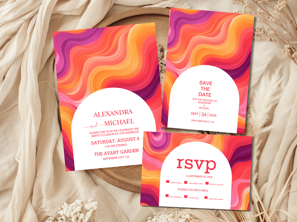
70s Groovy Wedding stationery — the warm earth palette that pairs most naturally with the sunflower statement direction.
2.6 — The Bold Mixed Retro Bouquet
The bold mixed retro bouquet is the maximalist option — the arrangement that takes the retro floral philosophy’s core principle (bold over delicate, colour over shape, personality over convention) and applies it without restraint. Carnations alongside sunflowers alongside gerberas alongside dahlias in a palette that clashes with intention: hot pink beside burnt orange beside warm yellow beside terracotta. The colour combinations that the conventional bridal market would never permit are the ones that the retro mixed bouquet deploys as its primary design statement.
The bold mixed bouquet reads as joyful rather than chaotic when its clash is intentional rather than accidental. The difference: an intentional clash uses colours from the same temperature family — warm tones across the spectrum, or cool tones across the spectrum — even when the specific hues are strongly contrasting. The accidental clash mixes warm and cool tones without a unifying temperature logic. Within a retro wedding, the warm temperature family — all the burnt oranges, hot pinks, mustard yellows, and terracotta tones — produces the clash that reads as deliberately joyful.
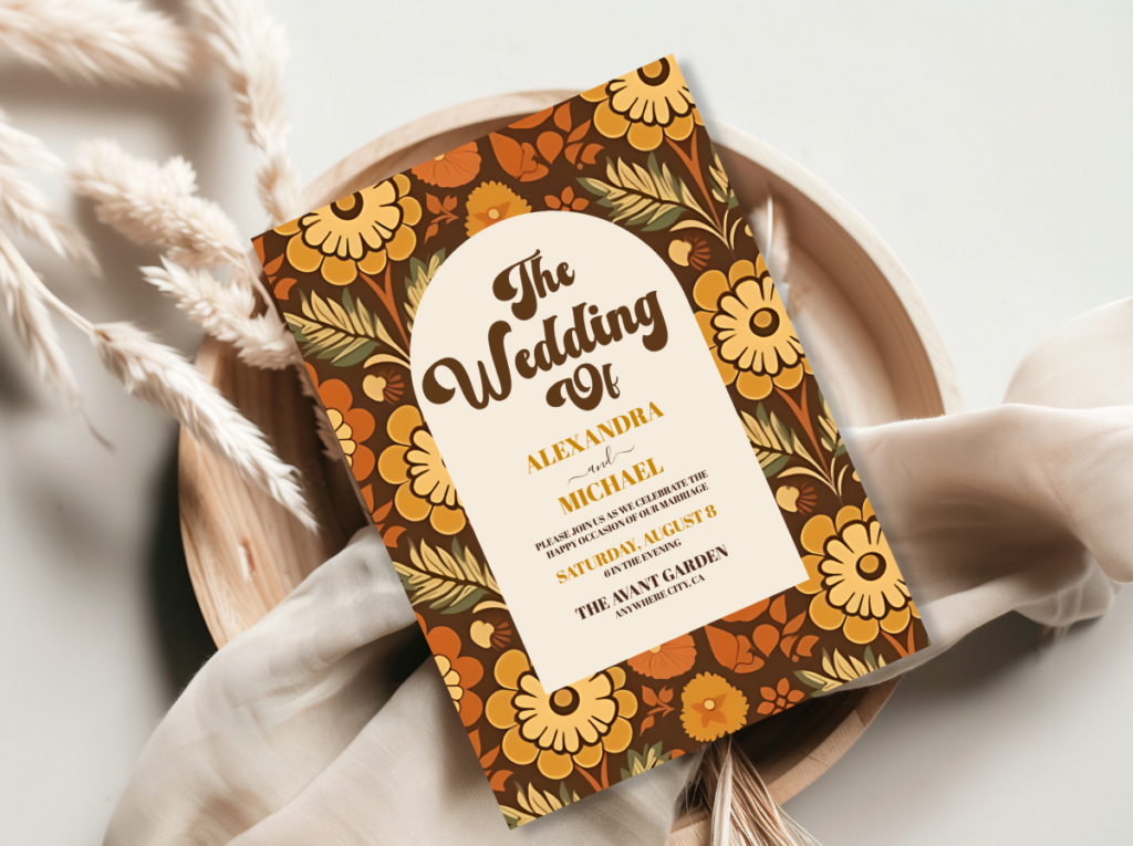
Retro Wedding stationery — the full retro collection for any bold mixed floral direction.
Section 03 Retro Flowers by Decade
Each decade has a specific flower vocabulary — the blooms that appear most frequently in its photographs, its films, its domestic interiors, and its cultural memory. Briefing a florist with decade specificity rather than individual flower preferences produces a more cohesive and more immediately readable retro result.
1970s. Sunflowers, cosmos, dahlias, chrysanthemums, marigolds, dried pampas grass, bleached wheat, dried grasses, and seedheads. The 1970s flower palette is the warmest and the most abundant of the retro decades — heavy on warm yellows, burnt oranges, and terracotta tones, with dried and natural elements as essential texture rather than optional filler. Carnations in the 70s earth palette tones — terracotta, warm orange, golden yellow — also read as specifically 70s when used in an abundant, garden-gathered arrangement.
1960s. Daisies (ox-eye and Shasta), carnations (in bold primary or pastel tones), gerberas, tulips, and any flower used as a single-variety graphic statement rather than a mixed arrangement. The 1960s floral philosophy was graphic over abundant, single over mixed, bold over soft. The daisy is the decade’s most iconic bloom; the carnation its most unapologetically bold. The 60s Mod palette favoured white, primary red, primary pink, and electric tones that read as deliberate and graphic rather than soft and botanical.
Disco (late 1970s). Dramatic roses — deep red, hot pink, bold orange — gladioli in saturated statement colours, bold statement stems in the disco palette’s jewel tones (plum, gold, deep red, electric pink). The disco floral direction is theatrical rather than garden-forward — single large-headed flowers with long dramatic stems, arranged for maximum visual impact in low, warm, theatrical light. Gold-tipped dried elements and mirror-reflective surface details belong to the disco floral world.
📋 Floral Tip
Ask your florist to avoid ‘contemporary garden style’ arrangements — the loose, airy, soft-toned aesthetic that dominates the current bridal market — and instead aim for ‘decade abundance’: denser, warmer, more colourful, and more specifically referencing the palette of a specific era. The decade reference is the design brief; the flowers execute it.
Section 04 Ceremony & Reception Florals
The retro floral direction does not stop with the bouquet. Ceremony arches, reception centrepieces, and larger floral installations each have a specific retro execution that carries the decade reference through every space of the celebration.
The retro ceremony arch. A retro ceremony arch is not the soft, loose, garden-style floral arch of the contemporary wedding market. It is more deliberate, more colourful, and more directly referencing the decade’s design logic. A 70s earth-palette arch uses sunflowers, dahlias, cosmos, and dried grass elements in an arrangement that reads as warm and abundant rather than soft and airy. A 60s Mod arch uses bold single-variety elements — daisies, carnations — in a graphic arrangement with strong colour contrast. The stationery collections from Wedding Avenue Studio include arch-motif designs that directly reference these floral directions and that produce the most cohesive result when the ceremony arch and the invitation share the same visual language.
Bold retro centrepieces. The retro centrepiece is abundant rather than architectural. Where the contemporary wedding centrepiece tends toward height, structure, and soft palette, the retro centrepiece tends toward width, warmth, and colour saturation. A low, wide arrangement of sunflowers, dahlias, and dried grasses in a terracotta vessel; a dense carnation arrangement in a warm-coloured ceramic bowl; a wildflower cluster in a rattan basket: these are the retro centrepiece directions that read most specifically and most beautifully as decade-specific celebrations.
Carnation installations. The carnation wall or carnation arch is the single most impactful retro floral installation available — and one of the most affordable per bloom, since carnations are among the least expensive fresh flowers available. A dense wall installation of hot pink carnations reads as 1970s immediately, produces extraordinary photographs, and costs significantly less than the equivalent rose or peony installation. The carnation’s rehabilitation in the retro wedding context is one of the most practical and most joyful floral decisions available.
🏛️ Floral Tip
The Arch Modern Retro 70s Floral stationery collection at Wedding Avenue Studio includes an arch-motif invitation that directly references the ceremony arch’s floral direction. When the invitation shows the same botanical arch illustration as the arch the guests walk through, the celebration reads as designed all the way through.
Section 05 Flowers & Stationery — The Connection
The retro wedding stationery and the retro wedding flowers are not two separate design decisions — they are the same design decision expressed in two different materials. When the invitation’s palette is the same warm earth palette as the bouquet, when the stationery’s botanical illustration echoes the flowers at the ceremony arch, and when every printed element belongs to the same decade’s visual world as every floral element, the celebration reads as a single coherent design rather than as a collection of themed choices.
The most effective approach is to begin with the stationery collection and use its palette as the florist brief. The Arch Modern Retro 70s Floral collection’s warm earth tones — burnt orange, avocado, mustard — translate directly into a sunflower and dahlia palette brief. The Groovy Retro Pink and Orange Arch collection’s hot pink and warm orange translate directly into a carnation and gerbera palette brief. The Groovy 70s Muted Tones collection’s terracotta and sage translate directly into a dried botanical and muted wildflower brief. In each case, the stationery is the palette reference; the flowers execute it.
The result of this approach — stationery palette leading, flowers following — is a celebration that photographs as a single designed world rather than as a set of separately made decisions. The bouquet photograph and the invitation flat-lay photograph belong to the same colour world. The ceremony arch and the thank-you card share the same botanical register. The guest table centrepiece and the place card share the same warm decade palette. This is the specific quality that separates a retro wedding that reads as deliberately designed from one that reads as a collection of retro-adjacent elements placed in the same room.
All Wedding Avenue Studio collections are available below — browse by decade direction, by palette, or by collection to find the stationery suite that matches your floral direction most exactly.
70s Groovy
70s Groovy Wedding
Warm earth tones and groovy typography — the stationery direction for sunflower and wildflower bouquets.
Retro Pink
Retro Pink Wedding
Hot pink and warm gold — the stationery direction for carnation and pink gerbera bouquets.
60s Mod
60s Wedding
Graphic, clean, and bold — the stationery direction for daisy and single-variety bouquets.
Full Retro Range
Retro Wedding
The complete retro wedding stationery collection across all decades and all directions.
Arch 70s Floral
Arch Modern Retro 70s Floral
Botanical arch illustration in the warm earth palette — the collection that most directly references the ceremony arch floral direction.
Groovy Pink Arch
Groovy Retro Pink and Orange Arch
Pink and orange arch illustration in the retro pink palette — the carnation and gerbera stationery direction.
Groovy Muted
Groovy 70s Muted Tones
Terracotta, sage, and warm cream — the muted botanical bouquet’s stationery direction.
Frequently Asked Questions
What flowers are most retro for a wedding?
Sunflowers, cosmos, dahlias, and chrysanthemums for the 1970s direction; daisies and carnations for the 1960s direction; bold roses, gladioli, and dramatic statement stems for the disco direction. The most universally retro flower is the carnation — its specific cultural association with the 1960s and 1970s is stronger than any other bloom’s, and its current unfashionability in the contemporary bridal market makes it the most immediately readable decade signal available. A hot pink carnation bouquet reads as 1970 before any other retro element has been noticed.
How do I brief a florist for a retro wedding?
Give the florist a decade reference, a palette image, and three descriptive words rather than a flower list. ‘1970s earth palette, wildflower quality, abundant rather than arranged’ is a more useful brief than a list of twelve individual stems. If you have chosen a stationery collection from Wedding Avenue Studio, share that image with the florist as the palette reference — the collection’s colour tones translate directly into a flower palette brief. Ask the florist to avoid ‘contemporary garden style’ and instead aim for ‘decade-specific abundance.’
Are carnations appropriate for a wedding bouquet?
Yes — in a retro wedding, carnations are not just appropriate but specifically ideal. The carnation’s current unfashionability in the contemporary bridal market is precisely what makes it the most decade-specific flower available: a hot pink carnation bouquet reads as 1970s immediately and without ambiguity. Single-variety carnation bouquets in bold, saturated tones — hot pink, warm orange, coral — are the most affordable and most photographically impactful retro bridal flower arrangement available. Carnation walls and carnation ceremony arches produce extraordinary photographs at a significantly lower cost per bloom than rose or peony equivalents.
How do I match my flowers to my retro stationery?
Use the stationery collection’s palette as the florist brief. The Arch Modern Retro 70s Floral collection’s burnt orange, avocado, and mustard translate directly into a sunflower, dahlia, and dried grass palette. The Groovy Retro Pink and Orange Arch collection’s hot pink and warm orange translate into a carnation and gerbera palette. The Groovy 70s Muted Tones collection’s terracotta and sage translate into a muted botanical and dried pampas palette. In each case, the stationery collection is the colour reference; the flowers execute it in the organic world of the ceremony and reception.
Wedding Avenue Studio · Retro Stationery · Flowers & Palette
Shop Retro Wedding Stationery
Invitation suites that match your floral palette — the stationery reference your florist needs to get the decade exactly right.