Mid-Century Modern Wedding — Complete Retro Elegant Guide 2026
Wedding Guide · Mid-Century Modern · 2026
Mid-Century Modern Wedding — Complete Retro Elegant Guide 2026
Four MCM aesthetics, the warm geometric colour palette, venue and ceremony guidance, and the stationery that makes mid-century modern the most design-literate wedding aesthetic in 2026.
There is a specific quality of design sophistication that belongs to mid-century modern — and it is the one that has proved most durable across the decades separating it from its source. The furniture, the architecture, the graphic design, and the domestic objects of the post-war modernist movement — from the early 1940s through the late 1960s — have never gone fully out of fashion because they never fully belonged to their moment in the first place. They belonged, instead, to a set of design values that transcend moment: the primacy of function, the beauty of purposeful form, the warmth that emerges when natural materials meet geometric intelligence.
The mid-century modern wedding draws directly from those values. It is not a period costume; it is a design philosophy applied to the most personal celebration available. The MCM bride is not trying to recreate the 1950s; she is applying the 1950s’ most enduring aesthetic principles — clean geometric lines, warm tonal palette, quality over quantity, design intention over decorative abundance — to a contemporary celebration that is specifically and recognisably her own.
“Mid-century modernism understood something that most design movements miss: restraint is not the absence of beauty, it is its condition. The most beautiful thing in the room is always the thing that was not placed there accidentally.”
Section 01 What Is a Mid-Century Modern Wedding?
Mid-century modern — the design movement that flourished from approximately 1945 to 1969, encompassing furniture design, architecture, graphic design, and domestic objects — is defined by a specific set of principles that are simultaneously of their historical moment and completely resistant to aesthetic dating. Clean geometric lines that emerge from structural necessity rather than decorative intention. Warm, saturated tonal palette — teal, mustard, coral, burnt orange, warm white — applied with confidence rather than caution. Natural materials — walnut timber, woven textile, ceramic, leather — combined with purposeful geometric form. And the governing conviction that every object in a space should have a reason to be there, expressed through both its function and its beauty.
The mid-century modern wedding applies these principles to the most personal and most designed event in most people’s lives. It is the most design-conscious of all the retro wedding aesthetics, and the one most driven by a genuine understanding of design history rather than by a decade’s surface culture. Where the 70s wedding draws from the earthy warmth of a specific decade’s popular aesthetic, and the disco wedding draws from a specific cultural movement’s glamour, the MCM wedding draws from a design philosophy that produced objects — the Eames chair, the tulip table, the Scandinavian lamp — that are still considered benchmarks of design excellence. The MCM bride knows what good design looks like. Her wedding looks like it.
The difference between a mid-century modern wedding and general retro is the same difference that separates a designed object from a decorated one: intent. General retro is warm and nostalgic, layered with the surface signals of past decades — vintage typography, antique props, period-adjacent colour. The MCM wedding is clean and precise, organised by a design logic that produces restraint rather than abundance, geometric rather than organic form, and the specific quality of a space where every element was chosen rather than accumulated. It is the only retro wedding aesthetic where the word ‘sophisticated’ applies without qualification.
In 2026, the mid-century modern wedding is the choice of couples who are drawn to the clean, design-led aesthetic of the MCM moment and who want a celebration that reads as considered and intentional from every angle. It is the retro aesthetic most at home in contemporary architectural spaces — the art gallery, the modernist house, the clean-lined hotel ballroom — and the one most likely to produce photographs that look as beautiful and as specific in twenty years as they do the day after the wedding.
Section 02 Four Mid-Century Modern Wedding Aesthetics
Four distinct directions within the MCM wedding, each applying the same design principles to a different palette and architectural register. The principles — clean geometric form, warm tonal palette, quality over quantity, design intention in every detail — remain constant; the specific visual world each direction inhabits differs.
2.1 The Mad Men Elegance — Teal, Mustard, Coral & Cream
The Mad Men Elegance direction is the MCM wedding at its most recognisable and most immediately evocative: the specific palette of warm teal, golden mustard, coral, and cream that reads, from the moment it appears, as the post-war modernist domestic world at its most confident and most beautifully executed. This is the direction that most directly references the visual world of the period’s most glamorous domestic interiors — the colour-saturated mid-century room where every object was a design decision and the combination of those objects produced a warmth that was simultaneously bold and comfortable.
The Mad Men Elegance wedding is not a period reconstruction; it is a contemporary celebration that borrows the period’s most enduring palette and applies it to every designed element of the event. The teal in the invitation’s typography; the mustard in the table linen’s accent tone; the coral in the floral arrangement’s bloom selection; the cream in the table surface and the ceremony arch’s geometric structure. Every element belongs to the same warm, saturated world — and the consistency of that world across every designed element is what produces the Mad Men Elegance reading.
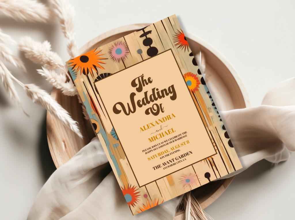
The Mid-Century Modern Wedding category — warm teal, mustard, and coral stationery in the Mad Men Elegance direction.
2.2 The Graphic Black & White MCM
The Graphic Black and White MCM direction takes the movement’s geometric design language and applies it to the highest-contrast palette available: crisp black and warm white, with a single bold accent colour that carries the warmth of the broader MCM palette into an otherwise monochromatic scheme. The geometric patterns of the MCM era — the repeating hexagonal tile, the atomic starburst, the organic-meets-geometric biomorphic form — read with particular clarity and power in black and white, where the form’s precision is not softened by colour.
This direction is the most architectural and the most graphic of the four MCM aesthetics — the one that most closely approaches the precision of the movement’s design objects rather than the warmth of its domestic interiors. The single bold accent colour — teal, warm coral, golden mustard — appears in one element per zone: the invitation’s typography colour, the ceremony arch’s accent detail, the single bloom in a graphic bud vase at each table setting. The restraint of one accent in an otherwise black-and-white scheme is the most specifically MCM design decision in this direction: it references the movement’s understanding that a single well-placed colour does more design work than three competing ones.
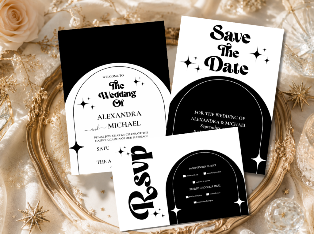
The Minimal Retro Arch Black and White collection — the most architectural and most graphic MCM stationery direction.
2.3 The Palm Springs MCM — Warm Desert Palette
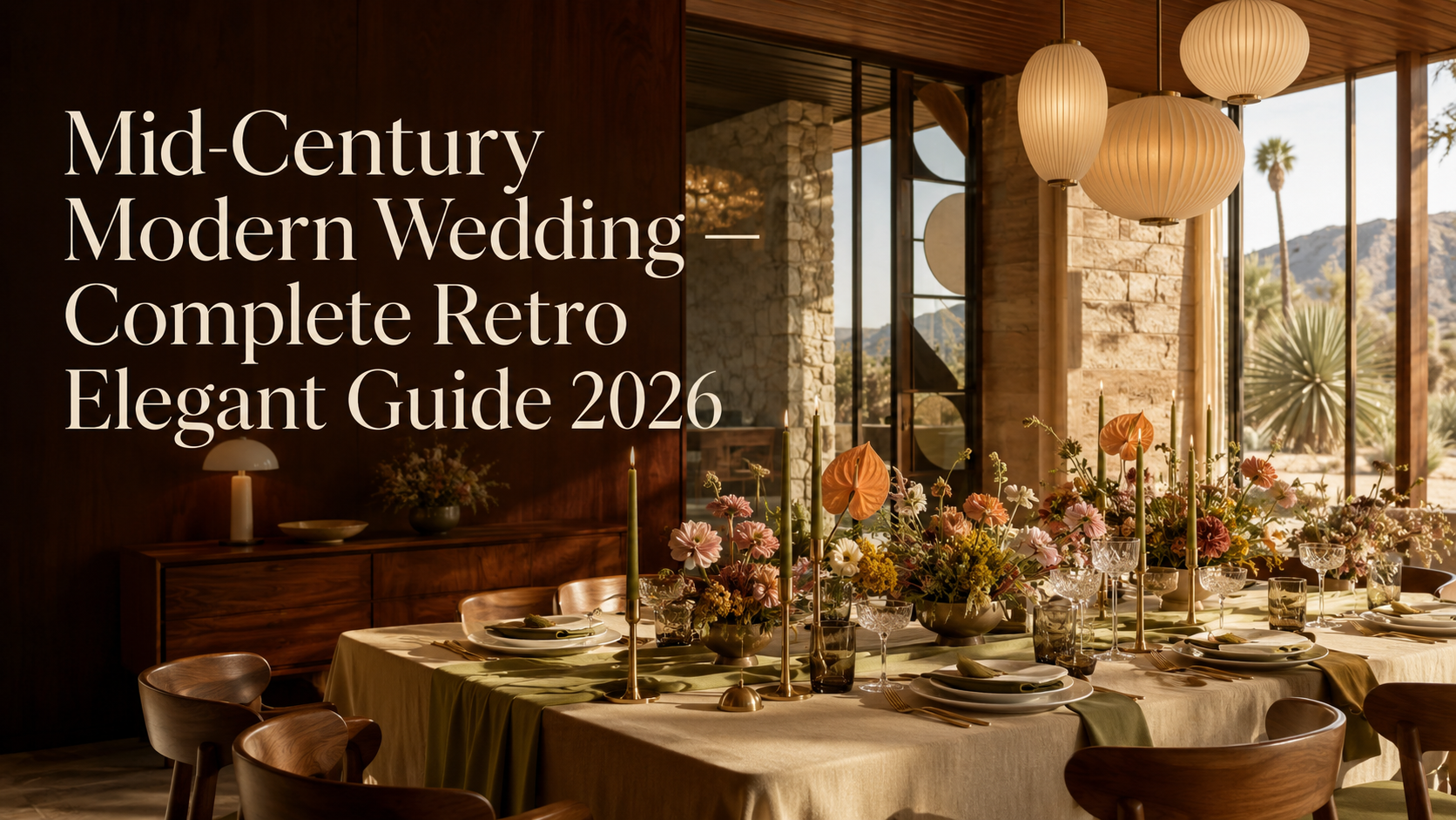
The Palm Springs MCM direction applies the movement’s design principles to the specific warm desert palette of Southern California’s most celebrated mid-century residential landscape: warm sand, terracotta, sage green, and warm white, in a combination that reads as both specifically mid-century and specifically warm-climate. The Palm Springs direction is the most sun-drenched of the four MCM aesthetics — the direction where the palette’s warmth comes from the landscape rather than from the interior design tradition, and where the geometric forms of the architecture and the natural forms of the desert climate exist in the same visual world.
The Palm Springs MCM wedding is the most suited to outdoor or semi-outdoor settings where the natural light and warm climate can activate the palette’s specific quality. An outdoor ceremony in a space with visible flat-roofline modernist architecture, or in a desert landscape where the terracotta and sage tones of the decoration belong to the colours already present in the surroundings; a reception in a space that brings the warm outdoor light inside through large windows or open walls. The floral vocabulary is restrained and desert-adjacent: succulents, warm-toned dried botanical elements, and single-variety white or cream blooms that read as clean against the terracotta and sage of the broader palette.
The Mid-Century Modern Wedding category — warm desert-toned stationery for the Palm Springs MCM direction.
2.4 The Mod Typography MCM
The Mod Typography MCM direction approaches the mid-century modern aesthetic from its graphic design output rather than from its interior design or architectural heritage. The typography and visual communication design of the MCM era — the Swiss International Style, the American advertising graphic design of the 1950s and early 1960s, the specific clean-lined sans-serif lettering of the period’s most ambitious commercial design — produced a typographic vocabulary that is immediately recognisable, specifically beautiful, and completely applicable to contemporary wedding stationery.
The Mod Typography MCM wedding treats the stationery suite as the celebration’s primary design object and applies the period’s typographic principles — clean hierarchy, purposeful white space, warm accent colour applied to type rather than to decorative elements — across every printed piece of the event. The decoration is restrained and clean; the stationery does the design work. This is the MCM direction for the couple who care most specifically about graphic design — who have an opinion about typefaces, who think about layout as seriously as they think about flowers, and who want their celebration to read as a designed environment from the printed element outward.
The Modern Retro Pink and Orange Typography collection — bold, typographically led stationery in the Mod Typography MCM direction.
Section 03 Mid-Century Modern Wedding Colour Palettes
Four palette systems for four MCM directions. The quality shared across all four: every colour is warm, saturated at a mid-level rather than either muted or vivid, and applied with intention rather than abundance. MCM colour never shouts; it asserts.
3.1 Classic MCM Palette
Warm teal, golden mustard, coral, and warm cream — the most iconic mid-century modern colour combination. Every tone warm and mid-saturated rather than either muted or vivid; the combination reads as both bold and comfortable because each colour is at the same level of warmth.
3.2 Desert MCM Palette
Warm sand, sage green, terracotta, and warm white — the Palm Springs-adjacent desert palette that reads as specifically sun-drenched and warm-climate MCM. Every tone warm and natural rather than synthetic; the combination belongs to the landscape it references.
3.3 Graphic MCM Palette
Crisp black and warm white as the primary contrast, with warm teal or coral as the single bold accent — the most architectural and most graphic MCM palette. The accent colour appears in one element per zone; its restraint is the palette’s most specifically MCM quality.
3.4 Warm MCM Palette
Burnt orange, olive green, warm cream, and copper — the warmest and most autumnal MCM palette direction. Draws from the broader mid-century domestic design vocabulary rather than from the period’s coolest or most graphic output; reads as warm and specifically considered.
Section 04 Mid-Century Modern Wedding Venue & Ceremony
The MCM wedding’s relationship with its venue is more specific and more demanding than any other retro aesthetic’s: the mid-century modern aesthetic is not applied over the top of an incompatible space; it is chosen in relationship to an architectural environment that already shares its values. The MCM wedding needs a space that respects clean lines, that does not compete with the decoration through its own ornamental complexity, and that provides the geometric proportions within which the MCM design language can read at its most powerful.
The architectural venue. A modernist building — with flat or gently pitched rooflines, large windows, geometric structural elements, and the clean, purposeful proportions of post-war architecture — is the most natural home for the MCM wedding. The mid-century era produced a specific architectural vocabulary that is still visible in buildings across the full age range of the built environment: from genuinely historic mid-century structures to contemporary buildings that draw explicitly from the movement’s proportional values. An art gallery with clean white walls and polished concrete floors, a modernist domestic space with the period’s specific residential character, or an outdoor setting with visible mid-century architecture as the ceremony’s backdrop — any of these provides the architectural context within which the MCM wedding’s decoration reads as specifically and beautifully of its aesthetic world.
The geometric ceremony arch. The MCM ceremony arch is a clean geometric structure — a circle, a wide rectangular frame, a bold hexagonal form — in warm white, teal, or the palette’s primary accent colour. It should read as an architectural object rather than as a decorated structure: the form itself is the design, and any floral or typographic element placed within or against it is secondary to the geometry. A simple circular arch in warm white with a single typographic element — the couple’s names in the invitation suite’s typeface — is more effectively MCM than a heavily decorated structure in the wrong aesthetic register.
Single-variety floral arrangements. The MCM ceremony’s floral language is the same as its broader design language: single variety, precisely arranged, chosen for its form as much as its colour. White tulips at the ceremony entry in clean ceramic vessels. Warm-toned chrysanthemums in geometric pots at the aisle’s intervals. A single bold botanical element at the arch’s base rather than a full floral installation at its crown. The floral arrangement in the MCM context should read as a design decision — deliberately placed, purposeful in its palette contribution — rather than as an organic addition to the architectural space.
The ceremony programme as designed object. In the MCM wedding, the ceremony programme is not a practical multi-page booklet; it is a single, beautifully designed card in the invitation suite’s typographic and colour system, printed at a scale that allows the type hierarchy to be read as a design decision rather than as a convenience. The folded programme in the MCM context is specifically appropriate to the movement’s graphic design legacy — a precisely proportioned, cleanly typeset piece of printed design that the guest takes home and keeps rather than leaves on the pew.
The Mid-Century Modern Wedding category and 60s Wedding category — the full spectrum of MCM and mod ceremony stationery.
Section 05 Mid-Century Modern Wedding Decor & Reception
The MCM reception applies the movement’s governing principle — every object should have a reason to be there, expressed through both its function and its beauty — to every surface and every object in the room. The result is a reception that reads as designed rather than decorated: fewer elements, each chosen with more care, producing a visual quality that more conventional reception styling — with its abundance of decorative elements — cannot replicate.
Clean table styling. The MCM reception table is not layered with decorative elements; it is precisely set. A solid-colour linen tablecloth in the palette’s primary tone — warm teal, golden mustard, or warm white — provides the table surface. A single centrepiece arrangement in a geometric or organically formed ceramic vessel, in the palette’s floral tones, at a precise height that does not interrupt the sight lines across the table. Warm metallic flatware — in copper or warm gold — as the place setting’s accent element. The printed menu and place card as design objects in the invitation suite’s typographic system. Every element has a reason to be there; nothing is present for decorative abundance.
Geometric patterns. The MCM era’s pattern vocabulary — geometric, repeating, based on the era’s specific formal language of hexagons, starbursts, overlapping circles, and the atomic forms that reference the post-war scientific culture — provides the MCM reception’s textile and surface design language. A patterned runner in the palette’s geometric print on a solid-colour tablecloth. A geometric-print napkin on a plain white charger plate. A patterned wallpaper panel or a printed textile backdrop behind the couple’s table, in the MCM pattern vocabulary, that provides the reception’s visual anchor without requiring a floral installation of equivalent scale.
Quality over quantity. The MCM wedding’s most fundamental decorative principle is the one that most distinguishes it from every other retro aesthetic: quality over quantity. One beautifully designed object does more work in the MCM room than three decorative elements of inferior individual quality. A single ceramic vase of beautiful form, in the palette’s accent colour, at the table’s centre reads as more specifically MCM than three vases of generic design in three different palette tones. The curation principle — every object chosen, nothing accumulated — is the design sensibility that makes the MCM reception read as the most sophisticated retro aesthetic available.
The Mad Men bar cart aesthetic. The bar area in an MCM reception is an opportunity to apply the period’s domestic design aesthetic to a functional space. A vintage-style bar cart with warm metallic fittings, glass decanters, and the period’s specific domestic barware provides a visual accent that reads as specifically of the era without requiring any additional decorative decision. Signage at the bar in the MCM typographic style — bold, clean, hierarchy-led — and glassware that references the period’s specific coupe and highball forms complete the bar aesthetic. The bar reads as a designed object within the reception rather than as a functional service point beside it.
Section 06 Mid-Century Modern Wedding Stationery
The MCM wedding stationery suite is the celebration’s primary design object — the most carefully considered and most thoroughly executed piece of graphic design in the entire event. This is not an exaggeration: in a wedding aesthetic that governs itself by the principle of quality over quantity and design intention over decorative abundance, the stationery is the most concentrated expression of the couple’s design sensibility. Every decision in the MCM invitation — the typeface, the layout, the colour application, the paper quality, the proportion of the card — is a design decision made with the same rigour that the movement’s designers applied to the objects that defined it.
The typographic language of the MCM invitation draws from the period’s graphic design legacy rather than from its popular culture. Clean, purposeful sans-serif type in a clear hierarchy — the couple’s names at the largest scale, the essential information at progressively smaller sizes, with deliberate white space between elements rather than decorative fill — produces an invitation that reads as specifically of the movement’s most considered graphic design output. The warm accent colour — teal, coral, or mustard — appears in the typography rather than in decorative elements, so that the colour does design work rather than decorative work. Every typographic decision should have a reason.
The paper quality of the MCM invitation should match the quality of the design it carries. A smooth, heavyweight card stock — warm ivory or warm white rather than bright optical white — in a precise weight that communicates the card’s importance without ostentation. The MCM invitation does not need embossing, die-cutting, or vellum overlay; its quality is communicated through the precision of its typography and the warmth of its paper rather than through added material complexity. A beautifully typeset invitation on excellent card stock is more specifically MCM than the same typography on an over-engineered card with additional decorative finish.
The stationery suite extends the invitation’s typographic and colour system through every printed element the guest encounters: the ceremony programme as a single precisely proportioned card, the place card as a small typographic object in the palette’s accent colour, the menu as a clean single-page document in the invitation’s type hierarchy, the table name card as an opportunity for the period’s specific graphic vocabulary — tables named after the movement’s designers, its architectural landmarks, or its most celebrated objects. The consistency of the typographic system is what makes the MCM wedding read as designed rather than as decorated — and it is the quality that guests who care about design will notice first and remember longest.
Primary MCM
Mid-Century Modern Wedding
The full Mid-Century Modern Wedding category — warm teal, mustard, and coral stationery across every MCM direction.
Minimal Graphic
Minimal Retro Arch Black & White
The most architectural and most graphic MCM direction — bold black and white geometric stationery with warm accent colour.
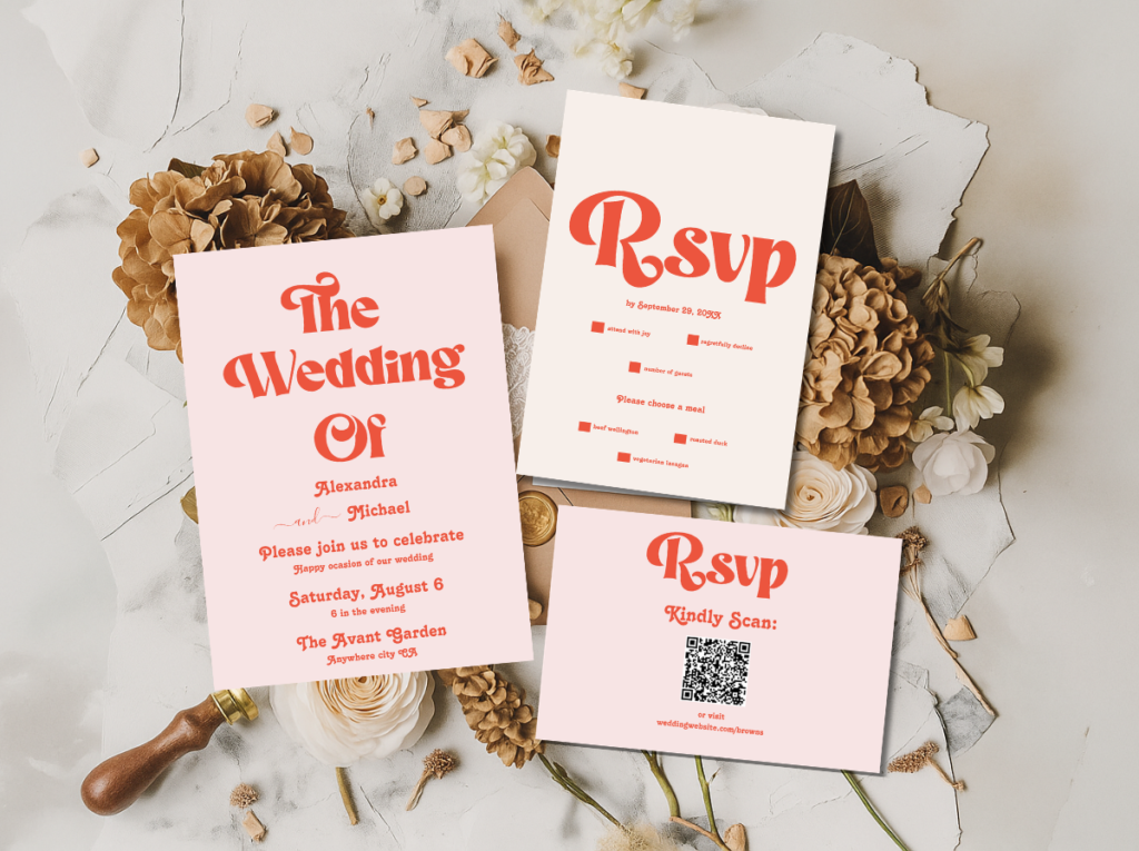
Mod Typography
Modern Retro Pink and Orange Typography
Bold typographic stationery in the Mod Typography MCM direction — the invitation as primary design object.
60s Adjacent
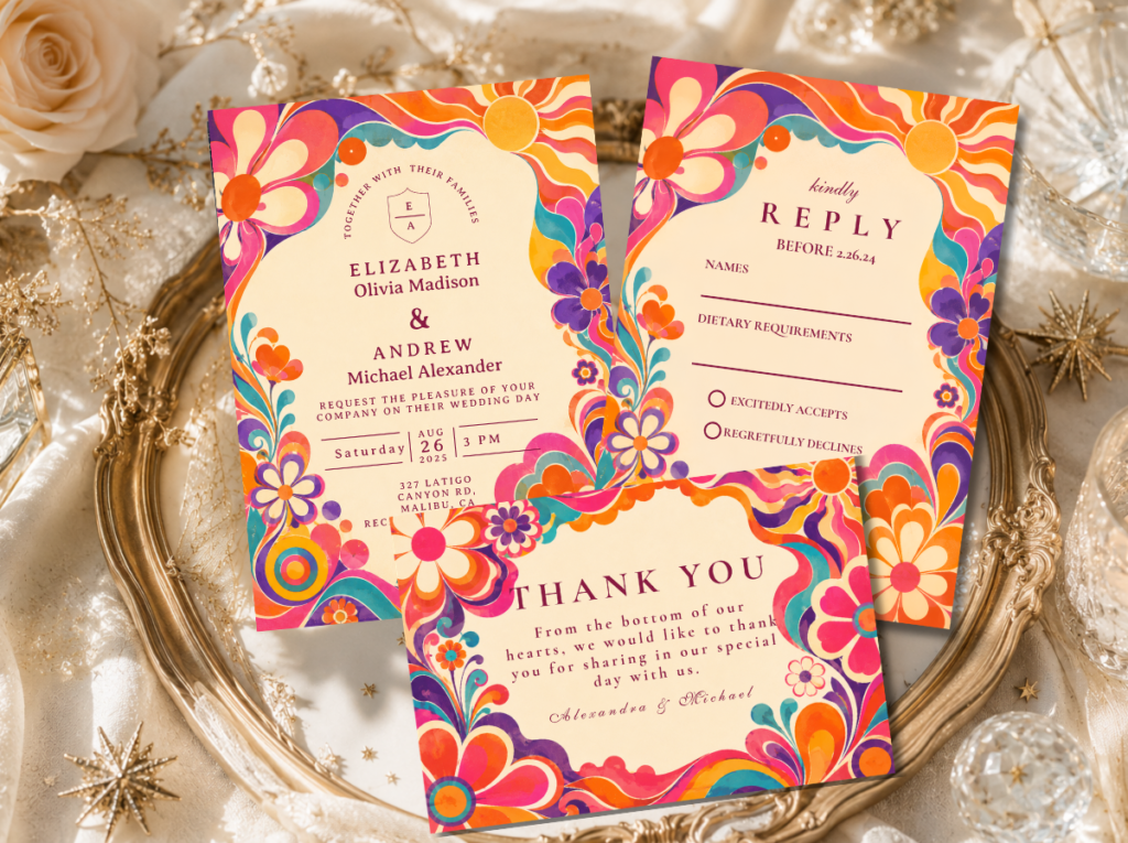
60s Wedding
The 60s Wedding category — the mod aesthetic most closely adjacent to the MCM direction, for the couple who wants graphic 60s energy alongside MCM restraint.
Full Retro Suite
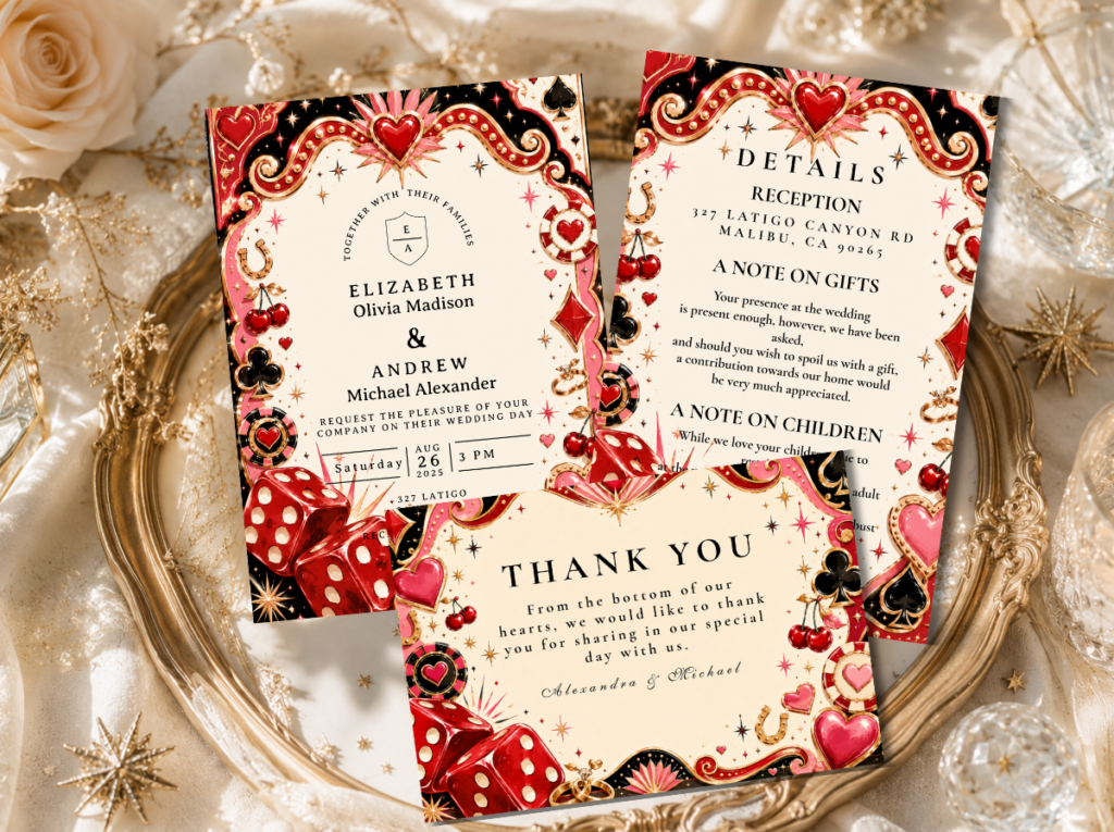
Retro Wedding
The full Retro Wedding category — warm, era-specific stationery across every retro wedding direction.
Browse the full MCM wedding stationery range — five collections and categories from Mad Men Elegance to Graphic Black and White to Palm Springs Desert.
Frequently Asked Questions
What is a mid-century modern wedding?
A mid-century modern wedding is a celebration aesthetic drawn from the design philosophy of the post-war modernist movement — the furniture design, architecture, graphic design, and domestic objects of approximately 1945 to 1969 — applied to a contemporary wedding as a governing design principle rather than as a period costume. It is characterised by clean geometric lines, a warm tonal palette (teal, mustard, coral, burnt orange, warm cream), natural materials in geometric forms, and the governing conviction that every element in the space should have a reason to be there. It is distinguished from general retro by its restraint and design precision: where retro is warm and nostalgic, MCM is clean and specifically intentional. The four MCM wedding directions — Mad Men Elegance, Graphic Black and White, Palm Springs, and Mod Typography — each apply this philosophy to a different palette and architectural register.
What colors are used in a mid-century modern wedding?
The MCM wedding uses four primary palette systems. The Classic MCM palette uses warm teal, golden mustard, coral, and warm cream — the most iconic and most immediately recognisable mid-century colour combination. The Desert MCM palette uses warm sand, sage green, terracotta, and warm white — the Palm Springs-adjacent direction. The Graphic MCM palette uses crisp black and warm white with a single bold accent colour — teal or coral — applied in one element per zone. The Warm MCM palette uses burnt orange, olive green, warm cream, and copper — the most autumnal direction. All four palettes share the quality of mid-level saturation: warm and confident rather than either muted or vivid, and always applied with restraint rather than abundance.
What is the difference between a mid-century modern wedding and a vintage wedding?
The distinction is one of governing principle. A vintage wedding is soft, nostalgic, and layered — characterised by warm muted tones, antique objects, lace and distressed surfaces, and the general quality of something that has aged beautifully. A mid-century modern wedding is clean, precise, and design-led — characterised by geometric form, warm saturated palette, natural materials in purposeful forms, and the quality of something that was designed rather than accumulated. Vintage reads as romantic and slightly faded; MCM reads as specifically and confidently of its design moment. The MCM wedding is the only retro aesthetic where the word ‘sophisticated’ applies without qualification — because it draws from a design philosophy rather than from a decade’s popular culture.
What venue is best for a mid-century modern wedding?
The MCM wedding is most at home in a space that already shares its design values: clean geometric proportions, absence of decorative architectural complexity, and the quality of a space where every structural decision was made with intent. A modernist building — with flat rooflines, large windows, and the clean proportional language of post-war architecture — is the ideal venue. An art gallery with white walls and polished concrete floors, a mid-century residential space with the period’s specific interior character, or an outdoor setting with visible modernist architecture as the ceremony backdrop all provide the architectural context within which the MCM decoration reads at its most powerful. The MCM wedding does not require a historic mid-century building; it requires a space that respects clean lines and does not compete with the decoration through its own ornamental complexity.
Clean Lines · Warm Palette · Quality Over Quantity · Design Intention
Shop Mid-Century Modern Wedding Stationery
Warm teal, mustard, coral, and geometric black and white — the most design-conscious stationery in the retro wedding collection.