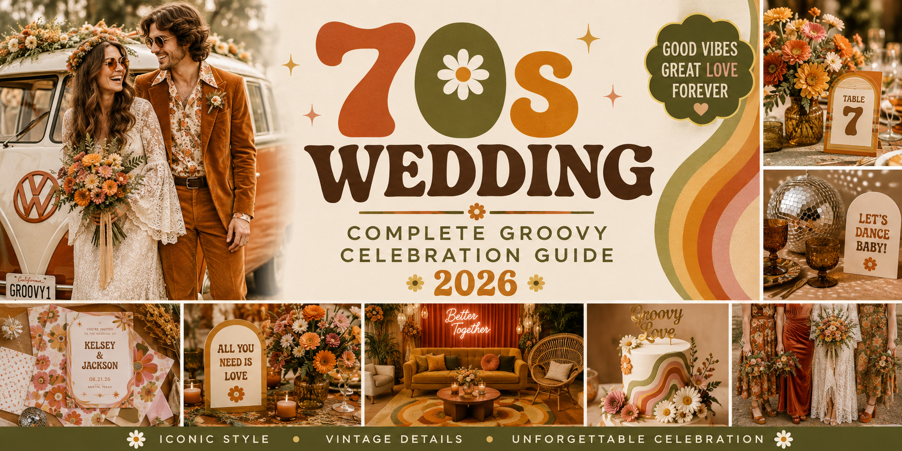
70s Wedding — Complete Groovy Celebration Guide 2026
Wedding Guide · 70s · Groovy · 2026
70s Wedding — Complete Groovy Celebration Guide 2026
Four 70s wedding aesthetics, the full earthy colour palette, ceremony and reception guidance, and everything from macramé arch to wildflower bouquet.
There is a specific quality of freedom that belongs to the 1970s wedding aesthetic and to no other decade — not the polished formality of the fifties, not the maximalist excess of the eighties, not the minimalist restraint of the nineties. The 70s wedding is warm, earthy, joyfully unstructured, and completely itself. It does not perform for the camera; it exists for the people in it. The wildflowers are real, the macramé is handmade, the dancing happens barefoot in a field as the sun goes down, and the whole celebration feels like it was woven from the landscape around it rather than installed into it.
The 70s wedding aesthetic has returned to contemporary wedding culture not as nostalgia but as philosophy: a celebration that values warmth over precision, natural materials over manufactured perfection, and personal authenticity over conventional expectation. Whether the specific direction is the iconic burnt orange and avocado earth palette, the refined muted terracotta and sage boho, the bold groovy pink and orange, or the maximalist kitschy direction, the 70s wedding is unified by a single quality: it feels alive.
“The 1970s was the decade that gave weddings back to the people getting married — earthy, unstructured, joyfully free. The 70s wedding does not aspire to perfection. It aspires to feeling completely, unmistakably alive.”
Section 01 What Is a 70s Wedding?
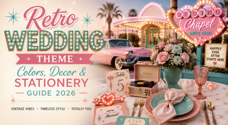
A 70s wedding is not a costume party set in the 1970s. It is a contemporary wedding that draws from the specific visual and philosophical language of the decade — and the distinction matters enormously. A costume party set in the 70s uses the decade’s most recognisable surface elements as props: oversized collars, lava lamps, disco balls, bell-bottom silhouettes. A 70s wedding uses the decade’s deeper aesthetic values as a design philosophy: warmth over coolness, natural over manufactured, unstructured over prescribed.
The visual language of the 70s wedding is built from earthy, muted tones that belong to the natural world rather than to the colour wheel of conventional wedding tradition. Burnt orange, avocado green, harvest gold, warm brown, and terracotta are the decade’s signature palette — the colours of a sunlit field, a terracotta pot, a dried flower arrangement, a field of wheat at harvest. These are not colours that read as ‘old-fashioned’ when applied correctly; they read as warm and specifically grounded in the natural world in a way that the cool neutrals and pastel palettes of more conventional weddings rarely do.
The material world of the 70s wedding is equally specific. Macramé — the knotted textile work that was the decade’s defining craft form — appears as ceremony arches, table runners, wall hangings, and hanging centrepieces. Wicker and rattan appear as chairs, vessels, and decorative objects. Pampas grass and dried botanical elements provide the textural backdrop. Wildflowers — unstructured, seasonal, imperfect — are the floral vocabulary. Natural wood, raw-edge timber, handmade ceramics, and woven textiles are the surface materials.
What distinguishes the 70s aesthetic from general boho — with which it is often confused — is the presence of decade-specific visual references that anchor the direction to a particular moment in time. The typography of the 70s invitation is distinctive: rounded, soft-edged letterforms with an organic quality that reads as immediately and specifically 1970s rather than as generically handmade. The pattern vocabulary — macramé texture, tile-inspired geometric print, vintage floral in earth tones — belongs to the decade rather than to a broader natural aesthetic. And the specific combination of burnt orange alongside avocado green is the chromatic signature that no other decade produced; it reads as 70s before any other design decision is made.
Section 02 Four 70s Wedding Aesthetics
The 70s wedding is not one aesthetic but four — four distinct interpretations of the decade’s visual vocabulary, each with its own palette, its own emotional register, and its own specific wedding application. The four directions below cover the full range from the iconic earth palette to the maximalist kitschy direction.
2.1 The Groovy Earth Aesthetic
The Groovy Earth direction is the most iconic and most immediately recognisable 70s wedding aesthetic — the one that most people visualise when they hear ‘70s wedding.’ Burnt orange and avocado green are the palette’s anchors; mustard yellow and warm brown are the secondary tones. Every element in this direction belongs to the warm, slightly dusty colour family of the decade’s most characteristic design output: the pottery, the wallpaper, the textile work, the printed ephemera that made the 1970s visually distinct from every decade before and after it.
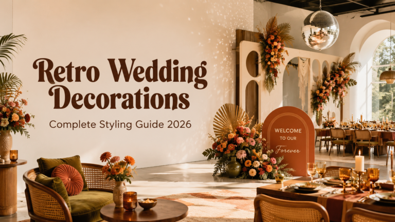
The Groovy Earth wedding ceremony unfolds in an outdoor setting where the landscape provides the backdrop and the decoration frames rather than replaces it. A macramé arch in natural jute or warm-toned cord, hung with dried wildflowers and pampas grass, provides the ceremony’s visual anchor. The aisle is wildflowers arranged loosely in terracotta pots at intervals, or dried botanical bundles tied with jute twine placed on hay bales. The reception tables carry the palette forward: burnt orange dahlias and sunflowers in warm-toned ceramic vessels on macramé runners, with retro-printed place cards and a groovy, rounded typeface on every printed element.
The Groovy Earth direction is the most versatile of the four: it works in outdoor countryside settings, in converted farm buildings with exposed timber, in sun-drenched gardens, and in any space with enough natural material and warm afternoon light to carry the earthy palette without fighting a cool or clinical venue aesthetic.
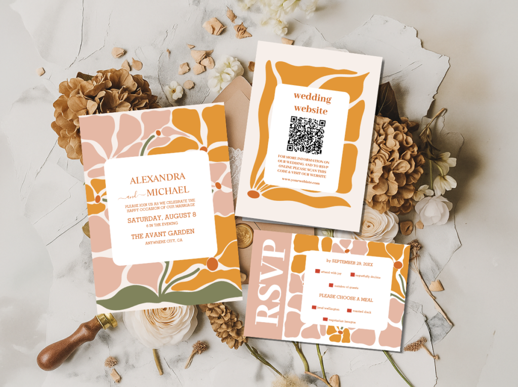
The 70s Groovy Wedding category and the Arch Modern Retro 70s Floral collection — the stationery starting point for the Groovy Earth aesthetic.
2.2 The Muted Boho 70s Aesthetic
The Muted Boho 70s direction takes the decade’s earthy palette and softens it into a more refined, more editorial register. Where the Groovy Earth aesthetic reads as warm and joyfully bold, the Muted Boho direction reads as warm and elegantly restrained: terracotta in its dustier, less saturated tone; sage green rather than avocado; warm cream as the primary base; copper as the metallic accent rather than the brighter warm gold. The result is a 70s wedding that reads as more contemporary in its styling while retaining the decade’s fundamental warmth and its commitment to natural materials.
The Muted Boho 70s wedding is the direction for the bride who loves the 70s aesthetic but wants a celebration that reads as elegant rather than exuberant — one that could appear in a current editorial spread as easily as it references the decade. The macramé is still present but in finer, more delicate knotwork; the wildflowers are still present but arranged with slightly more considered spacing; the palette is still warm but quieter, more like a faded photograph of the 70s than a full-colour reconstruction of it.
The stationery in the Muted Boho direction applies these softer tones to the same organic typography and natural-material aesthetic as the Groovy Earth direction, but at a lower visual temperature — terracotta on cream rather than burnt orange on warm white, sage detail rather than avocado accent.
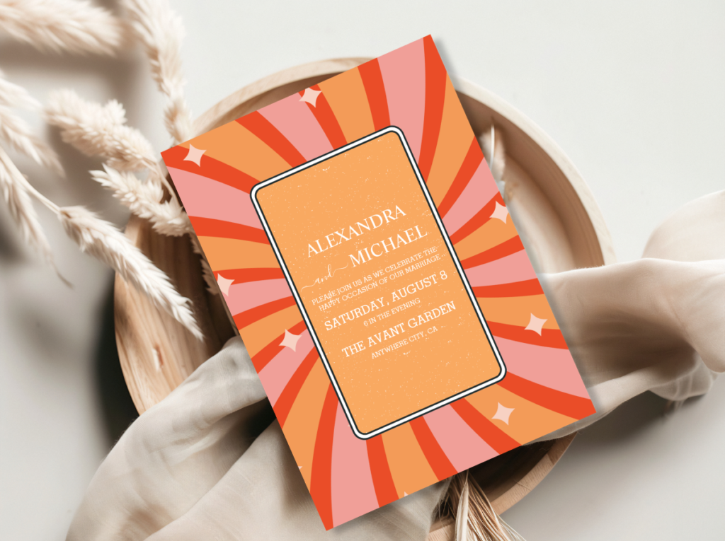
The Groovy 70s Muted Tones collection — terracotta, sage, and warm cream stationery for the most refined 70s wedding direction.
2.3 The Groovy Pink & Orange Aesthetic
The Groovy Pink and Orange direction is the most energetic and the most unapologetically joyful of the four 70s wedding aesthetics. Hot pink meets warm orange in a combination that reads as bold, celebratory, and specifically 1970s — the decade’s love of clashing warm brights applied to a wedding colour palette that refuses to be quiet or restrained. This is the direction for the bride who finds the earth palette’s warmth beautiful but wants more colour, more presence, more exuberance in her celebration.
The Groovy Pink and Orange wedding reads as a party from the moment the invitation arrives: warm orange and pink on a cream ground, in a rounded, retro typeface, with a floral or geometric pattern that immediately communicates the decade’s joyful visual energy. The ceremony flowers are hot pink cosmos and warm orange dahlias in loosely bundled arrangements. The reception is a explosion of warm colour: pink and orange blooms in terracotta vessels, orange-toned candles at varying heights, printed menus in the celebration’s groovy pink and orange palette.
The Pink and Orange direction works best in outdoor settings where natural light can activate the warmth of the palette — a sun-lit garden, a golden-hour field, a terracotta-walled courtyard — but it can also work in a well-lit interior with warm artificial lighting that prevents the pink and orange from reading as garish rather than warm.
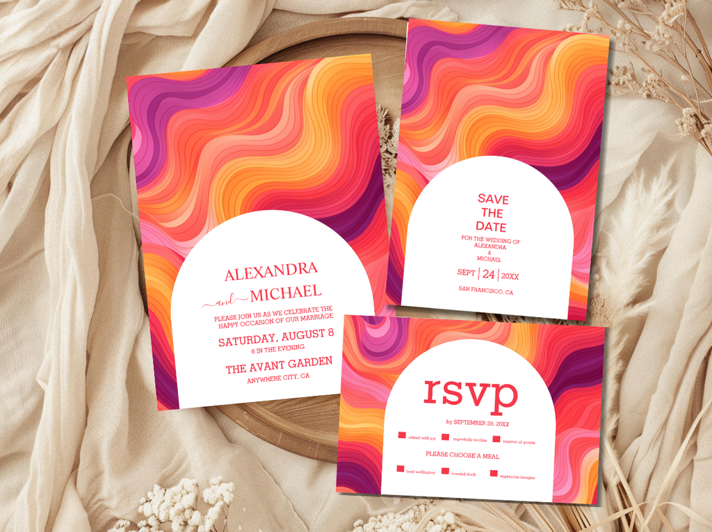
The Groovy Retro Pink and Orange Arch collection — hot pink, warm orange, and cream stationery for the most joyful 70s wedding direction.
2.4 The Kitschy 70s Aesthetic
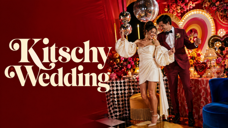
The Kitschy 70s direction is the 70s wedding at its most maximalist — the direction that embraces the decade’s love of pattern, bold typography, and unapologetic visual excess without apology or restraint. Clashing prints — a floral tablecloth beside a geometric chair cushion beside a tiled-print invitation — are not a mistake in the kitschy direction; they are the point. The visual excess is the aesthetic.
The Kitschy 70s wedding is the most demanding of the four directions to execute well, because the line between intentional maximalism and accidental visual chaos is a fine one. The key distinction is that every element in the kitschy direction should be individually beautiful within its own pattern or colour system; the clashing is produced by the juxtaposition of beautiful individual elements rather than by the combination of chaotic ones. A kitschy 70s table that works is one where every pattern, every colour, and every object would read as considered and beautiful in isolation, and where the combination produces a specific kind of joyful visual abundance rather than a confused aesthetic.
Bold retro typography — oversized, statement lettering in the rounded, organic style of the decade’s graphic design output — is the kitschy direction’s most distinctive stationery element. The invitation is a graphic design statement rather than a traditional wedding card.
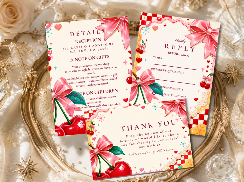
The Kitschy Wedding category — bold, maximalist 70s stationery for the most exuberant direction.
Section 03 70s Wedding Colour Palettes
Four specific palette systems, each corresponding to one of the four 70s wedding aesthetics above. The palette is the most powerful single design decision in the 70s wedding — it communicates the direction instantly and determines every subsequent choice.
3.1 Groovy Earth Palette
Burnt orange, avocado green, harvest mustard, and warm brown — the most iconic and most instantly recognisable 70s colour combination. All tones warm and slightly dusty rather than saturated and graphic. This palette reads as 70s before any other design element is added.
3.2 Muted Boho 70s Palette
Dusty terracotta, sage green, warm cream, and copper — the softer, more refined interpretation of the 70s earth palette. Every tone slightly faded and dusty rather than bold; the copper metallic replaces warm gold for a more editorial register.
3.3 Groovy Pink & Orange Palette
Hot pink, warm burnt orange, warm cream, and antique gold — the most energetic and most celebratory 70s colour combination. Warm and slightly dusty rather than neon; the orange anchors the pink and prevents it from reading as generically bright.
3.4 Kitschy 70s Palette
Burnt orange, hot pink, harvest gold, and avocado in combination — the maximalist mix that defines the kitschy 70s direction. No single tone dominates; the palette is the clashing itself, applied intentionally and joyfully across patterns and surfaces.
Section 04 70s Wedding Venue & Ceremony
The 70s wedding is almost always an outdoor celebration, or an indoor celebration that brings the outdoor world inside with such conviction that the distinction hardly matters. The ceremony setting for a 70s wedding should read as a part of the landscape rather than as something installed into it — a clearing in a woodland, a field at its most golden and abundant in late summer, a farm or countryside estate where the barn, the meadow, and the orchard all exist within the same ceremony walk.
The macramé ceremony arch. A macramé arch is the 70s ceremony’s most iconic single element — the one decoration that communicates the direction immediately and specifically. A well-made macramé arch in natural jute or warm-toned cord, hung with dried pampas grass at the arch’s upper edge and dried wildflower bundles at its sides, provides the ceremony’s focal point in a way that no floral arch can quite replicate: it is handmade, warm-toned, and specifically of its decade. The arch should be freestanding rather than attached to a venue’s existing architecture where possible, which allows it to be positioned in the landscape — at the edge of a meadow, between two old trees — rather than against a wall.
The wildflower aisle. The ceremony aisle in a 70s wedding is defined by wildflowers rather than by formal floral arrangement. Terracotta pots of mixed wildflowers — cosmos, cornflowers, marigolds, Queen Anne’s lace, dried lavender — placed at irregular intervals along the aisle’s length read as grown rather than arranged, which is the register this direction is looking for. Loose bundles of dried botanical material tied with jute twine and placed on the ends of hay bales work as aisle markers in the most authentically 70s farmstead context.
Hay bale seating. Hay bales covered in patterned blankets — woven throws in the palette’s earth tones, kilim-style printed rugs, macramé-edged textiles — are the most specifically 70s ceremony seating option available, appropriate for outdoor farm and countryside ceremonies. For a more formal venue with indoor elements, vintage wooden chairs in warm honey or walnut tones carry the decade’s natural material aesthetic into a setting that requires more structure than hay bales can provide.
The ceremony at golden hour. The 70s wedding’s most iconic photograph — the couple silhouetted against a warm, amber-toned sky as the sun sets behind them — requires a ceremony timing that places the vows in the hour before sunset. Planning the outdoor ceremony to begin sixty to ninety minutes before sunset allows the golden-hour light to be present for the processional, the vows, and the recessional, and for the photographs taken immediately after the ceremony to be lit by the specific warm amber quality of late-afternoon light that the 70s wedding aesthetic was practically designed to live in.
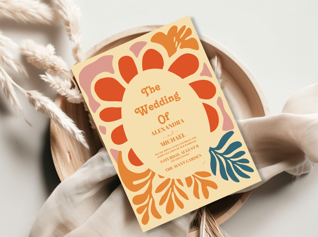
The 70s Groovy Wedding and Retro Wedding stationery categories — earthy, organic ceremony stationery in the full groovy direction.
Section 05 70s Wedding Decor & Reception
The 70s reception is a room — or a field, or a barn — where every surface speaks the same warm, handmade language. Nothing is matching in the conventional sense; everything belongs to the same earthy, joyful world.
Macramé table runners. A macramé runner down the centre of each reception table is the most immediately recognisable 70s table detail — and the most functional one, providing both the direction’s signature texture and a visual base for the centrepieces placed along it. Natural jute or warm-toned cord; wide enough to run half the table’s width; placed directly on the table surface or over a warm linen tablecloth in the palette’s cream or terracotta tone.
Wicker and rattan. Wicker and rattan details — wicker baskets used as bread baskets or favour holders, rattan charger plates, small rattan vessels holding individual wildflower arrangements — provide the decade’s specific material quality at the per-seat level. Rattan chiavari-style chairs or simple natural-wood ceremony chairs carry the material language from the ceremony into the reception without requiring a complete chair change.
Wildflower centrepieces. The 70s reception centrepiece is a wildflower arrangement in an earthy vessel — a terracotta pot, a wicker-wrapped glass jug, a raw-edge wooden container, a ceramic crock in warm brown or olive glaze — with the flowers arranged loosely rather than structured into a formal composition. Sunflowers, dahlias in burnt orange and warm yellow, cosmos, dried grasses, and pampas grass provide the floral vocabulary. The centrepieces should read as gathered from the surrounding landscape on the morning of the wedding rather than as designed by a florist, which means individual stems visible above the arrangement’s mass, visible foliage alongside the blooms, and no wire armature or foam visible beneath the arrangement.
Pampas grass installations. Large-scale pampas grass installations — in tall floor vases or vintage wicker urns at the reception’s entry, at the corners of the dance floor, or behind the couple’s table — are the 70s reception’s most architecturally significant decoration. The specific feathery, warm-toned quality of pampas grass provides scale without visual weight, height without formal stiffness, and seasonal abundance without the cost of large-scale fresh floral installations.
Bold retro typography signage. The 70s reception needs signage that reads as part of the aesthetic rather than as functional directional information. A large welcome sign in a rounded, organic retro typeface — white chalk on a dark wooden board, or printed on a warm cream poster with the invitation suite’s typeface and colour palette — sets the celebration’s typographic tone from the entry. Bar signs, menu boards, and table name signs should use the same typeface and the same groovy typographic character throughout, so that the printed language of the celebration reads as designed rather than as functional additions to an otherwise decorated space.
Section 06 70s Wedding Flowers
The 70s wedding bouquet is one of the most distinctive in the full spectrum of wedding floral directions — immediately recognisable by its specific combination of warm-toned blooms, dried elements, and the deliberate absence of the structural discipline that defines more conventional bridal bouquets. The 70s bride does not carry a sphere of roses tied with a satin ribbon. She carries something that looks like it was gathered from a wildflower meadow on the way to the ceremony.
Sunflowers. The sunflower is the 70s wedding’s most iconic single bloom — warm, abundant, and completely without self-consciousness. A bouquet that leads with sunflowers immediately reads as 70s regardless of what surrounds them, because the sunflower’s specific quality — its large face, its warm yellow, its association with summer abundance — belongs to the decade’s aesthetic in a way that more conventionally bridal blooms do not.
Dahlias in warm tones. Dahlias in burnt orange, deep terracotta, warm yellow, and chocolate-brown tones are the 70s wedding’s most sophisticated floral choice: they carry the palette’s depth, they photograph beautifully in golden-hour light, and they combine with dried elements and wildflowers without looking out of place. A bouquet of mixed warm dahlias with dried grasses and pampas tufts is the most editorial floral direction in the 70s category.
Chrysanthemums and cosmos. Chrysanthemums — particularly in warm orange, deep yellow, and burgundy tones — are an underused 70s wedding bloom with a specific decade association: they were a staple of the 1970s floral vocabulary and they bring an authentic period quality to an arrangement that deliberately-constructed ‘70s-inspired’ floristry sometimes lacks. Cosmos in warm pink, white, and magenta provide the loose, airy quality that prevents the bouquet from reading as too structured or too heavy.
Dried grasses and pampas. Dried botanical elements — pampas tufts, dried wheat stems, bleached seedpods, dried lavender, preserved eucalyptus — extend the palette’s warm, dusty quality into the floral design and provide the textural contrast that makes a 70s bouquet read as abundant and layered rather than as a collection of blooms. The dried elements also provide the bouquet’s ‘morning after’ quality — the sense that the flowers have been living in this world rather than freshly cut and structured for the day.
The deliberately unstructured bouquet. The binding technique of the 70s bridal bouquet is jute twine rather than satin ribbon — thick enough to be visible in the photograph, rough-textured rather than smooth, tied in a simple knot rather than a bow. The stems should extend below the bouquet’s binding point, left in their natural length rather than trimmed to uniform length. The arrangement itself should read as gathered rather than designed: different heights, different stem directions, the larger blooms visible above the smaller ones, and the dried elements woven through rather than placed at intervals.
Section 07 70s Wedding Stationery
The 70s wedding invitation is the first groovy signal — the piece of the celebration that arrives at a guest’s home weeks before the wedding day and communicates, in a single card, the entire aesthetic register of the celebration they are being invited to. A 70s wedding invitation that correctly executes the direction tells the guest: this will be warm, this will be earthy, this will be joyful, and this will be unlike any other wedding you have attended this year. The guest’s expectations — what to wear, what to feel, what kind of celebration awaits — are set entirely by the invitation before any other element of the wedding is experienced.
The typographic language of the 70s invitation is its most immediately distinctive feature. The rounded, organic letterforms of the decade’s graphic design output — soft-edged rather than sharp, warm rather than cool, flowing rather than geometric — produce an immediate decade reference that no other typographic style can replicate. When applied to a cream or warm-toned paper stock with earthy colour accents and a pattern element drawn from the decade’s visual vocabulary — a macramé-adjacent texture, a vintage floral in warm earth tones, an arch motif in the groovy 70s style — the result is an invitation that reads as specifically and beautifully 1970s from across the room.
The paper quality of the 70s invitation matters as much as its design. Textured, warm-toned card stock — slightly rough to the touch, warm ivory rather than bright white, with a weight that communicates the card’s importance — is the material equivalent of the macramé and the terracotta pot: it belongs to the warm, tactile, handmade world of the celebration rather than to the smooth, cool, manufactured world of conventional wedding stationery. The printed elements should be in earthy ink tones — warm brown, burnt orange, sage green, antique gold — rather than in black or bright white, so that the invitation reads as part of the 70s palette rather than as a conventional card with 70s decoration added.
The stationery suite should extend the invitation’s typographic and palette language through every printed element the guest encounters: the ceremony programme, the table name card, the printed menu, the place card, and the favour tag. The visual consistency of the stationery suite across every element is what produces the ‘designed celebration’ reading that distinguishes a wedding that was carefully considered from one that was assembled from individual decisions. The three collections and two categories below cover the full range of the 70s wedding stationery direction, from the Groovy Earth aesthetic to the Muted Boho to the Pink and Orange and the Kitschy direction.
70s Groovy Collection
Arch Modern Retro 70s Floral
A floral arch in the most iconic 70s wedding colour combination — warm orange, earthy green, and cream in a specifically 70s typographic style. The primary starting point for the Groovy Earth direction.
Muted Boho Collection
Groovy 70s Muted Tones
Softer, more refined 70s stationery in dusty terracotta, sage, and warm cream — the editorial 70s direction for the bride who wants the decade’s warmth at a lower visual temperature.
Pink & Orange Collection
Groovy Retro Pink and Orange Arch
Hot pink and warm orange in a groovy arch motif — the most joyful and most energetic 70s wedding stationery direction.
70s Groovy Category
70s Groovy Wedding
The full 70s Groovy Wedding category — earthy, rounded, and specifically 1970s stationery across every direction and every printed element.
Kitschy Direction
Kitschy Wedding
Maximalist, pattern-forward, boldly typographic — the 70s wedding stationery direction for the bride who wants more of everything.
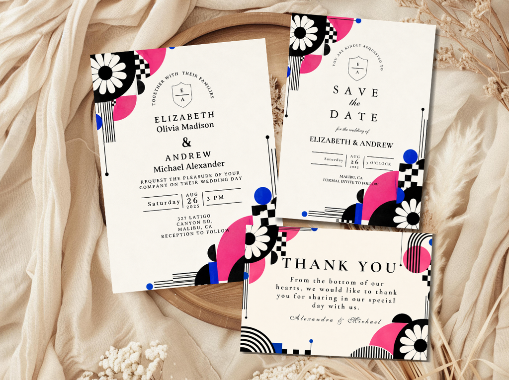
Browse the full 70s wedding stationery range — three collections and two categories from the Groovy Earth direction to the Kitschy maximalist.
Frequently Asked Questions
What is a 70s wedding theme?
A 70s wedding theme is a contemporary wedding aesthetic that draws from the visual and philosophical language of the 1970s: earthy, warm, joyfully unstructured, and committed to natural materials over manufactured perfection. The visual vocabulary includes a burnt orange and avocado green palette, macramé textile work, wildflower arrangements in terracotta vessels, pampas grass installations, and the specific rounded, organic typography of the decade’s graphic design. It is distinguished from general boho by the presence of specific decade references — the palette combination, the typographic style, the pattern vocabulary — that anchor the aesthetic to a particular moment in time rather than to a broader natural sensibility.
What colors are used in a 70s wedding?
The 70s wedding uses four primary palette systems depending on the chosen aesthetic direction. The Groovy Earth palette uses burnt orange, avocado green, harvest mustard, and warm brown — the most iconic 70s colour combination. The Muted Boho palette uses dusty terracotta, sage green, warm cream, and copper — a softer, more refined interpretation. The Pink and Orange palette uses hot pink, warm orange, cream, and antique gold — the most energetic direction. The Kitschy palette uses all of these in deliberate combination — the clashing of warm brights as the aesthetic itself. All four palettes share the same fundamental quality: warmth, earthiness, and a slightly dusty, muted tone rather than saturated graphic brightness.
What flowers are used in a 70s wedding?
The 70s wedding floral vocabulary centres on warm-toned wildflowers and dried botanical elements: sunflowers, dahlias in burnt orange and warm yellow, cosmos, chrysanthemums, marigolds, and dried grasses and pampas. The bouquet is deliberately unstructured — gathered rather than designed, bound with jute twine rather than satin ribbon, with visible stems extending below the binding point. Queen Anne’s lace, dried lavender, and bleached seedpods provide the airy quality that prevents the bouquet from reading as too heavy. The centrepieces use the same wildflower vocabulary in terracotta or ceramic vessels arranged loosely to read as gathered from the landscape rather than structured by a florist.
How do I make a 70s wedding look authentic rather than costume?
The distinction between an authentic 70s wedding aesthetic and a costume party set in the 70s lies in the depth of the reference rather than the specificity of it. An authentic 70s wedding uses the decade’s design philosophy — warmth over coolness, natural over manufactured, unstructured over prescribed — as the basis for every decision, and then applies decade-specific visual references — the palette, the typography, the macramé and rattan materials — as the expression of that philosophy. A costume-party 70s wedding uses the decade’s most recognisable surface elements as props without the underlying warmth and naturalism that make them feel authentic. The practical rule: every element in a 70s wedding should be able to exist in the world as a beautiful object outside the specific decade context, and the decade reference should be felt through the atmosphere of the celebration rather than declared by individual costume-like props.
Groovy · Earthy · Free-Spirited · Completely Yourself
Shop 70s Wedding Stationery
Earthy, rounded, and groovy — invitations, place cards, and full stationery suites for every 70s wedding direction.