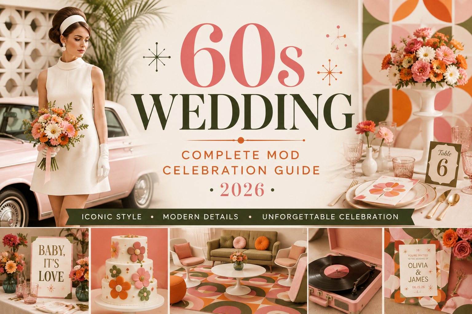
60s Wedding — Complete Mod Celebration Guide 2026
Wedding Guide · 60s Mod · 2026
60s Wedding — Complete Mod Celebration Guide 2026
Four mod aesthetics, the full graphic colour palette, ceremony and venue guidance, fashion direction, and the stationery that makes the 60s wedding the most visually confident celebration on the 2026 wedding circuit.
The 1960s is the decade that made graphic design a cultural force — bold, flat, geometric, and completely self-assured. The 60s wedding aesthetic draws directly from that visual confidence: clean lines over ornamentation, strong contrast over soft gradation, graphic pattern over floral romanticism, and a specific kind of stylishness that reads as modern even sixty years later. The 60s bride is not trying to look like something she has seen in a magazine; she is the magazine.
The return of the 60s wedding aesthetic to the top of the 2026 wedding trend cycle is not a coincidence. It reflects a broader cultural shift toward intentional design — weddings that look like they were considered from a graphic design perspective rather than assembled from a catalogue of conventional choices. The couples choosing the 60s direction in 2026 are couples who care about visual specificity, who can articulate exactly what they want their celebration to look like, and who are comfortable with a wedding that reads as distinctive rather than broadly accessible.
“The 1960s was the most visually confident decade in the history of design — bold, graphic, unafraid of contrast. A 60s wedding does not decorate; it designs. The invitation is a poster. The arch is a sculpture. The whole celebration is an act of visual intention.”
Section 01 What Is a 60s Wedding?
A 60s wedding is not a vintage wedding with a daisy motif and a vinyl soundtrack. The distinction matters enormously, and it begins with the word ‘vintage.’ Vintage in contemporary wedding culture connotes softness — lace, muted pastels, distressed wood, romantic blur. The 60s mod aesthetic is the opposite of all of this: graphic, crisp, bold-contrasted, and architecturally precise. Where vintage reads as nostalgic and soft-focused, 60s mod reads as razor-sharp and self-possessed.
The visual vocabulary of the 60s wedding is built from the decade’s graphic design output rather than from its domestic one. Op art and pop art — the hard-edged geometric abstraction of Bridget Riley, the bold flat colour of Roy Lichtenstein — provided the decade’s most distinctive visual language, and that language translates directly into a wedding aesthetic: strong black and white contrast, bold geometric pattern, flat planes of saturated colour, and the specific graphic confidence that comes from knowing exactly what you want the image to communicate. The 60s wedding table looks like a layout decision, not a decoration decision.
The specific cultural references that define the 60s wedding aesthetic are equally precise. The mod movement — the fashion and design culture that emerged from London in the early 1960s and produced the Swinging Sixties — gave the decade its most enduring visual signature: the shift dress, the geometric print, the bold graphic accessory, the specifically confident styling that reads as both of its time and completely contemporary. These references provide the 60s wedding with its editorial anchors: they are the specific images — the geometric-printed shift, the single statement mod accessory, the daisy in a graphic context — that tell the guest immediately what aesthetic world they are entering.
The 60s wedding is surging on Pinterest and wedding editorial platforms in 2026 for the same reason that mod fashion has re-entered the mainstream: it represents a specific kind of confidence that couples want their celebration to communicate. A 60s wedding says, explicitly and visually, that the people hosting it know what they like, know what they want, and are not interested in the softly generic. It is the most design-literate wedding aesthetic currently trending, and it is the one most likely to produce photographs that look intentional from every angle.
Section 02 Four 60s Wedding Aesthetics
The 60s wedding contains multitudes — four distinct aesthetic directions that all draw from the decade’s visual language but apply it to very different emotional registers. The direction that is right for one couple may be entirely wrong for another; the choice should be made based on the specific visual quality each couple wants their celebration to communicate.
2.1 The Mod Graphic Aesthetic
The Mod Graphic direction is the most iconic and most immediately recognisable 60s wedding aesthetic — the direction that most closely captures the visual confidence of the decade’s most specific design output. Black and white, in bold geometric pattern, is the palette’s foundation: crisp optical white and graphic black in a high-contrast combination that photographs as sharply as it reads in person. The ceremony backdrop is a geometric arch — a clean, architectural structure rather than a floral one — in black and white or in the palette’s single accent colour. The stationery is a graphic design object: bold sans-serif typography, strong visual hierarchy, a layout that reads as a poster rather than as a wedding invitation.
The Mod Graphic wedding table is the 60s aesthetic at its most design-led. White table linen, black graphic vessels containing single-variety floral arrangements — white daisies, white tulips, white anemones in graphic black pots — and printed menus and place cards in the bold typographic style of the invitation suite. The single accent colour — a bold graphic red, a flat electric pink — appears in one element per table: the place card, the napkin fold, the single bloom in a graphic bud vase. The restraint is the aesthetic; every element has a visual reason to be there.
This direction is the most demanding of the four in its execution requirements: black and white without softening reads as intended only when every element is consistent. A single conventionally romantic or soft element — a blush flower, a trailing ribbon, a vintage-style label — immediately breaks the graphic register and reads as an error rather than a decorative choice.
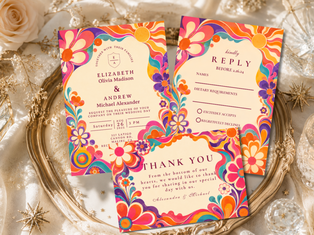
The 60s Wedding category and the Minimal Retro Arch Black and White collection — the stationery starting point for the Mod Graphic aesthetic.
2.2 The Pop Art Aesthetic
The Pop Art direction takes the 60s graphic language and applies it to a bold, joyfully saturated colour palette: electric blue, bold red, sunshine yellow, and white in flat, high-contrast planes of colour. Where the Mod Graphic direction is cool and precisely architectural, the Pop Art direction is warm and exuberantly celebratory — the 60s at its most joyful and its most unapologetically colourful. This is the direction for the couple who wants a celebration that photographs as vibrant and specifically of its aesthetic as the most memorable images of the decade.
The Pop Art wedding reception reads as a designed installation: bold-coloured linen on circular tables — one table in electric blue, one in sunshine yellow — with white graphic centrepieces and printed menus in the pop art palette. Signage is large-scale, typographically bold, and deliberately statement-making: a welcome sign in sunshine yellow with graphic navy lettering, a menu board in bold red with white type. The flowers are carnations in saturated colour — single-variety, single-colour arrangements in graphic graphic vessels that read as sculptural objects rather than floral arrangements.
The Pop Art direction is the most high-energy of the four 60s aesthetics and the most suited to evening receptions and larger guest lists, where its specific visual energy has space to fill a room. In an intimate daytime setting, the saturated palette can read as overwhelming rather than celebratory; in a well-scaled evening venue, it reads as the most vivid and most memorable celebration aesthetic of the year.
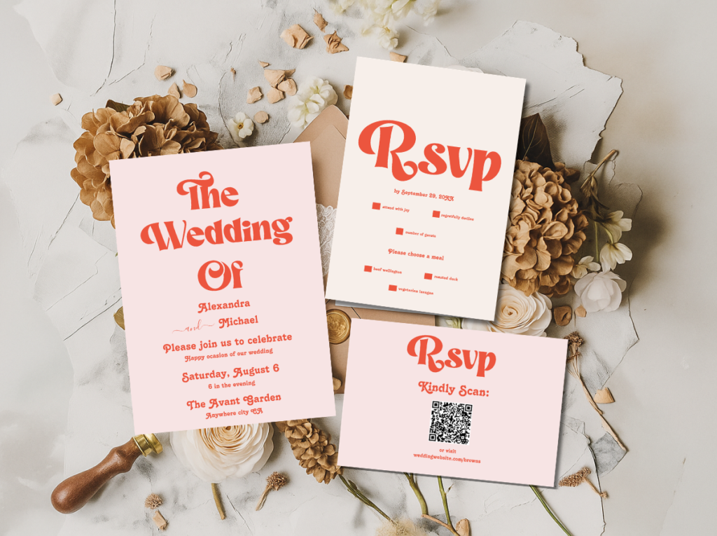
The Modern Retro Pink and Orange Typography collection — bold typographic stationery in the pop art direction.
2.3 The Twiggy Elegant Aesthetic
The Twiggy Elegant direction applies the 60s aesthetic to its most sophisticated and most refined register: the clean-lined elegance of the decade’s high fashion moment translated into a wedding celebration that reads as both specifically of its decade and completely contemporary. The palette is warm white, camel, mod gold, and nude — the neutral, slightly warm-toned combination that reads as elegant rather than graphic, refined rather than bold. The silhouettes are clean and architectural rather than romantic and draped.
The Twiggy Elegant wedding is the 60s direction most suited to more formally styled celebrations: an art gallery venue with clean white walls and polished concrete floors, a modernist building with large windows and architectural interior lines, or an outdoor ceremony setting where the architecture of the venue provides the geometric backdrop rather than requiring the decoration to create it. The ceremony elements are spare and deliberately placed: a single geometric arch in warm white or mod gold, a daisy aisle with blooms placed at precise intervals rather than in the loose wildflower style of the previous decade’s aesthetic.
The Twiggy Elegant reception table is a study in precise restraint: clean white linen, single-stem white blooms in bud vases at regular intervals along the table’s length, warm gold flatware, and stationery in the most refined typographic style of the decade’s fashion editorial output. Nothing is ornamental; everything is structural.
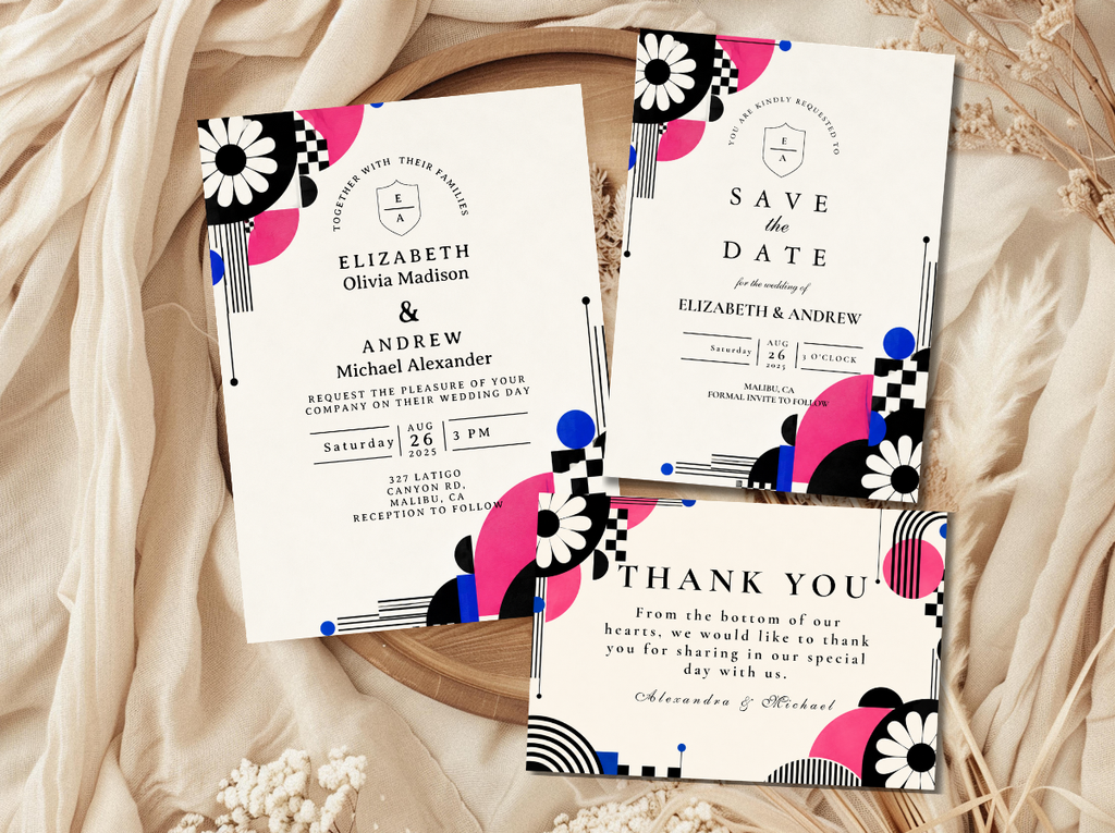
The 60s Wedding category — refined mod stationery in the Twiggy Elegant direction.
2.4 The Mid-Century Adjacent Aesthetic
The Mid-Century Adjacent direction sits at the intersection of 60s mod and mid-century modern design — the aesthetic space where the decade’s graphic confidence meets the warmer, more domestic palette of the post-war design movement that preceded it. Warm teal and mustard are the palette’s anchors, with coral and warm cream as the secondary tones: a combination that reads as geometric and design-led while carrying a warmth that the pure Mod Graphic direction deliberately avoids.
The Mid-Century Adjacent wedding is the 60s aesthetic direction most suited to couples who are drawn to the decade’s graphic language but want a celebration that reads as warm and welcoming rather than cool and architectural. The venue references are mid-century modern architecture — buildings with flat rooflines, large windows, and clean geometric proportions — but the decoration within them is warmer than the pure 60s graphic direction: teal and mustard blooms alongside white daisies, geometric patterned textile elements alongside clean white linen, warm wood details alongside the direction’s metallic accents.
The Mid-Century Adjacent aesthetic is the most broadly accessible of the four 60s directions — the one that the widest range of guests will find both beautiful and welcoming — while retaining the graphic specificity that makes the 60s wedding distinct from any other aesthetic.
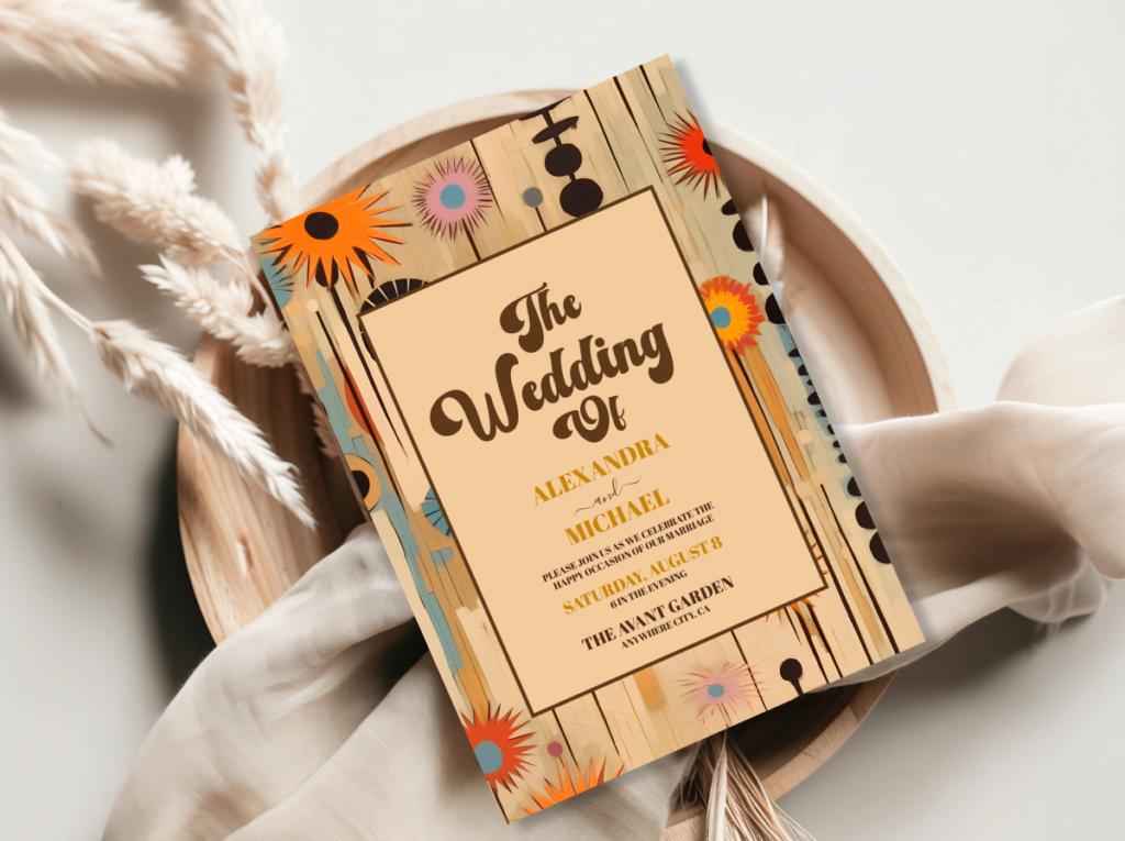
The Mid-Century Modern Wedding category — warm geometric stationery where 60s mod meets mid-century design.
Section 03 60s Wedding Colour Palettes
Four palette systems, each corresponding to one of the four 60s wedding aesthetics. The palette is the most immediate signal of the chosen direction — it communicates the aesthetic register before any other design element is registered.
3.1 Mod Black & White Palette
Crisp white and graphic black — the highest-contrast combination available — with bold graphic red as the single accent colour. Every tone flat and saturated rather than graduated or tinted. The palette that most immediately reads as 60s mod from across the room.
3.2 Pop Art Palette
Electric blue, bold red, and sunshine yellow on white — the flat, saturated primary colour combination of the decade’s most joyful design output. No muted or dusty tones; every colour at full saturation, applied in solid planes rather than gradients.
3.3 Twiggy Elegant Palette
Warm white, camel, mod gold, and nude — the most refined and most quietly sophisticated 60s palette. No black; the graphic quality comes from the clean geometric lines of the design rather than from colour contrast. Warm metallic rather than cool.
3.4 Mid-Century Mod Palette
Warm teal, mustard yellow, coral, and warm cream — the most welcoming and most broadly appealing 60s palette direction. Geometric confidence delivered through warm rather than cool colour, producing a celebration that reads as design-led without reading as cool or clinical.
Section 04 60s Wedding Venue & Ceremony
The 60s wedding’s venue relationship is the inverse of the 70s wedding’s: where the 70s aesthetic is most at home in a natural outdoor setting that provides its own organic backdrop, the 60s aesthetic is most at home in a built environment that provides architectural lines and geometric surfaces. The ideal 60s wedding venue has structure — clean walls, deliberate proportions, architectural detail — that the decoration can work with rather than against.
Art gallery and modernist spaces. A white-walled gallery space is the most natural home for the 60s wedding aesthetic: the clean white surfaces provide the graphic backdrop that the decoration requires, the architectural proportions provide the scale that mod-style installation elements need to read correctly, and the venue’s existing association with visual art and design lends an editorial quality to the celebration that more conventional venues cannot replicate. Mid-century modern buildings — with their flat rooflines, large windows, and clean geometric proportions — provide the same architectural quality in a domestic rather than institutional context.
The geometric ceremony arch. The 60s ceremony arch is not a macramé structure draped with wildflowers; it is a clean geometric form — a circle, a bold rectangular frame, a hexagonal or octagonal structure — in white, black, or the palette’s single accent colour. The arch should read as an architectural object rather than as a decorated structure: its form is the design, and the floral or typographic elements placed against or within it are secondary to the geometry of the form itself. A simple white circular arch with a single bold graphic welcome statement is more effectively 60s than a heavily decorated structure in the wrong aesthetic register.
Daisy aisle arrangements. Daisies are the 60s wedding’s floral signature — the bloom that most immediately reads as the decade’s most specific floral reference — and the ceremony aisle is where they should be placed most intentionally. In the Mod Graphic direction, white daisies in graphic black circular pots at precise intervals along the aisle’s length produce the visual cadence of a graphic pattern. In the Pop Art direction, coloured daisies in the palette’s accent tones at wider intervals produce the bold colour punctuation the direction requires. In all directions, the placement should be precise and deliberate rather than loose and organic.
Graphic ceremony signage. The 60s ceremony requires signage that reads as a design decision rather than as a directional necessity. A bold, typographically precise welcome sign in the palette’s primary colour and the invitation suite’s typeface placed at the ceremony’s entry sets the graphic register from the first moment. Order-of-service cards printed in the same bold typographic style as the invitation suite carry the graphic language through the ceremony itself. Every printed element should belong to the same visual system, because the 60s aesthetic’s power comes from consistency rather than from individual decorative decisions.
60s Wedding and Retro Wedding stationery — bold, graphic mod ceremony stationery.
Section 05 60s Wedding Decor & Reception
The 60s reception is a room where graphic design principles — hierarchy, contrast, repetition, alignment — are applied to the physical space with the same rigour they would be applied to a printed layout. Everything is deliberate. Nothing is accidental.
Geometric table styling. The 60s reception table applies the direction’s graphic language at the surface level: clean white or solid-colour linen in the palette’s primary tone, graphic-patterned napkins in the accent colour, and a precisely arranged table setting where the placement of every element — the cutlery, the glassware, the place card, the single bloom in its graphic bud vase — reads as a layout decision. Nothing is draped, layered, or softened. The graphic quality of the 60s table comes from precision rather than from abundance.
Bold graphic prints. Patterned textile elements — a graphic-print table runner in the palette’s geometric pattern, a mod-print seat cushion on each chair, a geometric-patterned table overlay in the accent colour — provide the 60s reception’s pattern language without compromising the clean, precise quality of the overall aesthetic. The pattern should be geometric rather than organic: hard-edged, repeating, and applied to a flat surface rather than draped or gathered in a way that loses its graphic precision.
Daisy centrepieces in graphic vessels. The daisy centrepiece in the 60s reception is not a loosely arranged wildflower bunch in a terracotta pot; it is a single-variety arrangement in a graphic vessel that reads as sculptural. White daisies in a black ceramic cylinder, yellow-centred daisies in a white circular pot, white anemones in a bold geometric vessel — the vessel is as important as the bloom, and both should read as design decisions. The arrangements should be at a consistent, precise height across all tables, so that the reception room reads as a designed environment rather than as a collection of individual table decorations.
Mod typography signage. Every piece of directional and informational signage in the 60s reception — the bar sign, the menu board, the table name card, the seating chart — should be in the bold typographic style of the invitation suite, so that the printed language of the celebration reads as a single coherent design system. Large-format signage — a welcome poster at the reception’s entry, a bold graphic menu board at the food station — is an opportunity to use the space’s scale to make the typographic statement that smaller-format stationery cannot. A large bold sans-serif welcome graphic in the palette’s primary colour is the 60s reception’s most immediately impactful single design decision.
Section 06 60s Wedding Flowers
The 60s wedding floral vocabulary is the opposite of the 70s wedding’s: where the 70s aesthetic requires wildflowers that look gathered and unstructured, the 60s aesthetic requires arrangements that look designed — single-variety, precisely placed, and chosen as much for their graphic quality as for their botanical beauty.
Daisies. The daisy is the 60s wedding’s signature bloom — the flower that most immediately and most specifically reads as the decade’s floral language. Its clean, graphic form — the flat white petals radiating from a bold yellow centre — is itself a geometric abstraction: it looks like something that could have been designed by the decade’s graphic artists rather than grown in a garden. In the Mod Graphic direction, white daisies in black graphic vessels; in the Pop Art direction, coloured gerbera daisies in the palette’s accent tones; in the Twiggy Elegant direction, white daisies at precise intervals in clean white bud vases. The daisy is the only 60s wedding bloom that works across all four aesthetic directions.
Single-variety bold arrangements. The 60s floral arrangement principle is the opposite of the layered, mixed-variety bouquet: single variety, single colour, precisely arranged to read as a mass of one visual element rather than as a composition of several. White tulips arranged in a perfect sphere in a graphic vessel read as a designed object rather than as a flower arrangement; mixed tulips and wildflowers in the same vessel read as general flower arrangement. The single-variety principle applies at every scale, from the single stem in a bud vase to the ceremony installation.
Graphic geometric floral installations. Large-scale floral installations in the 60s wedding context are geometric rather than organic: a circular frame covered in white daisies, a rectangular panel of white blooms in a precise grid arrangement, a hexagonal arch covered in single-variety flowers in the palette’s accent colour. These installations read as graphic design objects that happen to be made of flowers rather than as floral arrangements that happen to be geometric — the distinction is one of primary intention, and it is what makes them authentically 60s rather than generically contemporary.
Carnations in pop art colours. Carnations — the bloom that acquired an unfortunate generic association in the late twentieth century — are experiencing a significant editorial rehabilitation in contemporary wedding floristry, and they are specifically appropriate to the 60s pop art direction. In bold, saturated colours — electric pink, vivid red, bright orange — and arranged in single-variety masses in graphic vessels, carnations deliver the pop art palette at the floral level with a precision and a colour intensity that more ‘premium’ blooms often cannot match. They are also among the most photogenic blooms available in saturated colour, which makes them the most effective pop art floral choice for a celebration that will be extensively photographed.
Section 07 60s Wedding Fashion
The 60s bridal silhouette is as specific as the decade’s graphic design output — and it is as immediately recognisable. The shift dress — a straight, unwaisted silhouette that falls from the shoulder to above or at the knee — is the decade’s most iconic bridal form and the one that most clearly communicates the mod aesthetic’s rejection of the corseted, full-skirted romanticism of the decade that preceded it. The A-line mini or midi — slightly more structured than the shift but maintaining the same clean, geometric relationship to the body — is the alternative silhouette that works across all four 60s aesthetic directions.
The shift dress. The shift is the most authentically 60s silhouette: clean, unstructured at the waist, architectural in its relationship to the body, and completely opposed to the romantic, corseted vocabulary of conventional bridal wear. In white or warm ivory for the Mod Graphic and Twiggy Elegant directions; in the palette’s accent colour or in a geometric-patterned textile for the Pop Art and Kitschy directions. The hem falls above the knee for the most specifically mod reading, or at the midi length for a slightly more formal application of the same clean-lined principle.
The pillbox hat. The structured pillbox hat — worn slightly forward on the head, in white or in the palette’s accent colour — is the 60s bridal accessory that most immediately communicates the decade’s aesthetic reference. It requires a specific kind of confidence to carry; on the right wearer, it reads as the most precisely styled bridal look of any decade. A simpler graphic bow headband or a clean geometric hair accessory in the palette’s metallic tone provides the same decade reference at a lower visual stakes.
Kitten heels and graphic accessories. Kitten heels in white, nude, or the palette’s accent colour are the footwear choice most consistent with the 60s bridal aesthetic: low-heeled, architecturally clean in their silhouette, and specifically of the decade’s fashion moment. Bold graphic accessories — a single oversized mod earring, a bold geometric brooch at the neckline, a structured clutch in the palette’s accent colour — are the statement elements that should be chosen in maximum two, so that the overall look reads as precisely styled rather than as an accumulation of decade references.
Section 08 60s Wedding Stationery
The 60s wedding invitation is not a card that announces a wedding; it is a graphic design object that communicates the entire visual register of the celebration in a single printed piece. The difference between a 60s invitation and a conventional wedding invitation is the same as the difference between a poster and a notice: one is a designed artifact, the other is a piece of information. Every decision in the 60s invitation — the typeface, the layout hierarchy, the use of colour and white space, the relationship between the graphic element and the typographic element — is a design decision made with the same rigour that a graphic designer applies to a commercial brief.
The typographic language of the 60s invitation is its primary design element — and it should be treated as such. Bold, clean sans-serif letterforms at a large scale, in high contrast against the card’s ground colour, with a clear visual hierarchy that guides the eye from the most important information (the couple’s names, at the largest size) to the secondary information (date, time, venue, at progressively smaller sizes). The 60s invitation’s typography should read as a layout decision rather than as a typesetting one: the scale, weight, and placement of the type are as intentional as the pattern or graphic element that accompanies it.
The paper quality of the 60s invitation should support rather than soften the graphic quality of the design. A smooth, heavyweight card stock in crisp white or the palette’s primary tone — flat rather than textured, with a clean edge rather than a deckle — is the appropriate material choice. Textured or rough-edged paper belongs to the 70s and boho aesthetic; the 60s invitation is printed on something that feels as precisely made as it looks. The printing finish should be flat or slightly matte rather than glossy, which photographs as more graphic and less commercial.
The stationery suite extends the invitation’s graphic language through every printed element of the celebration: the ceremony programme as a bold typographic broadsheet, the place card as a small graphic object in the palette’s accent colour, the menu as a precisely laid-out single-page document in the invitation’s typeface and colour system, the favour tag as a miniature poster. The consistency of the typographic system across every printed element is what makes the 60s celebration read as designed rather than as decorated — and it is what guests will notice and remember as the specific quality that made the whole event feel considered.
Mod Graphic
Minimal Retro Arch Black & White
The most iconic and most precisely mod stationery direction — bold graphic contrast in the 60s wedding’s most authentically sharp aesthetic.
Pop Art Typography
Modern Retro Pink & Orange Typography
Bold typographic stationery in the pop art colour register — the most joyful and most energetically graphic 60s wedding stationery direction.
60s Category
60s Wedding
The full 60s Wedding stationery category — graphic, bold, and specifically mod across every direction and every printed element.
Mid-Century Adjacent
Mid-Century Modern Wedding
Warm geometric stationery at the intersection of 60s mod and mid-century modern design — the most welcoming graphic direction.
Browse the full 60s wedding stationery range — two collections and two categories from Mod Graphic to Mid-Century Adjacent.
Frequently Asked Questions
What is a 60s mod wedding?
A 60s mod wedding is a contemporary wedding aesthetic drawn from the visual language of the 1960s mod movement — specifically, the graphic, bold, architecturally precise design culture that emerged from London in the early part of the decade. It is characterised by strong geometric form, high-contrast palette, bold typography, and a specific kind of visual confidence that reads as both of its decade and completely contemporary. It is distinguished from general vintage by its sharpness: vintage reads as soft and nostalgic, 60s mod reads as graphic and self-possessed. The four main 60s wedding directions — Mod Graphic, Pop Art, Twiggy Elegant, and Mid-Century Adjacent — each apply this visual language to a different palette and emotional register.
What colors are used in a 60s wedding?
The 60s wedding uses four primary palette systems. The Mod Black and White palette uses crisp white and graphic black with bold red as the accent. The Pop Art palette uses electric blue, bold red, and sunshine yellow on white — flat, saturated, and at full colour intensity. The Twiggy Elegant palette uses warm white, camel, mod gold, and nude — the most refined and most quietly sophisticated direction. The Mid-Century Adjacent palette uses warm teal, mustard, coral, and cream — the most welcoming and most broadly appealing geometric direction. All four palettes share the characteristic of being applied in flat planes of colour rather than in gradients or soft washes.
What flowers are used in a 60s wedding?
The daisy is the 60s wedding’s signature bloom and the one that most immediately reads as the decade’s floral language — its clean, graphic form reads as geometric abstraction as much as botanical specimen. It works across all four 60s aesthetic directions: white in graphic black vessels for the Mod direction, coloured gerbera varieties for the Pop Art direction, precise white arrangements for the Twiggy Elegant direction, teal and mustard blooms for the Mid-Century direction. Beyond daisies, single-variety arrangements in graphic vessels, carnations in saturated pop art colours, and geometric floral installations with precise, architectural rather than organic structure are the key floral principles.
How do I make a 60s wedding look authentic rather than costume?
The distinction between an authentic 60s wedding aesthetic and a costume party set in the 1960s lies in the underlying design principle rather than the surface reference. An authentic 60s wedding applies the decade’s graphic design philosophy — strong visual hierarchy, bold contrast, precise geometric form, typographic intention — to every element of the celebration, and allows the decade-specific visual references (the daisy, the shift silhouette, the bold sans-serif type) to emerge naturally from that philosophy. A costume-party 60s wedding applies the decade’s most immediately recognisable surface elements — lava lamps, oversized sunglasses, peace symbols — as props without the underlying design rigour. The practical test: if every element of the celebration could exist as a beautiful designed object outside the specific decade context, and the decade reference is felt through the aesthetic quality of the whole rather than declared by individual props, the result is authentic.
Graphic · Bold · Designed · Completely Itself
Shop 60s Wedding Stationery
Bold, graphic, and specifically mod — invitations, place cards, and full stationery suites for every 60s wedding direction.