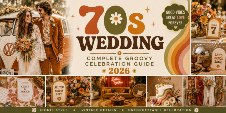
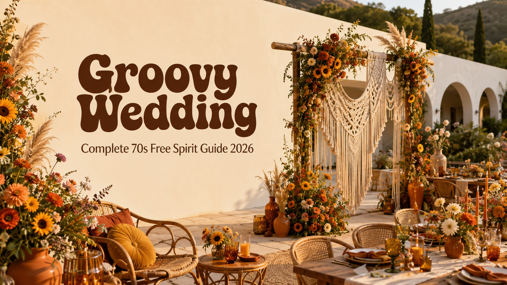
Groovy Wedding — Complete 70s Free Spirit Guide 2026
Wedding Guide · Groovy · Free Spirit · 2026
Groovy Wedding — Complete 70s Free Spirit Guide 2026
Four groovy aesthetics, the full earthy and bold palette, wildflower florals, and the typographic stationery that makes the groovy wedding the most joyfully free-spirited celebration in 2026.
Groovy is a word that has returned to contemporary wedding culture with its original meaning intact: not as a nostalgic reference to a decade, but as a description of a quality — a warmth, a looseness, a joyful refusal to take itself too seriously while still caring deeply about every decision it makes. The groovy wedding is warm and earthy and free-spirited, and it feels, above all else, like a celebration. Not a ceremony with a party attached, not a photographic event with dinner, but an actual celebration: the kind that everyone who attends remembers as the most alive wedding they have been to in years.
The groovy wedding aesthetic draws from the late 1960s and early 1970s — the specific crossover moment when the decade’s peace-and-love philosophy was producing its most distinctive visual output. Earthy palettes in warm, slightly dusty tones. Rounded, confident typography with a warmth and organic quality that no digital typeface has quite captured. Botanical and natural motifs that reference the era’s deep connection to the natural world. And the specific quality of a celebration that feels handmade, chosen, and specific to the people hosting it rather than assembled from a catalogue of conventional choices.
“Groovy is not a decade. It is a temperature — warm, free-spirited, and completely itself. A groovy wedding does not perform joy; it is joy. Every wildflower, every macramé knot, every warm earthy tone is a decision to celebrate fully rather than carefully.”
Section 01 What Is a Groovy Wedding?
The groovy wedding is not exactly a 70s wedding, though it draws from the same decade’s visual and philosophical source material. The distinction is one of temperature and register: the 70s wedding is earthy and grounded, drawing from the decade’s most characteristic design output — the burnt orange and avocado palette, the macramé, the pampas grass — with a faithfulness to the decade’s specific visual language. The groovy wedding is warmer and more playful, more typographically bold, more openly joyful, and more willing to take the decade’s spirit and run with it in a contemporary direction. Where the 70s wedding says ‘this is what that decade looked like,’ the groovy wedding says ‘this is how that decade felt.’
The word ‘groovy’ itself — originally used to describe a feeling of being in the flow, in the groove, of everything working beautifully and naturally together — is the most precise description of what the groovy wedding aesthetic attempts to produce in the person attending it. A groovy wedding feels good in the way that a summer afternoon feels good: warm, unhurried, full of colour and life and the specific pleasure of being exactly where you are. It is the aesthetic of a celebration that has decided to prioritise feeling over appearance, warmth over precision, and the joy of the gathered community over the perfection of any individual designed element.
What distinguishes the groovy wedding from general boho — the wider natural and earthy wedding aesthetic with which it shares some visual vocabulary — are three things. The typography: the groovy wedding uses bold, rounded, specifically retro letterforms that read as of-an-era rather than as timeless or handwritten. The palette: the groovy wedding uses warm, saturated earth tones rather than the muted, tonal neutrals of the broader boho aesthetic. And the energy: the groovy wedding is joyful and slightly irreverent, with a sense of humour about itself that the more earnest boho aesthetic rarely permits.
The groovy wedding is one of the most significant wedding trends of 2026 for the same reason that the broader retro aesthetic movement is dominating contemporary wedding culture: it represents a values shift from perfectionism to authenticity, from tonal elegance to warm colour, from the photograph-first mentality of the neutral palette wedding to the experience-first mentality of a celebration designed to feel as good as it looks. The groovy wedding is the most complete expression of this shift: warm, free-spirited, typographically bold, and completely uninterested in being mistaken for anything other than exactly what it is.
Section 02 Four Groovy Wedding Aesthetics
Four distinct groovy directions, each drawing from the same warm, free-spirited design philosophy and applying it to a different palette and emotional register. The governing quality across all four: warmth, joyful confidence, and the specific energy of a celebration that is not trying to look like any other celebration on anyone’s calendar.
2.1 The Groovy Earth Aesthetic
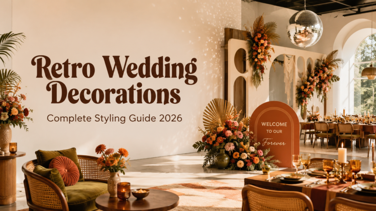
The Groovy Earth direction is the most iconic and most immediately recognisable groovy wedding aesthetic — the direction that leads with the decade’s most characteristic palette and material vocabulary. Burnt orange, avocado green, harvest mustard, and warm brown in the warm, slightly dusty tones of the era’s most beloved design objects. Macramé as the ceremony and table’s primary textile element. Wildflowers in earthy vessels. Pampas grass in abundance. Bold retro typography on every printed element. The Groovy Earth direction is the groovy wedding at its most fully committed to the decade’s specific visual world, and it is the most photogenic of the four aesthetics because every element is so specifically of its era and so warmly beautiful in outdoor natural light.
The Groovy Earth aesthetic is also the most universally loved of the four groovy directions: its warmth is immediately accessible, its colour combination is the most iconic available within the 1970s design vocabulary, and its material world — jute, macramé, terracotta, dried botanical — is the most immediately legible as ‘groovy’ to a guest who may not be familiar with the finer distinctions of the retro wedding aesthetic landscape. If in doubt about which groovy direction to choose, choose this one.
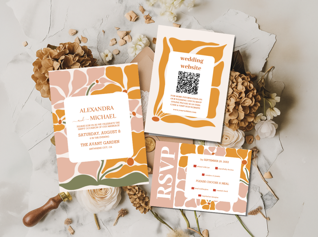
The 70s Groovy Wedding category and the Arch Modern Retro 70s Floral collection — stationery in the most iconic Groovy Earth direction.
2.2 The Muted Groovy Aesthetic
The Muted Groovy direction takes the Groovy Earth palette and refines it: the same warm, earthy tones at a lower visual temperature, producing a groovy wedding that reads as sophisticated and editorial rather than warm and exuberant. Dusty terracotta rather than burnt orange; sage green rather than avocado; warm cream as the primary ground rather than warm brown; copper rather than warm gold as the metallic accent. The palette is still unmistakably groovy — the warmth, the earthiness, and the botanical motif vocabulary are all present — but it reads as quieter, more considered, and more appropriate for a host who wants the groovy aesthetic’s values without its most saturated colour expression.
The Muted Groovy wedding is the most formally flexible of the four directions: it works across venue types from the most rustic outdoor meadow to the more formally styled indoor space, and it reads as appropriate for any time of day and any degree of ceremony. The stationery in the Muted Groovy direction is its most refined and most editorial piece — the groovy typography applied to the softer, more faded version of the palette, producing an invitation that reads as both specifically of its era and completely contemporary.
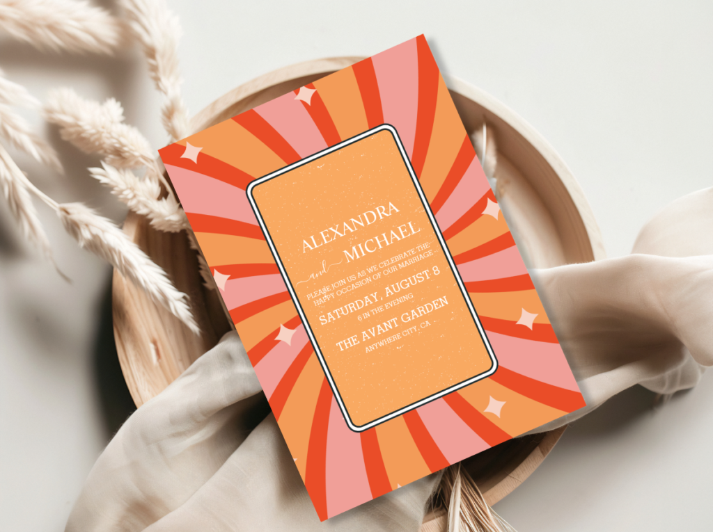
The Groovy 70s Muted Tones collection — refined terracotta, sage, and warm cream stationery for the most sophisticated groovy direction.
2.3 The Groovy Pink & Orange Aesthetic
The Groovy Pink and Orange direction is the groovy wedding at its most energetic and its most colour-joyful — the direction that takes the decade’s warm, bold palette and pushes it into the most vivid and most celebratory register available. Hot pink alongside warm orange: the combination that most specifically references the late 1960s’ and early 1970s’ most distinctive chromatic moment, when the era’s designers and artists were placing these two warm, saturated tones in deliberate and confident combination. In the wedding context, this direction reads as the groovy aesthetic turned up to its most joyful volume.
The Groovy Pink and Orange wedding is particularly suited to the host who wants their celebration to be immediately and unmistakably memorable — the wedding that guests describe to friends who were not there as ‘the most colourful and joyful wedding I have ever attended.’ The stationery in this direction is the most immediately striking piece in the entire retro wedding stationery range: hot pink and warm orange in bold groovy typography, on a warm cream or warm white ground, with a botanical or arch motif that anchors the typographic energy in the era’s natural world reference.
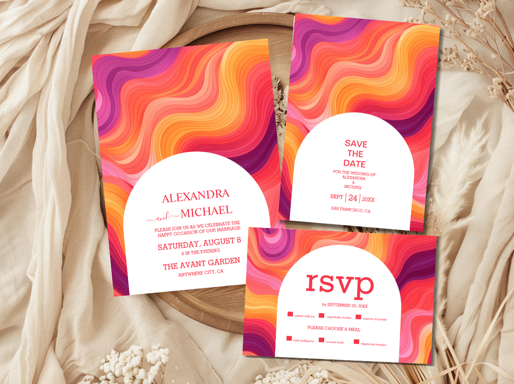
The Groovy Retro Pink and Orange Arch collection — hot pink, warm orange, and the most energetically joyful groovy stationery direction.
2.4 The Typography Groovy Aesthetic
The Typography Groovy direction applies the groovy aesthetic primarily through its typographic character rather than through its colour abundance or its material vocabulary. The rounded, inflated, warmly confident letterforms of the late 1960s and early 1970s graphic design output — applied at a large scale, in warm tones, across every piece of stationery and every piece of printed signage in the celebration — produce the groovy aesthetic’s specific energy through type rather than through decoration. The decoration in the Typography Groovy direction can be relatively restrained; the stationery does the design work.
The Typography Groovy direction is the most design-forward of the four groovy aesthetics and the one most suited to a couple who has a specific typographic sensibility and wants their wedding to read as intentionally designed from the first printed element. The invitation in this direction is a graphic artefact — a piece of design that belongs in a frame after the wedding rather than in a recycling bin. It communicates the celebration’s warmth, joyfulness, and specific aesthetic confidence through the single tool that the groovy era applied most powerfully: the letter itself.
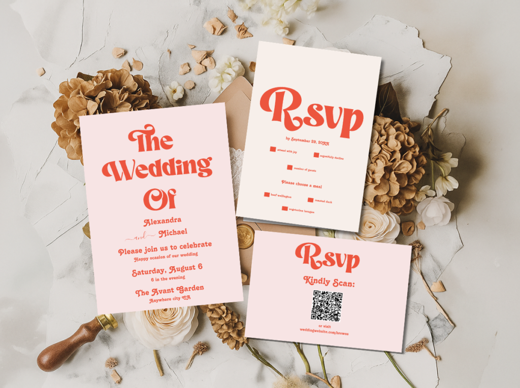
The Modern Retro Pink and Orange Typography collection — bold groovy typographic stationery for the most design-forward groovy direction.
Section 03 Groovy Wedding Colour Palettes
Four palette systems for four groovy directions. The quality shared across all four: every colour is warm rather than cool, earthy rather than clean, and applied with confidence rather than caution. The groovy wedding does not do cool or neutral.
3.1 Earth Groovy Palette
Burnt orange, avocado green, harvest mustard, and warm brown — the most iconic groovy palette. All tones slightly dusty rather than fully saturated; the combination reads as immediately and specifically of the late 1960s and early 1970s in a way no other colour combination does.
3.2 Muted Groovy Palette
Dusty terracotta, sage green, warm cream, and copper — the softer, more refined interpretation of the groovy earth palette. Every tone slightly faded; the copper replaces warm gold for a more editorial quality. Reads as groovy through its warmth and botanical vocabulary rather than through its colour intensity.
3.3 Bold Groovy Palette
Hot pink, warm orange, warm cream, and antique gold — the most energetic and most joyfully colour-committed groovy palette. Warm and fully saturated rather than dusty; the combination reads as the groovy era at its most celebratory and most vivid.
3.4 Typography Groovy Palette
Warm orange-red, pink, warm cream, and deep warm brown — the most graphic and most typographically specific groovy palette. Applied in flat warm planes of colour against the cream ground, in the rounded inflated letterforms of the era’s most joyful graphic design output.
Section 04 Groovy Wedding Venue & Ceremony
The groovy wedding ceremony is most at home in a space that the celebration can claim completely — an outdoor or semi-outdoor setting where the natural world provides the backdrop and the decoration frames and enhances it rather than competing with an existing interior aesthetic. The groovy wedding does not need an architecturally distinctive venue; it needs a space that is generous enough to let the decoration be itself.
The outdoor ceremony setting. A meadow, a farm, a countryside garden, a woodland clearing — any space where the landscape is present as a backdrop rather than as an interruption. The groovy ceremony does not try to control its outdoor setting; it settles into it. The ceremony location should be chosen for its atmospheric quality — the warmth of afternoon light, the presence of existing natural materials like old wood and stone, the sense of being inside the natural world rather than beside it — rather than for its convenience or its neutrality.
The macramé ceremony arch. The groovy ceremony arch is a macramé structure — a freestanding cord-knotted arch in natural jute or warm-toned cord, hung with dried pampas grass at the upper edge and dried wildflower bundles at the sides. It should be freestanding rather than attached to a venue structure, so that it can be positioned specifically within the landscape: at the edge of the meadow, between two old trees, in a clearing where the ceremony space is defined by the arch and the people standing within it rather than by the boundaries of an indoor room. The macramé arch is not a decoration added to the ceremony; it is the ceremony’s physical frame.
The wildflower aisle. Terracotta pots of mixed wildflowers at irregular intervals along the aisle, or loose bundles of dried botanical material tied with jute twine at the ceremony’s aisle markers. The placement should be irregular rather than symmetrical: the groovy aesthetic is not interested in the formal bilateral symmetry of conventional ceremony decoration, preferring instead the organic rhythm of things that have been placed with care rather than measured with precision.
Bold retro signage at the venue entrance. A large, bold retro-typography welcome sign at the ceremony entry — in the invitation suite’s rounded, warm typeface, on a wooden or cream board — is the groovy wedding’s most immediately impactful decorative statement before the ceremony itself begins. It communicates the celebration’s specific aesthetic world to the guest the moment they arrive and sets the typographic register that will continue through every subsequent printed element. The welcome sign should be large enough to read clearly from the entry point; the groovy aesthetic rewards scale in its typographic elements.
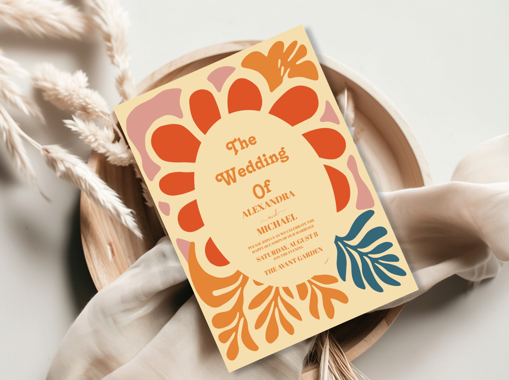
The 70s Groovy Wedding stationery and the Arch Modern Retro 70s Floral collection — warm, botanical, groovy ceremony stationery.
Section 05 Groovy Wedding Decor & Reception
The groovy reception applies the aesthetic’s governing values — warmth, natural materials, joyful colour, and the sense of a celebration that belongs to the people in it — to every surface and every object in the room. Nothing is matching in the conventional sense; everything belongs to the same warm, free-spirited world.
Macramé table runners. A macramé runner down the centre of each guest table is the groovy reception’s most immediately recognisable element — the decoration that most specifically communicates the aesthetic before any other detail has been registered. Natural jute or warm-toned cord; wide enough to serve as the visual base for the centrepiece arrangement placed along it. The macramé runner provides both the direction’s signature texture and the warm, handmade quality that distinguishes the groovy table from a conventionally decorated one.
Wicker and rattan details. Wicker baskets as bread holders, rattan charger plates beneath the dinner setting, small rattan vessels holding individual wildflower arrangements: the wicker and rattan details provide the groovy reception’s per-seat material language, carrying the natural, tactile quality of the aesthetic to the individual place setting. Wicker or natural-wood chairs at the guest tables — rather than conventional banqueting chairs — carry the material vocabulary into the room’s primary furniture decision.
Pampas grass installations. Large-scale pampas grass in tall floor vessels at the reception’s entry and at the room’s corners, and smaller pampas elements woven into the table centrepieces and the backdrop decoration: pampas grass is the groovy reception’s most architecturally significant natural material, providing height, warmth, and the specific feathery texture of the era’s most characteristic natural decoration without the cost or the formality of large-scale fresh floral installations.
Earthy vessels and wildflower centrepieces. Terracotta pots, ceramic crocks in warm brown and olive glaze, wicker-wrapped glass jugs, and raw-edge wooden containers as the centrepiece vessels: the groovy centrepiece is chosen as much for its vessel as for the flowers it holds. Wildflowers — cosmos, sunflowers, dahlias in warm tones, dried grasses, and pampas tufts — arranged loosely rather than structured into formal compositions. The arrangements should read as gathered from the surrounding landscape on the morning of the celebration rather than as delivered from a florist the evening before.
Bold typography signage. The groovy reception’s printed elements — welcome sign, bar sign, menu board, table name cards, food labels — should all use the bold, rounded retro typographic style of the invitation suite. The larger the scale of the signage element, the more effective the groovy typography reads: a welcome sign with large-scale, warm-toned lettering that fills the board is more specifically groovy than the same words in a smaller, more cautious scale. Table names in the groovy reception are not numbers; they are warm references to the couple’s shared world — their favourite albums, the places they have loved, the things that mean something to both of them.
Section 06 Groovy Wedding Flowers
The groovy wedding’s floral vocabulary is the most deliberately unstructured and most warmly abundant of all the retro wedding aesthetics. The groovy bouquet does not look like it was arranged; it looks like it was gathered — by someone who knows what they love and has chosen with care rather than with formal training.
Wildflowers. Wildflowers are the groovy wedding’s primary floral vocabulary: cosmos, cornflowers, marigolds, Queen Anne’s lace, poppies in warm tones, and any bloom that reads as found in a field rather than grown in a greenhouse. The specific quality of the wildflower — its slightly imperfect stem, its open face, its tendency to turn toward the light in an arrangement — is exactly the quality that makes the groovy bouquet read as organic and free-spirited rather than as formally composed.
Sunflowers. The sunflower is the groovy wedding’s most iconic single bloom — warm, abundant, and completely without self-consciousness. A bouquet or centrepiece arrangement that includes sunflowers immediately reads as groovy regardless of the other elements around them, because the sunflower’s specific quality — its large, warm face, its association with summer abundance and the era’s warmth — belongs to the groovy aesthetic in a way that more conventionally bridal blooms do not.
Dahlias in warm tones. Dahlias in burnt orange, deep terracotta, warm yellow, and chocolate-brown tones provide the groovy bouquet’s most sophisticated and most editorial floral element. They photograph beautifully in golden-hour light — the light that the groovy outdoor ceremony is timed to use — and they combine naturally with wildflowers and dried grasses without visual competition. A bouquet of warm-toned dahlias mixed with wildflowers and dried botanical elements is the groovy bouquet at its most beautifully considered.
Dried grasses and pampas. Dried botanical elements — pampas tufts, dried wheat, bleached seedpods, dried lavender, preserved eucalyptus — provide the groovy arrangement’s textural layer and extend the palette’s warm, dusty quality into the floral composition. They are also the arrangement’s most practical elements: dried botanicals hold their form through the ceremony, the photographs, and the reception, and they contribute the warm, slightly faded quality of the era’s material world to every arrangement they appear in.
The unstructured garden-gathered bouquet. The groovy bridal bouquet is bound with jute twine in a simple knot — wide enough to be visible in the photograph, rough-textured rather than smooth — and the stems extend below the binding in their natural varying lengths. The blooms are at different heights within the arrangement; the dried elements are woven through rather than placed as a separate layer. The overall impression is of a bouquet gathered on a walk through a summer garden: warm, imperfect, and specifically, joyfully itself.
Section 07 Groovy Wedding Stationery
The groovy wedding stationery is the celebration’s most specifically designed element — the one that most clearly communicates the aesthetic world the guest is being invited into before they have arrived. The groovy invitation does not describe the celebration; it is a piece of the celebration, delivered to the guest’s home weeks before the wedding day. It should feel warm, joyful, and specifically of its design world the moment it is opened.
The typographic language of the groovy invitation is its most immediately communicative design element. The rounded, inflated letterforms of the late 1960s and early 1970s graphic design output — warm rather than cool, organic rather than geometric, confident rather than delicate — communicate the celebration’s free-spirited and joyfully warm aesthetic before the words they form have been read. This typography, applied to a warm cream card stock in the chosen direction’s palette colours — burnt orange and warm brown for Earth Groovy, dusty terracotta and sage for Muted Groovy, hot pink and warm orange for Bold Groovy — produces a stationery piece that reads as specifically of its aesthetic world from every angle.
The botanical or arch motif element in the groovy invitation is the typographic element’s visual companion: a warm, slightly illustrated floral or botanical detail that provides the natural world reference alongside the typographic confidence. Where the typography communicates the era’s joyful design energy, the botanical element communicates its connection to the natural world — the combination that defines the groovy aesthetic’s dual identity as simultaneously retro-designed and nature-grounded. Together, they produce an invitation that reads as complete rather than as decoration added to information.
The full groovy stationery suite carries the invitation’s typographic and botanical language through every printed element: the ceremony programme as a single bold card in the palette’s warm tones, the place card as a small typographic object in jute or kraft material, the table name card as an opportunity for the couple’s most personal references in the groovy typeface, the menu as a warmly typeset document that belongs to the same designed world as the invitation. The consistency of the typographic system across every piece is what makes the groovy wedding read as designed from the first invitation to the last favour tag — and it is what guests who care about warmth and authenticity will feel most clearly as the specific quality that made the celebration feel like it belonged entirely to the people hosting it.
Earth Groovy
Arch Modern Retro 70s Floral
The most iconic groovy earth stationery direction — warm botanical arch in burnt orange, avocado, and cream.
Muted Groovy
Groovy 70s Muted Tones
Refined terracotta, sage, and warm cream stationery for the most sophisticated and most editorial groovy direction.
Bold Pink & Orange
Groovy Retro Pink and Orange Arch
Hot pink and warm orange in the most joyfully bold and most colour-committed groovy stationery direction.
Typographic Direction
Modern Retro Pink and Orange Typography
Bold groovy typographic stationery in the most design-forward direction — the invitation as graphic design artefact.
Full 70s Category
70s Groovy Wedding
The full 70s Groovy Wedding stationery category — earthy, rounded, and specifically of the era across every direction.
Pink Groovy
Retro Pink Wedding
Hot pink retro stationery in the most femininely bold groovy direction.
Maximalist Groovy
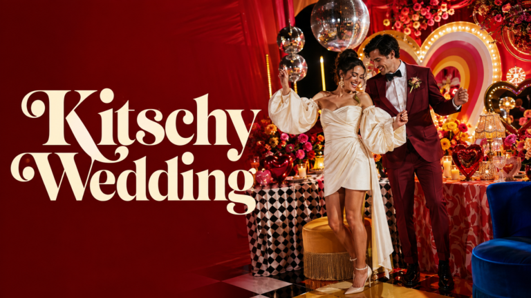
Kitschy Wedding
Maximalist, abundantly bold groovy stationery for the couple who wants the most exuberant direction.
Full Retro Range
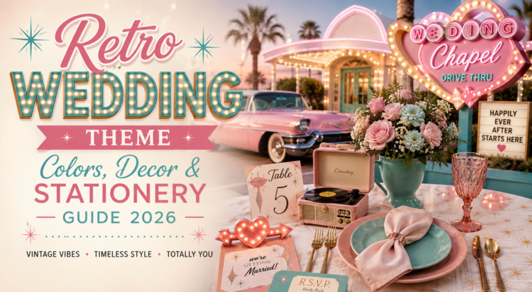
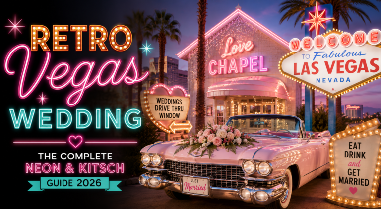
Retro Wedding
The full Retro Wedding category — warm era-specific stationery across every retro and groovy direction.
Browse the full groovy wedding stationery range — eight collections from Earth Groovy to Muted Groovy to Bold Pink and Orange.
Frequently Asked Questions
What is a groovy wedding?
A groovy wedding is a celebration that draws from the late 1960s and early 1970s’ most distinctive aesthetic values — warm earthy palette, bold rounded retro typography, natural materials including macramé and wicker, wildflower florals, and the joyfully free-spirited energy of an era that prioritised warmth and authenticity over formality. It differs from a purely 70s wedding in its playfulness and typographic boldness, and from general boho in its specific decade references and its more saturated colour palette. The four groovy wedding directions — Groovy Earth, Muted Groovy, Groovy Pink and Orange, and Typography Groovy — each apply this philosophy to a different palette and emotional register, from the most iconic earth tones to the most energetically colourful bold direction.
What colors are used in a groovy wedding?
The groovy wedding uses four primary palette systems depending on the chosen direction. The Earth Groovy palette uses burnt orange, avocado green, harvest mustard, and warm brown — the most iconic and most specifically of-the-era combination. The Muted Groovy palette uses dusty terracotta, sage green, warm cream, and copper — a softer and more editorial interpretation. The Bold Groovy palette uses hot pink, warm orange, warm cream, and antique gold — the most energetically joyful and most colour-committed direction. The Typography Groovy palette uses warm orange-red, pink, warm cream, and deep warm brown. All four palettes share warmth, earthiness, and a slightly dusty quality rather than either clean neutrals or bright saturated primaries.
What flowers are used in a groovy wedding?
The groovy wedding’s primary floral vocabulary centres on wildflowers — cosmos, cornflowers, marigolds, Queen Anne’s lace — alongside sunflowers, warm-toned dahlias, and dried botanical elements including pampas grass, dried grasses, dried lavender, and bleached seedpods. The bouquet is deliberately unstructured — gathered rather than arranged — and bound with jute twine with stems extending in their natural varying lengths. Centrepiece arrangements are in terracotta pots, ceramic crocks, or wicker-wrapped vessels, arranged loosely to read as gathered from the surrounding landscape. The consistent quality across all groovy floral choices: warm rather than cool, organic rather than structured, and full of the specific quality of things that have been chosen rather than prescribed.
What is the difference between a groovy wedding and a 70s wedding?
The groovy wedding and the 70s wedding draw from the same source material but apply it differently. The 70s wedding is more faithful to the decade’s specific visual language — the exact palette, the specific material vocabulary, the period references that anchor the celebration to the decade’s design output. The groovy wedding is more interested in the decade’s spirit than its surface: it uses the era’s most characteristic tones and typographic vocabulary but applies them with more playfulness, more colour range, and more typographic boldness than a strict period recreation would allow. Where the 70s wedding says ‘this is how that decade looked,’ the groovy wedding says ‘this is how that decade felt’ — and the difference is exactly the difference between a period photograph and a warm memory.
Warm · Free-Spirited · Joyfully Alive · Completely Itself
Shop Groovy Wedding Stationery
Warm, earthy, and typographically bold — invitations and full stationery suites for every groovy wedding direction.