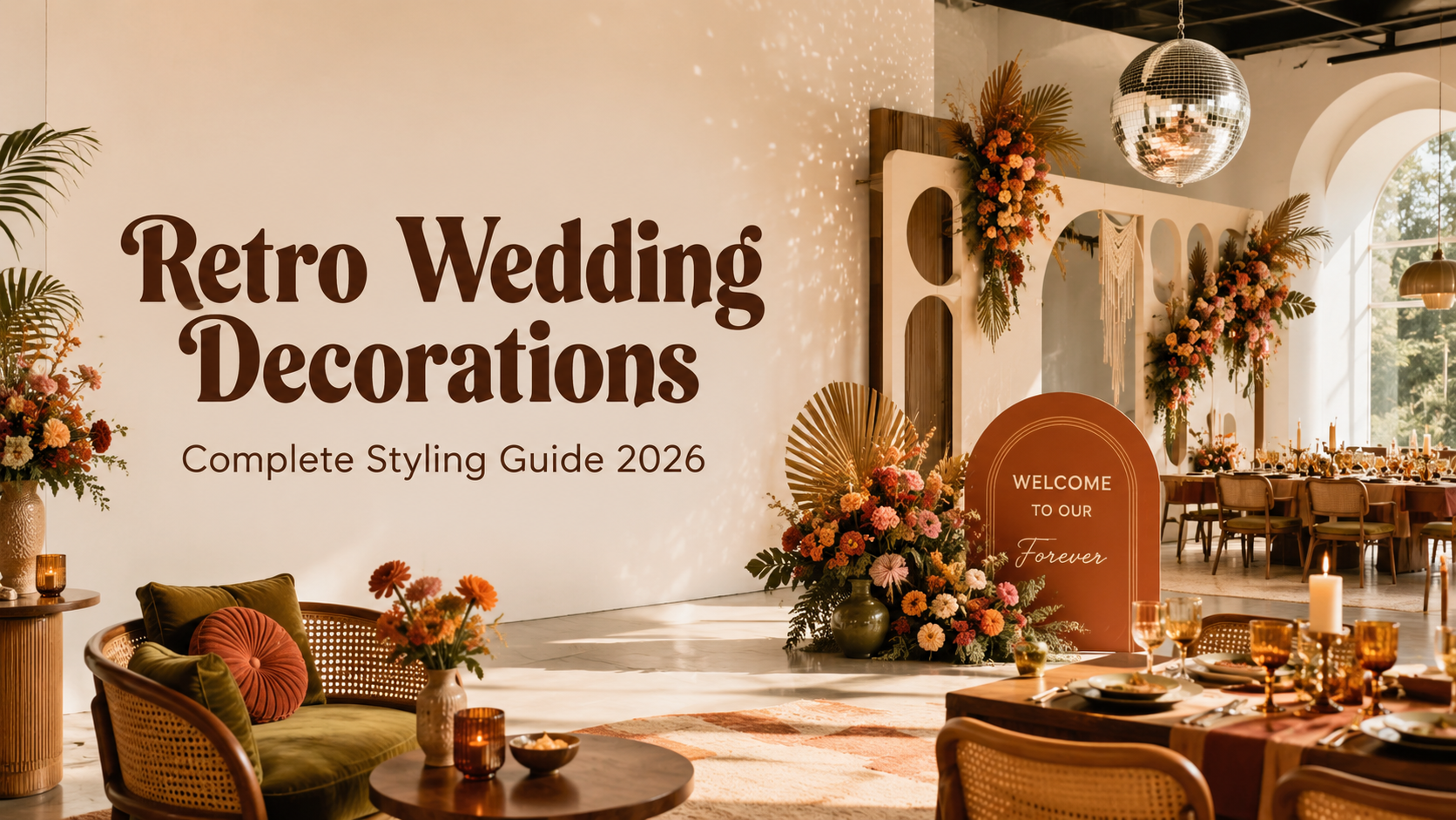
Retro Wedding Decorations — Complete Styling Guide 2026
Wedding Guide · Retro Decor · Every Aesthetic · 2026
Retro Wedding Decorations — Complete Styling Guide 2026
Ceremony and reception decoration by aesthetic across every retro direction — 70s groovy, 60s mod, Vegas, disco, mid-century, and retro pink — with the signage and stationery that ties it all together.
Retro wedding decoration is one of the most misunderstood categories in contemporary wedding styling — not because the individual elements are complicated, but because the governing principle is so frequently ignored. Retro decoration is not a collection of vintage props assembled into a vaguely period-adjacent room. It is a commitment to a specific decade’s design language: its palette, its typography, its material vocabulary, its specific way of combining those elements into a space that reads as of-an-era rather than as generically nostalgic. The difference between those two outcomes — a space that reads as specifically and beautifully retro, and a space that reads as a collection of old things — is determined entirely by the clarity and consistency of that commitment.
This guide covers the decoration decisions that make each of the eight retro wedding aesthetics work: what goes in the ceremony, what goes in the reception, how the signage and typography carry the aesthetic through the full space, and how the stationery suite extends the design language from the invitation to the last favour tag. Each section is specific to its aesthetic direction rather than generic, because the elements that make a 70s wedding look designed are not the elements that make a disco wedding look designed — and knowing the difference is the whole point.
“The best retro decoration is not a prop collection. It is a design decision — a commitment to a specific decade’s way of making things beautiful — applied consistently across every surface of the room, from the arch to the table to the sign on the wall.”
Section 01 The Retro Decoration Philosophy
Every successful retro wedding decoration scheme rests on the same three-part foundation — and every unsuccessful one can be diagnosed by identifying which of the three parts is missing or diluted.
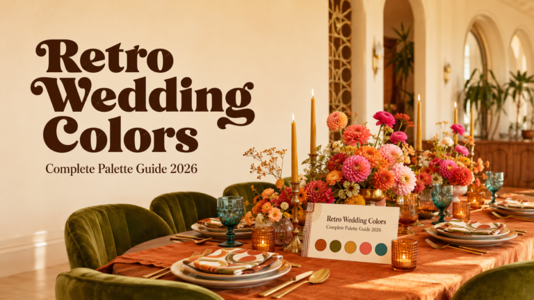
Palette commitment. The retro aesthetic’s palette is its most immediately communicative element — the one that reads across the room before any other detail has been registered. Retro decoration works when the palette is consistent across every surface: the tablecloth, the balloon arch, the centrepiece vessel, the printed stationery, the signage ground. The moment a surface element appears in a colour that does not belong to the chosen direction’s palette — a grey modern chair at a 70s table, a cool white linen at a warm-toned disco table, a soft pastel napkin at a pop art 60s setting — the palette consistency breaks and the room reads as partially retro rather than as designed. The rule: every colour in every element must belong to the chosen direction’s palette. Elements that are not in the palette do not belong in the room.
Typography. The retro aesthetic communicates its decade through typography at every scale — from the invitation’s headline typeface to the welcome sign at the ceremony entry to the table number card. The typography of each retro direction is specific and non-interchangeable: the groovy 70s wedding uses rounded, warm, organic letterforms; the 60s mod wedding uses clean, bold, geometric sans-serif type; the disco wedding uses inflated, joyful letterforms in warm colour; the mid-century modern wedding uses clean hierarchical type with deliberate white space. Applying the wrong typographic register — or applying no specific typographic register at all — is the decoration decision that most commonly makes a retro wedding read as generically nostalgic rather than as specifically of-its-aesthetic-direction.
Pattern and material vocabulary. Each retro direction has its own specific pattern and material vocabulary that is as important as its palette. The 70s wedding uses macramé, jute, wicker, rattan, and botanical organic patterns. The 60s mod wedding uses bold geometric prints, clean architectural forms, and graphic black-and-white pattern. The disco wedding uses sequins, chrome, and reflective surfaces that multiply light. The mid-century modern wedding uses warm walnut timber, woven textiles, ceramic, and the movement’s specific geometric-organic pattern forms. Introducing materials from the wrong vocabulary — a modern metallic vase at a 70s table, a macramé runner at a 60s mod table — produces the same visual dissonance as a wrong-palette surface element: the room reads as mixed rather than designed.
Half-hearted retro fails because it is attempting to be two things simultaneously — a retro celebration and a conventionally neutral celebration — and succeeds at being neither. The retro wedding that works commits completely to its chosen direction and excludes every element that does not belong to its design world.
Section 02 Ceremony Decorations by Aesthetic
The ceremony is where the retro aesthetic makes its first and most powerful design statement. The ceremony arch, the aisle treatment, and the entry signage are the three elements that communicate the direction’s visual world to every guest before the ceremony begins.
2.1 — 70s Groovy Ceremony
70s Groovy
Macramé Arch · Wildflower Aisle · Wooden Signs
The 70s ceremony arch is a freestanding macramé structure in natural jute or warm-toned cord, hung with dried pampas grass at the upper edge and dried wildflower bundles at the sides. It should read as the ceremony’s physical frame rather than as decoration added to it. The aisle is marked by terracotta pots of mixed wildflowers at irregular intervals — organic rhythm not bilateral symmetry — or loose bundles of dried botanical material tied with jute twine. The ceremony entry signage is a large wooden or reclaimed timber board with the welcome wording in a warm rounded retro typeface. The specific quality of the 70s ceremony decoration is that every element reads as handmade and chosen rather than ordered and assembled.
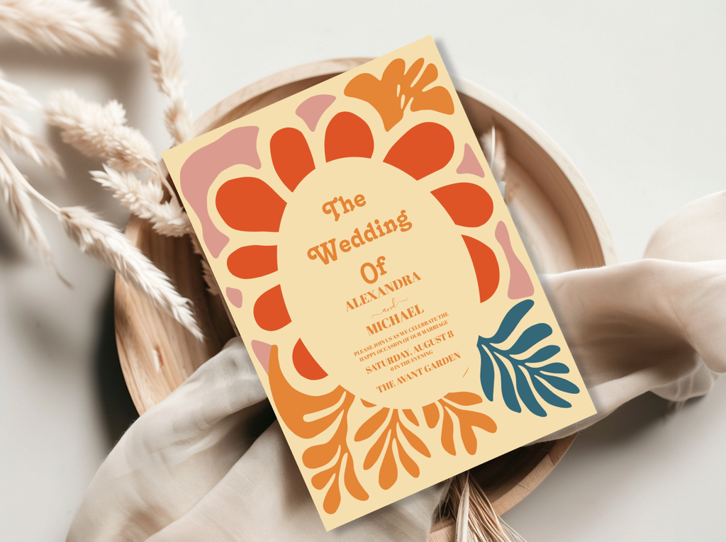
The 70s Groovy Wedding category and Arch Modern Retro 70s Floral collection — warm botanical stationery for the groovy ceremony.
2.2 — 60s Mod Ceremony
60s Mod
Geometric Arch · Daisy Aisle · Bold Signage
The 60s mod ceremony arch is a clean geometric structure — a circle, a wide rectangular frame, or a hexagonal form — in crisp white or the palette’s bold accent colour. The form itself is the design; the arch should read as an architectural object rather than as a decorated structure. The aisle is marked by white daisies in graphic black circular pots at precise intervals — deliberate symmetry and precise placement rather than the organic irregularity of the 70s aisle. The ceremony entry signage is in the bold clean sans-serif style of the decade’s graphic design output, at a scale that reads as a design statement. Every element is placed with the same intention that a graphic designer applies to a printed layout.
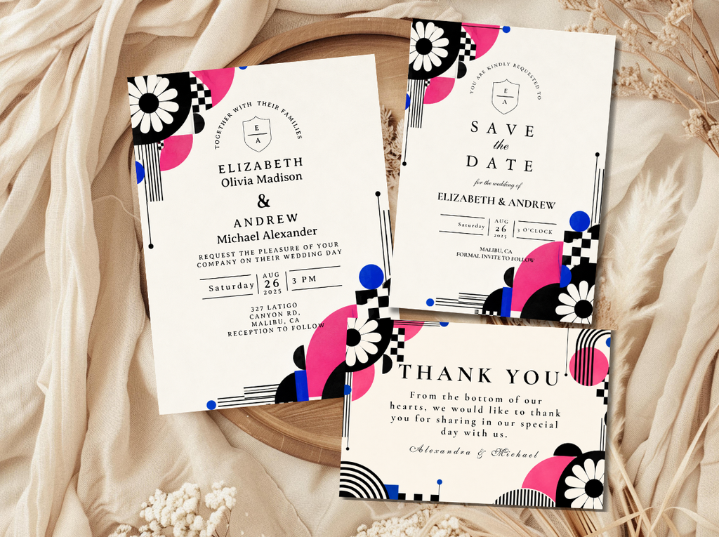
The 60s Wedding category and Minimal Retro Arch Black and White collection — graphic, bold ceremony stationery.
2.3 — Vegas & Kitschy Ceremony
Retro Vegas
Neon Signs · Bold Typography Arch · Spectacular Entry
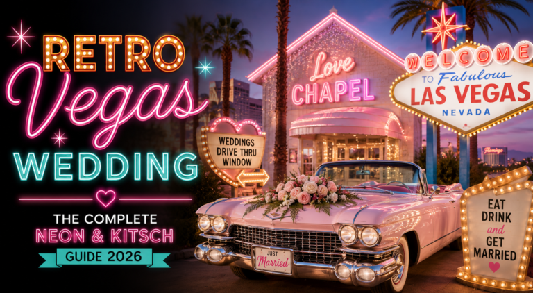
The Vegas ceremony arch is a spectacular object — a circular arch covered in gold metallic elements or warm gold floral installation, or a framed panel of gold balloon clusters at the ceremony backdrop. A custom neon sign hung at the ceremony entry — in the couple’s chosen wording, in a warm neon pink or gold script font — is the Vegas ceremony’s most immediately impactful decorative element: it operates simultaneously as atmospheric lighting, graphic design object, and declaration of the celebration’s specific personality. The entry signage is at the maximum typographic scale the surface allows; the Vegas ceremony does not do small text.
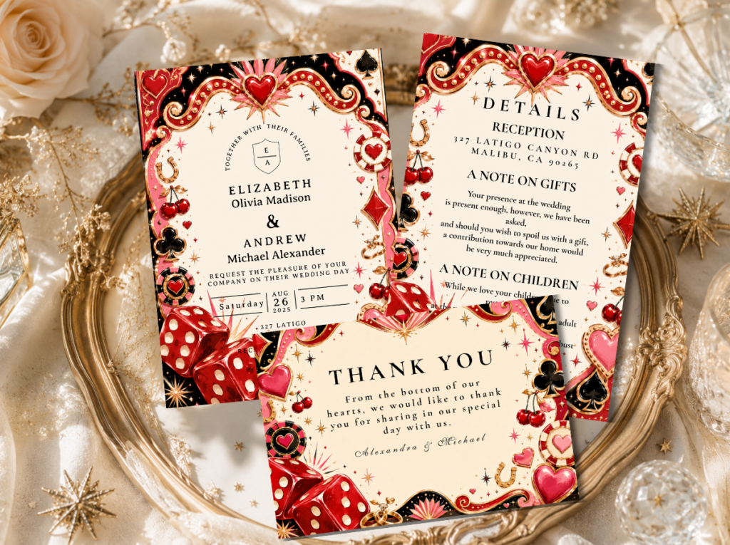
The Retro Vegas Wedding category — theatrical, show-stopping ceremony stationery.
2.4 — Disco Ceremony
Disco
Mirror Ball · Sequin Backdrop · Gold Arch
The disco ceremony is more restrained than the reception — intentionally — because the ceremony is the build before the reception’s release, and the pleasure of the disco reception is intensified by the contrast with a ceremony that is beautiful and warm but not yet spectacular. A ceremony arch in warm gold metallic foil or warm gold floral elements, with warm amber lighting and a single slow-rotating mirror ball above the ceremony space casting moving points of light across every surface: this is the disco ceremony at its most atmospheric. The sequin backdrop panel at the ceremony space’s rear provides the reflective surface that activates the mirror ball’s light distribution.
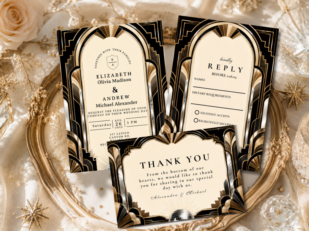
The Disco Wedding category — gold, glamorous, and spectacular ceremony stationery.
Section 03 Reception Decorations by Aesthetic
The reception is where each retro aesthetic is most fully and most completely expressed — across the guest tables, the backdrop, the centrepieces, and every surface between. The reception decoration applies the aesthetic’s three elements simultaneously: palette, typography, and material vocabulary.
3.1 — 70s Groovy Reception
70s Reception
Macramé · Wicker · Pampas · Earthy Vessels
A macramé runner down the centre of each guest table, beneath wildflower centrepieces in terracotta pots, ceramic crocks in warm olive glaze, or raw-edge wooden containers. Large-scale pampas grass in tall floor vessels at the entry and room corners. Rattan charger plates and wicker-detail elements at each place setting. The welcome sign and all directional signage in the warm, rounded retro groovy typeface. The 70s reception table reads as gathered rather than assembled — earthy, warm, and completely of its era — and every element from the macramé to the typography to the wildflower arrangement belongs to the same warm organic world.
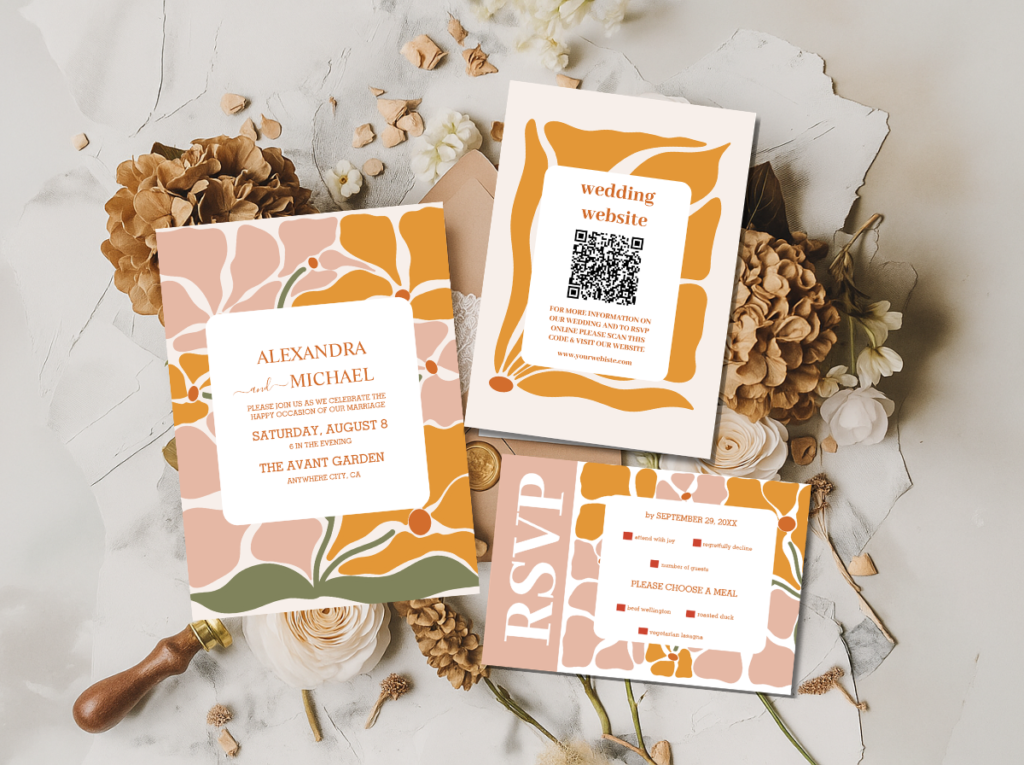
The 70s Groovy Wedding and Groovy 70s Muted Tones — earthy, typographically groovy reception stationery.
3.2 — 60s Mod Reception
60s Mod Reception
Geometric Prints · Daisy Centrepieces · Mod Table
Clean white or solid-colour linen on the guest tables, with geometric-patterned napkins in the palette’s accent tone. White daisy centrepieces in graphic black ceramic cylinders — single-variety, precisely arranged — at a consistent height across all tables. Warm metallic flatware at each setting. Bold clean sans-serif signage at the maximum scale each surface allows. The 60s mod reception table is a layout decision rather than a decoration decision: every element is placed with intention and the visual quality comes from precision rather than abundance. Nothing is present for purely decorative purposes; everything has both a functional reason and a design reason to be there.
The 60s Wedding and Minimal Retro Arch Black and White — graphic, bold mod reception stationery.
3.3 — Vegas & Kitschy Reception
Vegas & Kitschy Reception
Neon Signs · Bold Clashing Props · Maximum Impact
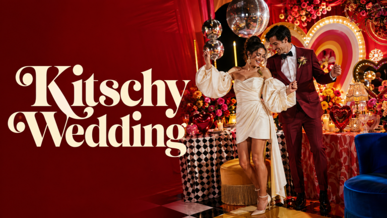
Custom neon signs in specific wording at the reception’s entry, above the dance floor, and at the bar. Bold gold and red table decoration in the Vegas direction; clashing bold-colour tablecloths on different tables in the kitschy direction. Unexpected personal props — vintage ceramic objects, pinball machine, jukebox, mismatched vintage photograph frames — as decorative elements that are specific to the couple rather than sourced from a generic prop catalogue. Every piece of signage and typography at the maximum scale the surface allows. The governing principle: more of everything that means something to the couple, applied at maximum joyful abundance.
The Retro Vegas Wedding and Kitschy Wedding — theatrical, neon-adjacent and maximalist reception stationery.
3.4 — Disco Reception
Disco Reception
Sequin Linens · Mirror Balls · Gold Everything
A mirror ball hung and operational before guests arrive, lit by at least one warm dedicated spotlight. Gold or silver sequin table runners the full length of each guest table. Low gold-vessel centrepiece arrangements — warm-toned chrysanthemums, dahlias, and orange roses — at a height that does not interrupt the mirror ball’s light distribution. A small disco ball at each table as the per-table mirror ball detail. Warm amber candlelight at each table. Song-request cards at each place setting as the stationery element that most directly communicates the dance-floor-first principle. The disco reception is organised around the premise that the dance floor is operational and inviting from the moment guests arrive.
The Disco Wedding category — gold, sequin-inspired, spectacular reception stationery.
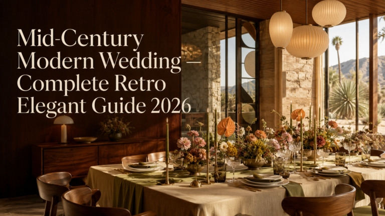
3.5 — Mid-Century Modern Reception
MCM Reception
Clean Geometry · Quality Materials · Design Intention
A solid-colour linen tablecloth in the palette’s primary tone — warm teal, golden mustard, or warm white — with a single centrepiece arrangement in a geometric or organically formed ceramic vessel at a precise height. Warm metallic flatware in copper or warm gold. A geometric-print table runner or patterned napkin in the MCM pattern vocabulary. A bar area styled as a designed object: vintage-adjacent bar cart with warm metallic fittings, glass decanters, and the period’s specific glassware forms. Every element chosen rather than accumulated; every surface decision made with the same design intention that the MCM movement applied to its most celebrated objects.
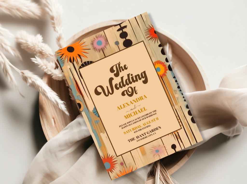
The Mid-Century Modern Wedding and 60s Wedding — warm geometric, design-led reception stationery.
3.6 — Retro Pink Reception
Retro Pink Reception
Pink Floral Abundance · Carnation Centrepieces · Gold Accents
Hot pink tablecloths as the full table surface, not as accent runners. Low carnation centrepiece arrangements in gold vessels — single-variety, full-bloom, in warm pink tones — at a consistent height across all tables. A pink sequin runner beneath the cake, providing the same light-multiplying quality as the disco’s sequin linen. Bold retro pink typography signage at every directional and informational surface. Warm gold candles of varying heights as the light source that activates the pink and gold combination. The retro pink reception reads as abundant, warm, and unapologetically joyful — the colour philosophy of the retro pink aesthetic applied to every surface simultaneously.
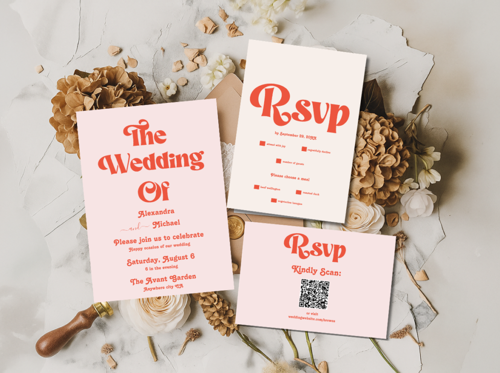
The Retro Pink Wedding and Groovy Retro Pink and Orange Arch — bold, warm, hot pink reception stationery.
Section 04 Retro Signage & Typography as Decoration
Typography is the retro wedding’s most underestimated and most impactful decoration tool — the one that does more design work per square centimetre than any other element, and the one most frequently given less attention than the flowers or the arch. A welcome sign in the correct retro typeface, at the correct scale, communicates the celebration’s aesthetic direction immediately and completely to every guest who enters the venue. The same information in the wrong typeface — a generic modern script, a clean contemporary sans-serif — communicates only the information and none of the aesthetic.
The welcome sign. The welcome sign is the retro reception’s most powerful single decoration element — more powerful than the centrepieces, more powerful than the balloon arch, more powerful than the floral installation — because it appears in the background of every photograph taken at the reception’s entry and because it communicates the celebration’s typographic world to every guest at the moment of arrival. In the 70s groovy direction: rounded, warm, organic lettering on a wooden board. In the 60s mod direction: bold, clean, geometric sans-serif on a white or colour-blocked board. In the disco and Vegas directions: the largest-scale, boldest, most joyfully confident letterforms available. In the MCM direction: clean hierarchical type with deliberate proportioning. The typeface is not a formatting decision; it is a decoration decision.
The seating chart. The seating chart in a retro wedding is not a printed grid of names and table numbers; it is a graphic design object in the invitation suite’s typographic style, presented at a scale that reads as a statement piece rather than as a functional information board. A groovy seating chart in warm rounded type on a warm cream ground, in the burnt orange and avocado palette, is as much a piece of the reception’s decoration as the pampas installation beside it. The typeface, the palette, and the layout should be consistent with the invitation suite’s design system.
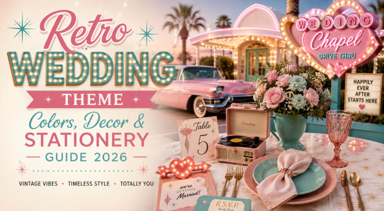
Table numbers and names. Table numbers in a retro wedding should be in the direction’s typographic style at the largest scale that the table number holder allows. In the groovy and disco directions, rounded inflated numerals in warm colour; in the 60s mod direction, bold geometric numerals in black or the accent colour; in the MCM direction, clean sans-serif numerals with deliberate proportional spacing. The more design-forward retro directions — groovy and kitschy particularly — replace table numbers with table names: the couple’s favourite albums, films, places, or shared references in the retro typeface, which adds personal specificity and additional typographic design opportunity simultaneously.
The Modern Retro Pink and Orange Typography collection — bold retro typographic stationery and signage for every retro direction.
Section 05 Stationery as Retro Decoration
The retro wedding stationery suite is not a separate category from the decoration; it is the decoration’s most portable and most personal element — the piece of the celebration that the guest carries with them into the space and encounters at every designed surface from the ceremony programme in their hand to the place card at their seat to the menu on the table. In retro wedding design, the stationery and the decoration are not parallel decisions; they are the same decision expressed at different scales.
The invitation is the decoration’s advance piece: it delivers the celebration’s typographic and colour world to the guest’s home weeks before the wedding day, establishing the visual expectations that the decoration will fulfil. An invitation in the correct retro typeface and palette tells the guest not just where and when the celebration is, but what kind of room they are entering — warm and earthy, or graphic and architectural, or joyfully abundant, or glamorously spectacular — before they have arrived. The invitation is the most efficient single design object in the retro wedding’s arsenal.
The printed elements at the ceremony — the order of service, the ceremony programme — and at the reception — the place card, the menu, the table name card, the food label, the favour tag — all carry the invitation’s typographic and colour system through the full guest experience. When the stationery suite is consistent across every piece, the guest encounters the same design world at every scale from the A5 invitation in their letterbox to the business-card-size place card at their setting. This consistency is what produces the ‘designed celebration’ reading — the sense that the whole event was considered as a single designed experience rather than as a collection of separate decisions.
The five collections and eight categories below cover the full range of retro wedding stationery, from the most iconic earthy 70s direction to the most graphic 60s mod to the most joyfully pink and the most glamorously disco. Each collection is designed to carry the chosen direction’s typographic and colour world through every printed element of the celebration.
Earthy Groovy
Arch Modern Retro 70s Floral
Warm botanical arch in burnt orange, avocado, and cream — the most iconic 70s groovy stationery direction.
Muted Groovy
Groovy 70s Muted Tones
Refined terracotta, sage, and warm cream — the most sophisticated and most editorial groovy direction.
Bold Pink & Orange
Groovy Retro Pink and Orange Arch
Hot pink and warm orange in the most energetically joyful retro stationery direction.
Bold Typography
Modern Retro Pink and Orange Typography
Retro typographic stationery in hot pink and warm orange — the invitation as graphic design statement.
Graphic Mod
Minimal Retro Arch Black and White
The most architectural retro direction — bold black and white graphic mod stationery with warm accent.
Full 70s Range
70s Groovy Wedding
The full 70s Groovy Wedding category — earthy, rounded, and specifically of the era across every direction.
60s Mod
60s Wedding
The full 60s Wedding stationery category — graphic, bold, and specifically mod from invitation to favour tag.
Vegas Spectacular
Retro Vegas Wedding
Theatrical, neon-adjacent stationery for the Vegas and kitschy directions.
Maximalist Kitsch
Kitschy Wedding
Bold, maximalist stationery for the kitschy and abundantly joyful directions.
Disco Glam
Disco Wedding
Gold, glamorous, and spectacularly fun stationery for the disco direction.
Mid-Century Modern
Mid-Century Modern Wedding
Warm teal, mustard, and coral stationery in the most design-led retro direction.
Retro Pink
Retro Pink Wedding
Bold hot pink stationery in the most joyfully feminine retro direction.
Full Retro Suite
Retro Wedding
The umbrella Retro Wedding category — warm, era-specific stationery across all retro directions.
Browse the full retro wedding stationery range — 13 collections and categories covering every retro direction from groovy earth to disco glam.
Frequently Asked Questions
What are the key elements of retro wedding decorations?
Every retro wedding decoration scheme rests on three elements working consistently together. First, palette commitment: every surface element — tablecloth, balloon arch, centrepiece vessel, signage ground — must be in the chosen direction’s specific palette. One wrong-palette element breaks the room’s designed reading. Second, typography: the signage and stationery typeface must belong to the chosen direction’s specific typographic register — rounded groovy letterforms for the 70s, clean bold geometric type for the 60s mod, inflated warm letterforms for the disco direction. Third, material vocabulary: each direction has specific materials (macramé and jute for 70s; geometric prints and clean architectural forms for 60s; sequins and chrome for disco; warm walnut and ceramic for MCM) and introducing materials from a different direction’s vocabulary produces visual confusion.
How do I make retro wedding decorations look designed rather than costume-like?
The distinction between designed retro and costume retro is consistency and depth rather than quantity of elements. Designed retro applies a specific decade’s design philosophy — its palette, its typography, its material vocabulary — consistently across every decision, so that every element belongs to the same visual world. Costume retro applies the decade’s most immediately recognisable surface props as standalone objects without the underlying design consistency: a lava lamp on a conventional table, or a daisy motif beside a generic neutral linen. The practical rule: every element in the room should work on its own terms within the chosen direction’s design world, and the combination should read as a specific, warm, considered aesthetic rather than as a collection of period references.
What is the most important retro wedding decoration element?
The welcome sign — or more precisely, the typographic quality of the welcome sign — is the single most impactful retro decoration element. It appears in the background of every entry photograph, it communicates the celebration’s aesthetic direction to every guest the moment they arrive, and it operates as the typographic anchor that gives every guest a reference point against which to read every other decoration decision in the room. A welcome sign in the correct retro typeface at the correct scale does more design work for the retro aesthetic than any individual prop, balloon arch, or centrepiece. The stationery suite comes a close second: the invitation establishes the design world weeks in advance, and the place cards and menus carry it through every guest interaction at the reception table.
Can I combine elements from different retro aesthetics in one wedding?
The short answer is no — and the reason is the same reason that half-hearted retro fails: a room that is attempting to be two retro aesthetic directions simultaneously reads as neither. The material vocabulary of the 70s (macramé, jute, terracotta) belongs to a different visual world from the material vocabulary of the 60s (geometric prints, clean ceramic, graphic black and white), and the two cannot coexist in the same space without producing visual confusion rather than retro abundance. The exception is directions within the same broad aesthetic family: the 70s groovy direction and the muted boho groovy direction share enough palette and material vocabulary to be combined in the same decoration scheme, as long as the typographic register is consistent across both. But attempting to combine the 70s groovy with the 60s mod, or the disco with the MCM, produces a room that reads as generically nostalgic rather than specifically designed.
Palette · Typography · Material Vocabulary · Complete Commitment
Shop Retro Wedding Stationery & Decoration
Invitations and stationery suites for every retro direction — the typographic element that carries the decoration through every surface of the celebration.