Autumn Wedding Color Palettes 2026
Autumn Wedding · 2026
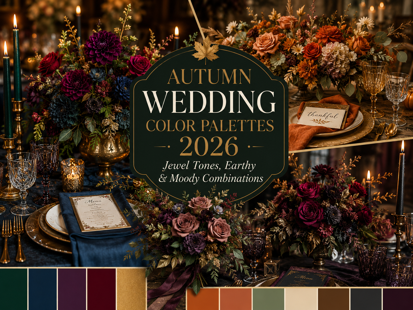
Autumn Wedding Color Palettes 2026 — Jewel Tones, Earthy & Moody Combinations
From rich jewel tones and warm earthy harvest hues to deep moody combinations and soft vintage palettes — the complete guide to choosing your autumn wedding colors in 2026.
Of every decision a couple makes when planning their wedding, none shapes the emotional experience of the day as completely as colour. Before the venue is dressed, before a single flower is arranged, before the dress is chosen — the autumn wedding color palette has already determined whether the celebration will feel opulent or intimate, dramatic or gentle, ancient or contemporary. Autumn offers more genuine palette range than any other season: from the deepest jewel tones and the moodiest dark combinations to the softest vintage pastels and the wildest forest greens, every register of colour finds its natural home somewhere in the autumn calendar. This guide organises every major autumn wedding colors 2026 direction — six core palettes, the aesthetics and stationery collections that bring each one to life, and the practical pairing knowledge to help you choose with confidence. Each palette below connects to a dedicated guide where you can explore that aesthetic in its full depth.
Colour is the first thing a guest feels and the last thing they consciously notice. Long before anyone registers the florals or the food or the music, the palette has already told them exactly what kind of afternoon they are about to have.
Section 01
How to Choose Your Autumn Wedding Color Palette
1.1 — Start With a Feeling, Not a Colour
The most common mistake in choosing a fall wedding colors scheme is starting with the colours themselves — opening a Pinterest board, falling in love with a single image, and working backward from there. The more reliable approach starts with feeling. Before any colour enters the conversation, ask three questions. First: what do you want your guests to feel when they walk into the space — warmth and intimacy, or drama and grandeur, or magic and wonder? Second: what does your venue already offer — does it have stone walls and candlelight potential, or open countryside and big skies, or a walled garden in full October bloom? Third: which season-specific colours are you genuinely drawn to, independent of any wedding context — the deep burgundy of a glass of wine, the copper of turning beech leaves, the charcoal of an evening sky in late October? The answers to these three questions will point toward one of the six palette families below far more reliably than any colour chart.
1.2 — The Rule of Three
Every successful autumn wedding color combination can be reduced to three roles: a primary colour that dominates — appearing in the largest elements, such as linens or bridesmaid dresses; a secondary colour that supports — appearing in florals, ribbons, and smaller textiles; and an accent colour that punctuates — appearing in the smallest and most concentrated details, such as candle holders, stationery typography, or table number frames. Antique gold serves this accent role in almost every autumn palette, which is why it appears so consistently throughout this guide. The most successful autumn palettes also tend to balance warm and cool, or light and dark, in this three-colour structure — a palette of three warm colours in similar tones can read as flat, while a palette that pairs a warm dominant tone with a cooler or darker accent creates the visual depth that photographs most beautifully.
1.3 — How Your Palette Becomes Your Stationery
The wedding invitation is the first place your palette becomes real — before the flowers arrive, before the venue is dressed, before the dress is even collected, the stationery suite is the first physical object that carries your colour choices into the world. This is why every palette section below points not only to a deeper aesthetic guide but to specific stationery collections built around that exact colour combination. Choosing your palette and choosing your stationery are not two separate decisions made at different points in your planning timeline — they are, in the most practical sense, the same decision made twice.
Section 02
The Six Autumn Wedding Colour Palettes for 2026
These six palettes cover the full range of autumn wedding color inspiration for 2026 — from the most opulent and maximalist to the softest and most quietly romantic. Each one represents a complete aesthetic world with its own venues, florals, and stationery, and each connects to a dedicated guide where the full story is told.
2.1
Jewel Tones — Opulent & Maximalist
Emerald · Sapphire · Deep amethyst · Ruby · Antique gold
There is no autumn palette with a stronger claim to genuine luxury than jewel tones — deep emerald, sapphire, amethyst, and ruby together create a richness that requires both scale and confidence, and rewards both magnificently. This is the autumn wedding jewel tones palette at its most maximalist: every colour at full saturation, antique gold running through the metalwork and stationery to unify the whole, and the cumulative effect being one of genuine grandeur. Jewel tones photograph with extraordinary depth in candlelight — the deep colours seem to glow rather than simply reflect, and the contrast between them creates a sense of richness that no single-colour palette can achieve. This palette demands a venue with the architectural scale to absorb it: a grand hall, a historic ballroom, an evening reception where the depth of the colours becomes part of the atmosphere itself.
Mood: Regal, abundant, dramatic · Best for: Grand venues, indoor celebrations, evening weddings
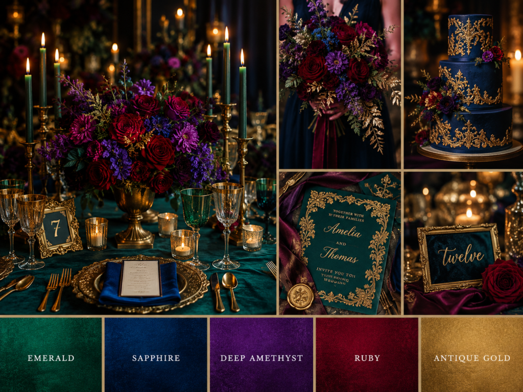
For the full jewel tone experience, explore our Burgundy Autumn Wedding guide → /burgundy-autumn-wedding-deep-romantic-fall-stationery-decor/
Stationery Collections for This Palette
2.2
Earthy & Rustic — Warm & Grounded
Burnt orange · Terracotta · Sage green · Warm ivory · Brown
The most universally beloved autumn wedding colors palette — and for good reason. Burnt orange and terracotta are provided almost entirely by the season itself, sage green grounds everything in the natural world, and warm ivory and brown complete a palette that feels honest, grounded, and genuinely of its place. This is the earthy wedding palette at its most accessible and most broadly flattering: it suits the widest range of venues, the widest range of dress styles, and the widest range of guest expectations. Earthy palettes photograph beautifully in natural light — the warmth of the colours amplifies the golden quality of October afternoon sun, and the palette requires almost no artificial enhancement to look complete. This is the palette for couples who want their wedding to feel like an extension of the countryside around it rather than an imposition on it.
Mood: Honest, warm, naturally beautiful · Best for: Barns, countryside venues, outdoor celebrations
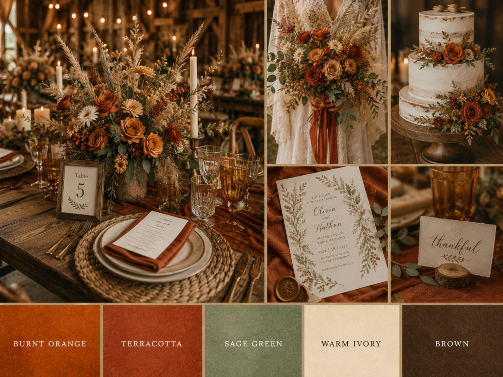
Discover the full range of earthy aesthetics in our Rustic Autumn Wedding guide → /rustic-autumn-wedding-complete-countryside-celebration-guide/
Stationery Collections for This Palette
2.3
Moody & Dark — Atmospheric & Dramatic
Charcoal · Deep plum · Oxblood · Antique gold · Black
The moody wedding colors palette has moved from alternative niche to mainstream editorial favourite faster than any other autumn direction — and the reason is simple: candlelight transforms charcoal, deep plum, and oxblood into something that no other palette can achieve in the same lighting conditions. This is darkness used as a design element rather than an absence of colour: every shade in this palette deepens and glows under warm light rather than disappearing into it. Antique gold provides the contrast that keeps the palette from reading as simply dark — it catches light, adds warmth, and creates the visual punctuation that makes the deep tones around it feel even richer. This palette belongs to evening receptions, candlelit venues with genuine architectural character, and couples who want their wedding to feel cinematic rather than conventionally pretty.
Mood: Cinematic, intense, deeply romantic · Best for: Candlelit venues, evening receptions, alternative celebrations
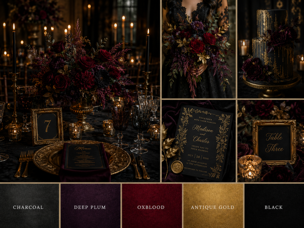
For the complete dark romantic palette guide, see our Moody Fall Wedding guide → /moody-fall-wedding-dark-romantic-autumn-celebration-guide/
Stationery Collections for This Palette
2.4
Vintage & Soft — Romantic & Nostalgic
Dusty rose · Antique gold · Sage · Warm ivory · Soft plum
The gentlest and most universally romantic of the six palettes — dusty rose and sage together create a softness that reads as genuinely nostalgic without being precious, while antique gold and warm ivory add the warmth that keeps the palette from feeling cold or overly pastel. This is the palette for the bride who wants her wedding to feel like the most beautiful pages of an antique album: warm, gentle, and timeless in a way that will look as beautiful in twenty years as it does on the day itself. Vintage and soft palettes are at their most beautiful in daytime light — garden venues and manor house settings with generous natural light bring out the full warmth of the dusty rose and antique gold without requiring the candlelit drama that moodier palettes depend on. The soft plum accent adds just enough depth to prevent the palette from reading as purely pastel.
Mood: Nostalgic, gentle, timeless · Best for: Garden venues, manor houses, daytime celebrations
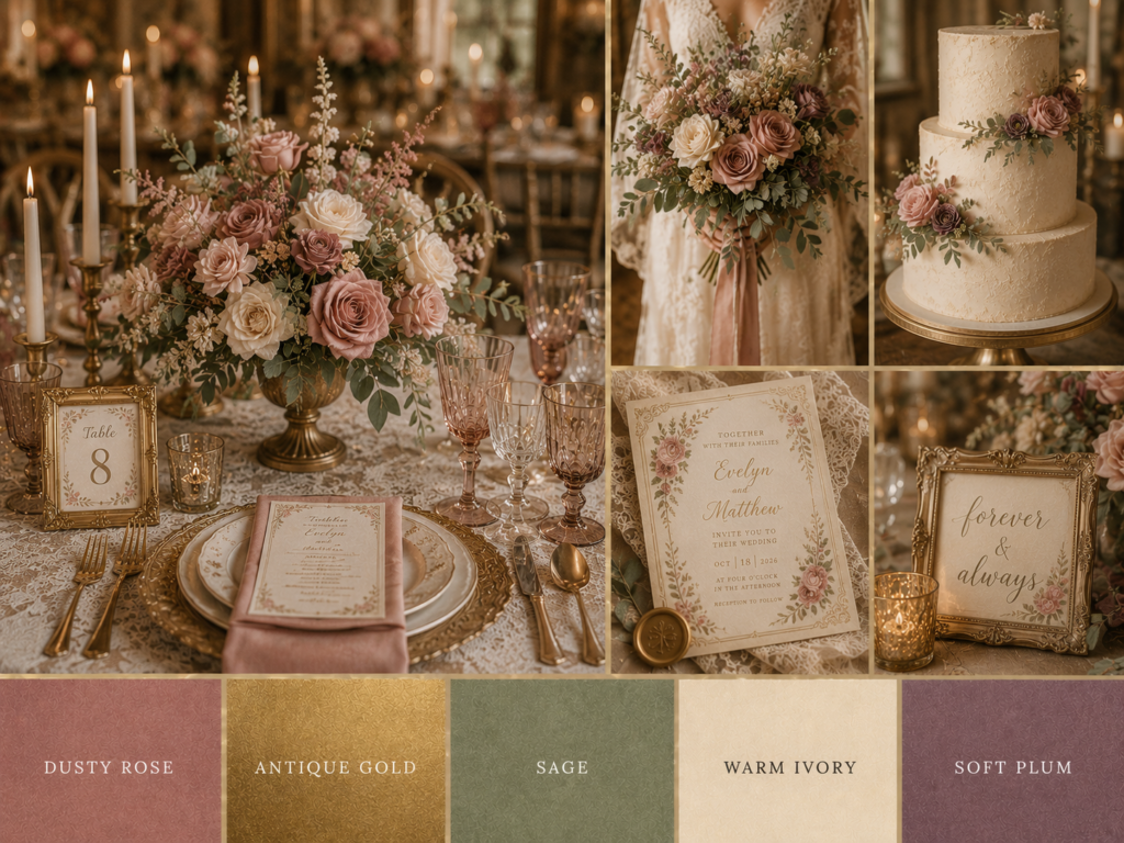
Explore the full vintage palette story in our Vintage Fall Wedding guide → /vintage-fall-wedding-rustic-botanical-stationery-decor-guide/
Stationery Collections for This Palette
2.5
Enchanted & Whimsical — Magical & Storybook
Deep moss · Antique gold · Dusty rose · Twilight blue
The most genuinely magical of the six palettes — deep moss and antique gold form the grounded foundation, while dusty rose adds romance and twilight blue introduces something otherworldly that no other autumn palette quite achieves. This is the palette of fairy lights threaded through ancient trees, of mushroom and moss centrepieces, of stationery that looks as though it was illustrated by someone who genuinely believes in enchantment. The twilight blue is the distinctive element here — it appears in small quantities, in iridescent details and dusk-toned accents, but its presence is what tips the palette from merely beautiful into something that feels like the edge of a fairy tale. This palette belongs to woodland venues and evening celebrations where fairy lights and candlelight together create the atmospheric depth the aesthetic requires.
Mood: Magical, otherworldly, deeply romantic · Best for: Woodland venues, garden settings, evening fairy-light celebrations
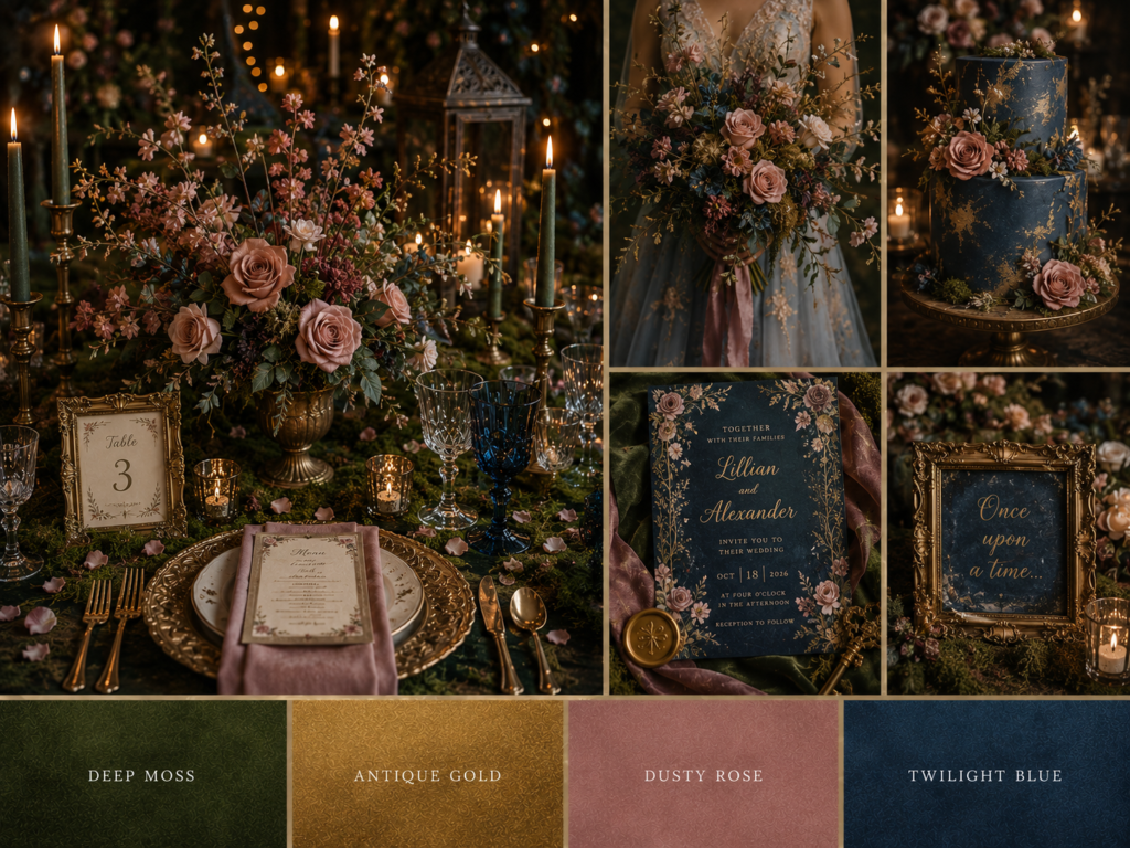
Discover every enchanted palette in our Whimsical Fall Wedding guide → /whimsical-fall-wedding-ideas-enchanted-autumn-celebration-guide/
Stationery Collections for This Palette
2.6
Forest & Woodland — Wild & Natural
Deep forest green · Warm brown · Antique gold · Rust
Anchored by deep forest green — the colour that defines this palette more completely than any single colour defines any other in this guide — the forest and woodland palette is the most genuinely wild and the most completely connected to the natural world. Warm brown grounds the palette in bark and earth; antique gold catches the light the way autumn sun catches turning canopy; rust provides the seasonal note that ties the whole palette to October specifically. This is the palette for couples whose wedding takes place within rather than merely near the natural world — ancient woodland, mountain forest, or any setting where the trees themselves are participants rather than backdrop. Forest and woodland palettes photograph with extraordinary depth against autumn foliage, and require almost no additional colour: the landscape provides most of what the palette needs.
Mood: Wild, grounded, connected to nature · Best for: Woodland venues, forest ceremonies, mountain celebrations
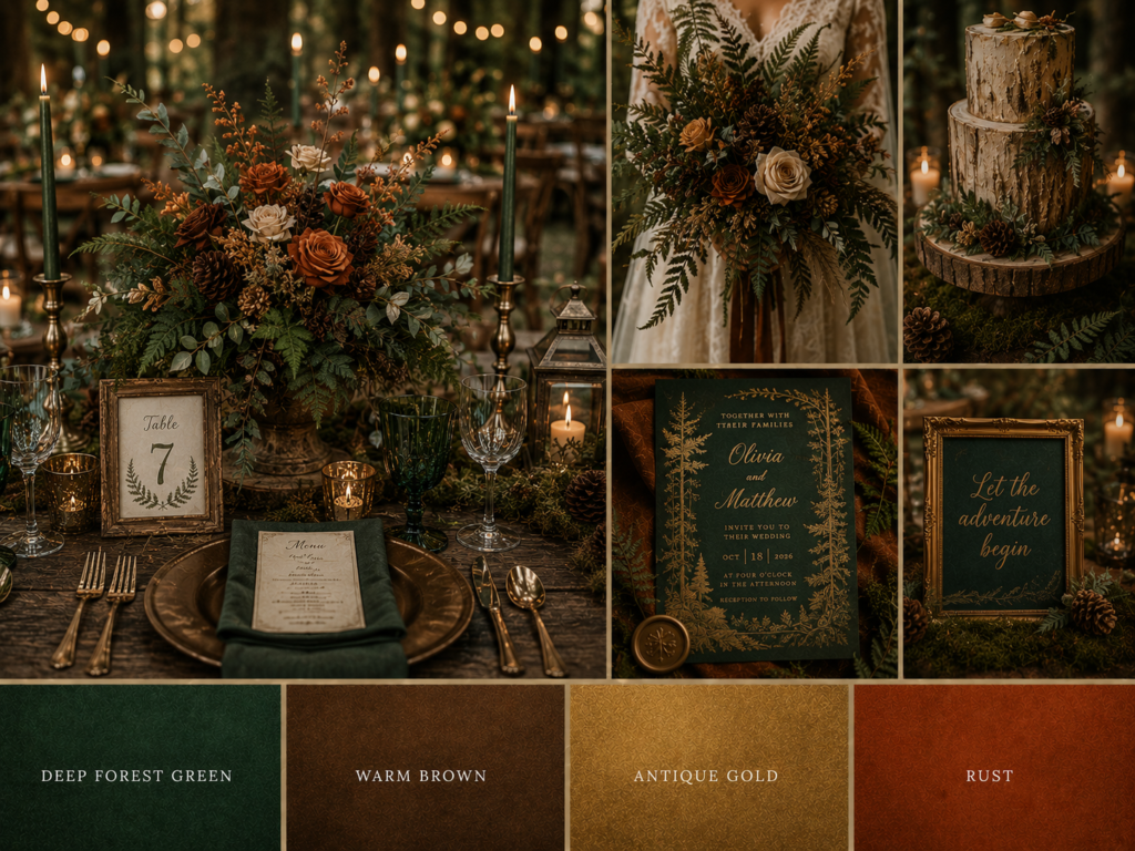
For the complete woodland palette guide, see our Forest Autumn Wedding guide → /forest-autumn-wedding-woodland-ceremony-stationery-guide/
Stationery Collections for This Palette
Section 03
Autumn Wedding Colour Combinations That Work
Beyond the six core palettes, certain pairing principles recur across autumn wedding color combinations regardless of which aesthetic family you are working within. Understanding these four pairing structures will help you adapt and personalise any of the palettes above.
3.1 — Warm + Dark
Burgundy and charcoal, rust and black, terracotta and espresso — pairing a warm autumnal tone with a near-neutral dark creates immediate sophistication. The warm colour provides emotional accessibility while the dark provides editorial depth. This combination works in almost any venue and is the most reliable way to add drama without losing warmth.
3.2 — Warm + Gold
Burnt orange and antique gold, terracotta and gold, rust and copper — this is the most universally flattering autumn combination, and the reason antique gold appears across nearly every palette in this guide. Gold amplifies warmth rather than competing with it, and photographs beautifully in both daylight and candlelight. It is the safest and most versatile starting point for any autumn palette.
3.3 — Cool + Warm
Sage and burgundy, forest green and rust, dusty blue and warm gold — unexpected ten years ago, increasingly popular in 2026. The cool tone provides a contemporary edge that prevents an autumn palette from feeling predictable, while the warm tone keeps it rooted in the season. This combination rewards confidence and works particularly well for couples who want their palette to feel current rather than traditional.
3.4 — Monochromatic Depth
Working entirely within a single colour family — every shade of burgundy, every tone of sage, the full spectrum of terracotta — creates a sophisticated tonal look that reads as genuinely editorial. This approach requires confidence and works best when the chosen colour family has enough natural range to create visual interest through variation in saturation and depth alone, without relying on contrast from a second hue.
Section 04
Choosing Your Palette by Month
The autumn palette landscape shifts noticeably across September, October, and November — not because the rules change, but because the natural world around the wedding changes, and the most successful palettes work with that shift rather than against it.
September
The transitional month — lighter and warmer palettes still work beautifully alongside the first signs of autumn. Dusty rose, sage, and warm ivory from the vintage and soft palette feel completely natural, as do the earthy rustic tones, since the season has not yet reached its deepest expression. September is the most forgiving month for palette choice — almost everything in this guide works, with the moodiest and darkest combinations being the only ones that may feel slightly premature.
October
The richest month for colour — and the month in which every palette in this guide reaches its fullest natural expression. Jewel tones find their most generous floral support; earthy and rustic palettes align with peak harvest; forest and woodland palettes align with peak foliage. October is the month where full commitment to any of the six palettes is rewarded most completely by the natural world around the wedding.
November
The darkest and most dramatic month — charcoal, deep plum, oxblood, and black move from optional to genuinely appropriate. November weddings have the shortest days and longest evenings of the autumn season, and the moody and dark palette is the one most naturally aligned with this light. Forest and woodland palettes also work beautifully in November, particularly in their darker, more atmospheric registers.
Section 05
From Palette to Stationery
The stationery suite is where your palette first becomes a physical object in the world — before the venue is decorated, before the flowers arrive, before anything else about the day has been seen by a single guest, the invitation has already communicated your colour choices to everyone who will attend. This makes the stationery decision considerably more consequential than its modest size might suggest: it is the first and, for many guests, the longest-lived physical expression of your autumn wedding color palette.
When translating a palette into a stationery decision, look for collections where the colour palette is the foundation of the design rather than an afterthought — where the illustration, typography, and layout were all conceived together with the palette in mind, rather than a neutral template that happens to be available in your colours. The difference is immediately visible: a collection built around a palette has colour relationships that feel intentional throughout, while a template merely recoloured for a palette often retains visual choices that made sense in a different colour scheme and feel slightly wrong in the new one.
Every palette in this guide connects to a complete stationery collection — explore the linked guides above for the full aesthetic story behind each colour combination, or use the quick reference grid below to jump directly to the collections that match your chosen palette.
Quick Reference
Autumn Wedding Colour Palettes at a Glance
| Palette | Colours | Best For | Shop |
|---|---|---|---|
| Jewel Tones | Emerald, sapphire, ruby, gold | Grand venues, evening | Dark Baroque Floral → |
| Earthy Rustic | Terracotta, sage, ivory, brown | Barns, outdoor | Autumn Rustic Wedding → |
| Moody Dark | Charcoal, plum, oxblood, gold | Evening, alternative | Autumn Dark Wedding → |
| Vintage Soft | Dusty rose, sage, antique gold | Gardens, manors | Art Nouveau Wedding → |
| Enchanted | Moss, gold, dusty rose, twilight | Woodland, fairy-light | Enchanted Rose Garden Gate → |
| Forest | Forest green, brown, gold, rust | Woodland, mountain | Autumn Forest Wedding → |
Frequently Asked Questions
Common Questions
What are the most popular autumn wedding colors for 2026?
Burgundy and antique gold remain the most consistently popular combination across all autumn wedding categories — the classic burgundy wedding colors pairing that appears, in some form, in nearly every palette in this guide. Beyond that, the moody and dark palette family has seen the fastest growth in 2026, moving from alternative niche to mainstream editorial favourite. The earthy rustic palette remains the most universally booked, while the enchanted and whimsical palette is the fastest-growing among woodland and outdoor venues specifically.
How do I choose between warm and dark autumn wedding colors?
Consider your venue’s natural lighting and the time of your ceremony. Warm palettes thrive in daylight and outdoor settings — they amplify natural golden-hour light and feel most at home in barns, gardens, and countryside venues. Dark autumn wedding colors depend on candlelight and evening atmosphere to reach their full potential — they can look flat or simply dim in bright daylight but become genuinely luminous once the lighting shifts to candles and warm lamps. An evening reception in a venue with genuine architectural character is the ideal context for a dark palette; a daytime garden celebration calls for warmth.
What colors should I avoid for an autumn wedding?
There are no genuinely forbidden colours, but some require more care in autumn than in other seasons. Very bright, saturated pastels — the kind that work beautifully in a spring wedding — can read as slightly out of step with the season’s natural palette and require more deliberate styling to integrate successfully. Pure cool white, used as a dominant rather than accent colour, can feel clinical against the warmth of autumn light and surroundings. The general principle is not that any colour is wrong, but that every colour benefits from being warmed, deepened, or paired with at least one genuinely autumnal tone — even the coolest palettes in this guide (the enchanted twilight blue, the forest green) are balanced by warm accents for exactly this reason.
How many colors should be in my wedding palette?
Three is the number that recurs throughout every successful wedding color palette ideas framework — a primary, a secondary, and an accent, as described in Section 01.2. Fewer than three can feel underdeveloped; more than four or five becomes difficult to apply consistently across stationery, florals, and decor without the palette feeling diffuse. Within the three-colour structure, however, there is enormous room for variation — each “colour” can itself encompass a range of tones, particularly in the monochromatic approach described in Section 03.4.
How do I match my wedding stationery to my color palette?
Identify which of the six palettes in Section 02 most closely matches your vision, then explore both the linked aesthetic guide and the stationery collections listed for that palette — each collection was designed with that specific colour combination as its foundation rather than as an adaptation of a neutral template. The quick reference grid above provides a direct shortcut: find your palette, follow the link to the matching collection, and look for a suite where the illustration style, typography weight, and colour palette all feel like they were conceived together rather than separately.
Find Your Palette
Find Your Autumn Wedding Palette — Explore Every Collection
Six distinct autumn palettes, dozens of customizable stationery collections — all designed with your names, date and wedding details in mind.