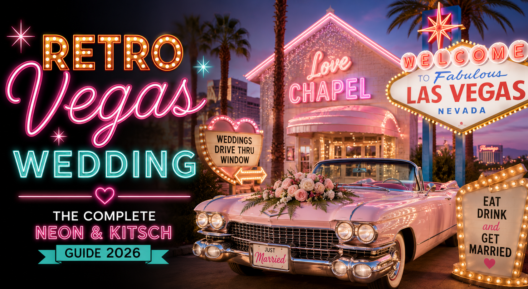
Retro Vegas Wedding — The Complete Neon & Kitsch Guide 2026
Retro Wedding · 2026
Retro Vegas Wedding — The Complete Neon & Kitsch Guide 2026
Four retro Vegas aesthetics, four bold colour palettes, and the complete guide to florals, stationery, and ceremony details for the most joyfully unapologetic wedding on earth.
Las Vegas is the most retro city on earth. While every other city has spent the last fifty years demolishing its neon signs and replacing them with minimalist sans-serif, Las Vegas kept building more — taller, brighter, and more audaciously itself than any city has a right to be. The Vegas retro wedding borrows from this tradition and turns it into a celebration: neon, bold typography, showgirl glamour, the specific joyful excess of a city that has always understood that the purpose of spectacle is to make people feel completely alive.
In 2026, the retro Vegas wedding is having a significant moment on Pinterest — because it represents the most complete rejection of generic wedding aesthetics available. A retro Vegas wedding cannot be neutral, cannot be understated, and cannot be confused with any other celebration happening on the same weekend. It is bold, specific, and completely itself. The couples who choose it are choosing maximum personality over minimum risk, and the results are the weddings that guests remember for the longest.
This guide covers four distinct retro Vegas aesthetics, their palettes, the ceremony and celebration details that execute each one, the floral direction that matches Vegas energy, and the stationery suite that functions as the first neon sign of the entire event.
“Las Vegas understood before anywhere else that neon is not excess — it is joy made visible. The retro Vegas wedding borrows that understanding and applies it to the most important celebration of your life. The result is the most joyful wedding on earth.”
Section 01 What Is a Retro Vegas Wedding?
The retro Vegas wedding is not a themed event in the novelty sense — not a costume party with a Vegas backdrop, not a kitsch exercise in ironic excess. It is a coherent aesthetic direction built from the specific visual language of Las Vegas in its most visually confident era: the 1950s through the 1970s, when neon signage was the city’s primary art form, when showgirl glamour was the entertainment industry’s dominant aesthetic, and when the concept of a Las Vegas wedding chapel represented the most joyfully anti-conventional ceremony option available in the country.
The critical distinction for the retro Vegas aesthetic is the difference between kitsch as a mistake and kitsch as a deliberate aesthetic choice. Kitsch as a mistake is what happens when too many unrelated decorative elements accumulate in a space without editorial intention: the result is visual noise that reads as confused. Kitsch as an aesthetic choice is what happens when a fully committed visual vocabulary — neon pink and gold, bold retro typography, sequins and feathers, checkerboard and chrome — is applied consistently and with confidence to every element of a celebration. The result reads as designed rather than accumulated, joyful rather than excessive, and specific rather than generic.
The retro Vegas visual vocabulary: Neon signs and neon-referencing graphic elements; bold display typography in the Las Vegas tradition — stacked, oversized, impossible to ignore; showgirl aesthetics: sequins, feathers, dramatic silhouettes, deep jewel tones alongside gold; the American diner register: checkerboard, red and white, chrome accents, milkshake pastels; and the electric pink palette that has become synonymous with the contemporary Vegas retro moment. Any combination of these elements, applied with commitment and editorial intention, produces a retro Vegas wedding aesthetic. The elements need not all appear simultaneously — one direction, fully committed, is more powerful than all directions partially represented.
The retro Vegas wedding is having a 2026 Pinterest moment for the same reason it has always drawn couples who want something genuinely different: it is the most legible aesthetic available. There is no ambiguity about what world a retro Vegas invitation inhabits, what a neon chapel ceremony communicates, or what a showgirl-glamour reception promises. The aesthetic makes its declaration before a single guest arrives — which is what the best wedding aesthetics always do.
Browse the Retro Vegas Wedding collection — all stationery directions for the neon and kitsch Vegas aesthetic.
Section 02 Four Retro Vegas Wedding Aesthetics
The retro Vegas aesthetic divides into four distinct directions, each with its own colour palette, its own visual register, and its own specific ceremony and reception energy. Choose the one that feels most instinctively like yours — and commit completely.
Aesthetic 2.1
The Neon Chapel Aesthetic
The Neon Chapel is the most iconic retro Vegas wedding visual — the one that is immediately and universally recognisable as Las Vegas wedding culture in its most joyful form. Electric pink neon against a dark night sky, a bold marquee sign reading ‘LOVE’ or ‘MARRIED’ in the specific typeface of mid-century Las Vegas signage, the small ceremony space lit entirely by neon: this is the visual language of the chapel wedding at its most distilled and most powerful.
The Neon Chapel aesthetic translates the exterior drama of the Vegas chapel sign into every interior element of the wedding. The invitation reads like a marquee: oversized typography, bold contrast, and a design that communicates ‘celebration’ before the guest has processed a single word. The palette is electric pink and warm gold against deep navy or midnight black — the specific combination that reads as neon even on paper, because the contrast between the bright pink and the dark ground produces the same high-energy visual quality as a lit neon tube against a dark sky.
The Neon Chapel aesthetic works best as a micro wedding or elopement: the intimacy of a small ceremony space amplifies the neon drama rather than diluting it across a large room. A small group of guests in a neon-lit space produces a specific electric atmosphere that a ballroom full of people in the same lighting cannot replicate. The Neon Chapel is the retro Vegas aesthetic for the couple who wants a ceremony that feels like an event — theatrical, memorable, and impossible to replicate.
Shop the Retro Vegas collection and the Modern Retro Pink & Orange Typography stationery — neon energy in every printed element.
Aesthetic 2.2
The Showgirl Glamour Aesthetic
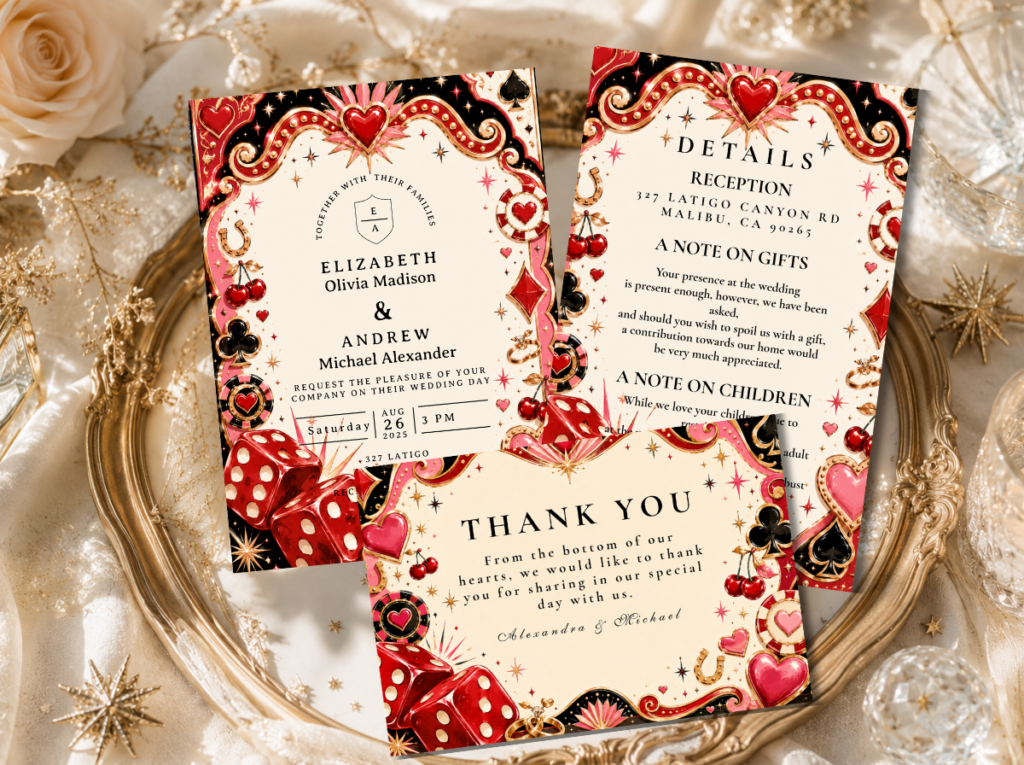
The Showgirl Glamour aesthetic draws from the Las Vegas entertainment tradition at its most spectacular: feathered headdresses, sequined costumes, dramatic stage lighting, and the specific glamour of a performance designed to make an entire room hold its breath. Translated to a wedding, this becomes an event where every detail communicates theatrical confidence — deep plum and gold as the primary palette, sequined tablecloths, feather centrepiece accents, and a reception that feels like an opening night rather than a dinner party.
The Showgirl Glamour palette is deep plum, warm gold, dramatic black, and the glinting silver of sequin and mirror surfaces. It is the most dramatically glamorous of the four Vegas retro directions and the most demanding of its guests: the dress code for a Showgirl Glamour wedding should be stated explicitly on the invitation — ‘black tie or sequins encouraged’ — because the aesthetic requires guest participation to produce its full effect. A room where half the guests are in glamorous formal attire and the other half are in casual clothing produces a visual inconsistency that breaks the immersive quality of the aesthetic.
The Showgirl Glamour wedding is at its best in a venue with stage-quality lighting: the aesthetic depends on warm, directional light that makes sequins glitter, makes gold tablecloths glow, and makes dramatic dark colours read as richly jewel-toned rather than simply dark. The reception programme should match: a performance element — a live singer, a jazz band that transitions to disco, a drag performer as the MC — gives the theatrical aesthetic its natural complement and transforms the reception from a dinner into a show.
Shop the Kitschy Wedding collection — maximalist and theatrical stationery for the Showgirl Glamour direction.
Aesthetic 2.3
The Retro Diner Vegas Aesthetic
The Retro Diner Vegas aesthetic combines the American roadside diner tradition — checkerboard floors, red vinyl, chrome accents, and the specific nostalgia of a place where milkshakes cost a quarter and everything on the menu comes with a side of optimism — with the Vegas retro palette and energy. It is the most playful and the most accessible of the four Vegas retro directions, requiring less production investment than the Showgirl Glamour or Neon Chapel aesthetics while producing an equally strong and equally specific visual world.
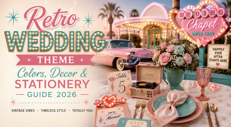
The Retro Diner palette is red and white with black graphic accents and the gleam of chrome: the primary colours of the American diner translated into a wedding context. The checkerboard pattern — on the dance floor, on the stationery, on the paper straws in the milkshake favours — is the Retro Diner’s equivalent of the Neon Chapel’s electric pink: the single element that immediately and completely communicates the aesthetic world the wedding inhabits. The food programme should lean into the diner register: sliders and fries on the menu, milkshakes as the wedding favours, a tiered cake decorated like a retro diner counter.
The Retro Diner Vegas aesthetic is also the most family-friendly of the four directions, which makes it the strongest option for a Vegas retro wedding with a mixed-age guest list. The nostalgia of the diner register is universally accessible — it reads as joyful to every generation simultaneously, which is a quality that the more dramatically theatrical Vegas aesthetics do not always share. A checkerboard dance floor, a jukebox as the centrepiece of the reception room, and a neon diner sign as the backdrop for the photo zone: these are the three installation elements that fully communicate the Retro Diner aesthetic.
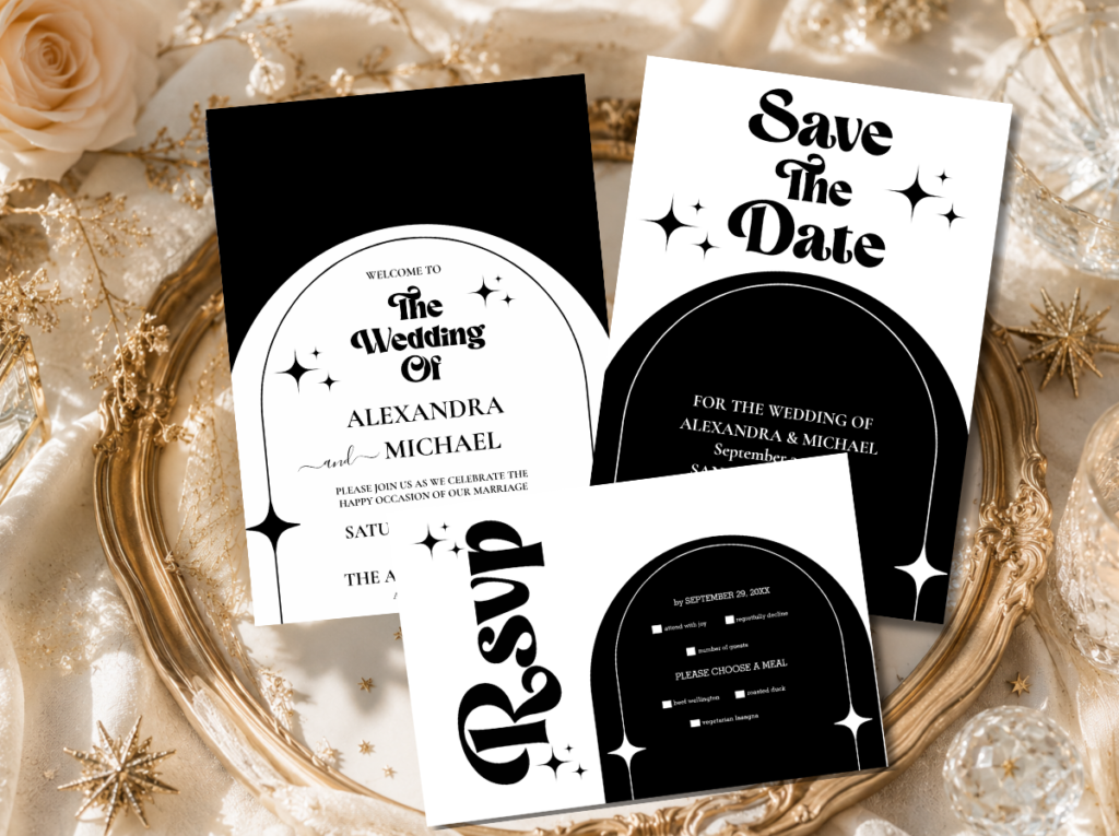
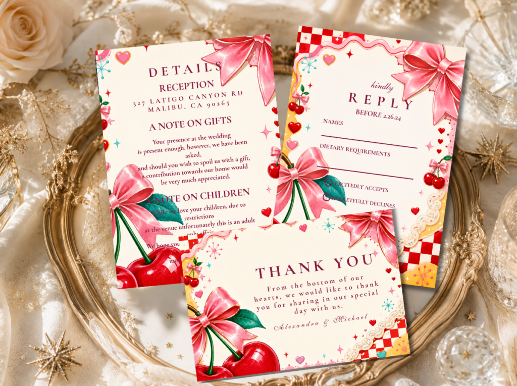
Shop the Minimal Retro Arch Black & White collection — graphic checkerboard and bold contrast stationery for the Retro Diner Vegas direction.
Aesthetic 2.4
The Pink Vegas Aesthetic
The Pink Vegas aesthetic is the most searched retro Vegas direction on Pinterest in 2026 — the intersection of bubblegum femininity and Las Vegas neon energy that produces the most photographically striking and the most joyfully unapologetic of all the Vegas retro directions. Bubblegum pink, hot pink, warm gold, and cream: this is the palette that reads as Las Vegas in the contemporary moment, simultaneously referencing the city’s neon tradition and the broader cultural moment of bold, confident, entirely serious femininity.
The Pink Vegas aesthetic does not hedge or qualify its pinkness. Every surface in the Pink Vegas wedding is some variation of pink: blush linens, hot pink floral installations, bubblegum pink neon signage, pink-tinted champagne in gold-rimmed coupes, a pink velvet wedding cake with gold-leaf detail. The aesthetic works because its commitment is total — a partial pink wedding, with neutral elements introduced to balance the pink, reads as a pink wedding that ran out of confidence. A full pink wedding reads as a Pink Vegas celebration, which is a completely different and considerably more powerful thing.
The Pink Vegas dress code should be stated on the invitation: ‘pink encouraged’ or ‘all shades of pink welcome.’ Guests who arrive in pink become part of the aesthetic; guests who arrive in any other colour provide the visual contrast that makes the pink read as more intentional by comparison. The reception photography benefits from a pink neon sign as the primary backdrop — ‘LOVE’ or the couple’s initials in hot pink neon against a pale pink or cream wall — because this one element anchors every photograph taken at the event to the specific visual world of the Pink Vegas aesthetic.
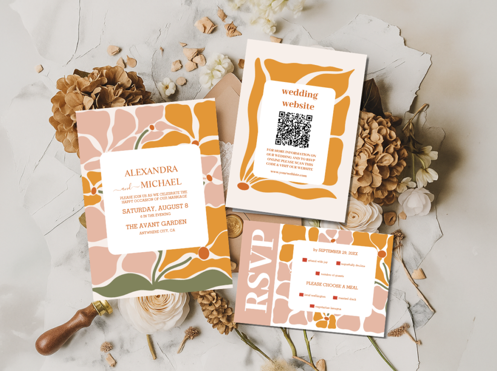
Shop the Retro Pink Wedding collection and Groovy Retro Pink & Orange Arch stationery — bold pink and gold for the Pink Vegas direction.
Section 03 Retro Vegas Colour Palettes
Each Vegas retro aesthetic has its own palette. The palettes are specific enough that choosing the wrong one for your chosen direction breaks the aesthetic immediately — the rule is the same as for all retro wedding aesthetics: choose one palette and commit completely.
Neon Electric — Hot Pink, Warm Gold, Electric Orange, Bright White
Showgirl Drama — Deep Plum, Gold, Midnight Black, Silver Glitter
Diner Classic — Red, White, Bold Black, Chrome Silver
Pink Vegas — Bubblegum, Hot Pink, Cream, Warm Gold
The principle across all four: the accent colour — electric pink, deep plum, red, bubblegum — should appear on at least three distinct surfaces in the wedding space simultaneously. When it appears on only one or two surfaces, it reads as a decorative choice; when it appears on three or more, it reads as a palette decision. The palette decision is what produces the retro Vegas aesthetic rather than a retro Vegas detail.
Section 04 Retro Vegas Ceremony & Celebration
The retro Vegas wedding is uniquely well-suited to the micro wedding and elopement format — not because it cannot scale to a larger celebration, but because the visual intimacy of a small ceremony space amplifies the neon and kitsch energy in a way that a large conventional venue rarely can. A ceremony space of twenty to fifty guests produces an intensity of shared experience that the retro Vegas aesthetic requires to read at its most powerful.
The ceremony space: The retro Vegas ceremony space communicates the aesthetic before the music starts. A neon sign above the ceremony arch — ‘LOVE’, ‘FOREVER’, or the couple’s initials — in the palette’s primary accent colour is the single most immediately effective installation element. Florals should be bold and single-variety rather than romantic and mixed: a ceremony arch built from hot pink carnations, or from bright sunflowers and white anemones in the Diner Classic palette, communicates ‘retro Vegas’ immediately. Candles in vintage-style glass holders or neon-coloured votives at the aisle edge provide the low-level atmospheric light that the overhead neon installation requires to read correctly. The ceremony programme card, folded and tied with a coloured ribbon in the palette’s accent tone, is the first stationery piece the guest holds — it should carry the same typographic energy as the invitation.
The reception: The retro Vegas reception should be the best party your guests have ever attended, and should be designed with that ambition explicitly in mind. Maximum fun, minimum fuss: a reception that runs three to four hours at high energy is more successful than one that runs six hours with an energy dip in the middle. The food programme should be celebratory rather than formal — served share-style or station-style rather than as a plated dinner, so that guests move through the space and create their own social experience rather than sitting at a fixed table for the duration. Cocktails in the palette’s colour family — pink gin and tonic for the Pink Vegas direction, a deep purple cocktail for the Showgirl Glamour direction — served in the appropriate glassware are both atmospheric and functional as social props.
Photography: The retro Vegas wedding produces its best photographs in the ceremony and reception spaces rather than in outdoor portrait sessions — because the aesthetic’s visual power comes from the neon, the graphic installations, and the bold interior palette rather than from natural light landscapes. Ensure that the primary photo backdrop — the neon sign, the sequined installation, the checkerboard dance floor — is lit correctly for photography before the event begins. A well-lit neon sign in the correct palette colour beside a well-dressed couple in their retro Vegas attire produces the photograph that defines the event in guest memory.
Browse the Retro Vegas stationery range — invitations, ceremony programmes, and reception signage in the neon Vegas aesthetic.
Section 05 Retro Vegas Florals
Retro Vegas florals do not follow the romantic mixed-variety rules of conventional wedding florals. They are bold, graphic, and single-variety — chosen for the visual impact of their colour rather than for their scent, their softness, or their association with romance. The retro Vegas bouquet and the retro Vegas ceremony installation are both designed to read clearly and powerfully from across the room, which requires the simplicity that a single variety in the right colour provides.
Hot pink carnations — the quintessential Vegas retro floral: The carnation has been dismissed as ordinary for decades, which is precisely what makes it the perfect retro Vegas flower: the retro aesthetic is built on finding beauty in the deliberately unfashionable, and the hot pink carnation at high volume — a ceremony arch built entirely from hot pink carnations, or a centrepiece of nothing but massed hot pink carnations in a gold vessel — produces a visual impact that no amount of delicate mixed-variety romantic florals can achieve. The colour is the point; the variety is the vehicle for the colour.
Bold sunflowers for the Diner Classic direction: The sunflower is the Diner Classic direction’s primary floral: its size, its graphic simplicity, and its specific warm yellow belong to the American diner and roadside aesthetic in a way that no other flower does. A ceremony arch built from large-headed sunflowers and white anemones in the Diner Classic palette — yellow, white, and black centre — communicates the aesthetic immediately. Mixed with black-eyed Susans and white cosmos, the sunflower arrangement produces a daisy-chain graphic quality that echoes the checkerboard pattern of the diner aesthetic without directly replicating it.
The deliberately non-bridal bouquet — neon-wrapped stems: The retro Vegas bridal bouquet rejects the cascading romantic arrangement in favour of a tight, graphic, single-variety bundle: a round posy of hot pink carnations, or a bundle of bright sunflowers, with the stems wrapped in a neon-coloured ribbon or a metallic gold twine rather than a neutral satin ribbon. The stem wrap is a design decision as important as the flower choice: a neutral ribbon on a bold floral arrangement reads as an attempt to moderate the aesthetic’s energy; a neon ribbon doubles it. The bouquet is the most personally held object of the entire wedding day — it should be as bold and as specific as every other element of the retro Vegas aesthetic.
Section 06 Retro Vegas Wedding Stationery
The retro Vegas wedding invitation is not a piece of stationery that conveys information. It is a neon sign — the first one, the most portable one, and the one that lands in a guest’s hand weeks before the event and communicates the entire aesthetic world of the wedding in a single printed object. Every design decision made for the retro Vegas invitation should be made with this function in mind: not ‘how do we make this look nice’ but ‘how do we make this look like Las Vegas.’
Typography is the primary design element of the retro Vegas invitation — not illustration, not floral motif, not calligraphy. The specific bold display typefaces of mid-century Las Vegas sign design — stacked, oversized, impossible to ignore — communicate the aesthetic before the palette is registered and before the wording is read. The invitation headline (the couple’s names, or a phrase like ‘WE’RE GETTING MARRIED’ in full capitals) should be the largest and most graphically dominant element on the front of the invitation, treated as a sign rather than as a heading.
The material finish of the retro Vegas invitation matters as much as the design. A foil-stamped or metallic-finish hot pink or gold treatment on the invitation communicates the neon quality of the aesthetic in a print medium — the specific quality of the foil catching the light produces the same high-energy visual response as the original neon it references. An uncoated card stock in cream or warm white provides the ground; the bold typography and the foil accent provide the Vegas energy. The envelope should be coloured — hot pink, deep plum, or bright red depending on the direction — with the recipient’s address in the same bold typeface as the invitation.
The complete stationery suite for a retro Vegas wedding — invitation, ceremony programme, menu card, table numbers, and signage — should maintain the same typographic register and the same palette throughout. A stationery suite that begins with a bold neon-energy invitation and ends with a neutral serif menu card produces a visual inconsistency that diminishes the commitment of the aesthetic. The boldness must be total and consistent from the first piece of paper a guest receives to the last sign they see on their way out.
Primary Vegas Direction
Retro Vegas Wedding
All stationery directions for the neon and kitsch Vegas aesthetic — the complete starting point for every retro Vegas stationery decision.
Bold Typography
Modern Retro Pink & Orange Typography
Oversized retro display fonts in electric pink and orange — the stationery direction where the typeface IS the design for the Neon Chapel and Pink Vegas aesthetics.
Pink Vegas Direction
Groovy Retro Pink & Orange Arch
Bold pink and orange in a groovy arch format — the stationery direction for the Pink Vegas aesthetic at its most graphic and most joyful.
Diner Classic Direction
Minimal Retro Arch Black & White
High-contrast black and white with bold graphic structure — the stationery direction for the Retro Diner Vegas aesthetic.
Browse the full retro Vegas stationery range — neon, bold typography, and maximum personality for the most joyful wedding on earth.
Frequently Asked Questions
What is a retro Vegas wedding aesthetic?
A retro Vegas wedding aesthetic draws from the specific visual language of Las Vegas in its most visually confident era — the 1950s through the 1970s — and applies it to a modern wedding with editorial intention and complete commitment. It is built from neon signage and neon-referencing graphic elements, bold display typography, showgirl glamour, diner aesthetics, and the electric pink palette that has become the contemporary retro Vegas visual signature. The critical distinction is between kitsch as a mistake (accumulated decoration without editorial intention) and kitsch as a deliberate aesthetic choice (a complete, committed visual vocabulary applied consistently to every element of the celebration). The retro Vegas wedding is firmly the second — it is designed rather than decorated, and specific rather than generic.
What makes a Vegas wedding retro rather than vintage?
The difference is one of emotional register and design confidence. A vintage Las Vegas wedding is soft, nostalgic, and gentle — it references the past with affectionate warmth, preferring muted tones and delicate details. A retro Las Vegas wedding is bold, graphic, and joyfully unrestrained — it references the past with the specific visual confidence of the design movements it draws from, preferring saturated palettes, bold typography, and the theatrical energy of Las Vegas entertainment culture at its peak. Both reference the same city and the same era, but they produce entirely different celebrations. The retro Vegas wedding makes no attempt to be restrained; restraint is the one quality the Las Vegas retro aesthetic has never had any interest in.
What colours work for a retro Vegas wedding?
The four retro Vegas palettes each suit a specific aesthetic direction. The Neon Electric palette — hot pink, warm gold, electric orange, and bright white — is the most universally recognisable as Las Vegas wedding culture and suits the Neon Chapel direction. The Showgirl Drama palette — deep plum, gold, midnight black, and silver — suits the most formally glamorous direction. The Diner Classic palette — red, white, bold black, and chrome silver — suits the most playful and accessible direction. The Pink Vegas palette — bubblegum, hot pink, cream, and warm gold — is the most searched direction in 2026 and suits any scale of celebration. Across all four, the principle is the same: choose the palette that belongs to your chosen aesthetic direction and apply it consistently to every surface in the celebration.
What stationery should I use for a retro Vegas wedding?
Retro Vegas stationery should be treated as a neon sign rather than as a conventional wedding invitation: the typography should be oversized, bold, and impossible to ignore; the palette should be the full saturated version of the aesthetic’s primary colours rather than a muted or neutral version; and the material finish should communicate energy — foil stamp, metallic ink, or a coloured ground rather than a plain white card. The invitation’s headline — the couple’s names or a bold phrase like ‘WE’RE GETTING MARRIED’ — should be the dominant visual element of the front face, treated as sign lettering rather than as editorial text. The full stationery suite should maintain the same typographic register from the invitation to the ceremony programme to the exit signage.
Neon · Bold Typography · Maximum Personality
Shop Retro Vegas Wedding Stationery
Invitations, ceremony programmes, and reception signage in neon pink, showgirl gold, diner graphic, and bubblegum pink — the most joyful stationery on earth.