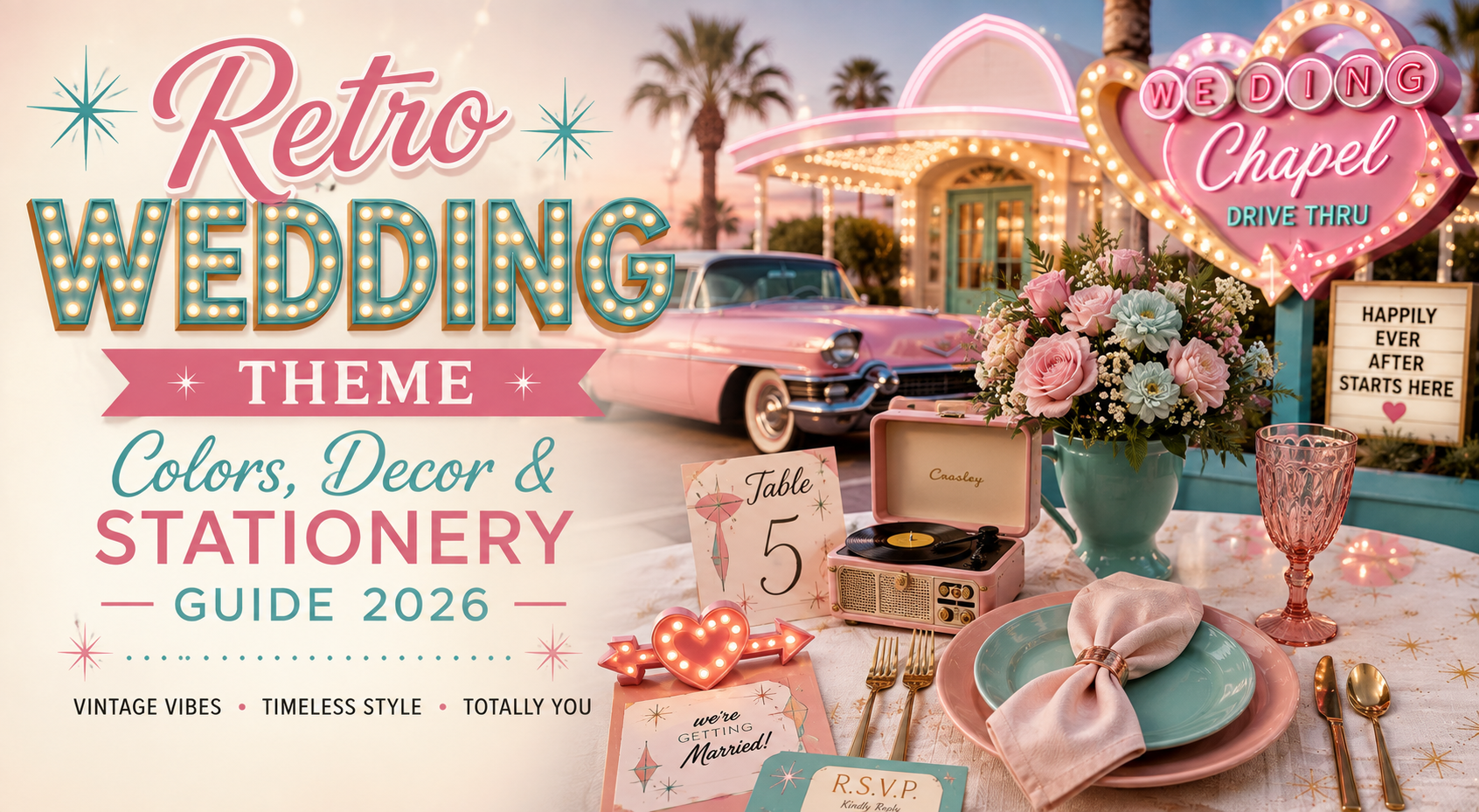
Retro Wedding Theme — Colors, Decor & Stationery Guide 2026
Retro Wedding · 2026
Retro Wedding Theme — Colors, Decor & Stationery Guide 2026
Eight retro wedding color palettes with decor direction, venue notes, and stationery links — scannable, specific, and built for couples who know retro is the only direction worth committing to.
A retro wedding theme is not a mood board of mismatched vintage references — it is the decision to commit to one decade’s complete visual language and apply it without apology to every element of the celebration. This guide maps eight distinct retro directions, each with its palette, its decor logic, and the stationery that should accompany it.
“A retro wedding theme that hedges — that uses one 70s element, one 60s element, and one mid-century prop — reads as undecided. The one that picks a decade and commits completely reads as designed.”
Section 01 How to Build a Retro Wedding Theme
Every successful retro wedding theme begins with a single decade as its primary reference. Not two decades. Not ‘vintage generally.’ One decade, whose silhouette, palette, typography, and props are applied consistently to every element of the celebration — from the invitation to the centrepiece to the dress.
The three elements that make a retro theme cohesive: Palette commitment — the colour palette must be the decade’s own, applied at full saturation rather than muted toward neutrality (avocado green in a 70s theme reads as 70s; sage green reads as contemporary); typographic register — the fonts on the signage, the stationery, and the table numbers must belong to the same decade as the palette, because nothing breaks a retro theme faster than a period-accurate centrepiece beside a modern minimalist typeface; and props with provenance — every decorative object should be legible as belonging to the decade, whether it is a macramé backdrop for a 70s theme or a mirror ball for a disco celebration.
Half-hearted retro fails for the same reason half-hearted anything fails in event design: it signals that a decision was almost made rather than fully committed to. A room with one bold retro installation and everything else neutral reads as a wedding with a nice statement piece. A room where the palette, the props, the florals, the typography, and the stationery all belong to the same decade reads as a retro wedding — and that is an entirely different and considerably more powerful experience for every guest in it.
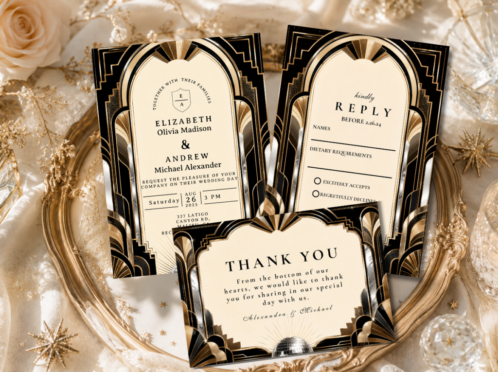
The full retro wedding stationery range — every decade, every direction, every palette.
Section 02 Eight Retro Wedding Themes — Color Cards
Each card below maps one complete retro direction: four palette colours, the emotional register, the venue type that suits it, the decor note that makes it cohesive, and the stationery collection to match. Pick the card that produces an instinctive ‘yes’ and commit completely.
Theme 01
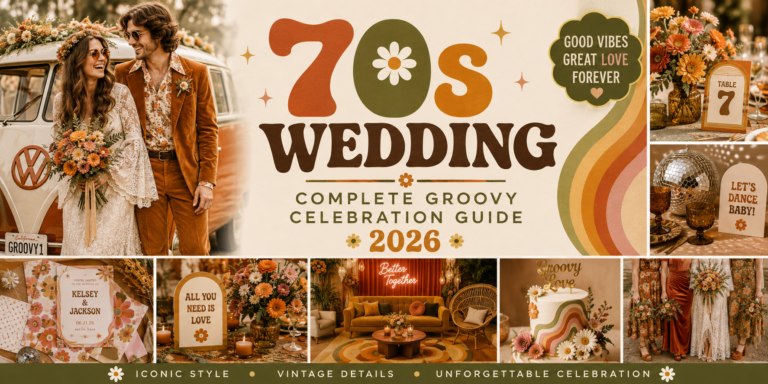
70s Groovy Earth
Burnt Orange · Avocado Green · Mustard · Warm Brown
Warm, organic, boho-harvest. The 70s direction that feels like wildflowers in a rattan vase and macramé in afternoon light.
Venue: Farm, barn, outdoor garden, or any venue with exposed natural materials and warm directional lighting.
Decor: Macramé backdrop, pampas grass, wildflower centrepieces in rattan vessels, wooden welcome sign in a groovy rounded typeface, linen runners in oatmeal and warm cream.
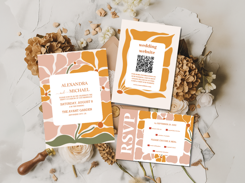
Shop the stationery that matches this palette.
Theme 02
60s Mod Graphic
Crisp White · Bold Black · Primary Red · Pop Yellow
Graphic, architectural, sharp-edged. The 60s Mod direction that treats design as a form of visual confidence.
Venue: Industrial venue, gallery space, or any location with clean geometric architecture and high ceilings.
Decor: Geometric table runners in black and white, daisy centrepieces in bold graphic vases, oversized black-and-white signage in a clean Mod typeface, pop-colour napkins as the accent element.
Shop the stationery that matches this palette.
Theme 03
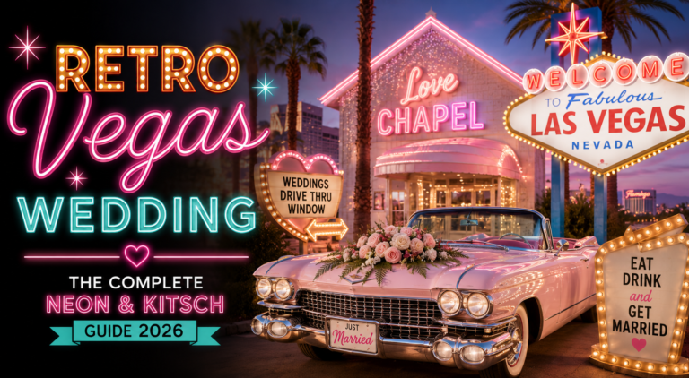
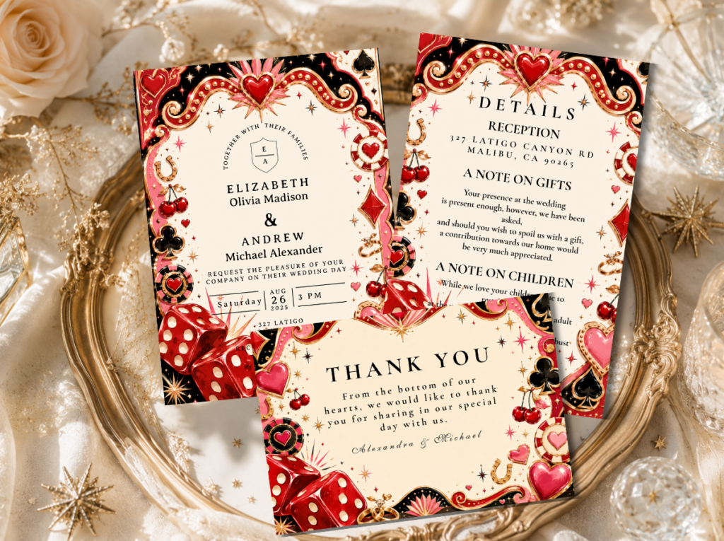
Retro Vegas Neon
Electric Pink · Hot Gold · Neon Orange · Bright White
Maximum energy, zero restraint. The Vegas retro direction that treats every surface as a potential neon sign.
Venue: Urban rooftop, an intimate chapel-style venue, a private club space, or any venue that supports dramatic lighting.
Decor: Neon sign installation in the palette’s primary accent colour, bold marquee-style typography props, showgirl-adjacent florals in hot pink and gold, electric pink invitation suite as the first neon signal.
Shop the stationery that matches this palette.
Theme 04
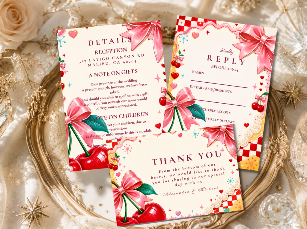
Kitschy Maximalist
Coral · Lime · Hot Pink · Sunshine Yellow
Deliberate excess, joyful collision. The kitschy direction that understands kitsch as an aesthetic position, not an accident.
Venue: A venue that can absorb maximum colour without looking cluttered — a large barn, an outdoor marquee, or a blank-canvas urban space.
Decor: Clashing print table runners that belong to the same colour family rather than the same pattern, unexpected prop combinations chosen for colour coherence, maximum floral abundance in the full palette simultaneously.
Shop the stationery that matches this palette.
Theme 05
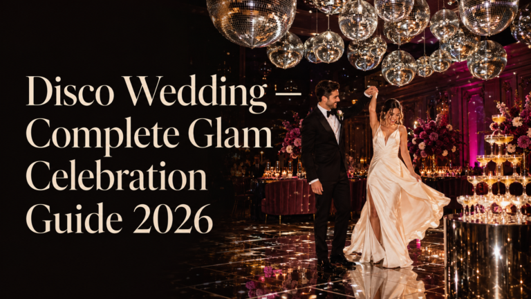
Disco Glam
Mirror Gold · Deep Plum · Midnight Black · Silver
Theatrical, dramatic, glamorous. The disco direction that treats the reception as an opening night and every guest as part of the spectacle.
Venue: A venue with stage-quality lighting: warm directional spots that make gold glitter and sequins catch the light from across the room.
Decor: Mirror ball as the primary installation element, sequined table linens in gold and silver, dramatic floral centrepieces in deep plum and midnight black, gold charger plates, a live performance element as the natural complement.
Shop the stationery that matches this palette.
Theme 06
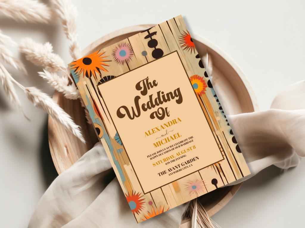
Mid-Century Sophisticated
Warm Teal · Mustard · Coral · Cream
Clean, architectural, quietly confident. The MCM direction that references the design decade that treated everyday objects as works of art.
Venue: A modernist venue — flat-roof, clean lines, large windows — or a hotel ballroom with enough geometric architecture to support the aesthetic without competing with it.
Decor: Geometric centrepiece vessels in warm teal or mustard, atomic-age tableware details, a clean graphic welcome sign in the Mad Men typographic register, linen in warm cream with a single bold colour fold.
Shop the stationery that matches this palette.
Theme 07
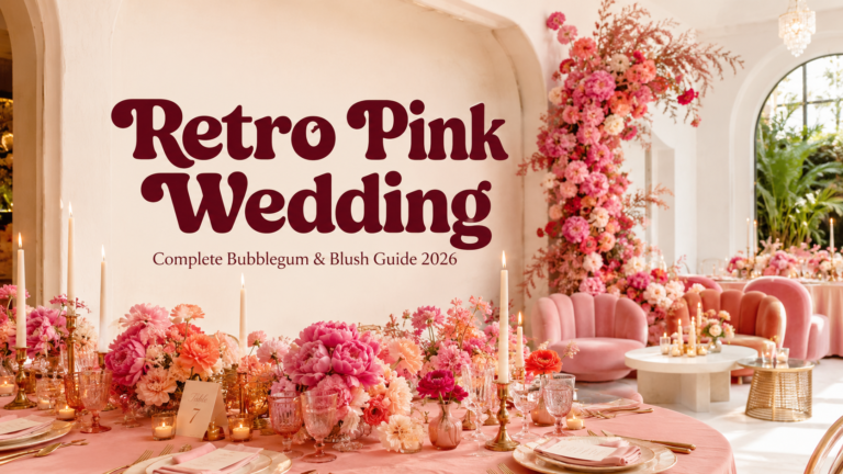
Retro Pink Bubblegum
Bubblegum Pink · Hot Pink · Cream · Gold
Joyfully unapologetic. The pink retro direction that commits fully to pink as a sophisticated bridal colour rather than a soft compromise.
Venue: Any venue where warm lighting can support the pink palette — indoor venues particularly, where the pink florals, pink linens, and pink neon installation glow rather than wash out.
Decor: Pink floral abundance in a single variety at high volume, retro typography props in the bubblegum pink palette, a pink neon sign as the primary backdrop, pink-toned invitation suite that declares the commitment before a guest arrives.
Shop the stationery that matches this palette.
Theme 08
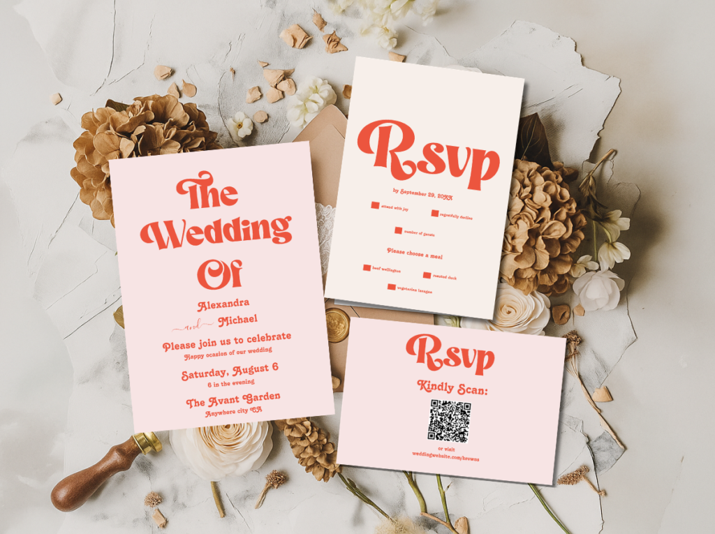
Groovy Typography
Warm Orange · Hot Pink · Cream · Deep Brown
Bold words as the primary design element. The direction where the typeface does the thematic work and the palette amplifies it.
Venue: Any venue where large-format signage can be positioned prominently — because the typographic direction requires visible, well-lit signage to produce its full effect.
Decor: Large-format retro font welcome signs, table numbers in oversized bold display type, menu cards where the typography is the dominant design element, a warm earth-tone styling that lets the bold type read without competing backgrounds.
Shop the stationery that matches this palette.
Section 03 Retro Decor Details That Work
The individual props that make a retro theme cohesive are not random vintage objects — they are objects that belong specifically to the chosen decade’s visual world. Four categories cover the majority of retro wedding decor decisions:
Retro signage: The welcome sign, bar sign, table number format, and seating chart all need to be in the same typographic register as the invitation suite. A 70s Groovy theme requires a rounded, warm, slightly imprecise slab-serif typeface across all signage — the same typeface in a sharp geometric sans-serif breaks the theme at every table the guest passes. The signage is the most frequently photographed non-floral element of any wedding; it should be the most period-specific element of the decor programme.
Period-appropriate florals: Each decade has a floral register: the 1970s uses wildflowers, pampas grass, dried botanicals, and loose arrangements in rattan vessels; the 1960s uses graphic single-variety bold-colour arrangements (daisy, carnation, gerbera) in geometric vessels; the disco and glam directions use dramatic orchid and dark peony arrangements in metallic vessels. The floral register is as specific to the decade as the palette — a romantic mixed garden-rose arrangement in a 60s Mod wedding breaks the graphic energy of the theme immediately.
Decade-specific tableware and linens: The tablecloth, runner, and napkin choices should belong to the palette rather than to a generic wedding linen catalogue. Oatmeal linen with a warm cream runner for the 70s direction; crisp white with a bold black geometric runner for the 60s; a sequined gold cloth for the disco direction; a bubblegum pink linen for the retro pink theme. The table is the surface the guest studies for the longest duration of the entire event — it is the most important detail canvas available.
The stationery as the most important theme-setting element: The invitation arrives before any decoration is seen, any food is tasted, and any venue is experienced. It is the sole element of the retro wedding theme that reaches the guest in their own home — which means it sets the entire aesthetic expectation of the celebration before the event begins. A retro wedding invitation that commits fully to its decade’s typographic register, colour palette, and design logic primes the guest to read every subsequent element of the wedding as intentional. The invitation is not a paper-good — it is the first room of the wedding, and it should be designed with the same commitment as every other room.
Browse all five retro stationery collections and find the one that belongs to your chosen decade.
Frequently Asked Questions
What is a retro wedding theme?
A retro wedding theme is the decision to apply one specific decade’s complete visual language — its colour palette, typography, decor props, and floral register — consistently to every element of the celebration. It is not a collection of vintage decorative objects; it is a designed aesthetic position. The five decades most referenced in retro wedding themes are the 1950s (mid-century modern and ball gown glamour), the 1960s (Mod graphic and geometric), the 1970s (groovy earth tones and boho), the late 1970s to early 1980s (disco glam), and the contemporary retro moment (Vegas neon and retro pink). Each produces a completely different celebration.
How do I choose which retro decade to use for my wedding?
Choose the decade whose palette produces an instinctive yes without deliberation. If the first thing you notice on the eight color cards above is the burnt orange and avocado green, the 70s Groovy Earth direction is yours. If the high-contrast black-and-white Mod graphic produces the stronger response, the 60s direction is the correct choice. The palette instinct is more reliable than a reasoned analysis of which decade’s props are easiest to source or which aesthetic is most frequently pinned — because the theme that feels instinctively right is the one that will be executed with full commitment, and full commitment is what produces a retro theme that reads as designed.
What makes a retro wedding decor scheme look cohesive?
Three elements applied consistently: palette, typography, and props. The palette must be the decade’s own, applied at full saturation rather than muted toward contemporary neutrality. The typography on all signage, stationery, and paper goods must belong to the same decade as the palette — a period-accurate prop beside a modern minimalist typeface breaks the theme immediately. And every decorative prop should be legible as belonging to the chosen decade: a macramé backdrop and rattan vessels for the 70s direction; geometric vessels and daisy arrangements for the 60s; mirror surfaces and sequin linens for the disco direction. Coherence comes from all three elements belonging to the same world simultaneously.
Do I need to match everything to one decade, or can I mix retro styles?
One decade as the primary reference, with one element from a secondary decade as a deliberate accent, is the most successful approach to mixing. A 70s Groovy theme with one 60s Mod typographic detail — a graphic invitation in a bold geometric typeface alongside a boho floral installation — reads as a considered editorial choice. A theme that draws equally from three or more decades simultaneously reads as undecided rather than eclectic. The primary decade should be immediately identifiable from across the room; the secondary reference should be a detail that rewards closer inspection rather than a competing aesthetic that confuses the overall reading.
Eight Directions · One Decade · Full Commitment
Shop Retro Wedding Stationery
Invitations, welcome signs, and suite stationery for all eight retro wedding directions — from earthy 70s groovy to disco gold glamour.