Kitschy Wedding — Complete Quirky Celebration Guide 2026
Wedding Guide · Kitsch · More Is More · 2026
Kitschy Wedding — Complete Quirky Celebration Guide 2026
Four kitsch aesthetics, clashing colour palettes, the maximalist reception, and why more is more is the most confident design philosophy available for a 2026 wedding.
There is a specific kind of cultural confidence required to declare, without apology, that your wedding will be kitschy — and it is not the confidence of someone who does not know what tasteful looks like. It is the confidence of someone who does know, and has decided that tasteful is less interesting than joyful. Kitsch as aesthetic choice is entirely different from kitsch as accident: one is an act of visual self-expression, a celebration that says ‘we love this and we are not asking for permission,’ and the other is a collection of mismatched decisions that add up to visual confusion. This guide is about the first kind.
The kitschy wedding is having its most significant cultural moment in the 2026 wedding cycle, and the reason is the same one that has always driven the most interesting aesthetic shifts: a reaction against the prevailing norm. For several years, the dominant wedding aesthetic has been restrained and neutral — sage greens, warm whites, dried pampas, the tonal palette of a very beautiful Instagram account. The kitschy wedding is the exuberant, colourful, unapologetically excess-embracing counter-movement to all of that. It does not ask whether every element matches. It asks whether every element makes the couple happy — and then it puts all of those elements in the same room and calls it a celebration.
“Kitsch is not a failure of taste. It is an excess of joy — the decision to put everything you love in the same room and let it be loud about it. The kitschy wedding celebrates exactly what the couple loves, with exactly as much of it as they want, and it does not wait for anyone’s approval before it begins.”
Section 01 What Is a Kitschy Wedding?
Kitsch is one of the most misunderstood words in aesthetic vocabulary, because it describes two entirely different conditions that share the same surface appearance. Kitsch-as-accident is the result of a decision-making process that lacks visual coherence: too many competing elements, too many different palettes, too many motifs from too many different aesthetic worlds arriving in the same room without any governing principle to hold them together. This produces visual confusion that reads as unintentional excess rather than considered abundance.
Kitsch-as-choice is something entirely different. It is an aesthetic philosophy — a governing principle, in fact — that simply applies a different set of values to the question of what a celebration should look like. Where conventional wedding aesthetics value restraint, coherence, and tonal elegance, kitsch values abundance, exuberance, and the specific joy of having everything you love present in the same space simultaneously. The governing principle of the kitschy wedding is not ‘what matches?’ but ‘what do we love?’ — and the skill of executing it well lies in ensuring that every element in the room is something the couple genuinely loves, rather than something they thought they were supposed to include.
The kitschy wedding in 2026 is having a cultural moment for a specific reason: it is the most direct possible response to several years of wedding aesthetics defined by restraint and neutral tones. The pampas grass, the sage linen, the dried botanical centrepiece, the warm-white balloon installation — all of it beautiful, all of it coherent, and all of it producing celebrations that look, increasingly, like variations on the same well-edited Pinterest board. The kitschy wedding is the room that does not look like a Pinterest board because it looks like the couple themselves: specific, idiosyncratic, full of things that mean something to someone rather than things that look beautiful to everyone.
The distinction that makes the difference between kitschy-as-successful and kitschy-as-confusing is the same distinction that separates any good maximalism from chaos: every individual element should be something that works on its own terms, and the combination of those elements should feel like an abundance of good things rather than a competition between conflicting aesthetics. A vintage fairground sign beside a neon cocktail bar sign beside a bold retro-typography welcome poster — this combination produces kitschy abundance because all three elements belong to the same joyful, bold, slightly unexpected world. The same neon sign beside a classical floral arrangement beside a minimalist ceramic centrepiece — this combination produces confusion because the elements do not share a governing emotional register.
Section 02 Four Kitschy Wedding Aesthetics
Four distinct directions within the kitschy wedding, each with its own governing palette and emotional register. All four apply the same maximalist philosophy; the specific visual world each one inhabits differs.
2.1 The Maximalist Colour Clash
The Maximalist Colour Clash direction is kitsch at its most fully committed — the direction that most completely embraces the philosophy that more is not just acceptable but actively better. Bold primary colours in clashing combination — hot pink beside electric blue beside sunshine yellow beside deep orange — applied across every surface of the celebration: tablecloths in one colour, chair cushions in another, floral arrangements in a third, printed stationery in a bold typographic combination of all of them simultaneously. The governing principle is not harmony but abundance: the visual joy of a room full of things that are each individually beautiful and collectively overwhelming in the best possible way.
The Maximalist Colour Clash wedding is the most technically demanding of the four kitschy directions to execute well, because the line between abundant and chaotic is thinnest here. The practical rule: every individual colour in the palette must be a saturated, warm tone rather than a cooler or more muted one, so that the combination reads as warm overall even when the individual tones are clashing. And every element should belong to the same broad visual world — bold, graphic, retro-adjacent — even when its specific colour is in deliberate contrast with its neighbour. The clashing works when every element is bold; it produces confusion when some elements are bold and others are soft or restrained.
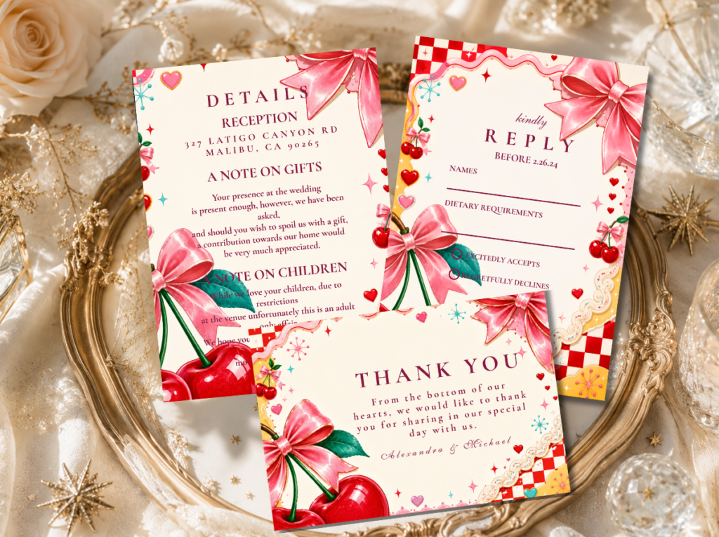
The Kitschy Wedding category — bold, maximalist stationery for the most abundantly kitschy wedding direction.
2.2 The Vegas Kitsch
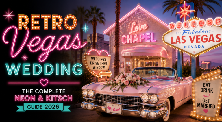
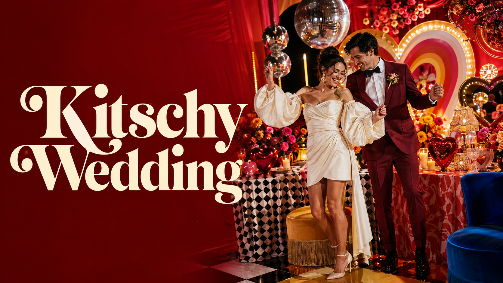
The Vegas Kitsch direction is kitsch with a specific cultural reference: the specific glamour of the Las Vegas aesthetic — neon lights, show-stopping spectacle, the unapologetic theatricality of a city that decided that excess was a design philosophy and committed to it for decades. The Vegas Kitsch wedding does not take place in Las Vegas; it takes the Vegas aesthetic and applies it to any space with enough ceiling height for a neon sign and enough personality to carry the spectacle. Gold and red are the palette’s anchors, with neon accent colours — electric blue, hot pink, bright white — appearing in the neon sign elements and the typographic details.
The Vegas Kitsch wedding’s most distinctive decorative element is the neon sign — a custom-made light installation in the couple’s chosen wording, above the dance floor or at the reception’s entry, that reads as both atmospheric lighting and graphic design object simultaneously. ‘Always bet on love,’ ‘deal us in,’ ‘jackpot,’ or simply the couple’s names in a script neon font: the wording should be specific to the couple, because the Vegas Kitsch aesthetic is about theatrical personal expression rather than generic glamour. The stationery matches the energy of the neon: bold, graphic, slightly over-the-top, and absolutely not apologetic about any of it.
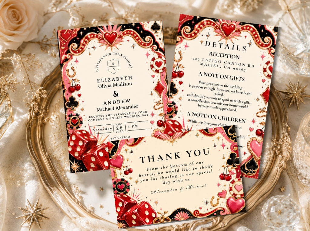
The Retro Vegas Wedding category — show-stopping, neon-adjacent stationery for the Vegas Kitsch direction.
2.3 The Pink Kitsch
The Pink Kitsch direction is the kitschy wedding at its most femininely abundant — the direction that takes hot pink and applies it to everything with the specific conviction that if pink is beautiful in one element, it is more beautiful in seventeen elements simultaneously. Hot pink tablecloths, pink balloon arches, pink floral walls, pink stationery in bold retro typography, pink-frosted cake, pink neon, pink sequin runners: the Pink Kitsch wedding is a single colour commitment taken to its most joyfully maximalist conclusion. The gold and warm orange accents prevent the all-pink direction from reading as sweet rather than spectacular; they introduce the warmth that makes the pink read as glamorous rather than pastel.
The Pink Kitsch direction is the 2026 kitschy wedding direction with the largest and most enthusiastic cultural audience, because it intersects with a broader fashion and design moment that has reclaimed pink — at full saturation, at maximum presence — as a statement of joyful confidence rather than as a gendered limitation. The Pink Kitsch wedding says, explicitly and joyfully, that there is nothing more powerful than a room full of hot pink when the person hosting it loves hot pink completely and without reservation. It is the most photogenic of the four kitschy directions and the one most likely to produce photographs that guests save to their camera rolls before they have even received the official images.
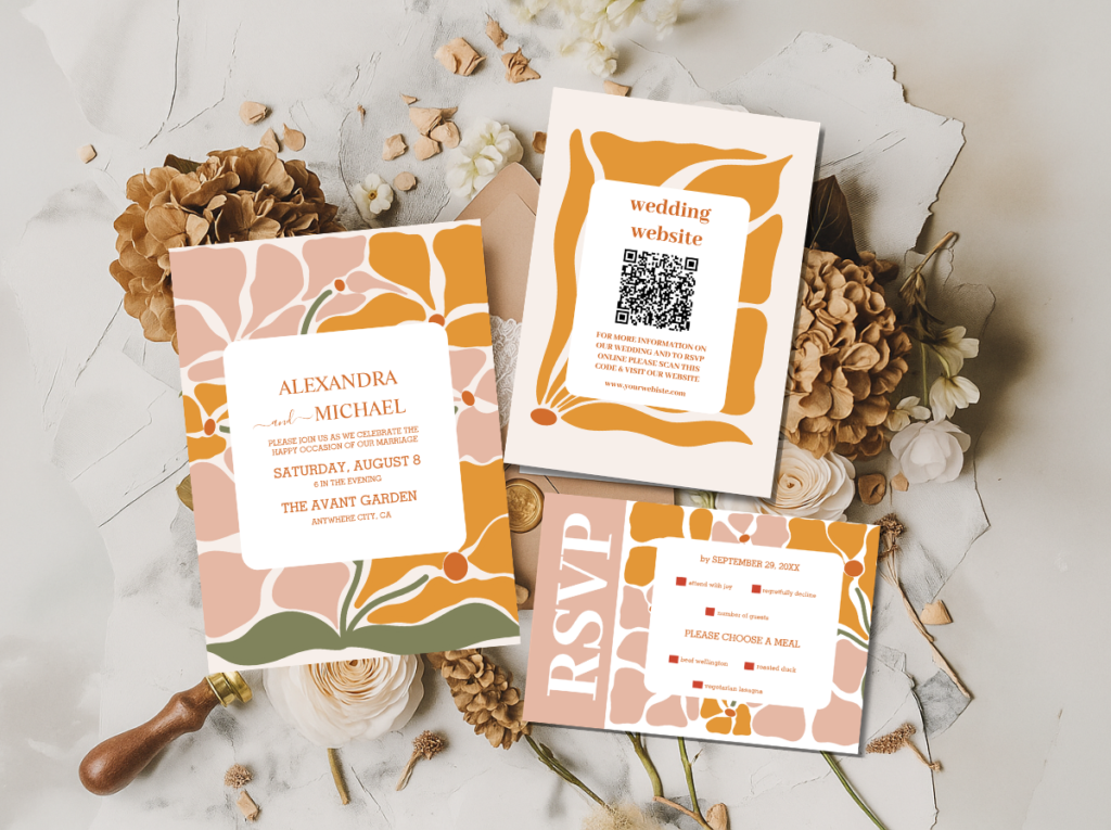
The Retro Pink Wedding and Groovy Retro Pink and Orange Arch collections — hot pink stationery in the most joyfully maximalist pink kitsch direction.
2.4 The Graphic Kitsch
The Graphic Kitsch direction applies the kitschy philosophy through typography and graphic design rather than through colour abundance: bold, oversized, retro-inflected letterforms on every surface, clashing pattern-on-pattern combinations in warm bold tones, and the specific visual energy of a celebration that reads as a designed artefact — a poster, a magazine cover, a record sleeve — rather than as a decorated space. The palette can be warm and earthy (orange, pink, and cream in the retro groovy register) or cool and graphic (black and white with single bold accent colour), but the governing principle is that the typographic and pattern elements are as important as — and as visible as — the decorative ones.
The Graphic Kitsch direction is the most design-forward of the four kitschy aesthetics and the one most likely to appeal to couples with a specific graphic design sensibility — couples who care about typefaces, who think about layout when they look at a table setting, and who want their celebration to read as intentional and considered even in its most exuberant moments. The stationery in the Graphic Kitsch direction is a graphic design object first and a wedding invitation second: it belongs on a wall after the wedding is over.
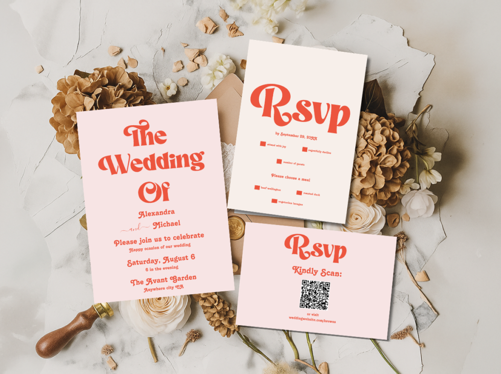
The Modern Retro Pink and Orange Typography and Minimal Retro Arch Black and White collections — bold graphic stationery for the Graphic Kitsch direction.
Section 03 Kitschy Wedding Colour Palettes
Four palette systems for four kitschy directions. The governing quality across all four: every colour should be warm and fully committed rather than muted or half-hearted. Kitsch does not do dusty.
3.1 Maximalist Colour Clash
Hot pink, electric blue, sunshine yellow, and warm orange in maximum-saturation combination — the most abundant and most deliberately clashing kitschy palette. Every tone warm and fully saturated rather than tinted or muted; the combination reads as warm overall because every individual tone is bold rather than cool.
3.2 Vegas Kitsch Palette
Bold red, warm gold, deep navy, and sunshine yellow — the glamorous, theatrical palette of the Vegas kitsch direction. Neon accent colours — electric pink, bright white, electric blue — appear in lighting and signage elements. Gold is the warm anchor that prevents the palette from reading as corporate.
3.3 Pink Kitsch Palette
Hot pink as the dominant tone, with warm gold and orange as the accent palette and warm cream as the base — the most femininely abundant and most photogenically bold kitschy palette. Pink at full saturation across all surfaces; gold and orange prevent the all-pink from reading as sweet rather than spectacular.
3.4 Graphic Kitsch Palette
Warm orange-red, hot pink, sunshine yellow, and warm cream — the most graphic and most typographically legible kitschy palette. Applied in flat bold planes of colour, in retro inflated letterforms, against the warm cream ground. Can alternatively be executed in black and white with a single bold accent colour for the most design-forward application.
Section 04 Kitschy Wedding Venue & Ceremony
The kitschy wedding’s venue relationship is simpler and more generous than any other retro aesthetic’s: almost any space that can accommodate the decorative scale the kitschy direction requires will work, because the kitsch aesthetic brings its own visual world so completely that the venue’s existing aesthetic is secondary to the decoration applied to it. The kitschy wedding does not need an architecturally distinctive venue; it needs a canvas.
The canvas over the backdrop. A neutral or blank venue — a white-walled hall, a converted warehouse, a large marquee — is often the most effective backdrop for the kitschy wedding, because it provides the maximum possible surface area for the decoration to claim. A venue with strong existing character — Gothic stone walls, Victorian decorative plasterwork, heavily patterned carpets — can create visual competition with the kitschy decoration rather than supporting it. The kitsch brings the world; it needs the venue to provide the space rather than the personality.
The ceremony moment. The kitschy wedding ceremony is as bold as the reception, but with a single governing decorative moment rather than the maximalist abundance of the reception room. A neon sign above the ceremony arch, a bold typographic backdrop panel, or a flower wall in the palette’s most saturated colour as the ceremony’s visual anchor: one spectacular element that communicates the aesthetic register immediately and completely. The ceremony chairs, the aisle arrangement, and the stationery carry the palette forward without competing with the hero element. The speech is where the couple exists; the hero element is the world it exists within.
The unexpected ceremony prop. Kitschy weddings are particularly suited to unexpected ceremonial props that would read as incongruous in any other wedding context — and that read, in the kitschy context, as specifically and joyfully the couple’s own. A vintage photo booth at the ceremony entry. A bold painted sign that reads exactly what the couple wants it to read rather than what a conventional welcome sign says. A collection of vintage props from the couple’s shared history arranged on a decorated table at the ceremony’s welcome zone. These elements communicate, from the moment guests arrive, that this celebration is going to be specific to the people hosting it in a way that most weddings are not.
The outdoor kitschy ceremony. Outdoor kitschy weddings add the specific joyful quality of unexpected abundance in a natural setting — the visual surprise of a hot-pink flower wall in a garden, or a vintage neon sign in a field, or a colour-clash balloon installation against a blue sky. The contrast between the natural outdoor setting and the maximalist decoration produces a specific quality of celebratory absurdity that photographs beautifully and reads, in person, as exactly as joyful as it is intended to be.
The Kitschy Wedding stationery category — bold, maximalist, and specifically joyful from the invitation outward.
Section 05 Kitschy Decor & Reception
The kitschy reception applies ‘more is more’ as a governing principle to every decorative decision — not as a license for visual incoherence, but as a commitment to the idea that every element that would be beautiful in a conventional wedding is more beautiful when multiplied, intensified, and placed in abundant combination with other beautiful elements.
Clashing prints and patterns. The kitschy reception table does not have a single consistent tablecloth; it has different tablecloths on different tables — one in a bold floral print, one in a geometric pattern, one in a solid saturated colour — because the combination of all three is more joyful than the uniformity of any one of them alone. Chair cushions in a pattern that intentionally clashes with the tablecloth beneath them. A patterned table runner over a solid-colour cloth over a floor-length overlay in a third pattern. The layering of prints and patterns should read as deliberately abundant rather than accidentally confused — which means that every individual pattern should be beautiful in its own right, and the combination should be warm rather than cool overall.
Unexpected props. The kitschy reception is full of objects that a conventional wedding would not include because they are too specific, too personal, or too weird — and these are exactly the objects that make the kitschy wedding memorable rather than generically beautiful. A collection of vintage ceramic animals as centrepiece elements. A pinball machine in the corner of the reception room as a guest activity. A jukebox at the music station rather than a DJ booth. A wall of vintage photographs in mismatched frames beside the dessert table. A themed photo corner with props chosen from the couple’s shared interests rather than from a generic prop box. The unexpected elements should be things the couple actually loves, because the love is what makes them read as intentional rather than random.
Neon signs. A custom neon sign — or several — is the kitschy reception’s most photographed and most immediately atmosphere-creating decorative element. Above the dance floor, behind the couple’s table, in the entry zone, at the bar: neon signs provide warm ambient lighting and graphic design in the same object, and they read as spectacular even in a room full of other spectacular elements. The wording should be specific: the couple’s names, a phrase that means something to them, a joke that their friends will understand. Generic neon wording — ‘love’ in a script font, ‘forever’ in block letters — is the only neon that reads as kitsch-as-accident rather than kitsch-as-choice.
Bold typography throughout. The kitschy reception’s printed elements — the welcome sign, the menu board, the table names, the bar sign, the dance floor song-request card — should all use the bold, retro-inflected typographic style of the invitation suite at the largest scale the surface allows. A menu board with text large enough to be read from across the room is more kitschy and more effective than a small-scale printed card; a welcome sign with lettering large enough to fill its board rather than leaving decorative margins around a modest amount of text. In the kitschy wedding, the typography is decoration as much as information.
Section 06 Kitschy Wedding Stationery
The kitschy wedding invitation is the first piece of the celebration that the guest encounters — and it should communicate, from the first glance, that this celebration is going to be unlike any other wedding on the guest’s calendar that year. The kitschy invitation does not do this by being conventionally beautiful in an unexpected colour; it does it by being boldly, joyfully, specifically itself. The invitation is a small piece of the celebration’s world delivered to the guest’s home before the wedding day — it should make them want to be there before they have finished reading it.
The typographic character of the kitschy invitation is its most powerful communicative tool. Rounded, bold, retro-inflected letterforms — the kind of type that reads as immediately and specifically of a particular era’s graphic design output rather than as generically contemporary — communicate the celebration’s joyful, unapologetic, excess-embracing aesthetic before the words they spell have been processed. Applied to a warm cream, hot pink, or bold colour-blocked card ground, with pattern or graphic elements drawn from the same retro design vocabulary, the kitschy invitation produces a stationery piece that reads as a designed artefact rather than as a conventionally beautiful card.
The envelope is the first moment of the kitschy aesthetic the guest experiences — and it should not be a plain white envelope. A bold colour, a pattern print, or a graphic-printed envelope that matches the invitation’s aesthetic register communicates, before the card is even removed, that what is inside is going to be specific and joyful rather than conventionally tasteful. The envelope lining, if the invitation has one, is another opportunity: a full-print lining in the celebration’s most saturated pattern, visible when the envelope is opened, produces a small moment of ‘oh, this is going to be something’ that is exactly the response the kitschy wedding aesthetic is designed to elicit.
The full stationery suite extends the invitation’s character through every printed element of the celebration. The ceremony programme as a bold single-card graphic object. The place card as a small printed artefact in the palette’s most saturated tone. The table name as an opportunity to continue the celebration’s personal references — tables named after the couple’s favourite films, albums, places, or inside jokes rather than after numbers or generic seasonal references. The menu as a bold typographic document that reads as confidently designed as the invitation that arrived weeks earlier. The six collections and categories below cover the full range of kitschy wedding stationery.
Primary Kitsch
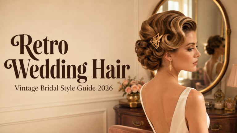
Kitschy Wedding
Bold, maximalist stationery for the full kitschy wedding direction — the primary starting point for any kitsch aesthetic.
Vegas Spectacle
Retro Vegas Wedding
Theatrical, show-stopping stationery in the Vegas kitsch direction — gold, red, and neon-adjacent from the invitation outward.
Pink Maximalism
Retro Pink Wedding
Hot pink stationery at full saturation — the most joyfully abundant and most photogenically bold pink kitsch direction.
Disco Energy
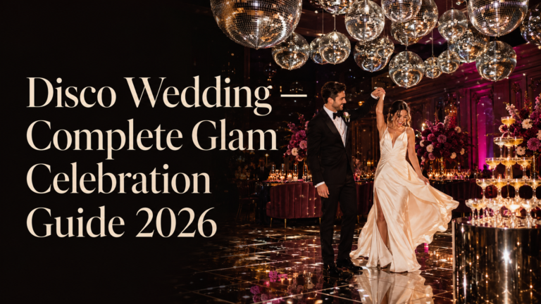
Disco Wedding
Gold, glamorous, and spectacularly fun stationery for the kitschy wedding’s most glam-adjacent direction.
Pink Typography
Modern Retro Pink and Orange Typography
Bold retro typographic stationery in the graphic kitsch direction — the invitation as graphic design artefact.
Graphic B&W
Minimal Retro Arch Black and White
Bold graphic stationery in the most design-forward graphic kitsch direction — high contrast, retro-inflected, specifically bold.
Groovy Pink
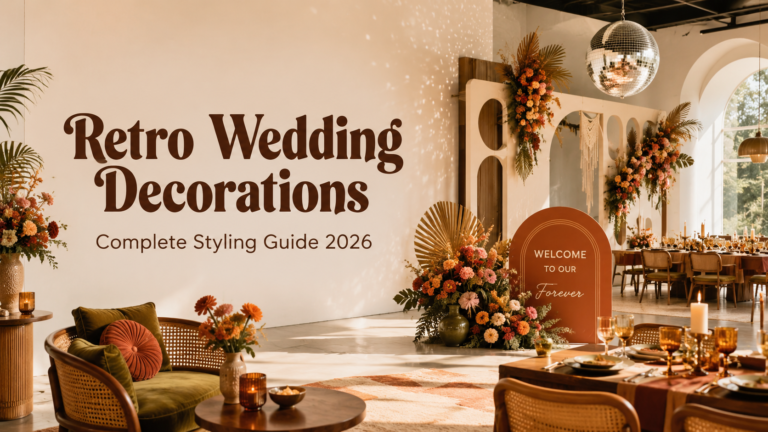
Groovy Retro Pink and Orange Arch
Hot pink and warm orange in the most joyfully groovy and retro-adjacent stationery direction.
Browse the full kitschy wedding stationery range — seven collections and categories from Maximalist Colour Clash to Vegas Spectacle to Graphic Kitsch.
Frequently Asked Questions
What is a kitschy wedding?
A kitschy wedding is a celebration that deliberately and joyfully embraces maximalism, colour abundance, unexpected props, and the specific visual pleasure of having everything you love present in the same space simultaneously — as an aesthetic philosophy rather than as a design accident. It is distinguished from visual confusion by the quality of its governing principle: in a successful kitschy wedding, every individual element is something the couple genuinely loves and that works on its own terms, and the combination of those elements produces a warm, joyful abundance rather than competing visual noise. The four main kitschy wedding directions — Maximalist Colour Clash, Vegas Kitsch, Pink Kitsch, and Graphic Kitsch — each apply this maximalist philosophy to a specific palette and emotional register.
How do I make a kitschy wedding look intentional rather than chaotic?
Two principles separate intentional kitsch from accidental visual chaos. The first is the warm-palette rule: every colour in the kitschy wedding should be warm and fully saturated rather than cool or muted, so that the combination reads as warm overall even when individual tones are in deliberate contrast. Cool, muted, and warm elements in the same space compete with each other; warm and saturated elements in the same space read as abundant. The second is the individual-element quality rule: every element in the kitschy wedding — every prop, every pattern, every decorative object — should be something that would be beautiful or interesting in isolation. Kitsch is an abundance of good things, not a collection of compromises. If an element would not be chosen on its own merits, it should not be in the room.
What decorations are used in a kitschy wedding?
The kitschy wedding’s decorative vocabulary is deliberately broad — which is part of its aesthetic point. Clashing print and pattern tablecloths and chair cushions that intentionally contrast with each other. Custom neon signs in specific wording chosen by the couple rather than generic phrases. Unexpected personal props — vintage ceramic animals, a pinball machine, a jukebox, a wall of mismatched vintage photograph frames — that are specific to the couple’s shared history rather than sourced from a generic prop catalogue. Bold typographic signage at large scale across every printed surface. Bold colour balloon installations in clashing palette tones. The governing principle: more of things that mean something, applied at maximum joyful abundance.
Can a kitschy wedding be elegant?
Yes — but the word ‘elegant’ in the kitschy context means something different from its conventional wedding application. Conventional wedding elegance means restraint, tonal coherence, and refined subtlety. Kitschy elegance means every element being individually excellent, the overall combination reading as warm and abundant rather than confused, and the whole celebration communicating a specific and confident aesthetic vision rather than a generic one. The Vegas Kitsch and Studio 54-adjacent kitschy directions are the most conventionally ‘elegant’ within the kitschy spectrum — gold and deep red in abundance reads as glamorous rather than overwhelming — while the Maximalist Colour Clash direction is the most joyfully non-elegant in the conventional sense. Both are valid; the choice depends on what the couple wants their celebration to feel like.
More Is More · Bold · Joyful · Unapologetically Yours
Shop Kitschy Wedding Stationery
Bold, maximalist, and completely yourself — invitations and full stationery suites for every kitschy wedding direction.