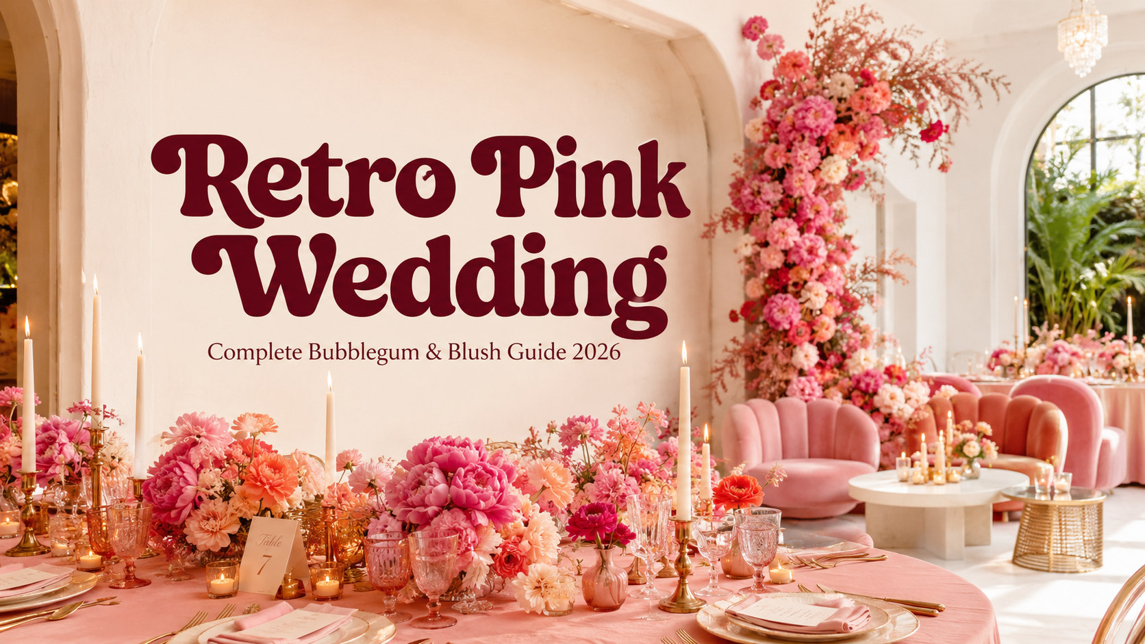
Retro Pink Wedding — Complete Bubblegum & Blush Guide 2026
Wedding Guide · Retro Pink · Bubblegum & Blush · 2026
Retro Pink Wedding — Complete Bubblegum & Blush Guide 2026
Four retro pink aesthetics, the full hot pink palette, carnation-led florals, and the stationery that makes the retro pink wedding the most joyfully bold celebration in 2026.
There is a specific quality of confidence required to commit fully to pink — not dusty rose, not blush, not the softened, apologetic version of pink that conventional wedding culture has made available as a way of having pink without quite committing to it, but actual hot pink, bubblegum pink, the full-saturation bold version of a colour that has been reclaimed in the past few years as one of the most powerful aesthetic statements available. The retro pink bride does not want her pink to be subtle. She wants it to be the first thing every guest remembers about the day.
The retro pink wedding draws its specific character from the intersection of full-saturation pink and the retro design vocabulary of the 1960s and 1970s — the rounded, organic typography, the warm colour combinations, the specific visual energy of a decade that was not afraid of colour and was not interested in restraint. The result is a celebration that is simultaneously joyful and designed: not a pink party with a wedding in the middle, but a wedding where pink is applied with the same confidence and intentionality that the decade’s most distinctive design applied to every other aesthetic decision.
“Pink at full saturation is not a failure of restraint. It is a declaration of joy — the decision to fill every surface of your most important day with the colour that makes you happiest, and to do it without asking whether anyone finds it too much.”
Section 01 What Is a Retro Pink Wedding?
The retro pink wedding is not a wedding with some pink flowers and a blush table runner. It is a wedding where pink — bold, full-saturation, retro-referenced pink — is the governing aesthetic principle rather than an accent. The distinction matters because it determines every subsequent decision: a wedding with pink accents can be any aesthetic with some pink added; a retro pink wedding is a designed colour world where every element that is not pink is chosen specifically to make the pink read at its most joyful and its most powerful.
The ‘retro’ in retro pink wedding is equally specific. It does not mean vintage, which connotes soft pastels, lace, and the muted, nostalgic reading of pink that most wedding culture has defaulted to when it allows pink at all. Retro in this context means the specific visual vocabulary of the 1960s and 1970s — the rounded, confident typography of the groovy era, the warm colour combinations that placed pink beside orange and gold rather than beside white and grey, and the specific cultural moment that produced the most joyfully confident use of colour in modern design history. Applied to hot pink, this vocabulary produces a wedding aesthetic that reads as bold and editorial rather than as soft and romantic — the difference between pink as a statement and pink as a suggestion.
The cultural moment for the retro pink wedding in 2026 is the continuation of a broader reclamation of pink as a statement of confident femininity rather than a concession to conventional expectations. Pink at full saturation — in the retro context, applied with the decade’s confidence and its specific graphic vocabulary — reads as powerful rather than gentle, deliberate rather than default, and specifically of an aesthetic world rather than generically feminine. The retro pink wedding is the most joyful expression of this reclamation: a celebration where pink is the point, the design principle, and the first thing every guest remembers.
The specific palettes that make the retro pink wedding work are the ones that warm the pink rather than cool it: gold, warm orange, and warm cream alongside hot pink produce a combination that reads as glamorous and specifically retro rather than as generically bright. Silver, grey, and cool white alongside hot pink produce a combination that reads as sharp but loses the warm, joyful quality that makes the retro pink direction specifically beautiful. Every palette decision in the retro pink wedding is a decision about whether the pink reads as warm or cool — and warm is always correct.
Section 02 Four Retro Pink Wedding Aesthetics
Four distinct directions within the retro pink wedding, each applying the same governing pink palette to a different emotional register and a different set of retro design references. All four are joyful, bold, and unapologetic; the specific character of each direction differs.
2.1 The Bubblegum Pink Aesthetic — Hot Pink, Cream & Gold
The Bubblegum Pink direction is the retro pink wedding at its most purely and most maximally feminine — hot pink in its most joyful and most fully committed application, alongside warm cream and antique gold in a combination that reads as glamorous rather than girlish because the gold warms the pink and prevents it from reading as sweet. The Bubblegum Pink wedding is the direction for the bride who knows exactly what she wants and wants it at full volume: hot pink tablecloths, hot pink floral installations, hot pink stationery in bold retro typography, and a celebration that is immediately and unmistakably pink from the moment the invitation arrives.
The Bubblegum Pink direction is the most broadly appealing and the most universally understood of the four retro pink aesthetics, because it applies a clear and joyful colour philosophy to every element of the celebration without requiring a specific design vocabulary to make it work. A room that is entirely pink and gold reads as beautifully hosted regardless of the guest’s aesthetic sensibility; the boldness is legible and the joy is immediate. The challenge in this direction is not making it work but making it feel considered rather than accumulated: every shade of pink should belong to the same warm, retro-influenced tonal family, and every gold element should be antique rather than bright.
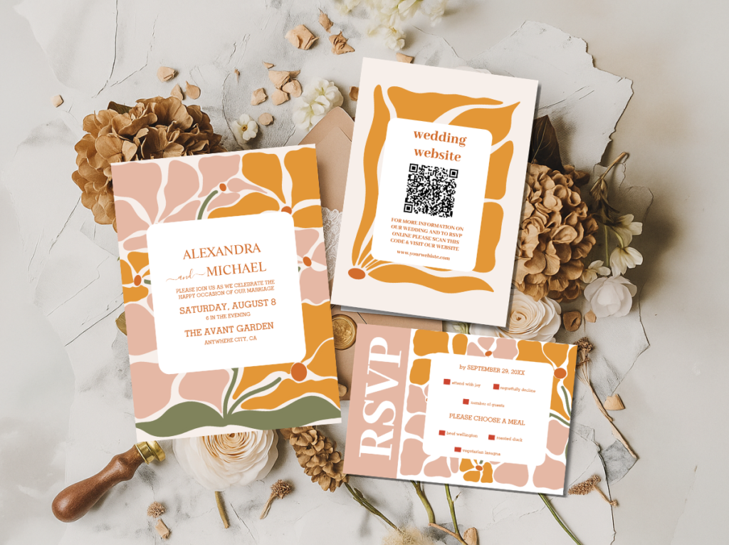
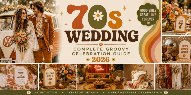
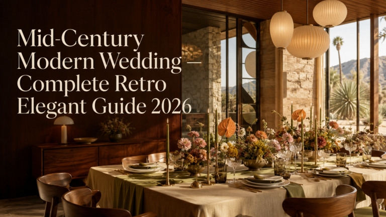
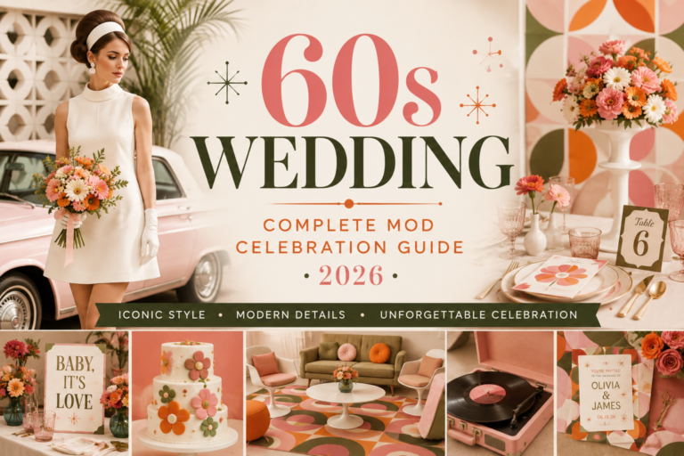
The Retro Pink Wedding category and the Groovy Retro Pink and Orange Arch collection — the stationery starting point for the Bubblegum Pink direction.
2.2 The Pink & Orange Groovy Aesthetic
The Pink and Orange Groovy direction takes the Bubblegum Pink palette and adds the specific visual energy of warm orange alongside it — the combination that most specifically references the 1970s’ most distinctive chromatic signature and that produces the most energetic and most joyfully retro reading of the pink wedding palette. Hot pink and warm orange in combination belong specifically to the retro design vocabulary; no other decade placed these two tones in such confident and characteristic combination. The result reads as immediately and specifically groovy — joyful in the particular way of a decade that knew how to be joyful with colour.
The Pink and Orange Groovy wedding is the direction most suited to couples who want the retro pink aesthetic but want to add a layer of design specificity beyond pure pink abundance. The orange gives the pink a context — a decade, a design world — that the purely pink Bubblegum direction does not always communicate on its own. The stationery in this direction is the celebration’s most specifically retro piece: bold, rounded, typographically confident, and in a colour combination that reads as of-its-era the moment it arrives in the post.
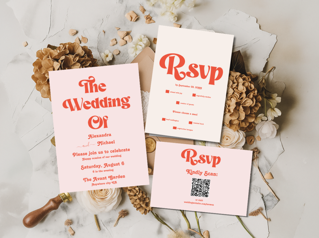
The Modern Retro Pink and Orange Typography collection — the most specifically groovy pink and orange retro stationery direction.
2.3 The Pink Vegas Aesthetic
The Pink Vegas direction applies the Las Vegas aesthetic’s specific glamour philosophy to the retro pink palette: neon pink, warm gold, and showgirl energy in a celebration that is theatrical, spectacular, and completely uninterested in understatement. Where the Bubblegum Pink direction is maximally feminine and the Pink and Orange Groovy direction is maximally retro, the Pink Vegas direction is maximally spectacular — the pink wedding at its most dramatically staged and its most overtly glamorous.
A custom neon sign in hot pink script above the dance floor. A pink sequin backdrop behind the couple’s table. Bold pink and gold typography on every piece of signage and stationery. A celebration that reads as a performance from the moment the guest enters the venue to the moment they leave — not because anything is artificial, but because every element has been chosen specifically to produce the sensation of being inside a spectacular moment. The Pink Vegas wedding is the most photogenic of the four directions and the one most likely to produce images that guests share before the professional photographs have been delivered.
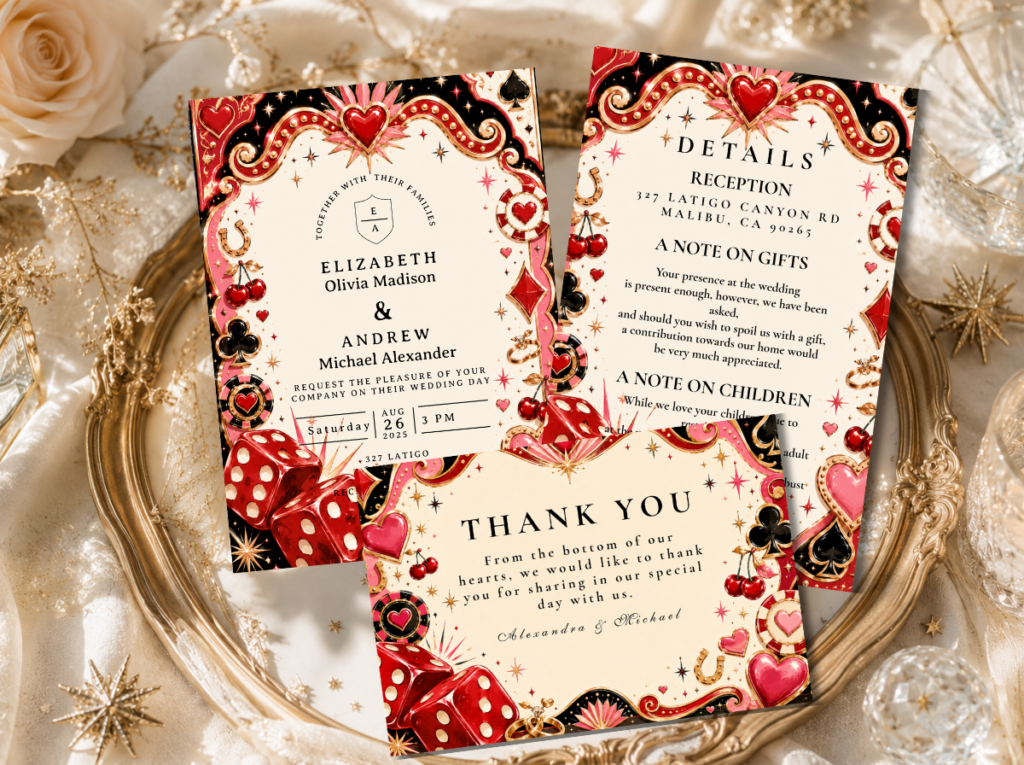
The Retro Vegas Wedding category — theatrical, neon-adjacent stationery for the Pink Vegas direction.
2.4 The Pink Kitsch Aesthetic
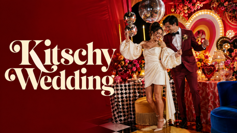
The Pink Kitsch direction is retro pink taken to its maximalist conclusion — the direction where more pink is always the answer and where the governing principle is the specific joy of a room where every surface, every textile, every decorative object, and every printed element is in a different and deliberately clashing shade of pink. Hot pink beside bubblegum pink beside coral beside dusty rose — all of these in deliberate combination, unified by their shared pink-family membership and differentiated by the specific warmth and energy of each individual tone.
The Pink Kitsch direction is the most demanding of the four to execute well, because the clashing pinks only read as intentional rather than confused when every shade is warm and fully saturated. A cooler or more muted pink in the combination — a grey-toned dusty rose beside a warm hot pink — breaks the warm coherence and reads as a mistake rather than a deliberate clash. The rule: every shade of pink in the Pink Kitsch direction must belong to the warm side of the pink spectrum. Cool and muted pinks should not appear in this direction at all.
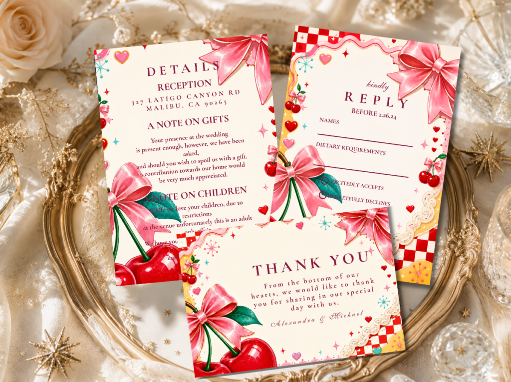
The Kitschy Wedding category — maximalist, unapologetically abundant stationery for the Pink Kitsch direction.
Section 03 Retro Pink Wedding Colour Palettes
Four palette systems for four retro pink directions. The quality shared across all four: every pink is warm rather than cool, and every accent colour warms the pink further rather than cooling it. Gold, orange, and warm cream are the retro pink wedding’s natural allies; silver, grey, and cool white are not.
3.1 Classic Bubblegum Palette
Hot pink, warm cream, antique gold, and sunshine yellow — the most joyful and most broadly appealing retro pink palette. Every tone warm; the gold and yellow prevent the pink from reading as sweet or cool. The most universally loved retro pink combination.
3.2 Pink & Orange Groovy Palette
Hot pink and warm orange in the most specifically retro colour combination — the palette that most directly references the 1970s’ chromatic signature. Warm cream as the base; antique gold as the metallic. No cool tones; every element warm and specifically groovy.
3.3 Vegas Pink Palette
Neon pink, warm gold, and bright white — the most theatrical and most spectacular retro pink palette. The bright white reads as a spotlight rather than as a cool tone because the pink and gold warm it completely. Appropriate for evening celebrations with controlled artificial lighting.
3.4 Pink Maximalist Palette
Clashing warm pinks — hot pink, bubblegum, coral-pink, and rose — in deliberate combination. All tones warm rather than cool; no grey or muted pinks. The combination reads as abundant rather than confused because every shade belongs to the same warm pink family.
Section 04 Retro Pink Wedding Venue & Ceremony
The retro pink wedding’s venue relationship is more generous than most retro aesthetics: pink at full saturation provides enough visual presence and warmth to transform almost any space. The most important venue quality for the retro pink wedding is not architectural character but the ability to accommodate the pink decoration without competing with it through its own strong colour or pattern.
Bright, light-filled interiors. A white-walled or pale-interior venue is the most effective backdrop for the retro pink wedding, because it provides the maximum reflective surface for the pink decoration’s warmth. Hot pink in a white room reads as beautifully saturated and warm; hot pink in a dark or strongly coloured room reads as competing with the venue’s existing colour rather than setting the room’s tone. Large windows that admit natural light are equally beneficial: pink in natural daylight reads at its most jewel-like and most specifically beautiful.
Garden settings. An outdoor garden ceremony or reception provides the most romantically beautiful setting for the all-pink decoration palette: pink blooms against green foliage, hot pink floral arches against a blue summer sky, and the specific quality of a garden in full colour where the decoration appears to belong to the landscape rather than to have been placed against it. The retro pink garden wedding is the most Instagram-consistent and the most photographically spectacular of the four direction’s setting options.
The pink floral arch. The retro pink ceremony arch is a floral installation rather than a geometric structure: a full arch or half-arch of hot pink blooms — carnations, peonies, ranunculus, roses — in the warm pink tones of the chosen direction, with warm gold ribbon or warm cream textural elements as the accent. The arch should read as abundant rather than sparse: the retro pink aesthetic is not a direction that benefits from restrained floristry. A full, opulent arch of warm pink blooms in varying tones and textures — from the flat petal surface of a carnation to the voluminous sphere of a peony — reads as specifically and beautifully of the direction.
The carnation aisle. Carnations in warm pink tones — placed in bold clusters at each aisle marker rather than in single stems — are the retro pink ceremony’s most specifically appropriate aisle decoration. The carnation’s specific quality — its dense, layered petal structure, its warm pink tones, and its long-standing association with the retro aesthetic that is currently experiencing its most significant editorial rehabilitation — makes it the perfect floral companion to the retro pink ceremony. At full bloom and in bold clusters, carnations read as opulent rather than modest, and they carry the warm pink palette from the entry to the ceremony arch without visual interruption.
The Retro Pink Wedding and Groovy Retro Pink and Orange collections — warm pink ceremony stationery from the invitation to the ceremony programme.
Section 05 Retro Pink Decor & Reception
The retro pink reception applies the governing pink palette at every surface level simultaneously — and the principle of simultaneous application rather than the conventional wedding’s approach of one pink element per zone is precisely what makes the retro pink reception read as designed rather than accidentally abundant.
Pink tablecloths and floral abundance. Hot pink tablecloths as the primary table surface — not as an accent runner over white linen, but as the full table surface in the direction’s saturated pink — provide the reception room’s primary warm colour field. Against this pink ground, the centrepiece arrangements and all other table elements should be chosen in tones that belong to the same warm family: warm cream, antique gold, warm orange accent elements, and the deep warm green of full botanical foliage as the contrast. The combination of hot pink ground and warm floral arrangement reads as abundant in the specifically retro manner: warm, full, and specifically of an era that understood that a table should feel like the most generous version of itself.
Bold retro typography signage in pink. Every piece of signage and directional information in the retro pink reception should be in the bold, rounded retro typographic style that defines the direction, applied in hot pink on a warm cream or gold ground. The welcome sign is a statement piece — large enough to fill its board, in a typeface that reads as immediately groovy and specifically retro, with the couple’s names at the maximum scale the surface allows. Bar signs, menu boards, seating charts, and table name cards follow the same typographic system. The printed language of the retro pink celebration reads as a complete visual design system rather than as individual informational pieces.
The pink cake table. The cake table in the retro pink reception is the room’s most spectacularly pink surface: a full pink tablecloth, a bold pink floral installation at one or both ends of the table, the cake itself in warm pink buttercream with retro-inspired typography in the invitation’s typeface as the printed element, and warm gold candles at varying heights as the light source that activates the pink and gold combination. A pink sequin runner beneath the cake, rather than a plain tablecloth, provides the specific sparkle quality that the retro pink aesthetic uses in the same way the disco aesthetic uses the mirror ball: as a light-multiplying surface that makes the whole cake table read as spectacular.
Carnation centrepieces. Carnations in warm pink tones — in full, opulent arrangements in gold vessels or clear glass vases — are the retro pink reception’s most specifically appropriate centrepiece flower. A single-variety carnation arrangement in a tight, full sphere reads as a designed object; a mixed arrangement of carnations with warm foliage and gold botanical elements reads as abundant and warm. Either approach carries the retro pink palette to the table level with a warmth and a specifically retro quality that more conventionally prestigious blooms cannot replicate at the same visual impact per stem.
Section 06 Retro Pink Wedding Flowers
The retro pink wedding’s floral vocabulary is the most specific of all the retro aesthetics — not because fewer flowers are appropriate, but because the retro pink direction has a hierarchy of blooms that work particularly well within its warm palette and its specifically bold visual register.
Carnations. The carnation is the retro pink wedding’s most important flower — not because it is the most expensive or the most conventionally prestigious, but because it is the most specifically retro, the most joyfully pink, and the most dramatically impactful at the scale the retro pink direction requires. The carnation has been experiencing a significant and well-documented editorial rehabilitation in contemporary wedding floristry, moving from its decades-long association with generic party decoration to its current status as the bloom most specifically associated with the retro aesthetic’s most celebrated contemporary revival. In warm pink tones — hot pink, deep rose, warm coral-pink — and arranged in abundant masses rather than in isolated single stems, carnations read as deliberately chosen and specifically beautiful.
Peonies. Peonies in warm pink tones — hot pink, deep rose, warm watermelon — are the retro pink bouquet’s most voluminous and most photographically beautiful bloom. Their dense, layered petal structure produces a warmth and a fullness that reads as specifically opulent in both natural and artificial light; their warm pink tone, in the retro context, reads as the most joyfully saturated version of itself rather than as conventionally bridal. A bouquet led by warm pink peonies with carnation and ranunculus as the secondary blooms is the most lush and most specifically pink arrangement available to the retro pink wedding.
Ranunculus. Ranunculus in warm pink, warm peach-pink, and deep coral provide the retro pink arrangement’s mid-scale bloom — smaller and more intricate than the peony, larger and more layered than the carnation, with the specific quality of a tightly wound petal spiral that reads as designed rather than organic. In the retro pink context, ranunculus provides the textural variety that prevents an all-carnation or all-peony arrangement from reading as uniformly dense; their more delicate petal structure offers visual relief without losing the warm pink palette.
Cosmos. Cosmos in warm pink and deep magenta provide the retro pink arrangement’s lightest and most airy bloom — the single-layer, open-face flower that adds visual movement and lightness to an otherwise voluminous arrangement. The cosmos’s specific quality of appearing to float within the arrangement — its thin stem and open face catching light from multiple angles — is the element that prevents the retro pink bouquet from reading as too heavy, however abundant the peony and carnation elements are.
The deliberately bold all-pink bouquet. The retro pink bridal bouquet is not a mixed bouquet with some pink added; it is a single-palette, all-pink composition in which the variety comes from the different bloom forms and textures rather than from colour variation. The binding is warm gold or warm orange ribbon — a wide, bold ribbon tied in a generous bow rather than the thin twine of the earthy aesthetic — and the stems are trimmed to a consistent length rather than extended below the binding in the boho manner. The overall impression is warm, opulent, and unapologetically pink: the most joyful bridal bouquet in the 2026 wedding landscape.
Section 07 Retro Pink Wedding Stationery
The retro pink wedding invitation is the celebration’s boldest first impression — and it should make that impression from the moment it arrives in the post. A hot pink envelope on a standard morning’s mail communicates, before it has been opened, that the celebration it announces is going to be unlike any other wedding on the guest’s calendar. The retro pink invitation does not use pink as an accent; it uses pink as the primary design decision, the first thing the guest sees and the last thing they remember about the card after it has been filed away with their other correspondence.
The typographic language of the retro pink invitation is the direction’s most specific design element: rounded, warm, confident letterforms in the groovy retro style that belongs specifically to the 1970s’ most joyful graphic design output. These are not soft or delicate letterforms; they are bold, warm, and large enough to read as graphic statements rather than as printed information. Applied in hot pink on a warm cream ground — or in warm cream on a hot pink ground — with warm orange or gold as the secondary typographic colour, the retro pink invitation reads as a graphic artefact that the guest wants to display on their refrigerator before they have even RSVPd.
The paper quality of the retro pink invitation should carry the warmth of the design it contains. A heavyweight warm ivory card stock — warm and slightly textured rather than smooth and optical white — carries the retro quality of the typography and allows the hot pink ink to read at its most saturated and most warm. A smooth bright white card with the same typography reads as more contemporary and less specifically retro; the slightly warm card stock adds the decade reference that the typography alone cannot provide. The envelope in a matching or complementary pink is the moment that the invitation makes its first dramatic statement.
The stationery suite carries the bold, warm, typographically confident character of the invitation through every piece the guest receives and encounters. The ceremony programme in the retro pink and gold palette, designed as a single bold graphic card rather than a multi-page booklet. The place card in hot pink with warm cream typography. The menu in bold retro typography on a warm pink or cream ground. The table names chosen from the couple’s shared cultural references — the films, albums, places, and moments that belong specifically to them — in the invitation’s bold typeface. The consistency of the typographic and colour system across every piece is what makes the retro pink wedding read as designed from the first invitation to the last favour tag.
Primary Pink
Retro Pink Wedding
The full Retro Pink Wedding category — bold, warm, hot pink stationery across every retro pink direction and every printed element.
Groovy Pink & Orange
Groovy Retro Pink and Orange Arch
Hot pink and warm orange in a groovy arch motif — the most specifically retro and most decade-referenced pink stationery direction.
Bold Typography
Modern Retro Pink and Orange Typography
Bold retro typographic stationery in hot pink and warm orange — the invitation as graphic design statement.
Vegas Spectacular
Retro Vegas Wedding
Theatrical, neon-adjacent gold and pink stationery for the Pink Vegas direction.
Pink Maximalist
Kitschy Wedding
Maximalist, abundantly pink stationery for the Pink Kitsch direction — more pink is always more.
Full Retro Suite
Retro Wedding
The full Retro Wedding category — warm, decade-specific stationery across every retro direction.
Browse the full retro pink wedding stationery range — six collections and categories from Bubblegum Pink to Pink Vegas to Groovy Pink and Orange.
Frequently Asked Questions
What is a retro pink wedding?
A retro pink wedding is a celebration where hot pink or bubblegum pink — at full saturation, not as a dusty rose or blush accent — is the governing aesthetic principle, applied through the specific visual vocabulary of the 1960s and 1970s: rounded retro typography, warm colour combinations (pink alongside orange and gold rather than alongside grey and white), and the confident, joyful design energy of a decade that was not afraid of colour. It is distinguished from a pink-accented wedding by the completeness of its pink commitment: every element is chosen to make the pink read at its most joyful and its most powerful, rather than to balance or soften it. The four retro pink directions — Bubblegum Pink, Pink and Orange Groovy, Pink Vegas, and Pink Kitsch — each apply this commitment to a different palette and emotional register.
What colors go with hot pink in a retro wedding?
The retro pink wedding’s most effective supporting palette is warm rather than cool: antique gold, warm orange, warm cream, and sunshine yellow are the colours that warm the pink and make it read as glamorous rather than sweet. Warm cream as the base tone; antique gold as the metallic accent; warm orange as the secondary colour in the Pink and Orange Groovy direction; sunshine yellow as a tertiary accent in the Bubblegum Pink direction. Silver, grey, and cool white should be avoided: they cool the pink and prevent it from reading as warm and retro, shifting it instead toward a more contemporary and less specifically joyful register. The rule: every colour in the retro pink wedding should warm the pink, not cool it.
What flowers are used in a retro pink wedding?
The retro pink wedding’s primary floral vocabulary centres on carnations, peonies, ranunculus, and cosmos in warm pink tones. Carnations are the direction’s most specifically retro and most dramatically impactful bloom: in warm pink tones and arranged in abundant masses, they read as deliberately chosen and specifically beautiful rather than generic. Peonies in warm pink provide the bouquet’s most voluminous and most photographically beautiful element. Ranunculus provides the mid-scale textural variety. Cosmos provides the airiness and visual movement that prevents the arrangement from reading as too dense. The governing principle: the bouquet is a single-palette, all-pink composition where variety comes from bloom form and texture rather than from colour, bound in warm gold or warm orange ribbon.
How do I make a hot pink wedding look sophisticated rather than childish?
Three decisions produce the most sophisticated result. The first is the warm-palette rule: every accent colour alongside the pink must be warm — antique gold rather than bright gold, warm orange rather than bright yellow, warm cream rather than bright white. Warm accents make the pink read as glamorous; cool accents make it read as garish. The second is the retro typography rule: bold, rounded, specifically retro letterforms in the stationery and signage communicate that the pink is a deliberate aesthetic choice rather than a default colour selection. The third is the quality of the individual floral and textile elements: a hot pink tablecloth in a rich, warm fabric with a precise drape reads as designed; a hot pink tablecloth in a thin, bright synthetic fabric reads as cheap. The sophistication of the retro pink wedding comes from the quality of its individual elements, not from toning down the pink.
Hot Pink · Bold · Retro · Unapologetically Joyful
Shop Retro Pink Wedding Stationery
Bold, warm, and completely pink — invitations and full stationery suites for every retro pink wedding direction.