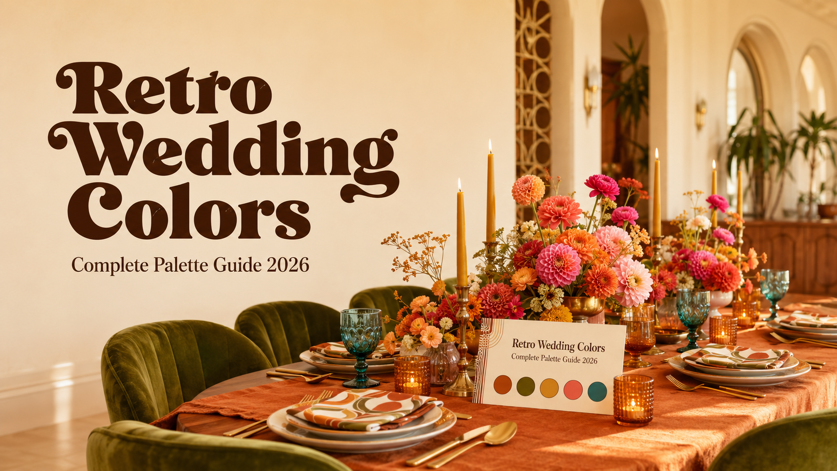
Retro Wedding Colors
Wedding Avenue Studio · Color Guide · 2026
Retro Wedding Colors
Complete Palette Guide 2026
Eight retro wedding palettes with visual colour swatches, decade logic, venue pairings, and direct links to matching stationery collections from Wedding Avenue Studio.
Retro wedding palettes are having their longest sustained moment in decades — not because nostalgia is fashionable, but because each decade’s colour language is so internally consistent that a retro palette almost styles itself. Choose the right decade, commit to it fully, and the rest follows naturally.
“Bold colour is not a risk in a retro wedding — it is the entire point. Each decade knew exactly which colours belonged together, and that confidence is what makes a retro palette feel joyful rather than chaotic.”
Section 01 How Decades Create Their Own Color Language
Every decade from the 1950s through the 1970s produced a colour palette shaped by specific forces: the dye technologies available, the dominant design movement, and the cultural mood. The 1960s Mod movement used black, white, and primary colours because high-contrast graphic shapes were its design language. The 1970s earth palette — burnt orange, avocado, mustard, harvest brown — reflected ecological consciousness and a deliberate move away from the clinical brightness of the previous decade. The disco palette of mirror gold and deep jewel tones reflected a nightlife-forward optimism and a specific love of reflective surfaces.
What makes retro palettes feel more joyful than contemporary wedding palettes is commitment. Contemporary trends favour soft, desaturated, easily combinable tones — dusty rose, sage, warm white — that photograph beautifully but read as carefully cautious. Retro palettes are not cautious. They use colour at full saturation with full confidence in the combination, because that is how the decade used colour in every context. When every element of the wedding belongs to the same decade’s colour world, the result reads as cohesive in the most joyful way available.
Section 02 Eight Retro Wedding Color Palettes
Eight palettes, each drawn from a specific decade and design movement. Each card shows the four colours visually, with venue pairing and direct stationery links.
Palette 01
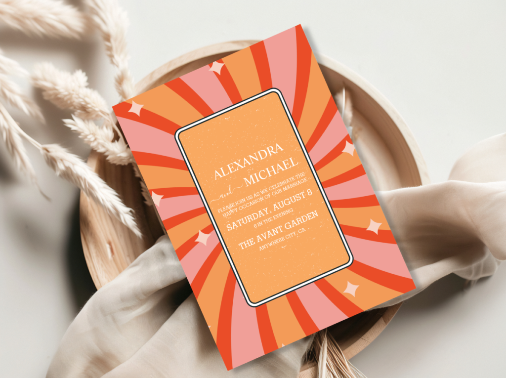
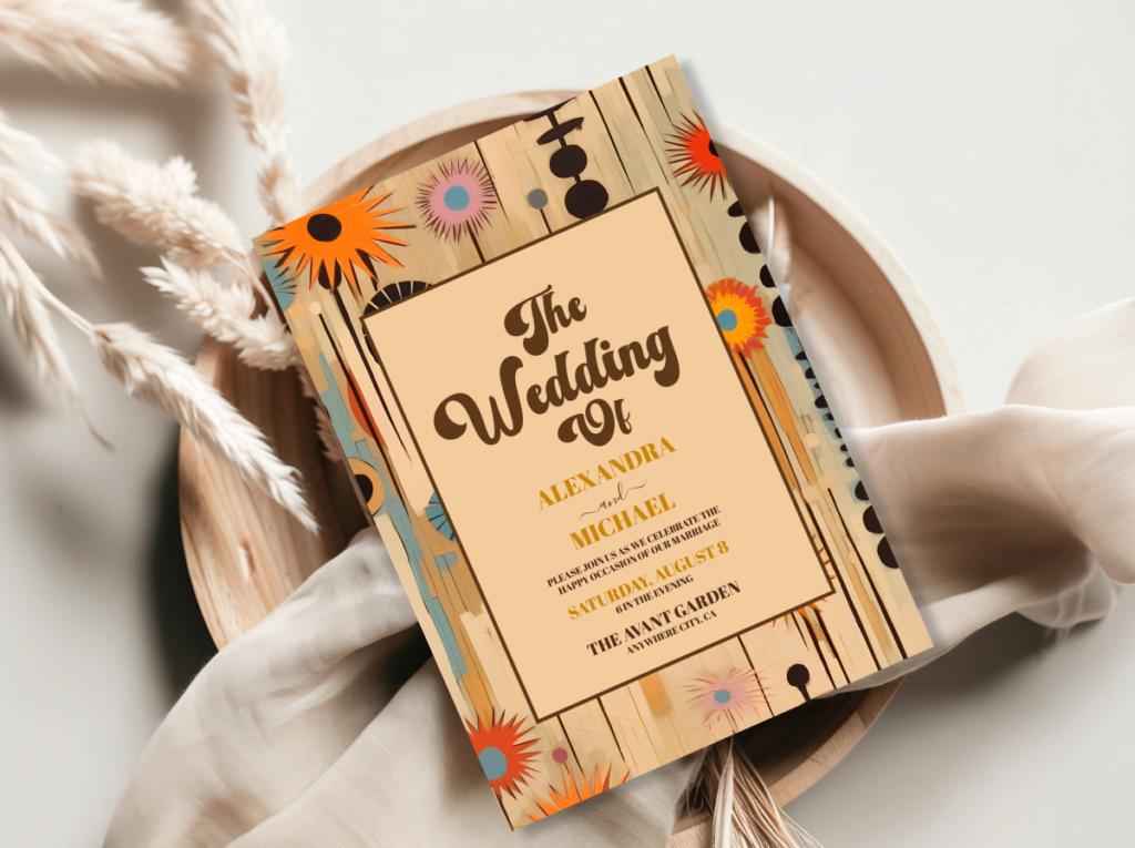
70s Groovy Earth
Feeling: Warm, grounded, and botanically abundant — the palette that reads as a sun-saturated garden. Organic, confident, and the most consistently beautiful retro palette for outdoor or barn venues.
Venue fit: Rustic barn, vineyard, outdoor garden, converted warehouse with exposed warm wood.
Stationery: Arch Modern Retro 70s Floral and Groovy 70s Muted Tones — botanical illustration in the earth palette’s warm tones.
Palette 02
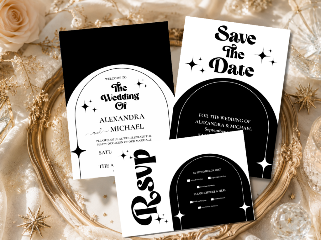
60s Mod Graphic
Feeling: Graphic, confident, and high-energy — the palette that reads as a deliberate design decision at full saturation. No ambiguity; every element is intentional.
Venue fit: Urban loft, rooftop, minimalist gallery, or any venue where architectural clean lines are the backdrop.
Stationery: Minimal Retro Arch Black and White — the stationery direction most specifically suited to the 60s graphic palette.
Palette 03
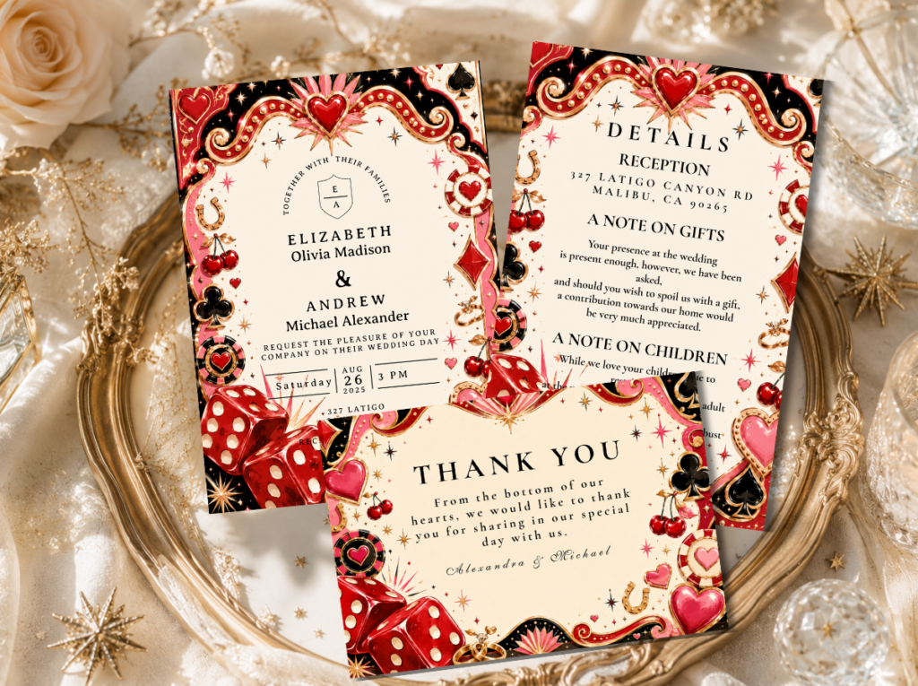
Vegas Neon
Feeling: Maximally celebratory, nightlife-forward, and unapologetically bold — the most visually confident palette of all eight.
Venue fit: Hotel ballroom, nightclub venue, rooftop with city lights, any space with warm ambient lighting and high ceilings.
Stationery: Retro Vegas Wedding stationery — neon-adjacent typography and gold detail.
Palette 04
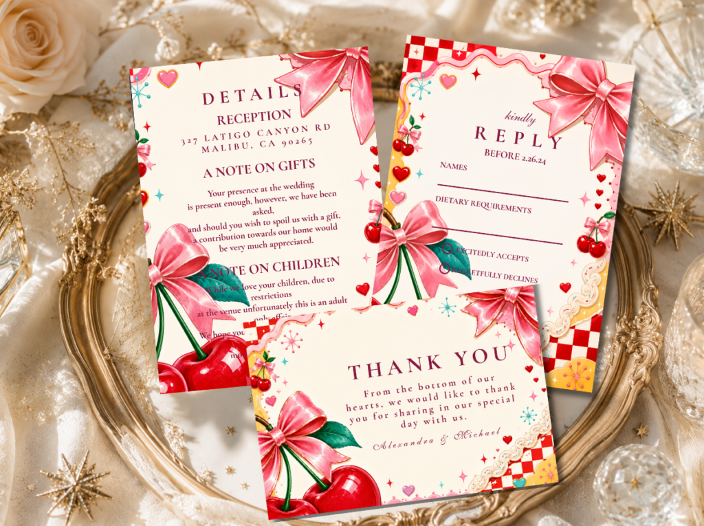
Kitschy Maximalist
Feeling: Maximalist, joyful, and specifically anti-minimal — the palette that celebrates colour abundance as a deliberate aesthetic statement.
Venue fit: Backyard garden, colourful indoor venue, any space where the decoration can match the palette’s full intensity.
Stationery: Kitschy Wedding stationery — designed for maximum colour impact and maximalist celebration confidence.
Palette 05
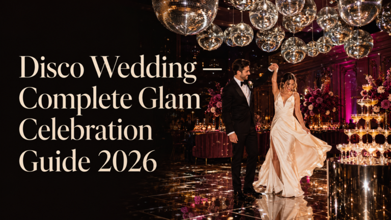
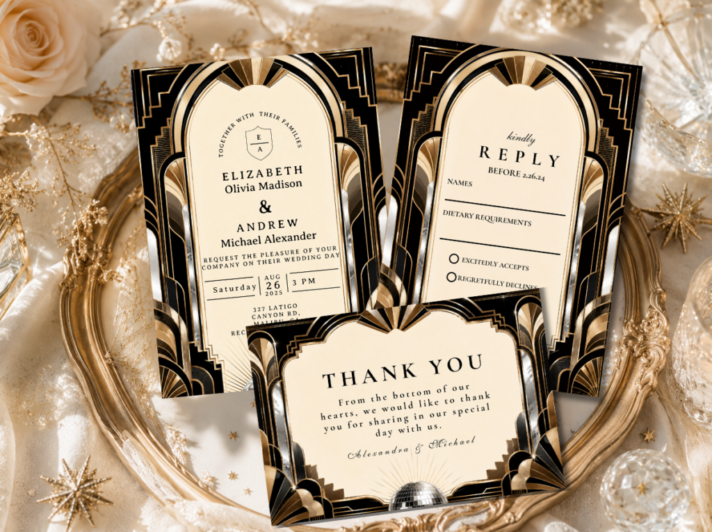
Disco Glam
Feeling: Glamorous, theatrical, and specifically nocturnal — designed for warm lamplight and reflective surfaces. The most evening-specific of all eight directions.
Venue fit: Hotel ballroom, supper club, any venue where evening lighting transforms the space.
Stationery: Disco Wedding stationery — gold and plum in the most theatrical retro celebration register.
Palette 06
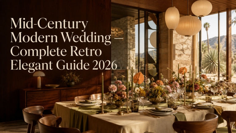
Mid-Century Warm
Feeling: Elegant, warm, and design-literate — the most sophisticated and broadly accessible of all eight. Retro character without maximum saturation.
Venue fit: Mid-century modern venue, museum, architecture-forward space, or any venue with clean lines and warm materials.
Stationery: Mid-Century Modern Wedding stationery — the most refined mid-century palette available.
Palette 07
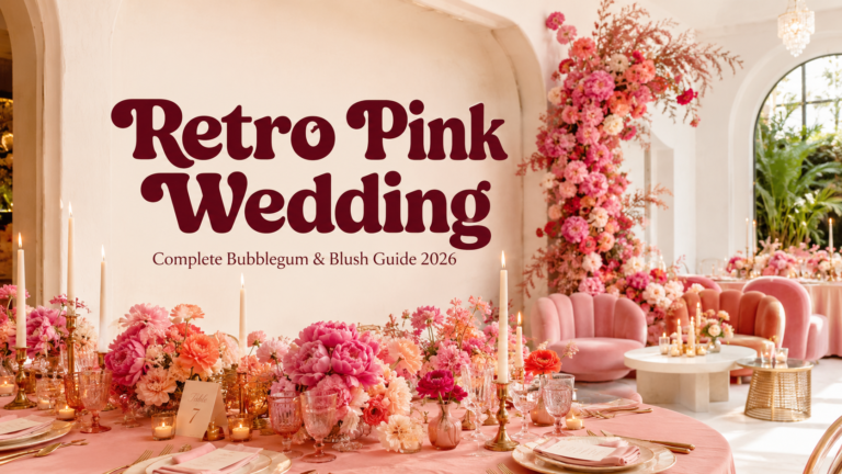
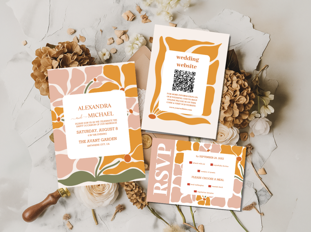
Retro Pink Bubblegum
Feeling: Feminine, joyful, and specifically retro-pink — celebrating the 1950s and early 1960s pink-forward aesthetic at its most exuberant.
Venue fit: Garden venue, restaurant private dining, any space where warm candlelight and floral decoration work naturally together.
Stationery: Retro Pink Wedding and Groovy Retro Pink and Orange Arch — the two pink-forward retro stationery collections.
Palette 08
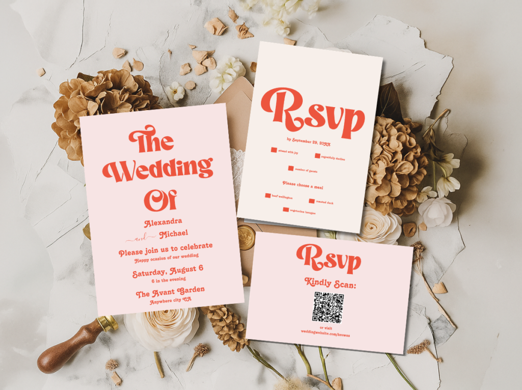
Groovy Typography
Feeling: Bold, typographic, and editorial — the palette that foregrounds letterform as the wedding’s primary design element. The most contemporary-feeling retro palette of all eight.
Venue fit: Urban restaurant, editorial-aesthetic venue, gallery space, or any location where the design direction is deliberately considered.
Stationery: Modern Retro Pink And Orange Typography and Groovy 70s Muted Tones — typography-forward retro stationery.
Section 03 Color Combinations That Work Across Retro Palettes
Three principles apply regardless of which of the eight palettes is chosen.
Every retro palette has a dominant and an accent. The 70s Earth palette’s dominant is burnt orange; mustard and avocado are accents. The Disco Glam palette’s dominant is deep plum; gold and silver are accents. Maintaining that proportion — dominant colour at roughly sixty percent of every major surface, accents dividing the remaining forty — is the single most important technique for making a retro palette read as designed rather than assembled.
Warm cream or warm white as the base prevents overwhelm. Every maximalist retro palette — Kitschy, Vegas Neon, Groovy Typography — needs a warm neutral base to give the saturation room to breathe. Warm cream or ivory as the tablecloth, stationery ground, and venue wall tone allows the bold palette to read as deliberate. The neutral is not a retreat from the palette’s boldness; it is the foundation that makes the boldness legible.
Natural materials warm every retro palette. Rattan, warm wood, dried botanicals, warm-toned candles, and textured linen belong to the warm world that retro palettes reference. Whatever the decade, these materials add authenticity that synthetic or cool-toned surfaces consistently subtract. A 70s Earth palette on a warm wood table reads as designed; the same palette on a cool grey surface reads as borrowed from a different aesthetic world.
Frequently Asked Questions
What are the most popular retro wedding colors for 2026?
The 70s Groovy Earth palette — burnt orange, avocado, mustard, and harvest brown — remains the most consistently requested, followed by Retro Pink Bubblegum which has seen the largest year-over-year growth. Disco Glam (mirror gold, deep plum, midnight black, silver) is the most requested evening-specific direction. Mid-Century Warm (teal, mustard, coral, cream) is the most broadly accessible for couples who want retro character without maximum saturation.
How do I keep a retro palette from looking like a costume party?
Three techniques prevent the costume reading. First, choose one decade’s palette and apply it consistently rather than mixing decades. Second, use natural materials — rattan, warm wood, dried botanicals, textured linen — as the surface context. Third, invest in designed stationery that treats the retro palette as a deliberate editorial choice. When the invitation is beautiful, the table is cohesive, and the materials are warm, the palette reads as considered rather than costumed.
Can I mix two retro palettes at the same wedding?
The safest approach is to choose two palettes from the same decade. The 70s Groovy Earth and Groovy Typography palettes share burnt orange and warm brown and read as coherent together. Mixing across decades — 60s Mod with 70s Earth — rarely produces a cohesive result because the decade logic differs too significantly. The most successful multi-palette weddings use one palette as dominant (stationery, tablecloths, main florals) and a second as a specific-zone accent (dessert table, lounge, ceremony arch).
What flowers work best with retro wedding color palettes?
Dahlias and chrysanthemums in burnt orange and mustard for the 70s Earth palette. Gerbera daisies and carnations in primary red and white for the 60s Mod palette. Peonies and roses in hot pink and cream for the Retro Pink palette. The general principle: flowers that read as bold and abundant rather than delicately arranged — full heads, warm tones, generous volumes. Rattan or terracotta vessels and macramé hangers read more authentically within retro palettes than contemporary glass or metallic vases.
Wedding Avenue Studio · Eight Palettes · Every Decade
Shop Retro Wedding Stationery
Invitation suites designed for each decade’s colour language — from 70s earth tones to Disco glam to retro pink.