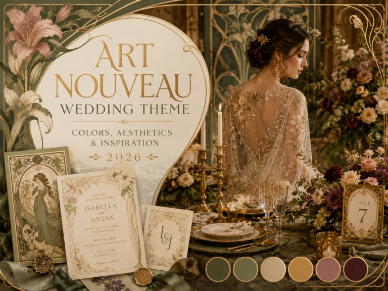
Art Nouveau Wedding Color Palettes
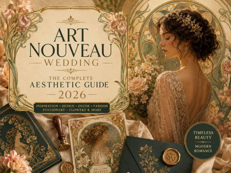
Art Nouveau Wedding · 2026
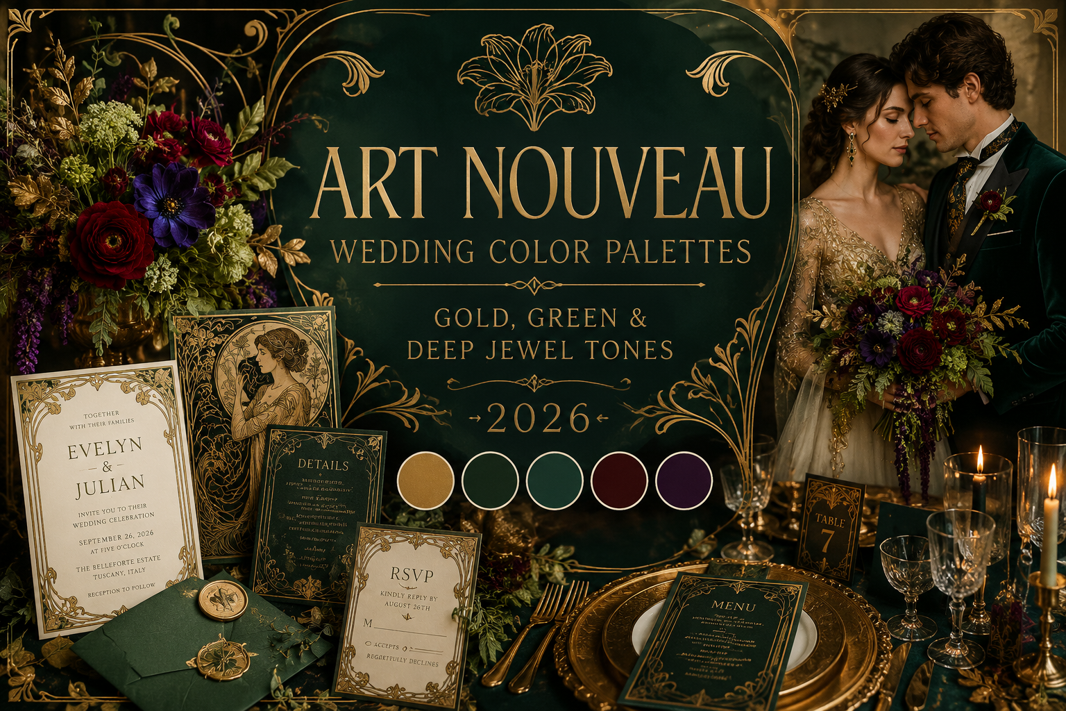
Art Nouveau Wedding Color Palettes — Gold, Green & Deep Jewel Tones 2026
Eight art nouveau colour palettes, eight stationery collections — find the botanical colour story your celebration belongs to.
An art nouveau wedding colour palette is not one fixed scheme but a family of related botanical colour stories. This guide maps eight of them, each with its own stationery match.
The movement never invented a colour. It simply looked harder than anyone had before at the ones already growing.
Section 01
How Art Nouveau Built Its Color Language
Art nouveau’s colour palette was built from direct observation of the natural world rather than invented in the studio — deep forest green from shadowed foliage, antique gold from late afternoon light through leaves, dusty rose from flowers past their first bloom. This is why the palette reads as organic rather than designed: every colour in it has a specific botanical referent, and the movement’s artists were looking at the actual plant before they decided what shade to use.
Japanese woodblock prints, which reached Europe in significant numbers during the late nineteenth century, had a substantial influence on the movement’s colour sensibility: flat, confident colour fields, asymmetric composition, and a willingness to let a single dominant hue carry an entire image rather than blending toward naturalistic gradation. This influence is visible throughout art nouveau’s most celebrated graphic work, in the bold, unmodulated colour fields that sit alongside the movement’s more delicately rendered botanical detail.
The movement’s palette has always contained a genuine duality: warm, muted, daylight botanical tones on one side, and deep, atmospheric jewel tones on the other, drawn from the same plants observed in different light. The eight palettes below sit across this full range — from the warmest vintage parchment to the darkest jewel gothic — and gold, in some antique form, appears in every one of them as the connecting thread the movement never varied on.
Section 02
Eight Art Nouveau Wedding Color Palettes
Find the card that matches the celebration you are imagining. Each links to the stationery collection built for that exact palette.
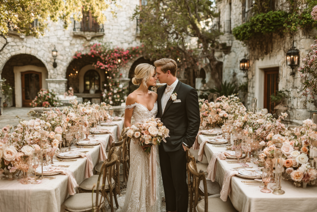
Palette 01
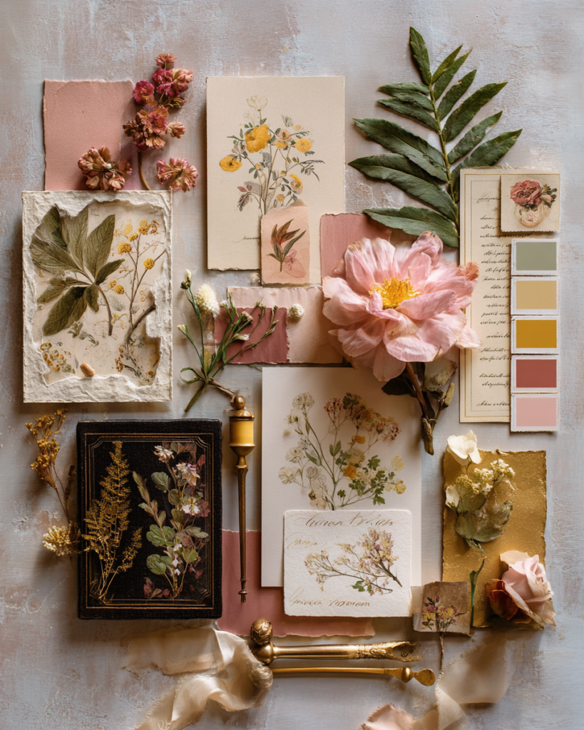
Botanical Gold
Forest Green · Antique Gold · Ivory · Dusty Rose
Warm, ornate, instantly recognisable — the defining art nouveau palette, lush with botanical depth and gold line work.
Glasshouses, orangeries, botanical gardens, historic halls with period detail.
Stationery: Art Nouveau Floral →
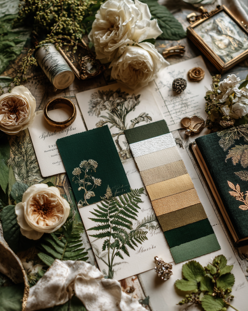
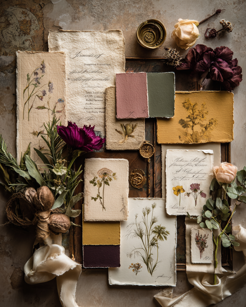
Palette 02
Vintage Parchment
Warm Ivory · Aged Gold · Dusty Rose · Sage
Nostalgic and romantic — the palette of a treasured Victorian botanical print, warm and softly aged.
Manor houses, walled gardens, conservatories with established planting.
Stationery: Art Nouveau Vintage →
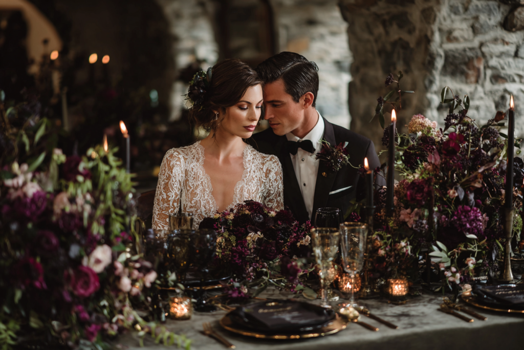
Palette 03
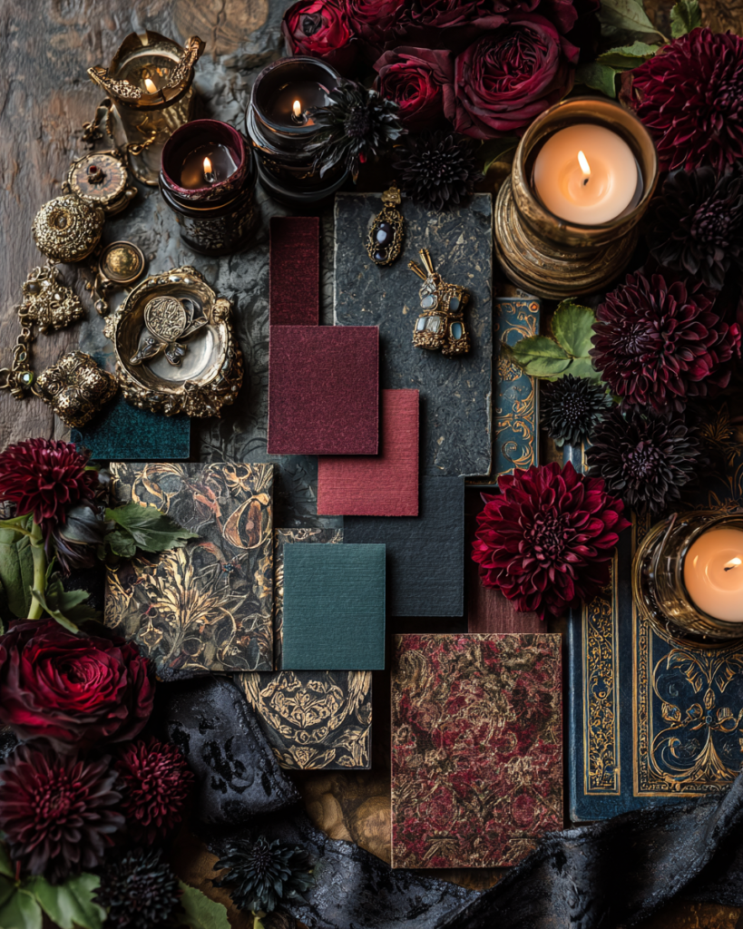
Dark Jewel Gothic
Burgundy · Midnight Green · Black · Gold
Atmospheric and dramatic — the movement’s symbolist strand, where botanical beauty meets candlelit darkness.
Ornate historic interiors, candlelit cellars, atmospheric architectural spaces.
Stationery: Art Nouveau Goth →
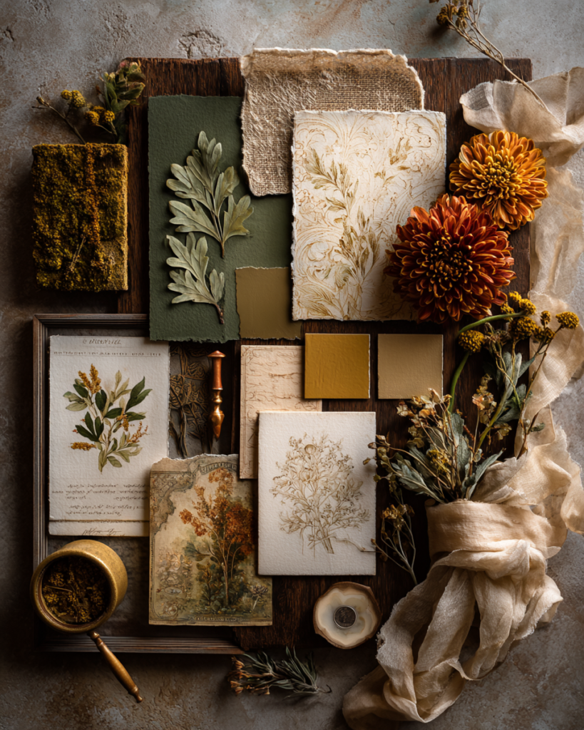
Palette 04
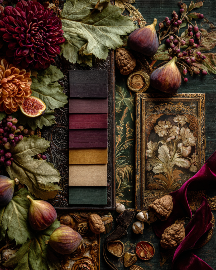
Harvest Botanical
Rust · Antique Gold · Forest Green · Plum
Rich and seasonal — art nouveau botanical abundance rendered in the deepest tones of an October canopy.
Autumn woodland venues, barn receptions, orangeries beside turning trees.
Stationery: Art Nouveau Autumn →
Palette 05
Flora Vintage Bloom
Dusty Rose · Sage · Parchment · Gold
Pure vintage botanical elegance — flowing floral illustration in the gentlest, most immediately warm register.
Botanical gardens, conservatories, vintage-styled garden receptions.
Stationery: Flora Vintage Art Nouveau →
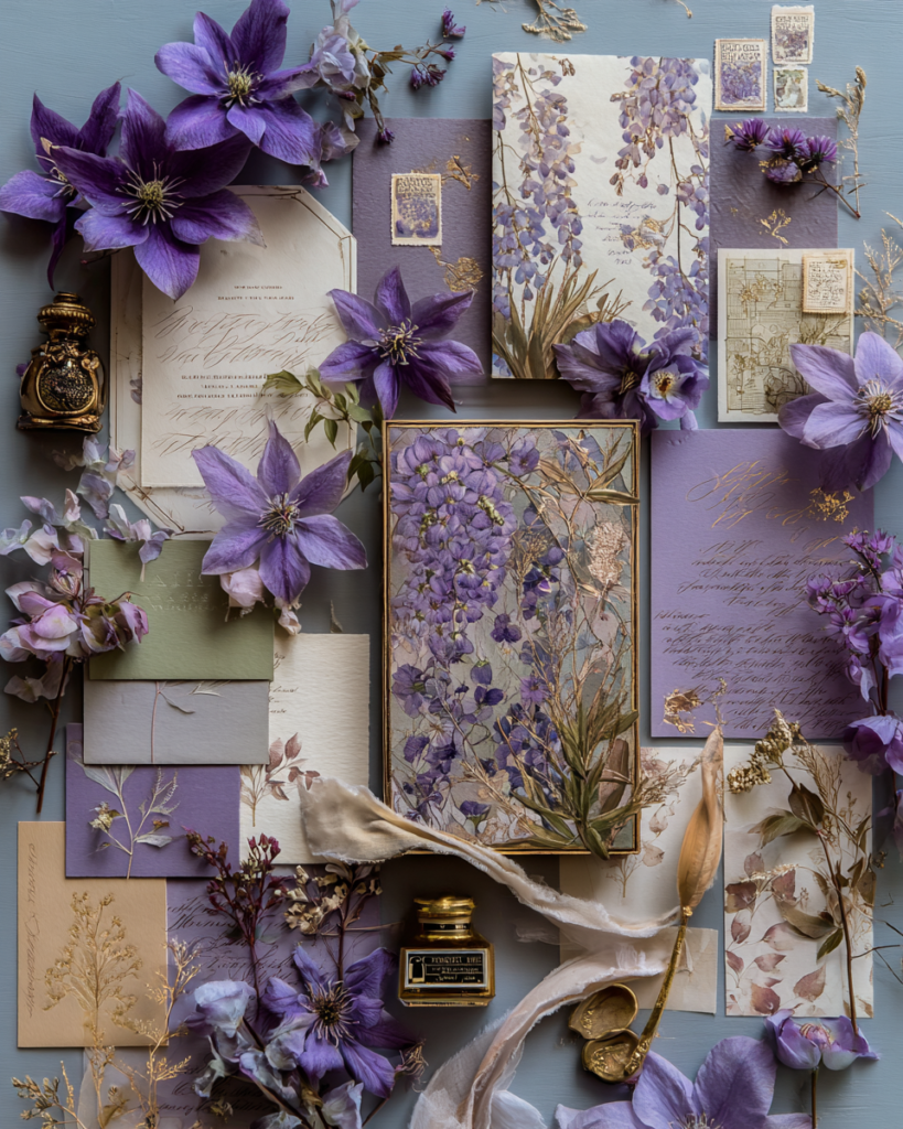
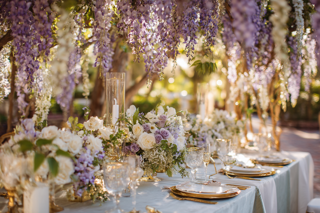
Palette 06
Wisteria Twilight
Lavender · Sage · Antique Gold · Ivory
Romantic and cascading — the movement’s most beloved motif, built around the soft trailing colour of flowering wisteria.
Glasshouses, garden arches, spring and early summer botanical ceremonies.
Stationery: Wisteria Arch Botanical →
Palette 07
Olive & Antique Gold
Olive Green · Gold · Cream · Rust
Distinctive and unexpected — a muted shadowed green with genuine precedent in the movement’s aged botanical palette.
Late summer and autumn celebrations, nature-connected and distinctive venues.
Stationery: Olive Green Vintage Floral →
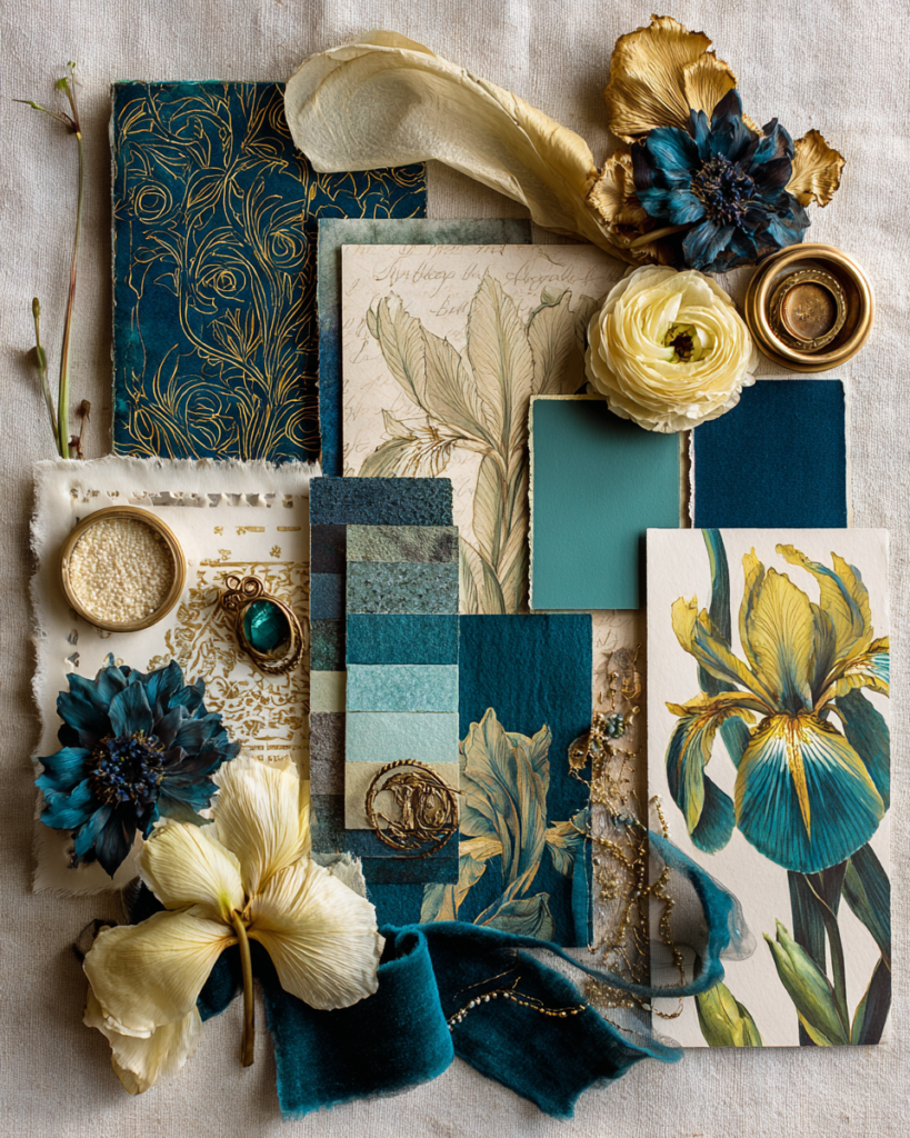
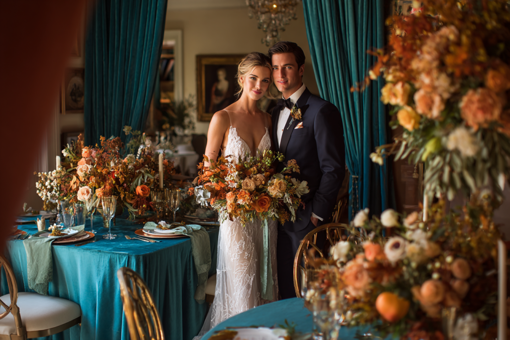
Palette 08
Elegant Decorative
Deep Teal · Gold · Ivory · Dusty Plum
Refined and sophisticated — the cooler, more restrained register of the movement, ornate without maximalism.
Mixed historic and contemporary venues, refined garden and hall settings.
Stationery: Elegant Decorative Floral →
Section 03
Color Pairings That Work
Several of the eight palettes pair naturally because they share an underlying tonal register — here are the combinations that work most consistently.
Botanical Gold + Wisteria Twilight
Both warm and abundantly floral — the forest green and gold anchor the palette while the wisteria lavender adds a romantic seasonal accent. Use Botanical Gold for the primary stationery and table linen, and Wisteria Twilight for the ceremony arch and bouquet.
Vintage Parchment + Flora Vintage Bloom
Nearly identical in register — the most coherent pairing of the eight, for couples who want maximum vintage warmth across every printed and decorative surface without introducing a second tonal direction.
Dark Jewel Gothic + Olive & Antique Gold
An unexpected but genuinely beautiful pairing — the deep burgundy and midnight green of the gothic palette grounded by the warmer, muted olive, producing a celebration that is atmospheric without reading as uniformly dark.
Elegant Decorative + Harvest Botanical
The cooler teal of the elegant palette against the warm rust of harvest botanical creates genuine contrast rather than a blended scheme — striking for couples confident enough to let two distinct registers share a single celebration.
Frequently Asked Questions
Common Questions
What is the most popular art nouveau wedding color palette?
Botanical Gold holds the highest search and save volumes — it is the most immediately recognisable as art nouveau and the most versatile across venue types. Vintage Parchment and Wisteria Twilight follow closely, both benefiting from the broader vintage botanical trend on Pinterest. Dark Jewel Gothic has grown fastest year-on-year as the alternative bridal aesthetic continues to expand.
Does every art nouveau palette need gold?
Effectively yes — gold, in some antique or aged form, is the one element that appears across all eight palettes in this guide and throughout the broader movement’s visual tradition. It functions as the connecting metallic thread between botanical illustration, jewellery, and architectural ironwork. Even the coolest and darkest palette here, Dark Jewel Gothic, retains gold as its single warm note against burgundy, midnight green, and black, because removing it entirely tends to read as simply dark rather than genuinely art nouveau.
Can I mix two of these palettes?
Yes — Section 03 above lists the combinations that pair most naturally. The general principle: choose one palette as primary for the stationery and the overall colour scheme, and use the second as an accent in florals or a single decorative register such as the ceremony arch. Avoid mixing more than two, since the visual coherence that makes art nouveau decoration so powerful depends on a consistent, traceable colour thread running through every surface a guest encounters.
How do I choose between the eight palettes?
Start with the feeling each card describes rather than the colours alone, then check the venue line against what you have already chosen or are considering. A glasshouse points toward Botanical Gold or Wisteria Twilight; a historic manor toward Vintage Parchment or Elegant Decorative; an atmospheric interior toward Dark Jewel Gothic; an autumn barn toward Harvest Botanical. For the complete reasoning behind each aesthetic, see the Art Nouveau Wedding Complete Aesthetic Guide.
Art Nouveau Wedding Stationery · 2026
Eight Palettes, One Perfect Match
Every palette above connects to a fully customizable stationery collection — add your names, date and details online.